9 Important Things of Color Theory in UI Design That You Shouldn’t Miss
Oct 22, 2025 6 Min Read 7847 Views
(Last Updated)
In User Interface (UI) Design, nothing is co-incidental or meaningless. Whatever you do or add to your design, reflects on the user behavior. That’s the case for colors as well. Color theory in UI design is interesting and you must know it if you want to stand out as a UI designer.
Colors play an important part in deciding user behaviors and there is a psychological backdrop for every color. Using it effectively can improve your overall UI performance.
That is why, this article covers the topic ‘Color theory in UI design’ and by the end of this article, you will understand the importance of color theory and how you can effectively use that in your UI designs.
So, let’s get started.
Table of contents
- What is Color Theory?
- Color Theory in UI Design
- Psychology of Colors
- Color Schemes
- Contrast and Accessibility
- Branding and Consistency
- Mood and Atmosphere
- Trends and Context
- User Testing and Feedback
- Technical Considerations
- Psychological Load
- Conclusion
- FAQ
- Can color trends impact UI design?
- What is the role of color psychology in UI design?
- What are primary, secondary, and tertiary colors?
- Why is color theory important in UI design?
- What are some common mistakes to avoid in applying color theory to UI design?
What is Color Theory?
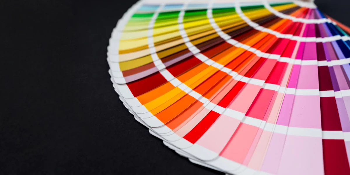
Before we get into the topic of color theory in UI design, let us first understand what color theory is and why it is important for you as a UI designer if you are designing UI patterns.
Color theory is a set of principles used to create harmonious or rhythmic color combinations and schemes. It’s all about understanding how colors interact, how they impact viewers, and how they communicate messages.
Colors are often organized on a color wheel, which shows the relationship between primary colors (red, blue, and yellow), secondary colors (created by mixing primary colors), and tertiary colors (made from primary and secondary colors).
In color theory, colors are also understood in terms of their hue (the actual color), saturation (intensity or purity of the color), and value (lightness or darkness).
This theory guides in making choices in art, design, fashion, and more, helping to achieve balance and visual interest in a composition. It’s a fundamental tool for anyone working with colors, as it helps predict and understand how different colors will look together and what kind of emotional response they might evoke.
Read: How To Switch Career In UI/UX Design? Easy or Hard? [2024]
As we proceed to the next phase, make sure you understand the fundamentals of UI/UX, which includes heuristic analysis, journey maps, testing, etc. If you want to explore more about it, join HCL GUVI’s UI/UX Course with Placement Assistance. You’ll also learn about the tools used in UI/UX which are Adobe XD, Illustrator, Photoshop, Figma, and many more. Build some amazing real-time projects to get hands-on experience.
Also, if you want to explore Figma through a Self-paced course, try HCL GUVI’s Figma certification course.
Color Theory in UI Design

If you are someone who aspires to become a professional UI designer or just started out but is unable to figure out a path, it is best if you enroll yourself in a professionally certified UI/UX designer course by a recognized organization as that can provide you with the basics of UI as well as UX making your knowledge on the subject robust.
Now let us get into the topic that you are eagerly waiting for, color theory in UI design.
1. Psychology of Colors
In color theory in UI design, the psychology of colors is important for making effective and appealing user interfaces. Different colors trigger specific emotional responses, which designers use to enhance user experience.
For example, in color theory in UI design, blue is often used for its calming and trustworthy vibe, ideal for banking or healthcare apps. Red, on the other hand, is energetic and attention-grabbing, perfect for ‘Buy Now’ buttons or important alerts. This aspect of color theory in UI design is vital for influencing how users feel and interact with the interface.
Furthermore, the psychology of colors in color theory in UI design also can be interpreted for cultural color interpretations, ensuring that the design is globally acceptable.
While white might symbolize purity in some cultures, in others, it’s associated with mourning. This consideration in color theory in UI design helps avoid misinterpretations and ensures the interface communicates the right message to a diverse audience.
By understanding and applying these psychological and cultural color nuances, you can create more responsible, engaging, and effective user interfaces.
2. Color Schemes
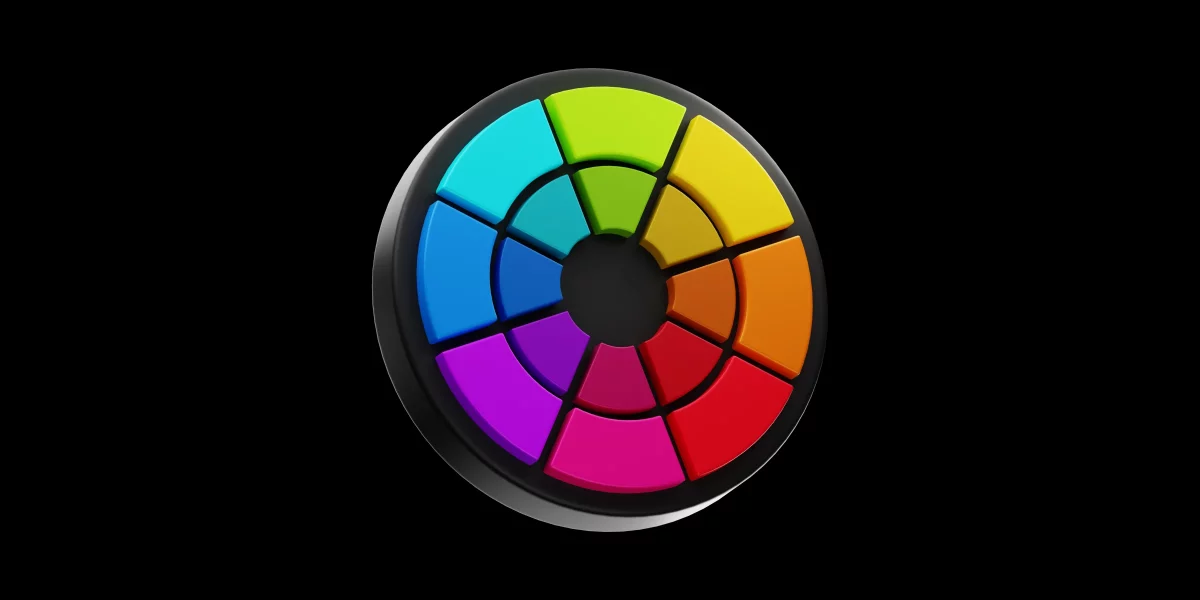
Selecting the right color scheme is essential for creating visually appealing and effective user interfaces. There are several types of color schemes, each with its own impact and use case.
A monochromatic scheme, an important color scheme in color theory in UI design, uses varying shades and tints of a single color, creating a harmonious and unified look that’s easy on the eyes.
Analogous color schemes, another concept in color theory in UI design, involve colors that are next to each other on the color wheel. These schemes offer more diversity while maintaining visual harmony, ideal for creating a balanced yet colorful UI.
On the other hand, complementary color schemes, a bold approach in color theory in UI design, use colors opposite each other on the color wheel. This contrast is eye-catching and is excellent for highlighting important elements like call-to-action buttons.
Triadic schemes, another dynamic aspect of color theory in UI design, use three evenly spaced colors on the color wheel. While vibrant, they require careful balancing to avoid overwhelming the user.
Understanding and applying these schemes in color theory in UI design helps you to create interfaces that are not only aesthetically pleasing but also functional and user-friendly.
Also Read Top 10 UI Design Patterns: Creating Intuitive and Engaging User Experiences
3. Contrast and Accessibility

In color theory in UI design, Contrast and Accessibility are key components that significantly impact user experience. High contrast between elements, especially text, and backgrounds, is a fundamental principle, as it enhances readability and user focus.
For example, black text on a white background or vice versa ensures that content is easily readable for most users. In digital interfaces, where users may skim content, this aspect of color theory in UI design is crucial for efficient information absorption and overall user satisfaction.
Accessibility, a vital consideration in color theory in UI design, involves ensuring that color choices and contrasts are friendly to all users, including those with visual impairments like color blindness.
This aspect goes beyond aesthetics, focusing on inclusivity. Designers use tools like contrast checkers to ensure that color combinations meet accessibility standards, making the UI usable for a wider audience.
By prioritizing contrast and accessibility in color theory in UI design, you can create interfaces that are not only visually appealing but also universally usable, enhancing the experience for all users.
4. Branding and Consistency

Branding and consistency help in creating a cohesive and recognizable user interface. The choice of colors is often dictated by a brand’s identity, making color theory in UI design an essential tool for reinforcing brand recognition and loyalty.
For example, a brand’s signature colors can be integrated into the UI design to create a strong visual connection with the user like how Facebook only uses blue and white. This application of color theory in UI design not only enhances aesthetic appeal but also strengthens the brand’s presence within the digital space.
Maintaining a consistent color palette across various screens and elements of the interface is a fundamental aspect of color theory in UI design and doing that in accordance to a brand’s color promotes the brand value as well.
By applying consistent colors in line with brand identity, you can build interfaces that are both visually appealing and functionally efficient, enhancing the overall user experience.
5. Mood and Atmosphere
Mood and atmosphere are pivotal in setting the tone and emotional backdrop of a user interface. The choice of colors can evoke specific moods, making color theory in UI design a powerful tool for influencing user perception and experience.
For instance, a palette of soft blues and greens might create a calming and tranquil atmosphere, ideal for wellness or meditation apps. On the other hand, vibrant and warm colors like reds and oranges can energize and stimulate, suitable for fitness or gaming apps.
This strategic use of color to craft mood is a central aspect of color theory in UI design, allowing designers to align the interface’s emotional tone with its purpose and content.
A well-thought-out color palette that resonates with the target audience can make the interface more inviting and enjoyable to use.
For example, professional and business applications might employ a more subdued and formal color scheme, aligning with their serious nature. In contrast, children’s apps might use bright, playful colors to create a fun and engaging atmosphere.
Thus, understanding and implementing mood and atmosphere through color theory in UI design is key to creating interfaces that not only look good but also feel right to the user.
6. Trends and Context
Trends and Context are essential factors that guide designers in making informed color choices. Staying current with color trends is an important aspect of color theory in UI design, as it helps create modern and relevant user interfaces.
However, trendiness should not overshadow suitability. A color might be fashionable, but if it doesn’t align with the app’s purpose or audience, it may not be effective.
Therefore, in color theory in UI design, it’s crucial to balance trendiness with appropriateness, ensuring that the color choices enhance the user interface while also resonating with the target audience.
Context is another key element in color theory in UI design. The same color can have different implications and effects in various settings.
For example, bright and bold colors might work well for a gaming app, providing an exciting and dynamic user experience. In contrast, a banking app would benefit from more subdued and stable colors, conveying security and trustworthiness.
By paying attention to trends and context, you can create interfaces that are both aesthetically pleasing and contextually appropriate.
Read Top UI/UX Design Trends: Embracing Innovation in 2024
7. User Testing and Feedback

In color theory in UI design, User Testing and Feedback are important to validate and refine the color choices made during the design process.
This aspect of color theory in UI design involves presenting the interface to actual users to gauge their reactions and gather insights. User testing helps determine if the chosen colors effectively convey the intended message, are appealing to the target audience, and facilitate usability.
For example, a color scheme that seems perfect in theory might be perceived differently by users, revealing unforeseen issues in legibility or emotional response. Incorporating user testing in color theory in UI design allows designers to make data-driven decisions, ensuring the final product resonates well with its intended users.
Feedback gathered from user testing plays a significant role in optimizing the interface in line with color theory in UI design. It provides actionable insights into how different demographics perceive and interact with the color scheme.
8. Technical Considerations
Technical Considerations refer to the practical aspects of implementing colors in digital interfaces. A key factor in this area of color theory in UI design is the understanding that different devices and screens display colors differently.
This variability means that a color scheme might look great on one monitor but appear dull or overly vibrant on another. To address this challenge, designers often test color schemes across a range of devices to ensure consistency and the intended visual impact.
Another technical aspect of color theory in UI design involves color codes and standards. Designers need to be familiar with color models like RGB (Red, Green, Blue) and HEX codes, which are used in digital design to create precise color schemes.
Additionally, considerations around web and app performance are also part of color theory in UI design. Heavily saturated colors or complex gradients might look appealing but could slow down a website or app.
Balancing aesthetic appeal with technical performance is a critical skill in color theory in UI design, ensuring that the final product is not only visually attractive but also technically robust and efficient.
9. Psychological Load

Psychological load refers to the mental and emotional impact that color choices have on users. This concept in color theory in UI design emphasizes the importance of selecting colors that not only create visual appeal but also support a user-friendly experience.
Overly complex or intense color schemes can lead to cognitive overload, making it difficult for users to focus or find what they need. For instance, using too many bright, contrasting colors can be distracting or even stressful for users.
In contrast, a well-balanced color palette, guided by color theory in UI design, can create a more comfortable and pleasant user environment, enhancing user engagement and satisfaction.
Furthermore, color theory in UI design also considers the subtlety of color usage to reduce psychological load. Subdued or neutral colors can create a background that allows more vibrant elements to stand out without overwhelming the user.
This is how color theory in UI design affects a user’s action. So, whenever you are creating a UI design, make sure to follow these standards.
Also Read: Conducting Competitive Analysis in UI Design: All You Need To Know
Kickstart your UI/UX journey by enrolling in HCL GUVI’s UI/UX Course where you will master technologies like AdobeXd, Illustrator, and Figma, and build interesting real-life UI/UX projects.
Alternatively, if you would like to explore Figma through a Self-paced course, try HCL GUVI’s Figma certification course.
Conclusion
In conclusion, color theory in UI design is an important component that goes beyond mere aesthetics to significantly enhance user experience and interaction.
By understanding and applying the principles of color harmony, contrast, branding consistency, and psychological impact, designers can create interfaces that are not only visually appealing but also functionally intuitive and emotionally resonant.
Whether it’s guiding users’ attention, reinforcing brand identity, ensuring accessibility, or setting the right mood, color theory is a much-needed tool for any UI designer.
As digital interfaces continue to evolve, the thoughtful application of color theory remains key to creating engaging, user-friendly, and effective designs that make your UI design stand out from the rest.
Also Explore 12 Unique UI/UX Project Ideas to Boost Your Portfolio
FAQ
1. Can color trends impact UI design?
Yes, staying updated on color trends can make a UI design feel more modern and relevant. However, it’s important to balance trendiness with functionality and brand alignment.
2. What is the role of color psychology in UI design?
Color psychology in UI design involves using colors to evoke specific emotional responses, which can influence user behavior and perceptions, such as trust, excitement, or calm.
3. What are primary, secondary, and tertiary colors?
Primary colors are red, blue, and yellow, which cannot be made by mixing other colors. Secondary colors are green, orange, and purple, made by mixing primary colors. Tertiary colors are made by mixing primary and secondary colors.
4. Why is color theory important in UI design?
In UI design, color theory is crucial for creating visually appealing interfaces, enhancing usability, establishing brand identity, and guiding user emotion and behavior.
5. What are some common mistakes to avoid in applying color theory to UI design?
Common mistakes include using too many colors, creating insufficient contrast, overlooking brand identity, and ignoring cultural connotations of colors.



Did you enjoy this article?