

UI/UX Designing Articles
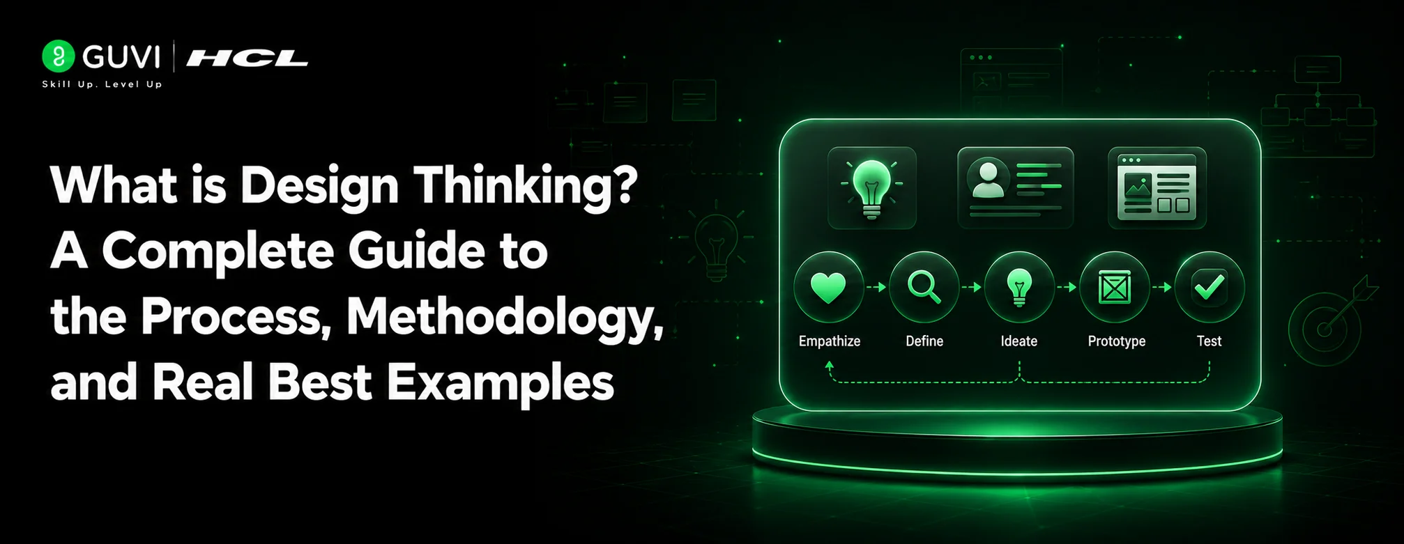
What is Design Thinking? A Complete 2026 Guide to the Process, Methodology, and Real Best Examples
15 Graphic Designer Roles and Responsibilities: Best guide


Get In Touch For Details! Request More Information
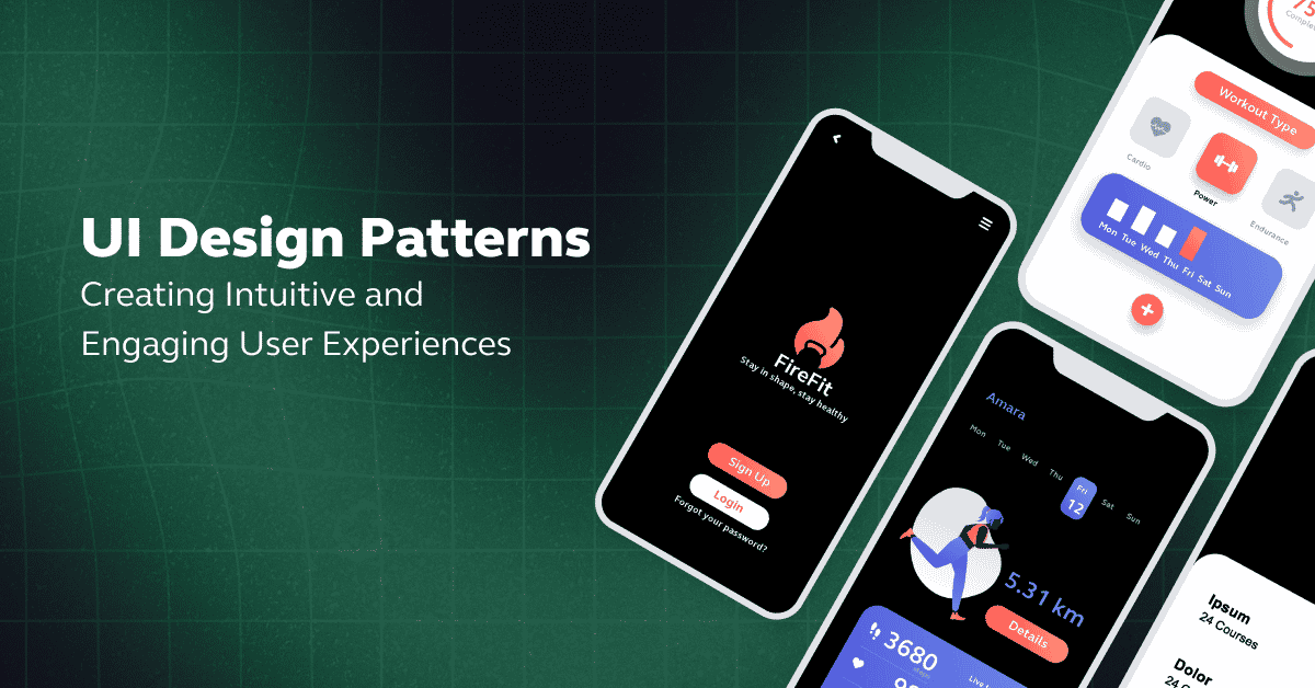
Top 10 UI Design Patterns: Creating Intuitive and Engaging User Experiences
Sep 30, 2025 6 Min Read 13296 Views
(Last Updated)
UI design patterns play a crucial role in creating intuitive and engaging user experiences. These recurring solutions to common design challenges provide a framework that guides designers in crafting functional and user-centric interfaces.
By understanding and mastering these patterns, designers can elevate their work and deliver seamless user experiences.
In this article, we will explore various UI design patterns, their impact on user engagement, and how they can be effectively implemented in design projects.
Table of contents
- What are UI Design Patterns?
- The Top 10 UI Design Patterns:
- Breadcrumbs
- Button
- Badge
- Date Picker/Calendar
- File Upload
- Rich Input Field
- Loader vs. Progress Bar
- Time Picker
- Data Visualization (Stat and Table)
- Inline Alert
- Concluding Thoughts...
- FAQ's
- What are the 4 golden rules of UI design?
- What are UI design patterns?
- What is the 6 3 1 rule in UI design?
- What is AI in UI design?
What are UI Design Patterns?
Imagine building a house without any blueprints or plans. It would be a daunting task, starting from scratch and making countless design decisions.
UI design patterns are exactly like those blueprints but for digital interfaces. They are recurring solutions to common design challenges, providing tried-and-tested guidelines for creating effective user interfaces.

Just like a magnifying glass icon instantly communicates “search,” these patterns help users navigate and interact with digital interfaces effortlessly.
The impact of effective UI design patterns is far-reaching. When applied correctly, they enhance the user experience in several ways:
- Intuitive Navigation: Users can easily find what they’re looking for, reducing frustration and increasing satisfaction.
- Consistency: Familiar patterns create a cohesive experience across different pages or sections of a website or app.
- Increased Engagement: When users feel comfortable and understand an interface, they are more likely to engage, return, and recommend it.
- Efficiency: Users can complete tasks faster and with fewer errors.
To ensure consistency and streamline the design process, designers can utilize UI kits and design systems. These resources provide pre-designed UI components that adhere to the guidelines of a design system, ensuring a cohesive and efficient workflow.
Before moving forward explore What is UI/UX? Top Things to Know in 2024
As we proceed to the next phase, make sure you understand the fundamentals of UI/UX, which includes heuristic analysis, journey maps, testing, etc. If you want to explore more about it, join HCL GUVI’s UI/UX Course with Placement Assistance. You’ll also learn about the tools used in UI/UX which are AdobeXD, Illustrator, Photoshop, Figma, and many more. Build some amazing real-time projects to get hands-on experience.
Also, if you want to explore Figma through a Self-paced course, try HCL GUVI’s Figma certification course.
The Top 10 UI Design Patterns:
UI design is not a one-size-fits-all approach. However, having a set of design patterns can provide valuable guidelines and solutions based on industry best practices and user experience research.
Let’s explore some common UI design patterns that can help designers create modern and user-friendly interfaces.
1. Breadcrumbs
Breadcrumbs act as a secondary navigation tool that helps users retrace their steps within a website or app’s hierarchical structure.

They provide users with a clear path and context of their location within the site. Breadcrumbs are especially useful when a website or app has a deep hierarchy with multiple levels of pages or sections.
By implementing breadcrumbs, users can easily navigate back to higher-level pages or the homepage.
Anatomy of breadcrumbs:

- Active state: Clickable links that display the user’s path in the app or website.
- Slash: A visual separator between different links or pages in the breadcrumb trail.
- Current state: Indicates the current page or position the user is on.
Things to keep in mind when using breadcrumbs:
- Start with the homepage and end with the current page.
- Keep breadcrumbs small and subtle, not dominating the page.
- Use simple separators like a slash (/) to maintain clarity.
- Highlight the current page, making it stand out and unclickable.

2. Button
Buttons are essential elements in user interfaces that trigger specific actions based on user interaction.

They can be used for various purposes, including calls to action, navigation, search, sharing, and more. Buttons guide users through an interface and highlight the most important actions they can take.
Anatomy of a button:

- Button label: The text or action name is displayed on the button.
- Icons: Optional visual symbols that accompany the text to make actions or choices more noticeable.
Things to keep in mind when designing buttons:
- Understand the button’s role and clear function.
- Determine the visual importance of the button based on its purpose.
- Organize button hierarchy logically based on importance.
- Choose the right shape, color, and padding to make buttons stand out.
- Use legible typefaces and provide feedback when a button is clicked.
Also Read: 12 Unique UI/UX Project Ideas to Boost Your Portfolio
3. Badge
Badges are small interactive or static elements used to label, categorize, or organize items using text. They provide quick visual cues that help direct users’ attention to important information, updates, or actions.

Badges can indicate things like the number of unread messages or notifications, status indicators, or filtering and sorting options.
Anatomy of a badge:

- Label: Text or name attached to the badge, providing context and description.
- Supporting icons: Visual symbols used alongside text to provide extra information or emphasis.
Things to keep in mind when using badges:
- Make the purpose of badges clear and instantly recognizable.
- Use a consistent design across shapes, colors, and placement.
- Limit text to keep badges concise and easily readable.
- Avoid overusing badges and highlight only the most important information.
- Use colors and opacity wisely to differentiate between different types of badges.
4. Date Picker/Calendar
Date pickers or calendars allow users to select specific dates or date ranges. They are commonly used in web forms for tasks like scheduling, making reservations, or filling out forms that require date information.

Date pickers eliminate the need for users to remember specific date formats and reduce the likelihood of input errors.
Anatomy of a date picker:

- Date field: Displays the chosen date within the selected month.
- Separator: Spaces between the date components (day, month, year) to differentiate each.
- Time input label: Labels like “Hours,” “Minutes,” and “Seconds” guide users on what to input.
Things to keep in mind when designing date pickers:
- Keep the design simple and provide format hints within the input field.
- Set useful defaults for the date picker, such as the current date or end of the year.
- Break date fields for efficient navigation, and display the month and year on top.
- Make user behavior intuitive by ensuring compatibility with different input methods.
- Provide clear feedback and validation for correct date input.
5. File Upload
File uploaders allow users to upload files to a server or cloud storage. They are commonly used in forms or as standalone elements.

File upload components simplify the process of transferring files and make it more intuitive and error-free. They provide immediate visual feedback on the upload process and allow users to track progress.
Anatomy of a file upload:

- Leading icon: A visual symbol indicating the file upload action.
- Prompt Title: The main heading or instruction for the file upload.
- Prompt description: Additional information or guidelines about the file upload.
- File button: A clickable button that initiates the file upload process.
Things to keep in mind when designing file upload components:
- Provide clear labels and descriptions to guide users through the upload process.
- Make the drag-and-drop functionality intuitive for users to upload files.
- Show file details and progress to keep users informed during the upload process.
- Handle long filenames and use icons to visually represent file types.
- Provide feedback on successful uploads or errors during the process.
6. Rich Input Field
Rich input fields are advanced versions of traditional text boxes. They offer additional functionalities like auto-complete, formatting options, embedded links, and integrated dropdowns.

These fields enhance the user experience by allowing users to input and edit various types of information more efficiently.
Anatomy of a rich input field:

- Control field: Allows users to input or select data.
- Label: Describes the purpose or type of input required.
- Description: Provides additional information or guidance for the input field.
Things to keep in mind when designing rich input fields:
- Select the appropriate type of rich input field based on the required data.
- Keep the design simple and provide clear instructions and labels.
- Provide instant feedback and validation to help users input data correctly.
- Utilize placeholder text to give examples or hints about the required data format.
- Make user interactions seamless across different input methods.
7. Loader vs. Progress Bar
Loaders and progress bars provide visual feedback to users during time-consuming processes. Loaders indicate that a process is underway, such as data retrieval or slow computations.

Progress bars, on the other hand, show the duration of a process or journey, providing users with an understanding of how long they need to wait.
Anatomy of a loader:

- Spinner: A visual aid that animates when a process is loading.
- Description: Optional text that adds feedback to the loading status.
Anatomy of a progress bar:

- Label: The process or journey the progress bar refers to.
- Progress bar: The background field and indicator that represents the progress.
- Caption: Additional information or context related to the progress.
Things to keep in mind when using loaders and progress bars:
- Minimize display time to keep the user experience smooth.
- Provide time estimations to set user expectations.
- Explain the reason for the delay or progress to keep users informed.
- Differentiate between active, success, error, and paused/idle states.
- Avoid overwhelming users and carefully evaluate the context for usage.
8. Time Picker
A time picker allows users to select specific times or durations. It is particularly useful for scheduling tasks, making appointments, or filling out forms that require time information.

Time pickers simplify the process of entering time and reduce the likelihood of input errors.
Anatomy of a time picker:

- Time input: Allows users to input specific hours, minutes, and seconds.
- Separator: Spaces between the time components to differentiate each.
- Time input label: Labels like “Hours,” “Minutes,” and “Seconds” guide users on what to input.
- Time period: Buttons to choose between “AM” or “PM” for the time being set.
Things to keep in mind when designing time pickers:
- Default to common times to save users time and effort.
- Clearly indicate AM/PM to avoid confusion.
- Provide feedback on the user’s input and validation if necessary.
- Make corrections easy by allowing users to modify their selection.
- Display the time picker in a legible and user-friendly manner.
9. Data Visualization (Stat and Table)
Data visualization presents complex data through visual elements, making it easier for users to understand and analyze information.

Two common types of data visualization patterns are stat components and tables.
Anatomy of a stat component:

- Leading icon: Supports the visual representation of the statistical data.
- Stat content: Combination of overline, label, and description text to set the context of the stat.
- Badge: Optionally shows a positive, neutral, or negative change in the data.
Anatomy of a table:

- Table column header: Indicates the column heading with optional actions.
- Leading cell: Shows the first column in the table.
- General content cell: Contains various content types and makes up the rest of the cells in the table.
Things to keep in mind when designing data visualization components:
- Label clearly to provide an immediate understanding of the represented data.
- Provide contextual information and descriptions to explain the data.
- Indicate periodic data changes using badges or other visual cues.
- Make sure tables are editable when necessary and provide feedback on user interaction.
- Use a diverse color palette and size variations for better visual recognition.
10. Inline Alert
Inline alerts are messages placed within the content to provide timely information or feedback to users. These alerts can be used for form validation, confirmation messages, error messages, or subscription/purchase confirmations.

Inline alerts ensure that users receive important information without being taken out of their current context.
Anatomy of an inline alert:

- Label: Indicates the alert’s purpose in a concise manner.
- Dismiss icon: Allows users to dismiss the alert if desired.
- Description: Provides additional information or context related to the alert.
- Actions: Includes relevant actions that users can take.
Things to keep in mind when using inline alerts:
- Place alerts in proximity to related items for context-specific feedback.
- Position alerts appropriately within forms or content sections.
- Maintain a consistent color scheme and design for different types of alerts.
- Keep alerts short and straightforward, specifying a maximum character limit.
- Ensure that alerts do not obstruct or hide other content on the page.
Know More with 8 Essential Skills Required for UI Designers
Kickstart your UI/UX journey by enrolling in HCL GUVI’s UI/UX Course where you will master technologies like AdobeXd, Illustrator, and Figma, and build interesting real-life UI/UX projects.
Alternatively, if you would like to explore Figma through a Self-paced course, try HCL GUVI’s Figma’s certification course.
Concluding Thoughts…
In conclusion, UI design patterns are essential tools for creating intuitive and engaging user experiences. By understanding and applying these patterns, designers can enhance navigation, consistency, engagement, and efficiency in their interfaces.
Whether it’s implementing breadcrumbs for easy navigation, using buttons for clear calls to action, or incorporating loaders and progress bars for feedback, UI design patterns are the building blocks of successful user interfaces.
So, leverage these patterns, customize them to suit your specific needs, and create user experiences that stand out and deliver exceptional value.
Also Read Top 12 Key UI/UX Design Principles
FAQ’s
What are the 4 golden rules of UI design?
The 4 golden rules of UI design include visibility, feedback, efficiency, and simplicity.
What are UI design patterns?
UI design patterns are reusable solutions to common design problems, promoting consistency and usability.
What is the 6 3 1 rule in UI design?
The 6-3-1 rule in UI design suggests choosing a dominant color and using it in 60% of the space, a secondary color in 30%, and a final color in the remaining 10%.
What is AI in UI design?
AI in UI design refers to the integration of artificial intelligence techniques to enhance user experience, such as personalization and predictive features.
Success Stories

About the Author
Jaishree Tomar
A recent CS Graduate with a quirk for writing and coding, a Data Science and Machine Learning enthusiast trying to pave my own way with tech. I have worked as a freelancer with a UK-based Digital Marketing firm writing various tech blogs, articles, and code snippets. Now, working as a Technical Writer at GUVI writing to my heart’s content!
View all posts by Jaishree Tomar
Connect with me @


Did you enjoy this article?