
Exploratory Data Analysis (EDA) With Numpy, Pandas, Matplotlib And Seaborn
Nov 19, 2025 6 Min Read 2280 Views
(Last Updated)
In the world of data science, every project starts with one vital step and that is understanding your data. Before building models or drawing insights, it’s essential to know what your data truly represents. This is where Exploratory Data Analysis(EDA) plays a key role.
EDA helps you uncover hidden patterns, detect anomalies, test hypotheses, and validate assumptions through summary statistics and visual exploration. Simply put, it’s the process of understanding your dataset.
In this blog, you’ll discover how to perform EDA using four powerful Python libraries: NumPy, Pandas, Matplotlib, and Seaborn. Through hands-on examples and code snippets, you’ll learn how to explore, visualize, and interpret your data effectively.
Table of contents
- What Is Exploratory Data Analysis (EDA)?
- Importance Of EDA In Data Science
- Key Python Libraries For EDA
- A. Numpy – The Foundation of Numerical Computing
- B. Pandas – The Heart of Data Analysis
- C. Matplotlib – The Backbone of Visualization
- D. Seaborn – The Statistical Visualization Powerhouse
- Real-World EDA Workflow Example
- Sample Dataset
- Step 1: Import Libraries
- Step 2: Load Dataset
- Step 3: Initial Inspection
- Step 4: Check Missing Values
- Step 5: Univariate Analysis
- Step 6: Bivariate Analysis
- Step 7: Correlation Matrix
- Insights From This Mini Project
- Conclusion
- FAQS
- What is the main goal of EDA?
- How is EDA different from data preprocessing?
- Can EDA be automated?
- What is the most used library for EDA in Python?
- Is EDA required before machine learning?
What Is Exploratory Data Analysis (EDA)?
Before proceeding with EDA using NumPy, Pandas, Matplotlib, and Seaborn, let’s first understand what EDA actually means. Exploratory Data Analysis is the first crucial step in any data science workflow, it’s a process that helps you make sense of your dataset before diving into complex modeling or machine learning.
Think of EDA as your opportunity to explore, question, and interpret the data. It allows you to uncover patterns, detect anomalies, and gain insights that guide your next steps in analysis. By using statistical summaries and visualizations, EDA helps you:
- Understand data distributions
- Detect missing values or outliers
- Identify relationships among variables
- Summarize key features that influence outcomes
Example – Suppose you’re analyzing sales data for an e-commerce company. Before forecasting revenue or predicting customer churn, you’d begin by exploring the dataset, checking which products sell best, how often customers return, and whether certain seasons impact sales.
Kickstart your data journey with HCL GUVI’s Data Science eBook, your step-by-step guide to mastering analytics and visualization. Explore topics like data preprocessing, EDA techniques, Python essentials, and visualization tools – all simplified for beginners to learn at their own pace.
Importance Of EDA In Data Science
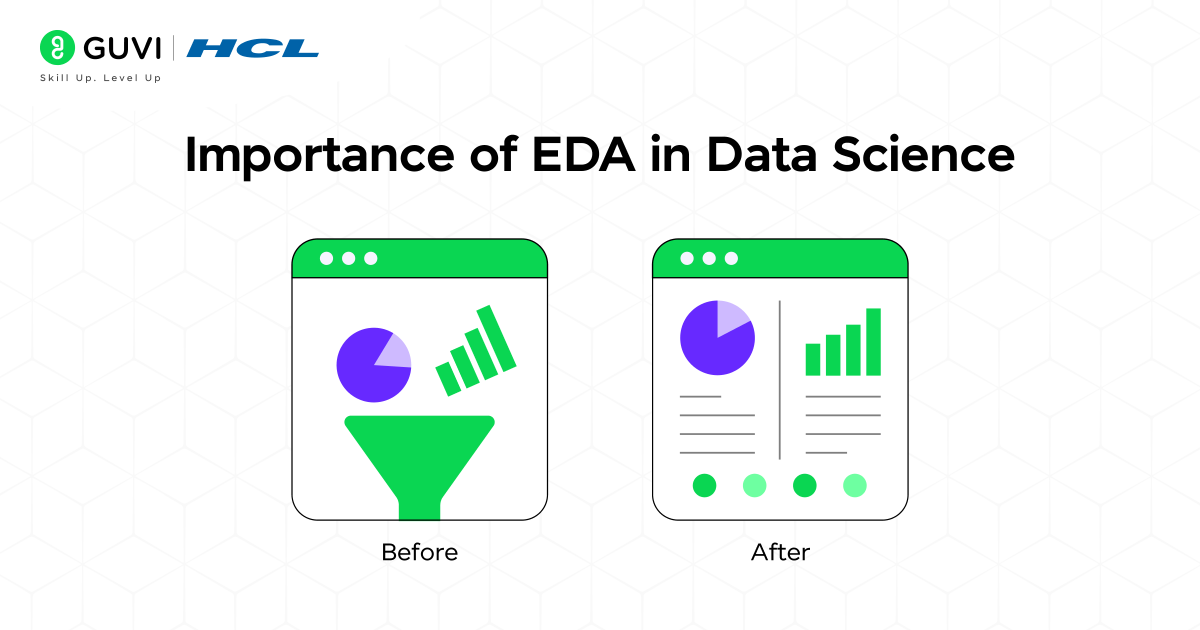
Before you begin any kind of analysis or modeling, it’s essential to understand why Exploratory Data Analysis (EDA) plays such a critical role. In data science, skipping EDA is like setting sail without a map. You might move forward quickly, but you’ll have no idea if you’re heading in the right direction. EDA ensures that the data you use for modeling is clean, accurate, and aligned with your goals.
Here’s why EDA is so important:
- Validates Data Quality: Detects missing, incorrect, or inconsistent values that could lead to false conclusions.
- Guides the Analytical Approach: Helps you choose the right models, transformations, or techniques based on how the data behaves.
- Prevents Costly Errors: Identifies outliers and anomalies that can negatively impact the model’s accuracy.
- Reveals Business Insights: Highlights meaningful trends, relationships, and patterns that can shape real-world strategies.
Key Python Libraries For EDA
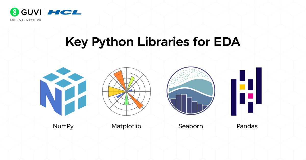
Before performing any analysis, it’s important to know which tools make EDA possible. Python offers a powerful ecosystem of libraries that simplify data exploration, visualization, and interpretation. Each library serves a unique purpose and works together to turn raw data into meaningful insights.
Let’s look at the four main libraries that make EDA efficient and effective.
- Numpy
- Pandas
- Matplotlib
- Seaborn
A. Numpy – The Foundation of Numerical Computing
Before any meaningful analysis, you need a solid base to handle numbers efficiently, and that’s exactly what NumPy provides. It’s the core Python library that helps you manage large sets of data and perform quick mathematical operations.
NumPy makes it easy to calculate averages, medians, or standard deviations, and even helps in finding unusual or extreme values in your dataset. It’s what keeps your computations fast, clean, and accurate.
Key Functions:
- np.mean(), np.median(), np.std() – for quick statistical summaries
- np.where() – to filter data based on conditions
- np.percentile() – for spotting outliers
Example:
Input
import numpy as np

# Sample salary data
data = np.array([45, 50, 55, 60, 65, 70, 150])

print("Mean:", np.mean(data))
print("Median:", np.median(data))
print("Standard Deviation:", np.std(data))
Output
Mean: 70.71428571428571
Median: 60.0
Standard Deviation: 31.676848893042084
B. Pandas – The Heart of Data Analysis
Once your data is ready to explore, Pandas is the go-to tool for working with it. It helps you easily load, clean, organize, and analyze data in Python. Pandas uses a structure called a DataFrame, which organizes data into rows and columns, similar to how information is arranged in an Excel table. This makes it simple to view, edit, and understand your data. In short, Pandas helps you turn messy, unorganized data into clear and useful information before you start creating visualizations or building models.
Key Functions:
- df.head(), df.info(), df.describe() – get a quick overview of your data
- df.isnull().sum() – find missing values
- df.groupby() – group and analyze related data
- df.value_counts() – count how many times each value appears
Example:
Input:
import pandas as pd

# Creating a sample sales dataset
data = {
    "Product": ["Laptop", "Phone", "Tablet", "Laptop", "Phone", "Tablet"],
    "Category": ["Electronics", "Electronics", "Electronics", "Electronics", "Electronics", "Electronics"],
    "Revenue": [85000, 45000, 30000, 90000, 48000, 31000],
    "Quantity": [5, 8, 10, 6, 7, 9]
}

df = pd.DataFrame(data)

# 1. Viewing first few rows of the dataset
print("First five rows of the dataset:")
print(df.head())

# 2. Checking basic info
print("\nDataset Info:")
print(df.info())

# 3. Summary statistics
print("\nSummary Statistics:")
print(df.describe())

# 4. Checking for missing values
print("\nMissing Values:")
print(df.isnull().sum())

# 5. Grouping and analyzing average revenue by product
print("\nAverage Revenue by Product:")
print(df.groupby("Product")["Revenue"].mean())

# 6. Counting how many times each product appears
print("\nProduct Frequency Count:")
print(df["Product"].value_counts())
Output:
First five rows of the dataset:
  Product    Category  Revenue  Quantity
0  Laptop  Electronics    85000         5
1   Phone  Electronics    45000         8
2  Tablet  Electronics    30000        10
3  Laptop  Electronics    90000         6
4   Phone  Electronics    48000         7

Dataset Info:
<class 'pandas.core.frame.DataFrame'>
RangeIndex: 6 entries, 0 to 5
Data columns (total 4 columns):
 #   Column    Non-Null Count  Dtype
---  ------    --------------  -----
 0   Product   6 non-null      object
 1   Category  6 non-null      object
 2   Revenue   6 non-null      int64
 3   Quantity  6 non-null      int64
dtypes: int64(2), object(2)
memory usage: 320.0 bytes
None

Summary Statistics:
           Revenue   Quantity
count      6.000000   6.000000
mean   54833.333333   7.500000
std    25857.285438   1.870829
min    30000.000000   5.000000
max    90000.000000  10.000000

Missing Values:
Product     0
Category    0
Revenue     0
Quantity    0
dtype: int64

Average Revenue by Product:
Product
Laptop    87500.0
Phone     46500.0
Tablet    30500.0
Name: Revenue, dtype: float64

Product Frequency Count:
Laptop    2
Phone     2
Tablet    2
Name: Product, dtype: int64
Explanation:
- The first few rows help you quickly see if your data is loaded correctly.
- The info() command gives a summary of columns, data types, and missing values.
- The describe() command shows key statistics like average and range.
- The missing values check ensures your data is complete.
- The groupby() function helps you compare data, such as finding which product brings in the highest revenue.
- The value_counts() function shows how often each product appears in your dataset.
C. Matplotlib – The Backbone of Visualization
After cleaning and preparing your data, the next step is to visualize it — to actually see what’s going on. Matplotlib is the most widely used library in Python for creating graphs and charts. It helps you spot patterns, trends, and outliers visually, making your analysis much easier to understand. You can use it to create histograms, bar charts, line graphs, scatter plots, and more. It’s a powerful tool for turning numbers into visuals that tell a story.
Key Functions
- plt.hist() – shows the distribution of data
- plt.boxplot() – helps detect outliers
- plt.scatter() – shows relationships between two variables
Example:
Input:
import matplotlib.pyplot as plt

plt.hist(df["Revenue"], bins=20, color="skyblue", edgecolor="black")
plt.title("Distribution of Revenue")
plt.xlabel("Revenue")
plt.ylabel("Frequency")
plt.show()
Output:
- The x-axis (Revenue) shows the range of revenue values divided into 20 small bins (intervals).
- The y-axis (Frequency) shows how many data points fall into each revenue range.
- The title “Distribution of Revenue” appears at the top.
- Each bar’s height indicates how many entries in your dataset have revenue values within that range.
D. Seaborn – The Statistical Visualization Powerhouse
Once your data is clean and ready, it’s time to explore it visually — and that’s where Seaborn shines. Seaborn is built on top of Matplotlib but offers more advanced and attractive visualizations with just a few lines of code. It’s perfect for understanding relationships, spotting patterns, and comparing different groups in your data. With Seaborn, you can easily create heatmaps, pairplots, and boxplots that help you find correlations and trends hidden in your dataset
Key Functions
- sns.heatmap() – shows how variables are related to each other
- sns.pairplot() – compares relationships between multiple variables
- sns.boxplot() – helps compare categories and detect outliers
Example:
Input:
import seaborn as sns
import matplotlib.pyplot as plt

# Correlation heatmap
plt.figure(figsize=(8,6))
sns.heatmap(df.corr(), annot=True, cmap="coolwarm")
plt.title("Correlation Matrix")
plt.show()

# Pairplot
sns.pairplot(df, hue="Category")
plt.show()
Output:
- The heatmap summarizes numerical relationships at a glance.
- The pairplot shows these relationships in detail — how each pair of variables interacts, grouped by category.
Together, they give you both a big-picture and in-depth understanding of your dataset, making Seaborn an excellent tool for the exploratory stage of analysis.
Join HCL GUVI’s 5-day free Data Science Email Series and learn the essentials of data analysis through daily lessons, practical exercises, and visual guides. Perfect for beginners eager to understand NumPy, Pandas, Matplotlib, and Seaborn from scratch.
Real-World EDA Workflow Example
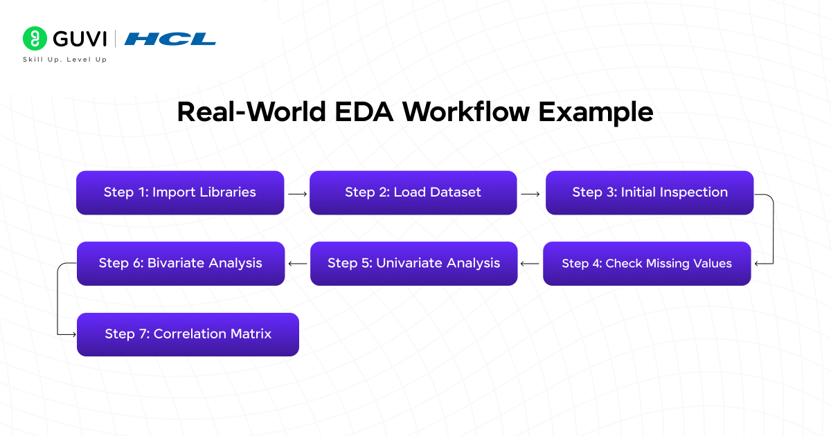
Let’s walk through how to apply Exploratory Data Analysis (EDA) to a Marketing Campaign dataset. This example helps you understand how marketers analyze spending and revenue data to find which channels perform best.
Sample Dataset
Below is a small example dataset named marketing_campaign.csv.
You can create it using Excel or a text editor and save it as a CSV file.
Sample Dataset : marketing_campaign.csv
| Campaign_ID | Spend | Revenue | Channel | AgeGroup |
| 1 | 5000 | 5200 | Social Media | 25-34 |
| 2 | 7000 | 6500 | 35-44 | |
| 3 | 4000 | 3000 | TV Ads | 25-34 |
| 4 | 6000 | 8000 | Social Media | 18-24 |
| 5 | 3000 | 2000 | Print Media | 45-54 |
| 6 | 9000 | 12000 | 35-44 | |
| 7 | 10000 | 11500 | Social Media | 25-34 |
| 8 | 3500 | 4000 | TV Ads | 18-24 |
| 9 | 7500 | 9000 | 25-34 | |
| 10 | 2000 | 1500 | Print Media | 45-54 |
Step 1: Import Libraries
import numpy as np
import pandas as pd
import matplotlib.pyplot as plt
import seaborn as sns
These libraries will help handle, analyze, and visualize the data.
Step 2: Load Dataset
# Load the dataset
df = pd.read_csv("marketing_campaign.csv")
print(df.head())
Output:
Campaign_ID Spend Revenue Channel AgeGroup
0 1 5000 5200 Social Media 25-34
1 2 7000 6500 Email 35-44
2 3 4000 3000 TV Ads 25-34
3 4 6000 8000 Social Media 18-24
4 5 3000 2000 Print Media 45-54
Step 3: Initial Inspection
print(df.info())
print(df.describe())
Output:
<class ‘pandas.core.frame.DataFrame’>
RangeIndex: 10 entries, 0 to 9
Data columns (total 5 columns):
# Column Non-Null Count Dtype
— —— ————– —–
0 Campaign_ID 10 non-null int64
1 Spend 10 non-null int64
2 Revenue 10 non-null int64
3 Channel 10 non-null object
4 AgeGroup 10 non-null object
Spend Revenue
count 10.000000 10.000000
mean 5950.000000 6420.000000
std 2640.055789 3795.942415
min 2000.000000 1500.000000
max 10000.000000 12000.000000
This shows:
- No missing values
- Spend ranges from ₹2,000 to ₹10,000
- Revenue ranges from ₹1,500 to ₹12,000
Step 4: Check Missing Values
print(df.isnull().sum())Output:
Campaign_ID 0
Spend 0
Revenue 0
Channel 0
AgeGroup 0
dtype: int64
Everything looks clean – no missing data.
Step 5: Univariate Analysis
sns.histplot(df["Spend"], kde=True, color="blue")
plt.title("Distribution of Marketing Spend")
plt.xlabel("Spend")
plt.ylabel("Frequency")
plt.show()
Explanation:
The output of this is a histogram that shows how marketing spend is spread out.
You can see that most campaigns spend between ₹3,000 and ₹8,000.
Step 6: Bivariate Analysis
sns.scatterplot(data=df, x="Spend", y="Revenue", hue="Channel", s=100)
plt.title("Spend vs Revenue by Marketing Channel")
plt.xlabel("Spend")
plt.ylabel("Revenue")
plt.show()
Explanation:
The scatterplot helps you see which channels are most effective.
For example, Email and Social Media campaigns tend to generate higher revenue for similar spending, while Print Media performs poorly.
Step 7: Correlation Matrix
sns.heatmap(df.corr(), annot=True, cmap="coolwarm")
plt.title("Correlation Heatmap")
plt.show()
Output Explanation:
- The correlation between Spend and Revenue is around 0.9, meaning more spend usually brings higher revenue.
- High correlation helps in identifying key predictors for future modeling.
Insights From This Mini Project
From this small dataset, EDA reveals:
- Social Media and Email are the most profitable channels.
- Print Media shows low ROI despite moderate spend.
- Spending and Revenue are strongly correlated.
Conclusion
Exploratory Data Analysis is the first and most critical step in any data journey. By using NumPy, Pandas, Matplotlib, and Seaborn, you can clean, visualize, and understand your data efficiently, thus laying the groundwork for better decision-making and accurate models.
If you’re eager to master EDA and data visualization, HCL GUVI’s Data Science Course Program offers a practical, project-based learning path. With modules covering Python, NumPy, Pandas, Matplotlib, Seaborn, and machine learning, you’ll gain hands-on experience guided by mentors, preparing you for real-world data roles.
FAQS
1. What is the main goal of EDA?
To summarize data characteristics, identify patterns, and prepare it for modeling.
2. How is EDA different from data preprocessing?
EDA focuses on understanding and visualizing data, while preprocessing involves transforming and cleaning it for models.
3. Can EDA be automated?
Yes, tools like Sweetviz and Pandas-Profiling automate report generation, but human interpretation remains crucial.
4. What is the most used library for EDA in Python?
Pandas for data manipulation and Seaborn for visualization are the most commonly used.
5. Is EDA required before machine learning?
Absolutely! Skipping EDA can lead to wrong assumptions, poor model performance, and misleading insights.


Did you enjoy this article?