


Full Stack Development Articles
Claude for Architecture and Engineering Documentation
Freelancing as a Python Developer: Getting Your First Client

Get In Touch For Details! Request More Information
60+ CSS Interview Questions and Answers for 2026 (With Code Examples)
Sep 08, 2026 13 Min Read 28956 Views
(Last Updated)
If you are interested in giving life to HTML structure through CSS and you want to crack a job in that field, you need to prepare for CSS (Cascading Style Sheets) interview questions and answers.
As you already know, CSS is essential for web development, giving life to HTML structure and creating visually engaging designs.
This guide will walk you through essential CSS interview questions and answers for beginners, intermediates, and advanced learners. Let’s dive into some common CSS interview questions and answers to help you shine in your next interview!
Quick answer:
CSS interviews in 2025–2026 test more than definitions: they focus on layout logic, responsiveness, and real-world debugging. Be confident with the box model, specificity, Flexbox vs Grid, positioning, media queries, and modern features like container queries and :has(). Understanding how and why CSS works will help you stand out.
Table of contents
- Top 40 CSS Interview Questions and Answers
- Beginner Level Questions
- Coding Questions
- Advanced Questions
- Challenging Coding Questions
- More Questions
- CSS Flexbox Interview Questions
- What are the main axes and cross axes in Flexbox?
- What is the difference between justify-content, align-items, and align-content?
- What do flex-grow, flex-shrink, and flex-basis do?
- What is the difference between flex: 1 and flex: auto?
- How does the order property work in Flexbox?
- What does align-self do in Flexbox?
- How can you create equal-width columns using Flexbox?
- What is the gap property in Flexbox?
- Why might a flex item overflow its container even when flex-shrink is enabled?
- CSS Grid Interview Questions
- What are grid tracks, grid lines, and grid cells in CSS Grid?
- What does the fr unit mean in CSS Grid?
- What is the difference between explicit and implicit grids?
- What is the difference between auto-fill and auto-fit in CSS Grid?
- What are named grid lines in CSS Grid?
- What is grid-template-areas, and when should you use it?
- What is the difference between justify-items, align-items, and place-items in CSS Grid?
- How can a grid item span multiple rows or columns?
- What is grid-auto-flow, and how does it affect item placement?
- What is CSS Subgrid, and when is it useful?
- Scenario-Based and Practical CSS Interview Questions and Answers
- CSS Interview Questions for React and Angular Developers
- How do you apply conditional CSS classes in React?
- How does CSS style encapsulation work in Angular?
- What is View Encapsulation in Angular?
- How do you manage global and component-specific CSS in React or Angular applications?
- Conclusion
- Frequently Asked Questions
- What CSS topics are most important for interviews?
- Are Flexbox and CSS Grid both important for CSS interviews?
- Do CSS interviews include practical coding questions?
- How should experienced developers prepare for a CSS interview?
Top 40 CSS Interview Questions and Answers
Getting ready for a CSS interview requires a solid understanding of both fundamental concepts and advanced technical skills. These 30 questions comprise all those concepts and skills. Let us understand them one by one!
Beginner Level Questions
1. What is CSS? Why is it used in web development?
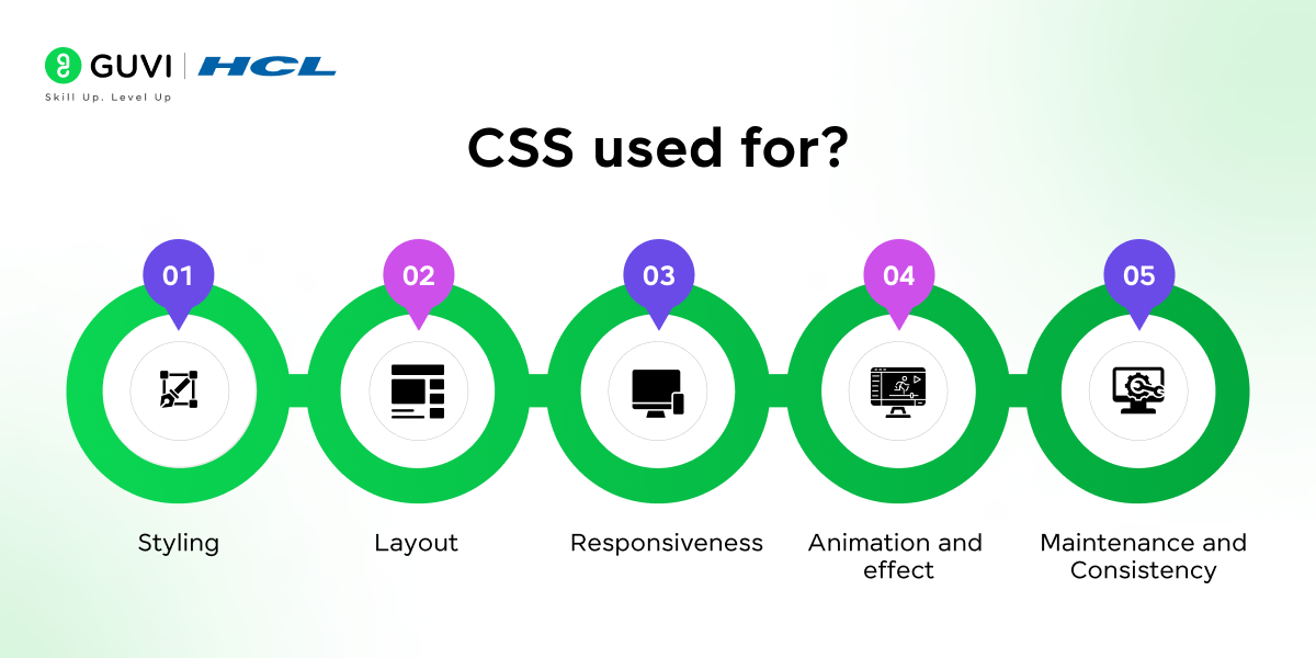
CSS stands for Cascading Style Sheets and is a language used to style HTML documents. CSS controls the layout, colors, fonts, and overall visual presentation of a website. You use CSS to make web pages visually appealing and responsive across different devices.
Interview Tip: CSS powers 96.2% of all websites. Every front-end, full-stack, or UI developer role requires CSS proficiency.
2. Can you explain the CSS box model?
The CSS box model is a fundamental concept that includes margins, borders, padding, and the content itself. Understanding this model is crucial since it affects how elements occupy space on a web page.
Example:
.box {

    width: 200px;

    padding: 10px;

    border: 5px solid black;

    margin: 20px;

}
3. What are the different types of CSS?
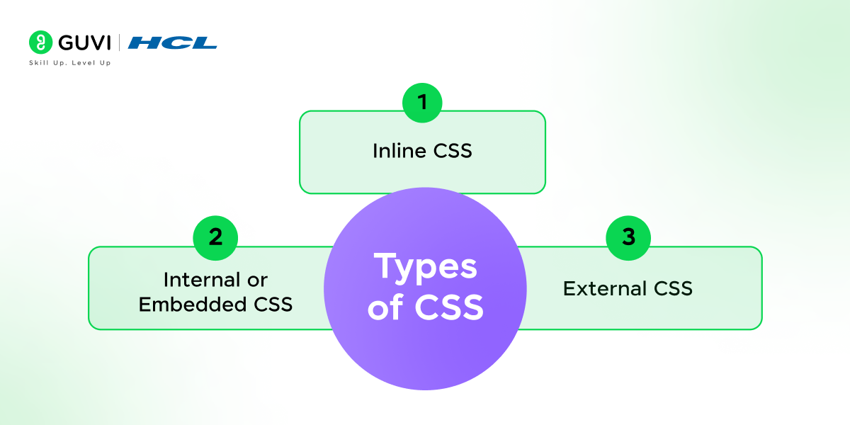
The three types of CSS are: Inline CSS (written directly in an HTML tag’s style attribute), Internal CSS (written inside a <style> tag in the HTML <head>), and External CSS (written in a separate .css file and linked to the HTML). External CSS is the industry standard for maintainability.
| Type | Where Written | Best Used For | Specificity Priority |
|---|---|---|---|
| Inline CSS | Inside HTML tag: style=”” | Quick one-off overrides | Highest |
| Internal CSS | Inside <style> in <head> | Single-page styles | Medium |
| External CSS | Separate .css file linked via <link> | Site-wide styles (recommended) | Standard |
4. Explain the difference between class and ID selectors.
An ID selector is unique and used for a single element, while class selectors can be applied to multiple elements. id has higher specificity, making it more powerful than class.
Interview Tip: Most modern CSS resets apply box-sizing: border-box globally because it makes responsive layouts far more predictable.
5. How does specificity work in CSS?
Specificity determines which CSS rule applies when multiple rules target the same element. id selectors have the highest specificity, followed by classes, attributes, and elements.
6. What is Flexbox, and how does it differ from CSS Grid?
Flexbox is used for one-dimensional layouts (either row or column). CSS Grid is more powerful for two-dimensional layouts as it can handle both rows and columns simultaneously.
7. How can you center an element horizontally and vertically using CSS?
Centering an element both horizontally and vertically can be achieved using Flexbox:
.container {

    display: flex;

    justify-content: center;

    align-items: center;

    height: 100vh; /* Full viewport height */

}
Alternatively, using CSS Grid:
.container {

    display: grid;

    place-items: center;

    height: 100vh;

}
Both methods ensure the child element is centered within the container.
8. What is the difference between padding and margin?
- Padding is the space inside an element, between the content and the border.
- Margin is the space outside the element, between the element and other elements.
9. How does the display property work?
The display property controls how an element appears on the page. Some common values are:
- block: Takes up the full width, starting on a new line.
- inline: Only takes up as much width as needed, without starting a new line.
- none: Hides the element completely.
10. What is a CSS class, and how do you use it?
A CSS class is a reusable style you can apply to multiple elements. To use it, you define it in CSS with a . before the class name (e.g., .exampleClass) and then apply it to HTML elements using the class attribute. This lets you style multiple elements in the same way.
Coding Questions
11. How would you create a centered, responsive navigation bar?
This is a practical test of Flexbox. Here’s an example:
.navbar {

    display: flex;

    justify-content: center;

    background-color: #333;

}

.navbar a {

    padding: 10px;

    color: white;

}
12. Write CSS code to make a div occupy the full screen.
Here’s how to write a CSS code to make a div occupy the full screen
.full-screen {

    width: 100vw;

    height: 100vh;

}
13. Explain the use of position in CSS. What are the different position values?
- CSS position determines how an element is placed on the page. The values are:
- static: Default positioning.
- relative: Positioned relative to its normal position.
- absolute: Positioned relative to the nearest positioned ancestor.
- fixed: Positioned relative to the viewport.
- sticky: Toggles between relative and fixed, based on scroll position.
14. How would you create a hover effect to change an element’s color?
.hover-effect:hover {

    color: blue;

}
!importantgives a declaration priority over normal declarations, but it does not eliminate CSS specificity. Use it sparingly, as overuse can make styles harder to maintain.
Advanced Questions
15. What are pseudo-elements in CSS?
Pseudo-elements like ::before and ::after allow you to style specific parts of an element without adding extra HTML.
- CSS powers 96.2% of all websites on the internet, making it one of the most universal technologies in web development.
- External CSS is used by 89.8% of websites, highlighting the preference for clean separation between structure and style.
- Inline CSS appears on 91.2% of websites, mainly for quick fixes or specific visual overrides.
- Embedded CSS through
<style>tags is still widely used, found on 81.8% of all websites.
16. How does the z-index property work in CSS?
The z-index property specifies the stack order of elements along the Z-axis. Elements with higher z-index values appear above those with lower values.
17. Can you explain CSS variables and provide an example?
CSS variables, or custom properties, allow you to reuse values throughout your CSS. They make styling flexible and maintainable.
:root {

    --main-color: #3498db;

}

.box {

    background-color: var(--main-color);

}
18. How would you implement responsive design in CSS?
Use media queries to adjust styles based on screen sizes. Example:
@media (max-width: 600px) {

    .container {

        font-size: 12px;

    }

}
19. What is the difference between display: none and visibility: hidden?
display: none removes the element from the document layout, while visibility: hidden hides it but maintains the layout space.
Challenging Coding Questions
20. Create a card with an image that overlays text on hover.
.card {

    position: relative;

    width: 300px;

}

.card img {

    width: 100%;

}

.card .overlay {

    position: absolute;

    top: 0;

    left: 0;

    width: 100%;

    height: 100%;

    background: rgba(0, 0, 0, 0.5);

    opacity: 0;

    color: white;

    display: flex;

    align-items: center;

    justify-content: center;

    transition: opacity 0.3s ease;

}

.card:hover .overlay {

    opacity: 1;

}
Interview Tip: position: sticky will silently fail if any ancestor has overflow: hidden, overflow: auto, or overflow: scroll set. This is one of the most common CSS bugs in real interviews
21. Explain how to use animations in CSS with an example.
Use @keyframes to define an animation and apply it to an element with animation properties.
@keyframes slide {

    from { transform: translateX(0); }

    to { transform: translateX(100px); }

}

.box {

    animation: slide 2s ease-in-out;

}
22. How would you implement a grid-based layout using CSS Grid?
CSS Grid provides two-dimensional layout capabilities. Example:
.grid-container {

    display: grid;

    grid-template-columns: repeat(3, 1fr);

    gap: 10px;

}
23. What are CSS preprocessors, and how do they help?
CSS preprocessors like SASS and LESS allow you to use variables, nested rules, and mixins, making CSS more powerful and easier to maintain.
More Questions
24. How would you hide elements on mobile but display them on larger screens?
This can be achieved using media queries:
.hide-on-mobile {

    display: none;

}

@media (min-width: 768px) {

    .hide-on-mobile {

        display: block;

    }

}
25. What are CSS Modules, and how do they differ from traditional CSS?
CSS Modules are a methodology that allows you to write CSS with locally scoped class and animation names by default. This approach prevents global scope issues, such as naming conflicts and unintended style overrides, which are common in traditional CSS.
26. Explain the use of the overflow property.
The overflow property in CSS controls how content is handled when it exceeds the dimensions of its container. It has several values:
- visible: Default value; content is not clipped and may overflow the container.
- hidden: Overflowing content is clipped, and the rest is hidden.
- scroll: Adds scrollbars to the container, allowing users to scroll through the overflowing content.
- auto: Adds scrollbars only when necessary, i.e., when the content overflows.
- clip: Clips the content without adding scrollbars.
Proper use of the overflow property ensures that layouts remain intact and the user experience is maintained when dealing with content that exceeds container boundaries.
27. Describe how to create a responsive image gallery.
To create a responsive image gallery, you can utilize CSS Grid Layout, which allows for flexible and adaptive designs. Here’s an example:
html

<div class="gallery">

  <div class="gallery-item"><img src="image1.jpg" alt="Image 1"></div>

  <div class="gallery-item"><img src="image2.jpg" alt="Image 2"></div>

  <!-- More images -->

</div>
css
.gallery {
display: grid;
grid-template-columns: repeat(auto-fill, minmax(200px, 1fr));
gap: 10px;
}
.gallery-item img {
width: 100%;
height: auto;
display: block;
}In this setup, the grid-template-columns property uses the repeat function with auto-fill and minmax to create a responsive grid that adjusts the number of columns based on the container’s width. The gap property adds spacing between the grid items. Each image scales to fit its grid cell, ensuring the gallery adapts seamlessly to different screen sizes.
28. How would you create a simple dropdown menu in CSS?
A simple dropdown menu can be created using CSS by leveraging the :hover pseudo-class. Here’s an example:
html

<nav class="navbar">

  <ul>

    <li class="dropdown">

      <a href="#">Menu</a>

      <ul class="dropdown-content">

        <li><a href="#">Option 1</a></li>

        <li><ba href="#">Option 2</a></li>

        <li><a href="#">Option 3</a></li>

      </ul>

    </li>

  </ul>

</nav>
css
.navbar ul {
list-style-type: none;
}
.dropdown-content {
display: none;
position: absolute;
background-color: #f9f9f9;
min-width: 160px;
box-shadow: 0px 8px 16px 0px rgba(0,0,0,0.2);
z-index: 1;
}
.dropdown-content li {
padding: 12px 16px;
}
.dropdown:hover .dropdown-content {
display: block;
}In this example, the .dropdown-content is initially hidden using display: none;. When the user hovers over the .dropdown element, the nested .dropdown-content becomes visible due to the :hover pseudo-class. This method provides a straightforward way to implement a dropdown menu using only CSS.
29. What is BEM methodology, and how does it help with naming conventions?
BEM (Block, Element, Modifier) is a naming convention methodology for writing CSS that promotes component-based development and reusability. It divides the user interface into independent blocks, their child elements, and their possible variants (modifiers). The naming convention follows this pattern:
- Block: The standalone entity that is meaningful on its own (e.g., button).
- Element: A part of the block that has no standalone meaning and is semantically tied to its block (e.g., button__icon).
- Modifier: A flag on a block or element that changes its appearance or behavior (e.g., button–primary).
By using BEM, developers can create clear and descriptive class names that reflect the structure of the UI components, leading to more maintainable and scalable codebases.
30. How does the z-index property work in CSS, and when would you use it?
The z-index property in CSS controls the vertical stacking order of elements that overlap. Elements with a higher z-index value are displayed in front of those with a lower value. It’s important to note that z-index only works on positioned elements (i.e., elements with a position value other than static).
You would use z-index when you have elements that overlap and you need to control which one appears on top. For example, in a modal dialog that appears over the rest of the page content, you would assign a higher z-index to the modal to ensure it displays above other elements.
In case you want to learn more about CSS and frontend development, consider enrolling in HCL GUVI’s Full Stack Developer online course that teaches you everything from scratch and equips you with all the necessary knowledge!
Before modern CSS layouts, developers sometimes used transparent 1×1 pixel GIFs to create empty space and control where elements appeared on a webpage.
CSS Flexbox Interview Questions
Flexbox is an essential CSS layout tool for building flexible and responsive interfaces. Here are 10 commonly relevant Flexbox concepts you should understand for CSS interviews.
31. What are the main axes and cross axes in Flexbox?
Flexbox positions items along two axes:
- Main axis: The primary direction in which flex items are arranged.
- Cross axis: Runs perpendicular to the main axis.
The flex-direction property determines the main axis.
.container { display: flex; flex-direction: row; }With flex-direction: row, the main axis runs horizontally and the cross axis vertically. If you use column, these directions are reversed.
32. What is the difference between justify-content, align-items, and align-content?
These properties control alignment in different ways:
- justify-content aligns items along the main axis.
- align-items aligns items along the cross axis within a flex line.
- align-content controls spacing between multiple flex lines and works when wrapping creates more than one line.
Understanding the axes is key to choosing the correct alignment property.
33. What do flex-grow, flex-shrink, and flex-basis do?
These three properties determine how a flex item uses the available space inside a container.
- flex-grow determines how much an item can grow.
- flex-shrink determines how much it can shrink.
- flex-basis specifies its initial size before the remaining space is distributed.
They can also be written using the flex shorthand.
.item { flex: 1 1 200px; }34. What is flex-wrap, and when should you use it?
By default, Flexbox attempts to place all flex items on a single line. flex-wrap allows items to move onto additional lines when there isn’t enough space.
.container { display: flex; flex-wrap: wrap; gap: 16px; }It is particularly useful for responsive groups of cards, buttons, tags, and other elements that should wrap as the available width decreases.
35. What is the difference between flex: 1 and flex: auto?
Both are shorthand values, but they handle sizing differently.
flex: 1 generally allows items to grow and share available space while using a zero flex basis.
.item { flex: 1; }flex: auto allows an item to grow and shrink while taking its initial size into account.
.item { flex: auto; }Therefore, flex: 1 is useful when items should share space more evenly, while flex: auto is useful when their content or initial dimensions should influence their size.

36. How does the order property work in Flexbox?
The order property changes the visual order of flex items without changing their position in the HTML.
.first { order: 2; } .second { order: 1; }Here, .second appears visually before .first.
However, order should be used carefully because changing only the visual order can create a mismatch with the underlying document order, which may affect keyboard navigation and accessibility.
37. What does align-self do in Flexbox?
align-self allows an individual flex item to override the cross-axis alignment defined by the container’s align-items property.
.container { display: flex; align-items: center; } .special-item { align-self: flex-start; }In this example, most items are centered, while .special-item is aligned to the start of the cross axis.
38. How can you create equal-width columns using Flexbox?
You can give each flex item the same ability to grow and occupy the available space.
.container { display: flex; gap: 20px; } .column { flex: 1; }Each .column receives an equal share of the available space. This approach is useful for simple responsive column layouts where all columns should have equal widths.
39. What is the gap property in Flexbox?
The gap property creates consistent spacing between flex items without requiring margins on individual elements.
.container { display: flex; gap: 20px; }You can also specify separate row and column gaps:
.container { display: flex; flex-wrap: wrap; row-gap: 20px; column-gap: 10px; }Using gap often makes spacing easier to maintain than applying margins to each flex item.
40. Why might a flex item overflow its container even when flex-shrink is enabled?
Flex items can sometimes refuse to shrink enough because their default min-width is auto, which can prevent them from becoming smaller than their content.
A common solution is:
.flex-item { min-width: 0; }This allows the flex item to shrink below its content’s intrinsic width when necessary.
It is particularly useful when a flex item contains long text, URLs, or other content that could otherwise cause unexpected horizontal overflow.
CSS Grid Interview Questions
CSS Grid is widely used to create structured, responsive two-dimensional layouts. These interview questions cover important Grid concepts, properties, and practical use cases that developers should understand.
41. What are grid tracks, grid lines, and grid cells in CSS Grid?
These terms describe the basic structure of a CSS Grid:
- Grid lines are the horizontal and vertical lines that divide the grid.
- Grid tracks are the spaces between two adjacent grid lines, forming rows or columns.
- Grid cells are the individual spaces created where a row and column intersect.
For example:
.container { display: grid; grid-template-columns: 1fr 1fr 1fr; grid-template-rows: 100px 100px; }This creates three column tracks and two row tracks, resulting in six grid cells.
42. What does the fr unit mean in CSS Grid?
The fr unit represents a fraction of the available space inside a grid container.
.container { display: grid; grid-template-columns: 1fr 2fr 1fr; }Here, the middle column receives twice as much available space as each outer column.
The fr unit makes it easier to create flexible layouts without calculating fixed widths or percentages manually.
43. What is the difference between explicit and implicit grids?
An explicit grid is created using properties such as grid-template-columns and grid-template-rows.
An implicit grid is created automatically when grid items extend beyond the rows or columns you explicitly defined.
.container { display: grid; grid-template-columns: repeat(2, 1fr); grid-auto-rows: 100px; }Here, grid-auto-rows controls the size of rows that CSS Grid creates automatically.
44. What is the difference between auto-fill and auto-fit in CSS Grid?
Both auto-fill and auto-fit can create responsive columns without manually specifying their number.
.container { display: grid; grid-template-columns: repeat(auto-fit, minmax(200px, 1fr)); }The key difference is:
- auto-fill can preserve empty grid tracks when additional columns could fit.
- auto-fit collapses empty tracks and allows existing items to expand into the available space.
This distinction becomes most noticeable when the container has more available space than required by its grid items.
45. What are named grid lines in CSS Grid?
CSS Grid allows developers to assign names to grid lines instead of referring to them only by numbers.
.container { display: grid; grid-template-columns: [sidebar-start] 250px [sidebar-end content-start] 1fr [content-end]; } .sidebar { grid-column: sidebar-start / sidebar-end; }Named grid lines can make complex layouts easier to understand and maintain because the placement rules describe the purpose of each area.
46. What is grid-template-areas, and when should you use it?
grid-template-areas allows you to create a grid layout using descriptive names for different page regions.
.container { display: grid; grid-template-areas: “header header” “sidebar main” “footer footer”; } .header { grid-area: header; } .sidebar { grid-area: sidebar; } .main { grid-area: main; }It is particularly useful for layouts with clearly defined regions because the CSS visually represents the structure of the page.
47. What is the difference between justify-items, align-items, and place-items in CSS Grid?
These properties control how content is aligned inside grid cells.
- justify-items controls alignment along the inline or horizontal axis.
- align-items controls alignment along the block or vertical axis.
- place-items is shorthand for setting both properties together.
The same alignment can be written more concisely as:
.container { display: grid; place-items: center; }48. How can a grid item span multiple rows or columns?
You can use grid-column and grid-row to specify how many tracks an item should occupy.
.featured { grid-column: span 2; grid-row: span 2; }Here, .featured spans two columns and two rows.
You can also specify exact grid lines:
.featured { grid-column: 1 / 3; }This places the item from grid line 1 up to grid line 3.
49. What is grid-auto-flow, and how does it affect item placement?
grid-auto-flow controls how automatically placed items are added to the Grid.
Its common values include:
- row – places items by filling each row.
- column – places items by filling each column.
- dense – attempts to fill smaller gaps left earlier in the Grid.
The dense option can make better use of available space, but it may change the visual order of items, so accessibility and logical reading order should still be considered.
50. What is CSS Subgrid, and when is it useful?
subgrid allows a nested grid to use the track sizing of its parent Grid instead of defining an entirely separate set of tracks.
.parent { display: grid; grid-template-columns: repeat(3, 1fr); } .child { display: grid; grid-template-columns: subgrid; grid-column: span 3; }This is useful when nested components need to remain aligned with the columns or rows of their parent layout.
For example, cards containing headings, descriptions, and buttons can use a shared grid structure so that corresponding content remains aligned across multiple cards.
Scenario-Based and Practical CSS Interview Questions and Answers
51. How would you convince a team to adopt a CSS methodology like BEM or SMACSS?
Large projects often suffer from duplicated styles and naming conflicts. A structured methodology like BEM or SMACSS introduces predictability. It reduces friction between developers because everyone follows the same pattern, and the result is cleaner, scalable CSS.
52. What steps do you take when a stakeholder demands pixel-perfect design across all browsers?
The approach involves:
- Setting clear expectations about rendering differences between browsers
- Shifting focus toward design fidelity rather than exact pixels
- Stressing accessibility and responsiveness as higher priorities
Consistency of experience is more practical than chasing identical pixels.
53. How do you handle CSS debt in a project that has grown over many years?
Old stylesheets usually contain rules that are unused or overwritten. The best path forward is incremental cleanup:
- Audit the CSS to identify redundant and outdated rules
- Remove unused selectors carefully, supported by testing
- Gradually refactor sections instead of rewriting the entire file
This keeps development stable while steadily improving maintainability.
54. What’s your strategy when product managers want faster release cycles but design reviews slow CSS updates?
Introduce design tokens as a shared language between design and development:
- Define tokens for colors, fonts, spacing, and shadows
- Apply them consistently across all components
- Reduce review time since most style choices are already standardized
This bridges the gap between speed and consistency.
55. How do you respond when a client insists on using animations that may hurt performance?
Start by analyzing the performance cost. Show how heavy animations affect loading or scrolling. Then suggest alternatives such as transitions on properties like transform or opacity, which are more efficient. This balances the desire for motion with technical responsibility.
56. What do you do if two designers disagree on spacing standards in the CSS system?
Conflicts can be resolved by creating a spacing scale:
- Use a base unit like 4px or 8px
- Apply multiples of that unit across the system
- Document the scale so designers and developers stay aligned
A shared scale prevents design disagreements from stalling progress.
57. How do you measure the effectiveness of your CSS beyond visual correctness?
Effectiveness is visible in performance metrics. File size, unused selectors, and render-blocking issues reveal efficiency. Regular audits give insight into whether CSS contributes to speed or adds unnecessary weight. Pairing these metrics with design outcomes shows real impact.
58. How do you prepare a website’s CSS for internationalization?
Different languages create challenges in layout and spacing. To prepare:
- Support both left-to-right and right-to-left flows
- Use logical properties like margin-inline and padding-block
- Allow flexible containers for longer or shorter text strings
International-ready CSS ensures that the same site works smoothly across regions.
59. What’s your approach when CSS changes accidentally break other parts of the site?
Breakage often happens due to global selectors. To minimize this:
- Scope styles to specific components
- Use visual regression testing to catch side effects
- Favor modular CSS structures instead of global overrides
This turns CSS into isolated, predictable pieces rather than fragile global code.
60. How would you future-proof CSS for a product expected to live 10 years?
Future-proofing focuses on stability. Use features backed by standards instead of relying on hacks. Document design decisions so future developers understand the choices made. Build a design system so new components fit into existing patterns rather than reinventing styles each time.
CSS Interview Questions for React and Angular Developers
React and Angular developers need CSS skills to build responsive, maintainable, and reusable user interfaces. In framework-based projects, interviews may also test how you scope, organize, and apply styles across components.
| CSS Area | Why It Matters in React/Angular |
| Component-scoped styling | Prevents styles from unintentionally affecting other components |
| Conditional styling | Changes appearance based on component state or data |
| Global vs local styles | Helps organize application-wide and component-specific CSS |
| CSS variables | Supports reusable design values and themes |
| Responsive styling | Ensures components work across different screen sizes |
| Style maintainability | Keeps CSS manageable as the application grows |
Let’s look at some of the questions and answers:
61. What are CSS Modules, and how are they used in React?
CSS Modules allow CSS classes to be locally scoped to a component, reducing the risk of class-name conflicts across a React application.
/* Button.module.css */ .primary { padding: 10px 16px; font-weight: bold; } import styles from “./Button.module.css”; function Button() { return ; }This approach is particularly useful in larger applications where multiple components may otherwise use similar class names.
62. How do you apply conditional CSS classes in React?
React can apply different classes depending on component props, state, or other conditions.
function Button({ isActive }) { return ( ); }Here, the active class is applied only when isActive is true. This is useful for interactive elements such as selected tabs, active navigation links, validation states, and toggles.
63. How does CSS style encapsulation work in Angular?
Angular supports component-specific styles, helping prevent a component’s CSS from unintentionally affecting other parts of an application.
For example:
@Component({ selector: ‘app-card’, templateUrl: ‘./card.component.html’, styleUrls: [‘./card.component.css’] }) export class CardComponent {}The styles defined for this component can be scoped according to Angular’s view encapsulation behavior.
This makes it easier to maintain styling in applications containing many independent components.
64. What is View Encapsulation in Angular?
View Encapsulation determines how the styles defined for an Angular component are applied.
Angular provides different encapsulation modes, including:
- Emulated: Mimics scoped styling by adding generated attributes to elements and selectors.
- ShadowDom: Uses the browser’s native Shadow DOM to isolate styles.
- None: Applies component styles globally without encapsulation.
For example:
@Component({ selector: ‘app-card’, templateUrl: ‘./card.component.html’, styleUrls: [‘./card.component.css’], encapsulation: ViewEncapsulation.Emulated })Understanding View Encapsulation is important when debugging style conflicts or deciding how styles should be shared across Angular components.
65. How do you manage global and component-specific CSS in React or Angular applications?
Large React and Angular applications usually combine global styles with component-specific styles to keep CSS organized and maintainable.
- Global CSS is suitable for typography, resets, design tokens, themes, and styles shared across the application.
- Component-specific CSS keeps styles associated with individual UI components and reduces unintended style conflicts.
- React applications may use CSS Modules or other component-level styling approaches.
- Angular provides component styles and View Encapsulation for controlling style scope.
For example, a global stylesheet can define reusable CSS variables:
:root { –primary-color: #2563eb; –spacing-md: 16px; }Individual components can then use those shared values:
.card { padding: var(–spacing-md); border-color: var(–primary-color); }A balanced approach keeps common design rules consistent across the application while allowing individual components to maintain their own styles.
Conclusion
In conclusion, mastering CSS is essential for any aspiring full-stack developer, as it’s the backbone of creating visually appealing, user-friendly web designs. Understanding the questions and answers we’ve covered can give you a strong foundation to confidently tackle CSS-related questions in an interview setting.
Remember, practice makes perfect—so keep experimenting with CSS to improve your skills and stay updated with the latest trends. Good luck with your CSS journey, and may your next interview be a success!
Frequently Asked Questions
1. What CSS topics are most important for interviews?
Focus on CSS fundamentals such as selectors, specificity, the box model, positioning, and responsive design, along with modern layout concepts such as Flexbox and Grid. For experienced roles, you should also understand CSS architecture, performance, maintainability, and practical debugging.
2. Are Flexbox and CSS Grid both important for CSS interviews?
Yes. Flexbox and Grid solve different layout problems, so interviewers may expect you to understand both. You should know their core properties, alignment techniques, responsive behavior, and how to choose the appropriate layout system for a given use case.
3. Do CSS interviews include practical coding questions?
Yes. Along with conceptual CSS interview questions and answers, interviews can include tasks such as creating responsive layouts, centering elements, building components with Flexbox or Grid, fixing specificity conflicts, or debugging broken styles. Practising small CSS coding problems can help you prepare for these tasks.
4. How should experienced developers prepare for a CSS interview?
Experienced developers should go beyond memorizing CSS properties. Prepare to explain architectural decisions, performance optimization, scalable styling approaches, responsive design, browser behavior, accessibility, and how you would troubleshoot CSS issues in a large application.
Success Stories

About the Author
Lukesh S
A professional content writer who has experience in freelancing and now working as a Technical Content Writer at HCL GUVI having sound knowledge in Blog Writing and Creative Writing!
View all posts by Lukesh S
Connect with me @

































Did you enjoy this article?