


Full Stack Development Articles
Claude for Architecture and Engineering Documentation
Freelancing as a Python Developer: Getting Your First Client


Get In Touch For Details! Request More Information
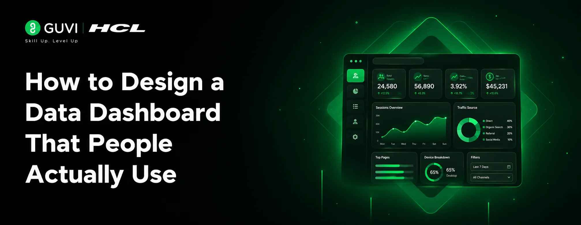
How to Design a Data Dashboard That People Actually Use
Aug 06, 2026 4 Min Read 434 Views
(Last Updated)
Table of contents
- TL;DR Summary:
- Introduction
- Direct Answer
- What Is a Data Dashboard?
- Why Do Many Dashboards Fail?
- Who Is the Dashboard For?
- What Questions Should Your Dashboard Answer?
- Choose the Right KPIs
- Select the Right Chart for the Data
- Organize Information with Visual Hierarchy
- Keep the Design Clean and Consistent
- Make Dashboards Interactive
- Optimize Performance
- Ensure Accessibility
- Common Dashboard Design Mistakes
- Real-World Example
- Dashboard Design Process
- Step 1: Define Business Goals
- Step 2: Identify Users
- Step 3: Select KPIs
- Step 4: Design Layout
- Step 5: Build Interactive Features
- Step 6: Test with Real Users
- Dashboard Design Tools
- Conclusion
- FAQs
- What makes a good data dashboard?
- How many KPIs should a dashboard include?
- Which chart is best for showing trends?
- Why do users stop using dashboards?
- Should dashboards be interactive?
TL;DR Summary:
- Start with business questions, not charts.
- Display only the metrics users need to make decisions.
- Use clear visual hierarchy and consistent layouts.
- Choose charts based on the type of data being presented.
- Optimize dashboards for speed, accessibility, and mobile devices.
- Continuously improve dashboards using user feedback and analytics.
Introduction
Many data dashboards look impressive but fail at their primary purpose: helping people make better decisions. Overloaded charts, confusing layouts, and irrelevant metrics often leave users overwhelmed rather than informed. The result is low adoption, poor decision-making, and dashboards that are opened once and forgotten.
An effective dashboard isn’t defined by how much data it displays—it’s defined by how quickly users can find answers to their most important questions. In this article, you’ll learn the principles of designing data dashboards that people actually use, including planning, visualization, layout, common mistakes, and best practices backed by real-world experience.
Direct Answer
A data dashboard should present the right information to the right audience in a clear, actionable format. The most effective dashboards focus on business goals, highlight key performance indicators (KPIs), minimize unnecessary visual elements, and guide users toward insights rather than overwhelming them with raw data. Good dashboard design balances usability, performance, and decision-making.
What Is a Data Dashboard?
A data dashboard is a visual interface that displays key metrics, trends, and performance indicators from one or more data sources. Its purpose is to help users monitor performance, identify issues, and make informed decisions quickly.
Unlike static reports, dashboards are interactive and update as new data becomes available.
Common examples include:
- Sales dashboards
- Marketing analytics dashboards
- Financial reporting dashboards
- Website analytics dashboards
- Operations monitoring dashboards
Why Do Many Dashboards Fail?
Many dashboards fail because they prioritize showing data instead of solving user problems. Adding more charts doesn’t automatically make a dashboard more useful.
Common reasons include:
- Too many metrics
- Poor navigation
- Inconsistent chart styles
- Slow loading times
- Lack of business context
- No clear audience
Data Point
Business intelligence studies consistently show that dashboards aligned with specific user roles achieve higher adoption and more frequent usage than generic, one-size-fits-all dashboards.
Who Is the Dashboard For?
Before designing anything, identify your primary audience. Different users require different levels of detail.
| User Type | Primary Focus |
| Executives | High-level KPIs and trends |
| Managers | Team performance and operational metrics |
| Analysts | Detailed data exploration |
| Operations Teams | Real-time monitoring and alerts |
Understanding the audience helps determine which metrics deserve the most attention.
What Questions Should Your Dashboard Answer?
A useful dashboard begins with business questions rather than visualizations.
Ask questions such as:
- Are sales increasing?
- Which products perform best?
- Where are customers dropping off?
- Which campaigns generate the highest ROI?
- Are service-level agreements being met?
Every chart should help answer at least one meaningful question.
Pro Tip
If a visualization doesn’t support a decision or answer a business question, consider removing it.
Choose the Right KPIs
Key Performance Indicators (KPIs) should reflect measurable business objectives.
Examples include:
- Revenue growth
- Customer acquisition cost (CAC)
- Monthly recurring revenue (MRR)
- Conversion rate
- Customer retention
- Average response time
Avoid displaying dozens of KPIs on a single screen. Prioritize the metrics users monitor most frequently.
Select the Right Chart for the Data
Different chart types communicate different kinds of information.
| Data Type | Recommended Visualization |
| Trends over time | Line chart |
| Category comparison | Bar chart |
| Part-to-whole | Pie chart (limited use) |
| Correlation | Scatter plot |
| Geographic data | Map |
| Single KPI | Scorecard |
Choosing the correct visualization reduces cognitive effort and improves understanding.
Design dashboards around one clear user goal, keep the layout simple, and highlight only the most important KPIs. Learn data analysis and dashboarding with HCL GUVI’s Data Science and Analytics course.
Organize Information with Visual Hierarchy
Users naturally scan dashboards from top to bottom and left to right. Place the most important information where it receives immediate attention.
A common layout includes:
Key KPIs
──────────────
Trend Charts
──────────────
Detailed Tables
──────────────
Filters & Insights
Use size, spacing, and typography to emphasize critical information without overwhelming the page.
Keep the Design Clean and Consistent
Consistency makes dashboards easier to understand and navigate.
Best practices include:
- Use a limited color palette.
- Apply consistent fonts and spacing.
- Align charts and cards evenly.
- Keep labels concise.
- Avoid unnecessary decorations.
Best Practice
Reserve bright or contrasting colors for alerts and important changes rather than using them throughout the dashboard.

Make Dashboards Interactive
Interactive features allow users to explore data without cluttering the interface.
Useful interactions include:
- Date range filters
- Search functionality
- Drill-down views
- Hover tooltips
- Sorting and filtering
- Export options
Interactive dashboards serve both executive overviews and detailed analysis without requiring separate reports.
Optimize Performance
Even the best-designed dashboard loses value if it loads slowly.
Improve performance by:
- Limiting unnecessary queries
- Aggregating data where possible
- Using efficient caching
- Loading visualizations progressively
- Optimizing database indexes
Warning
Adding more charts doesn’t just affect readability—it can significantly increase loading times and reduce user satisfaction.
Ensure Accessibility
Accessible dashboards are easier for everyone to use.
Consider:
- High color contrast
- Keyboard navigation
- Readable font sizes
- Descriptive chart labels
- Alternative text for visual elements
- Colorblind-friendly palettes
Accessibility should be incorporated during design rather than added later.
Common Dashboard Design Mistakes
| Mistake | Better Approach |
| Too many charts | Focus on essential insights |
| Decorative graphics | Prioritize readability |
| Inconsistent colors | Use a standard visual language |
| Hidden filters | Make controls easy to find |
| Static dashboards | Add meaningful interactivity |
| No business context | Include benchmarks or targets |
Real-World Example
Imagine a sales dashboard used by regional managers.
- An early version displayed more than 30 charts, multiple tables, and dozens of filters. Although comprehensive, users struggled to identify the information needed for weekly performance reviews.
- After redesigning the dashboard, the team reduced the number of primary visualizations to eight, highlighted the most important KPIs at the top, and introduced drill-down functionality for detailed analysis. Managers spent less time searching for information and more time acting on it.
- The redesign demonstrated that removing information can often improve decision-making more than adding new metrics.
Design dashboards around one clear user goal, keep the layout simple, and highlight only the most important KPIs. Learn data analysis and dashboarding with HCL GUVI’s Data Science and Analytics course.
Dashboard Design Process
Step 1: Define Business Goals
Understand what decisions users need to make.
Step 2: Identify Users
Design for specific roles instead of generic audiences.
Step 3: Select KPIs
Choose measurable metrics aligned with business objectives.
Step 4: Design Layout
Create a clear visual hierarchy.
Step 5: Build Interactive Features
Allow users to explore additional details without clutter.
Step 6: Test with Real Users
Gather feedback and iterate continuously.
Dashboard Design Tools
| Tool | Best For |
| Power BI | Business reporting |
| Tableau | Interactive analytics |
| Looker Studio | Marketing dashboards |
| Grafana | Infrastructure monitoring |
| Apache Superset | Open-source analytics |
| Metabase | Self-service BI |
Each platform offers different strengths depending on reporting requirements and technical expertise.
Conclusion
Designing a data dashboard that people actually use requires more than attractive charts—it requires a deep understanding of users, business goals, and decision-making workflows. By focusing on meaningful KPIs, choosing appropriate visualizations, maintaining a clean layout, and continuously refining the experience based on feedback, you can create dashboards that deliver lasting value.
Whether you’re building dashboards for executives, analysts, or operational teams, remember that simplicity, clarity, and relevance are the foundations of effective dashboard design.
FAQs
What makes a good data dashboard?
A good data dashboard presents relevant KPIs clearly, supports business decisions, loads quickly, and is easy for its intended audience to understand and use.
How many KPIs should a dashboard include?
There’s no fixed number, but most dashboards are more effective when they focus on a limited set of high-priority KPIs rather than displaying every available metric.
Which chart is best for showing trends?
Line charts are generally the best choice for displaying trends and changes over time.
Why do users stop using dashboards?
Common reasons include information overload, slow performance, poor usability, irrelevant metrics, and a lack of actionable insights.
Should dashboards be interactive?
Yes. Features such as filters, drill-downs, and date selectors help users explore data without overwhelming the interface.
Success Stories

About the Author
HCL GUVI
This article was selected and published as part of the HCL GUVI AI Blogathon 2026, an initiative designed to encourage students, AI enthusiasts, and aspiring tech writers to simplify complex AI concepts through impactful technical content. The contest recognized high-quality, original, and insightful AI-focused blogs, with selected authors receiving publication opportunities on the HCL GUVI blog platform along with official author credits and recognition.
View all posts by HCL GUVI
Connect with me @







































Did you enjoy this article?