
How to Use Design Sources (Figma, Dribbble) for CSS Practice
Feb 21, 2026 6 Min Read 870 Views
(Last Updated)
Using Design Sources for CSS Practice is one of the most effective ways to move from basic styling to real-world front-end development. Instead of practicing isolated properties, learners can use platforms like Figma and Dribbble to perform design-to-code practice and understand how real interfaces are built.
This blog explains how to use Figma for CSS learning and Dribbble for CSS workflows step by step. It covers how to convert designs to CSS, practice CSS from mockups, recreate real designs, and build strong front-end skills through design replication practice. The content is ideal for beginners, students, and career switchers looking to strengthen their CSS fundamentals.
Quick Answer
To practice CSS using Figma and Dribbble, pick a real design, break it into components, structure it with HTML, apply CSS using Flexbox or Grid, and make it responsive. Work on projects like landing pages, cards, blogs, and dashboards to learn CSS faster and gain practical front-end experience.
Table of contents
- How To Use Design Sources For CSS Practice
- Step 1: Choose A Design Source (Figma Or Dribbble)
- Step 2: Study The Design Before Writing Code
- Step 3: Break The Design Into CSS Components
- Step 4: Build The HTML Structure First
- Step 5: Create The Layout Using Flexbox Or Grid
- Step 6: Apply Visual Styling From The Design
- Step 7: Add Hover States And Small Interactions
- Step 8: Make The Layout Responsive And Refine
- Types Of CSS Practice Projects Using Designs
- Beginner-Level Projects
- Intermediate-Level Projects
- Advanced-Level Projects
- Real Example: Practicing CSS Using A Landing Page Design
- Step 1: Select A Real Design From Figma
- Step 2: Analyze The Layout Structure
- Step 3: Create The HTML Structure
- Step 4: Build The Layout Using CSS
- Step 5: Apply Visual Styling From Figma
- Step 6: Add Hover Effects And Responsiveness
- Tips While Practicing
- 💡 Did You Know?
- Conclusion
- FAQs
- Can beginners use Figma or Dribbble for CSS practice?
- Do I need to know JavaScript to practice CSS using designs?
- Should I copy designs exactly when practicing CSS?
- How often should I practice CSS using designs?
How To Use Design Sources For CSS Practice
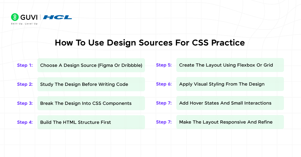
This section explains how to practically use design sources like Figma and Dribbble to improve your CSS skills. It walks you through the process of selecting a design, breaking it down, and rebuilding it using CSS step by step. The goal is to help beginners understand how real UI designs are converted into structured, responsive code. Following these steps ensures you practice CSS in a realistic and confidence-building way.
Step 1: Choose A Design Source (Figma Or Dribbble)
Start by selecting a design source that matches your current skill level. Figma is ideal for editable community designs, while Dribbble provides finished design mockups for inspiration. Beginners should avoid overly complex dashboards and focus on simple landing pages or card layouts to build confidence.
What To Do:
Select a clean, well-structured design with clear sections, consistent typography, and adequate spacing.
Why It Helps:
It ensures you focus on CSS fundamentals without being overwhelmed by unnecessary design complexity. Picking the right design sets the foundation for a smooth design-to-code workflow and builds confidence from the start.
Step 2: Study The Design Before Writing Code
Before writing any HTML or CSS, spend time analyzing the design carefully. Observe spacing, alignment, font hierarchy, repeated components, and color usage. This step ensures that when you start coding, you fully understand the layout logic and design intent, making your workflow efficient and accurate.
What To Do:
Visually scan the design and note patterns in layout, font sizes, spacing, and color schemes.
Why It Helps:
It trains your eye to think like a front-end developer. Recognizing repeated patterns, spacing logic, and alignment details makes CSS structuring more efficient and reduces trial-and-error during coding.
Step 3: Break The Design Into CSS Components
Dividing the design into reusable components makes development manageable. Identify sections like headers, cards, buttons, footers, and navigation bars. Breaking a design into components also allows you to style and test each part individually, ensuring consistency before assembling the full layout.
What To Do:
List containers, rows, columns, and reusable elements, then plan their hierarchy.
Why It Helps:
Organizing the design into components improves your code structure, maintainability, and scalability. This approach mirrors real-world front-end workflows where modular components are essential for team projects and future updates.
Step 4: Build The HTML Structure First
Creating a clean HTML skeleton before adding styles ensures proper structure and semantic meaning. Focus on headings, lists, buttons, and sections first, leaving CSS for later. This structured approach avoids confusion later and provides a clear roadmap for applying styles systematically.
What To Do:
Write semantic HTML using <header>, <section>, <footer>, and <article> tags to reflect the design layout.
Why It Helps:
Separating structure from styling makes your CSS easier to apply and maintain. This approach also improves accessibility and sets a strong foundation for responsive adjustments in later steps.
Step 5: Create The Layout Using Flexbox Or Grid
After the HTML skeleton is ready, position elements using Flexbox or CSS Grid. Flexbox is perfect for one-dimensional layouts, like rows or columns, while Grid handles two-dimensional layouts efficiently. Proper layout creation ensures all elements align as intended and respond well to different screen sizes.
What To Do:
Define containers and apply display: flex or display: grid. Adjust properties like justify-content, align-items, grid-template-columns, and gap to match the design layout.
Why It Helps:
Using Flexbox or Grid ensures consistent spacing, alignment, and layout flow. It teaches core front-end skills and prepares you for real-world projects where precision and responsiveness are essential.
Step 6: Apply Visual Styling From The Design
Focus on typography, colors, borders, shadows, and spacing to closely match the original design. Carefully measure padding, margins, font sizes, and line heights to replicate the UI accurately. This attention to detail ensures your final product looks polished and professional.
What To Do:
Apply CSS properties for fonts, colors, backgrounds, padding, margin, borders, and shadows. Use variables for consistent color schemes when necessary.
Why It Helps:
This step enhances attention to visual detail and strengthens the ability to translate design mockups into code. Matching the design improves UI consistency and teaches you how to handle real-world design specifications.
Step 7: Add Hover States And Small Interactions
Add hover effects, button animations, and transitions to make the interface interactive. Interactivity improves usability and gives your project a polished, production-ready feel. It also helps in understanding how subtle changes can impact user experience.
What To Do:
Use CSS pseudo-classes like :hover and :focus and transitions for smooth animation effects.
Why It Helps:
Adding interactions teaches practical front-end techniques and encourages thinking about user experience. These small details can make your projects more realistic and job-ready.
Step 8: Make The Layout Responsive And Refine
Test your layout on various screen sizes, including mobile and tablet. Adjust container widths, font sizes, and spacing using media queries to ensure a seamless experience across devices. Responsive refinement ensures your project works consistently and looks professional on all devices.
What To Do:
Implement responsive breakpoints, adjust Flexbox or Grid properties, and refine padding, margins, and typography for smaller screens.
Why It Helps:
This step ensures your projects are production-ready and helps you understand the principles of responsive design. It also builds confidence in creating layouts that work across devices.
Types Of CSS Practice Projects Using Designs
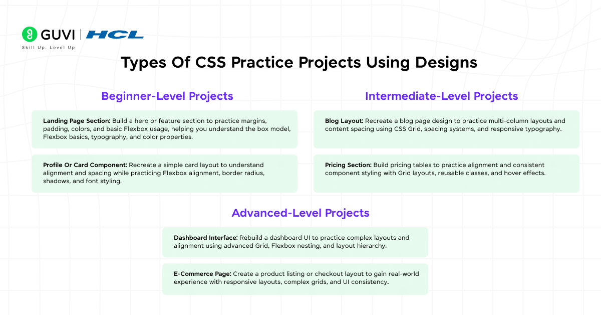
Building projects using design sources for CSS practice helps learners apply CSS in realistic scenarios. These css projects are based on figma to css practice and dribbble design recreation, allowing you to gradually improve layout accuracy, responsiveness, and visual consistency.
Practicing CSS with design-based projects helps you move from basic styling to real-world layouts gradually. By choosing projects based on your skill level, you can strengthen fundamentals first and then progress toward complex interfaces without feeling overwhelmed.
1. Beginner-Level Projects
Beginner projects focus on understanding basic layout structure, spacing, and visual styling. These projects are ideal when you are just starting CSS practice using designs from Figma or Dribbble.
- Landing Page Section: Build a hero or feature section to practice margins, padding, colors, and basic Flexbox usage, helping you understand the box model, Flexbox basics, typography, and color properties.
- Profile Or Card Component: Recreate a simple card layout to understand alignment and spacing while practicing Flexbox alignment, border radius, shadows, and font styling.
2. Intermediate-Level Projects
Intermediate projects combine layout accuracy with responsiveness and component reuse. These projects help you think beyond single sections and understand page flow.
- Blog Layout: Recreate a blog page design to practice multi-column layouts and content spacing using CSS Grid, spacing systems, and responsive typography.
- Pricing Section: Build pricing tables to practice alignment and consistent component styling with Grid layouts, reusable classes, and hover effects.
3. Advanced-Level Projects
Advanced projects simulate real product interfaces and prepare you for professional front-end work. These designs usually require precision and responsive planning.
- Dashboard Interface: Rebuild a dashboard UI to practice complex layouts and alignment using advanced Grid, Flexbox nesting, and layout hierarchy.
- E-Commerce Page: Create a product listing or checkout layout to gain real-world experience with responsive layouts, complex grids, and UI consistency.
Real Example: Practicing CSS Using A Landing Page Design
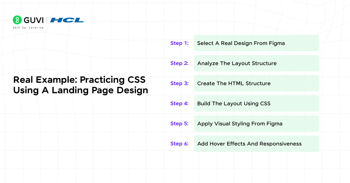
This section demonstrates how to practice CSS using a real design example from Figma. You will see how a simple landing page design is converted into HTML and CSS, following the same workflow used by front-end developers in real projects. The goal is to help you understand not just what to do, but how and why each step matters.
Step 1: Select A Real Design From Figma
For this example, use a free landing page design available in the Figma Community. Search for “Simple Landing Page UI” and choose a clean design with a header, hero section, and call-to-action button. Carefully inspect all components, spacing, colors, and typography to ensure you fully understand the layout before coding.
What To Do:
Open the design in Figma and inspect font sizes, colors, spacing, and layout structure. Note the hierarchy of sections and any reusable elements to plan your HTML structure efficiently.
Why It Helps:
Understanding the design in detail ensures that your CSS implementation matches the original layout closely. This preparation reduces guesswork and allows you to code more confidently and accurately.
Design Source that you can use :
Figma Community – Free Landing Page UI
Step 2: Analyze The Layout Structure
Examine how the page is visually divided into sections like header, hero, text blocks, and button areas. Pay attention to alignment, spacing, and grouping of elements to create a mental map for your code.
What To Do:
Break the page into logical containers and components, noting which elements are grouped and how they interact.
Why It Helps:
This analysis allows for structured HTML planning, making the subsequent styling process more organized and reducing errors.
Step 3: Create The HTML Structure
Begin writing the HTML skeleton by defining semantic tags for each section. Focus on the content structure rather than styles to maintain clarity and accessibility.
What To Do:
Use <header>, <section>, <button>, and <footer> tags to structure the layout according to the design.
Why It Helps:
A well-structured HTML foundation simplifies CSS application and ensures your project is accessible and maintainable.
Step 4: Build The Layout Using CSS
Use Flexbox to position elements according to the design. Center content, manage spacing, and ensure the layout mirrors the design hierarchy accurately.
What To Do:
Apply display: flex, set direction, alignment, and spacing properties, and test placement against the Figma design.
Why It Helps:
Hands-on layout building helps reinforce understanding of Flexbox and CSS positioning while creating a visually accurate interface.
Step 5: Apply Visual Styling From Figma
Implement colors, fonts, spacing, borders, and shadows to replicate the design. Check measurements and details closely to achieve visual fidelity.
What To Do:
Set typography, background colors, padding, margins, and button styles to match the original design specifications.
Why It Helps:
Applying visual styles accurately teaches you attention to detail and improves your ability to replicate professional UI designs.
Step 6: Add Hover Effects And Responsiveness
Incorporate hover interactions, transitions, and media queries. Ensure the design adapts to different screen sizes while maintaining usability and aesthetics.
What To Do:
Use pseudo-classes like :hover and :focus, apply CSS transitions, and add breakpoints for mobile and tablet views.
Why It Helps:
This step helps you understand interactive design principles and responsive CSS, preparing your projects for real-world usage.
Tips While Practicing
- Do not aim for pixel-perfect accuracy initially.
- Compare your output side-by-side with the Figma design.
- Rename classes meaningfully based on the layout purpose.
- Practice the same design twice to improve speed and confidence.
Do check out HCL GUVI’s Modern HTML & CSS course to learn how web pages are structured and styled from scratch. It covers essential HTML elements, semantic layout, and modern CSS styling techniques. You also get hands-on practice in building responsive, real-world web pages. This course is ideal for beginners starting their web development journey.
💡 Did You Know?
- Practicing CSS with real designs improves layout understanding faster than tutorials alone.
- Front-end developers often spend more time converting designs into CSS than writing logic.
- Design-based practice helps you build portfolio-ready UI projects.
Conclusion
Using design sources like Figma and Dribbble transforms CSS practice from trial-and-error into structured learning. By following a clear step-by-step approach and building projects across different difficulty levels, you gain confidence in layouts, styling, and responsiveness.
To take this knowledge further, regularly recreate new designs, compare your output with the original, and gradually increase complexity. Over time, this method helps you think like a front-end developer and prepares you for real-world UI development.
FAQs
1. Can beginners use Figma or Dribbble for CSS practice?
Yes. Beginners should start with simple sections or cards and focus on layout and spacing before attempting complex designs.
2. Do I need to know JavaScript to practice CSS using designs?
No. You can practice CSS effectively using only HTML and CSS for most design-based projects.
3. Should I copy designs exactly when practicing CSS?
Try to match layouts and spacing closely, but focus more on understanding structure than pixel-perfect accuracy.
4. How often should I practice CSS using designs?
Practicing a few designs every week helps reinforce concepts and improves visual accuracy steadily.








Did you enjoy this article?