


Data Visualization Articles
Best Power BI Course With Certificate: Top Options for Beginners
Plotly for Data Visualization: Complete Guide


Get In Touch For Details! Request More Information
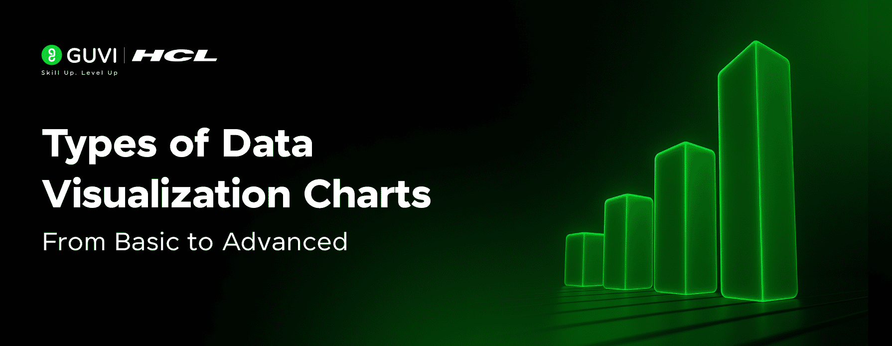
Types of Data Visualization Charts: From Basic to Advanced
Nov 28, 2025 8 Min Read 1605 Views
(Last Updated)
Have you ever looked at a large table full of numbers and felt confused about what it really means? Many people find it difficult to understand raw data because it has no visual meaning. Without a clear way to see patterns or trends, data can easily become overwhelming.
Data visualization solves this problem by turning data into charts, graphs, and diagrams that are easy to read. These visuals help us compare values, notice patterns, understand relationships, and make decisions faster. This is why data visualization is widely used in business, education, research, marketing, and almost every field that deals with information.
In this blog, we will learn about the different types of data visualization charts, starting with basic charts and then moving to advanced ones. You will also understand when each chart should be used and how it can help communicate insights more clearly and effectively.
Table of contents
- Importance of Data Visualization
- Types of Data Visualization Charts
- Basic Charts
- Advanced Charts
- Tools Used for Data Visualization
- How To Choose The Right Chart
- Applying Different Charts To One Dataset
- Conclusion
- FAQ
- Which chart is best for comparing values?
- Which chart is best for showing changes over time?
- What is the main difference between a histogram and a bar chart?
- Why should I avoid too many categories in a pie chart?
- Which visualization tools are easiest for beginners?
Importance of Data Visualization
Before we explore the different charts, it’s important to understand why data visualization matters. When data is shown only as numbers, it can be hard to interpret. Visualization turns that data into visuals that are easier to understand and compare. In this section, we will see the importance of visualizing data and how it helps in making information clear and meaningful
• Clear Communication – Helps present information in a simple, visual form that is easy to understand.
• Quick Pattern Recognition – Makes it easier to notice trends, increases, and changes in the data.
• Better Decision-Making – Supports smarter decisions by highlighting facts and insights visually.
• Enhanced Engagement – Visual representations capture attention better than plain text or tables.
• Efficient Data Comparison – Allows viewers to compare values and categories quickly at a glance.
Data visualization is not just about making charts look good — it plays a key role in data science. Clear visualizations help you explain patterns, tell stories with data, and make better decisions. If you are building your basics in data science, the HCL Guvi’s Data Science eBook is a helpful companion. It explains core concepts in simple language and guides you through real-world workflows, making your learning more structured and practical.
Types of Data Visualization Charts

Have you ever looked at a chart and understood the message instantly without reading any explanation? That’s the power of choosing the right type of visualization. Different charts serve different purposes, and the clarity of your data depends on selecting the one that fits your message. Some charts are simple and perfect for quick comparison, while others help reveal hidden patterns and deeper insights.
In this section, we will explore data visualization charts in two groups. First, we will go through basic charts that are simple and widely used for everyday data understanding. Then, we will look at advanced charts that are useful for detailed analysis and storytelling with data.
We will be covering:
- Basic charts for simple and clear data comparison
- Advanced charts for deeper insights and professional data analysis
Basic Charts

When you are new to data visualization, basic charts are the best place to start. They are simple, clear, and commonly used to compare numbers, show changes over time, or represent parts of a whole. These charts are seen in everyday presentations, business reports, school projects, and dashboards because they are easy to read and understand.
In this section, we will explore the most commonly used basic charts and learn when they are most useful. Understanding these charts will give you a solid foundation before moving on to advanced visualizations.
We will cover the following basic charts:
- Bar Chart – Used to compare values across different categories.
- Column Chart – Similar to bar charts but vertical; useful for comparing data over time.
- Line Chart – Best for showing trends and changes across continuous time.
- Pie Chart – Shows how different parts contribute to a whole.
- Area Chart – Similar to line charts but filled with color to show volume or magnitude.
1. Bar Chart

A bar chart is a simple and widely used chart that displays data using horizontal bars. The length of each bar represents the value of the category it stands for. Longer bars show higher values, while shorter bars show lower values, making it easy to compare data at a glance.
A bar chart is useful when you want to:
- Compare performance between different items or groups
- Show differences clearly without overwhelming the viewer
- Present data in a way that is easy to read and understand
- Highlight the highest and lowest values in a dataset
Example: If you want to compare the monthly sales of different products, a bar chart will help you quickly see which product sold the most and which one sold the least.
2. Column Chart

A column chart is similar to a bar chart, but the bars are vertical instead of horizontal. Each column represents a category, and the height of the column shows the value for that category. Column charts are especially useful when you want to show how values change over time or compare data in a clear and straightforward way.
A column chart is useful when you want to:
- Show trends over months, quarters, or years
- Compare performance between categories in a time sequence
- Highlight increases or decreases clearly
- Present values in a format that is easy for most audiences to understand
Example: If you want to track how your monthly revenue has changed throughout the year, a column chart can clearly show which months had higher earnings and which months had lower earnings.
3. Line Chart

A line chart uses points connected by straight lines to show how values change over time. It is one of the best charts for displaying trends, patterns, and continuous data. The smooth connection between points helps the viewer understand whether values are rising, falling, or staying steady.
A line chart is useful when you want to:
- Show data changes over hours, days, months, or years
- Highlight upward or downward trends clearly
- Track progress or performance over time
- Compare trends between two or more data series
Example: If you want to show how the temperature changes throughout the week, a line chart will reveal whether it is gradually getting hotter, cooler, or fluctuating daily.
4. Pie Chart

A pie chart is a circular chart divided into slices, where each slice represents a part of a whole. The size of each slice shows the proportion or percentage of that category in the total dataset. Pie charts are best used when you want to show how different parts contribute to a single whole amount.
A pie chart is useful when you want to:
- Show the percentage distribution clearly
- Highlight which category has the largest or smallest share
- Represent simple and limited categories in a visually appealing way
- Give a quick overview without focusing on detailed numerical values
Example: If you want to show how a company’s budget is divided among departments such as marketing, HR, operations, and sales, a pie chart makes it easy to see which department receives the highest share of the budget.

Advanced Charts

As your data becomes more complex, basic charts may not be enough to show meaningful insights. Advanced charts help you explore patterns, relationships, and deeper trends within data. These charts are commonly used in research reports, business intelligence dashboards, and data-driven decision-making because they help display multi-dimensional information more clearly.
In this section, we will look at advanced charts that allow for deeper analysis, pattern recognition, and comparison across multiple variables.
We will cover the following advanced charts:
- Scatter Plot – Shows the relationship between two variables using dots.
- Histogram – Displays how data is distributed across different value ranges.
- Heat Map – Uses color intensity to show variations and patterns across data.
- Radar Chart – Compares multiple variables or characteristics in a circular layout.
- Tree Map – Represents part-to-whole relationships using nested rectangles
1. Scatter Plot

A scatter plot is a graph that uses dots to represent values for two different numerical variables. Each dot on the plot shows how one value relates to the other. Scatter plots are especially useful when analyzing the strength and direction of relationships between variables. They help reveal trends, clusters, or unusual values in data.
A scatter plot is useful when you want to:
- Identify patterns or correlations in data
- Understand how one variable changes in relation to another
- Detect outliers that do not follow the general trend
- Analyze real-world data relationships such as performance, growth, or measurement comparisons
Example: If you compare hours studied to test scores for a group of students, the scatter plot may show that scores improve as study hours increase, helping identify a positive relationship between the two variables.
2. Histogram

A histogram is a chart used to show how data is distributed across different ranges or intervals. It looks similar to a bar chart, but instead of comparing categories, it groups data into continuous ranges (called bins). The height of each bar shows how many data points fall within that range. Histograms make it easy to understand the spread, frequency, and shape of data.
A histogram is useful when you want to:
- Analyze the distribution or spread of data
- Identify patterns such as skewness, peaks, or gaps in data
- Understand how frequently values occur within certain ranges
- Explore variations in performance, measurement, or behavior
Example: If a teacher wants to analyze how students performed in an exam, a histogram can show how many students scored within 0-20, 20-40, 40-60, and so on. This helps quickly identify common score ranges and overall performance trends.
3. Heatmap

A heat map is a visualization that uses color shades to represent the intensity or value of data. Darker or brighter colors usually indicate higher values, while lighter colors show lower values. Heat maps are very helpful when you need to compare large sets of data at once and immediately spot patterns, highs, lows, or clusters.
A heat map is useful when you want to:
- Identify patterns or trends across two dimensions (such as time vs category)
- Compare large amounts of data visually
- Highlight areas of high and low concentration
- Quickly observe correlations or performance variations
Example: If a business wants to see monthly product sales across different regions, a heat map can show which regions had strong sales (darker shades) and which regions had lower sales (lighter shades), making performance differences easy to observe at a glance.
4. Box Plot

A box plot is a chart that shows how data is spread out. It divides the data into parts and shows the highest value, the lowest value, the middle value, and how the values are grouped. It also makes it easy to spot if some data points are unusually high or low compared to the rest.
A box plot is useful when you want to:
- See how data is spread across a range
- Compare the differences between several groups
- Find values that are much higher or lower than others
- Understand if the data is closely packed or widely spread
Example: If you have test scores from three different classrooms, a box plot helps you see which class performed consistently, which class had wide differences in scores, and whether any student scored extremely high or low compared to others.
Tools Used for Data Visualization

Choosing the right tool is important because different tools serve different needs. Some tools are great for quick and simple charts, while others help create advanced dashboards, interactive visuals, or research-level graphics. The choice depends on how complex the data is, who will view the visuals, and how often charts need to be updated.
Common tools used for data visualization include:
- Excel / Google Sheets – Good for basic charts and everyday reporting. Easy for beginners and widely used in offices.
- Tableau – Helps create interactive dashboards and explore data visually. Often used in business analytics.
- Power BI – Common in companies for dynamic dashboards and performance tracking.
- Python (Matplotlib, Seaborn) – Useful for programmers and data analysts who need custom visualizations.
- R (ggplot2) – Mostly used in research and statistics for creating detailed and layered visual graphics.
As you start exploring different visualization tools like Excel, Tableau, Power BI, Python, and R, it can feel overwhelming to understand where each tool fits in real projects. To help you learn step-by-step, the 5-Day Free Data Science Email Series provides daily lessons that explain how these tools are used in real analysis, reporting, and dashboard creation. Each day focuses on simple, practical examples so you can understand how to choose the right tool and apply it confidently in real work situations.
How To Choose The Right Chart
Choosing the right chart is important because it helps communicate the message behind the data clearly. Different charts highlight different insights, so the best chart depends on what you want to show and how you want the audience to understand the information.
Use this simple guide to choose the right chart:
- To compare values between different categories → Use a bar chart or column chart
- To show trends and changes over time → Use a line chart
- To show the share or percentage of each part in a total → Use a pie chart
- To understand relationships between two variables → Use a scatter plot
- To see how data is spread across a range → Use a histogram or box plot
- To find patterns or intensity across multiple dimensions → Use a heat map
The main idea is to choose the chart that makes your insight easy to read, visually clear, and meaningful at a glance.
Applying Different Charts To One Dataset
Below is a dataset showing the monthly performance of three products along with total sales and advertising spend. We will use this one dataset to understand how different charts highlight different insights.
Dataset: Monthly Performance Data
| Month | Product A Sales | Product B Sales | Product C Sales | Total Sales | Advertising Spend (₹) |
| January | 20 | 35 | 18 | 73 | 5,000 |
| February | 28 | 32 | 22 | 82 | 6,000 |
| March | 40 | 38 | 30 | 108 | 8,500 |
| April | 30 | 36 | 25 | 91 | 7,000 |
| May | 55 | 40 | 35 | 130 | 10,000 |
| June | 48 | 34 | 28 | 110 | 9,000 |
Bar Chart
A bar chart can be used to compare the sales of products in a single month. Each product will have one bar, and the height of the bar will show the sales number.
This helps us quickly see which product performed the best and which one performed the least in that month.
Example: In May, Product A has the tallest bar, meaning it had the highest sales compared to Product B and Product C.
Column Chart
A column chart can show how sales change over time for one product. The months are placed on the horizontal axis, and the column heights show how sales increased or decreased.
This makes it easy to track month-to-month performance growth or decline.
Example: For Product A, the columns rise gradually from January and peak in May, showing improvement.
Line Chart
A line chart connects sales values across months, helping you see trends and patterns clearly.
It is useful for understanding whether total sales are rising, falling, or fluctuating over time.
Example: The line for Total Sales climbs from January to March, dips slightly in April, peaks again in May, and then eases in June.
Pie Chart
A pie chart shows how much each product contributed to total sales in one month.
This gives a sense of proportion rather than exact numerical values.
Example: In June, if Product A’s slice is the largest, it means it contributed the most to the total sales that month.
Scatter Plot
A scatter plot can show the relationship between advertising spend and total sales.
If both values increase together, the points will show an upward pattern.
Example: With higher advertising spend in May (₹10,000), total sales were also high (130 units), showing a positive relationship.
Histogram
A histogram shows how often certain sales values appear, helping us understand the spread of numbers for one product.
This is useful for identifying whether the product usually sells low, medium, or high numbers.
Example: If most Product C sales fall between 20 and 35, this range will have taller bars in the histogram.
Box Plot
A box plot shows the range and variation of sales for each product.
It helps identify consistency, spread, and unusual high/low values.
Example: If Product B’s box is narrow, it means its sales are consistent across months. If Product A’s box is wider, it means its sales vary more.
Heat Map
A heat map uses color to show which product sold more in which month.
Darker colors show higher values, lighter colors show lower values.
Example: Product A will show the darkest color in May, where it achieved the highest sales.
Conclusion
Data visualization helps turn numbers into clear stories. When the right chart is chosen, patterns become easier to notice, comparisons become clearer, and decisions can be made with confidence. Basic charts are useful for everyday understanding, while advanced charts allow deeper exploration of relationships and patterns in larger datasets. By practicing with different chart types on the same dataset, you learn how each visualization highlights a different aspect of the data.
The key idea is that there is no single chart that fits every situation. The best chart depends on the message you want to communicate and the type of data you have. With the right approach, visualizations can make data more meaningful, engaging, and easier to act on.
If you want to build real-time data visualization skills and learn how to apply them in real projects, you can explore the Data Science Course, which offers mentor-led learning, hands-on projects, and job-focused training.
FAQ
1. Which chart is best for comparing values?
Bar and column charts are best for comparing values across categories.
2. Which chart is best for showing changes over time?
Line charts are ideal for showing trends and changes over time.
3. What is the main difference between a histogram and a bar chart?
A histogram shows data distribution across ranges, while a bar chart compares categories.
4. Why should I avoid too many categories in a pie chart?
Too many slices make the chart difficult to read and interpret.
5. Which visualization tools are easiest for beginners?
Excel, Google Sheets, and Tableau are easy to start with and widely used.
Success Stories

About the Author
Jebasta
I translate the language of data into stories that anyone can understand. As a writer with a data science background, I simplify analytics, AI, and decision-making so beginners and enthusiasts can confidently explore the world of data.
View all posts by Jebasta
Connect with me @


Did you enjoy this article?