

Data Analysis Articles
What are Analytical Skills and How to Master them for 3X Career Growth?
Skills for Financial Data Analysis and Modeling: A Complete Guide
Skills to Become a Healthcare Data Analyst: A 2026 Career Guide


Get In Touch For Details! Request More Information
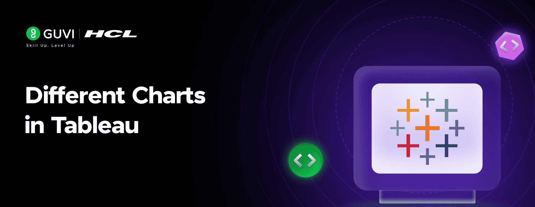
In today’s data-driven world, presenting information clearly can be the difference between confusion and understanding. Tableau, a leading data visualization tool, helps users transform raw data into interactive, easy-to-read visuals that support better business decisions.
Whether you are starting your journey as a data analyst or are an experienced data professional, knowing the different charts in Tableau is crucial. Each chart type serves a unique purpose, has specific features, and is best suited for particular scenarios. This guide will walk you through the main chart types in Tableau, explaining how and when to use each to gain the most meaningful insights.
Table of contents
- Importance Of Charts In Tableau
- Types Of Charts In Tableau
- Simple Charts
- 1 Bar Chart
- 2 Line Chart
- 3 Pie Chart
- 4 Scatter Plot
- 5 Histogram
- 6 Heat Map
- 7 Tree Map
- Advanced Charts
- 1 Bubble Chart
- 2 Gantt Chart
- 3 Box and Whisker Plot
- 4 Bullet Graph
- 5 Funnel Chart
- 6 Waterfall Chart
- 7 Donut Chart
- How To Choose The Right Chart
- Real-World Applications Of Tableau Charts
- Conclusion
- FAQs
- Which chart is best for comparing multiple categories in Tableau?
- Can Tableau automatically suggest suitable chart types?
- What’s the main difference between a tree map and a heat map?
- Are all chart types available in Tableau by default?
Importance Of Charts In Tableau
Charts are the core of data visualization in Tableau. They turn large amounts of data into clear visuals that make patterns, trends, and insights easy to understand. The most important features of charts in Tableau that help businesses make better decisions are:
- Charts make complex data easy to understand and interpret visually.
- They help track important business metrics and performance over time.
- They allow easy comparison between categories and reveal important relationships in data.
- Tableau’s interactive dashboards let users filter, drill down, and explore data quickly.
Example: A marketing manager can use a line chart in Tableau to track customer engagement over time. This helps spot trends, peaks, and dips instantly, making it easier to take fast, data-driven actions.
Kickstart your journey into analytics with HCL GUVI’s free 5-day Data Science Email Series! You’ll receive bite-sized lessons covering data visualization, Tableau charts, and practical analytics, which is perfect for beginners aiming to build a strong data foundation.
Types Of Charts In Tableau
Tableau offers a variety of chart types to help visualize data effectively. Depending on your goal, you can choose from simple charts for everyday analysis or advanced charts for multi-dimensional insights. Understanding which chart to use can make your dashboards more meaningful and easier to interpret.
1. Simple Charts

Simple charts are perfect for beginners and everyday analytics. They help you visualize comparisons, distributions, and proportions in a clear and structured way. These charts are easy to create in Tableau and are widely used in business dashboards and reports.
The most commonly used simple charts in Tableau include:
- Bar Chart – for comparing categories
- Line Chart – for tracking trends over time
- Pie Chart – for showing proportions
- Scatter Plot – for visualizing relationships between two variables
- Histogram – for analyzing frequency distributions
- Heat Map – for showing intensity using colors
- Tree Map – for hierarchical data and category contributions
1.1 Bar Chart

Bar charts are one of the most popular and widely used visuals in Tableau. They represent categorical data using rectangular bars, where the length of each bar corresponds to its value.
Features:
- Ideal for comparing data across different categories, such as sales by region or revenue by product.
- Supports stacked and grouped formats for multi-level comparisons.
- Simple to interpret, making them perfect for dashboards and business reports.
Example: A retail company can use a bar chart to compare yearly sales across regions, helping identify the best-performing areas and make informed business decisions.

1.2 Line Chart

Line charts are ideal for visualizing trends over time. They connect individual data points with lines, making it easy to track changes and patterns.
Features:
- Best for time series data such as monthly sales, revenue, or website visits.
- Can plot multiple lines to compare trends across categories or products.
- Helps quickly identify increases, decreases, and seasonal variations in data.
Example: A business can use a line chart to display monthly revenue growth for different product lines, making it easier to spot seasonal trends and plan inventory or marketing campaigns accordingly.
1.3 Pie Chart

Pie charts are used to represent parts of a whole, clearly showing how each category contributes to the total.
Features:
- Suitable for displaying proportional data, such as market share by product or departmental contribution.
- Works best with fewer than five categories for clarity.
- Helps quickly visualize relative sizes and composition.
Example: A company can use a pie chart to show how different departments contribute to overall expenses, making it easy to identify the largest cost centers at a glance.
1.4 Scatter Plot

Scatter plots are used to visualize relationships between two continuous variables and are particularly helpful for identifying correlations or clusters in data.
Features:
- Ideal for regression analysis or predictive modeling.
- Can reveal patterns, trends, and outliers that are not obvious in tables.
- Helps analyze how one variable affects another and identify data groupings.
Example: A marketing team can use a scatter plot to explore the relationship between advertising spend and total sales, helping determine which campaigns deliver the best return on investment.
1.5 Histogram

Histograms are used to analyze the distribution of a dataset by displaying how often data points fall within specific ranges.
Features:
- Perfect for statistical analysis and detecting data skewness.
- Helps identify the most common value ranges and potential outliers.
- Makes it easier to understand the overall shape and spread of data.
Example: A marketing team can use a histogram to visualize customer age distribution, helping design targeted campaigns for the most common age groups.
1.6 Heat Map

Heat maps use color gradients to represent data intensity, making it easy to spot trends, patterns, and anomalies at a glance.
Features:
- Ideal for visualizing performance across two dimensions, such as products vs. months.
- Highlights high and low values quickly using color variations.
- Commonly used in sales, HR, and marketing dashboards for quick insights.
Example: A sales manager can use a heat map to track performance across different product lines and months, quickly identifying which products are performing well and which need attention.
1.7 Tree Map

Tree maps visualize hierarchical data using nested rectangles, where both the size and color of each rectangle represent values and categories.
Features:
- Useful for understanding data composition across multiple levels.
- Efficient for space-constrained dashboards, allowing large datasets to be visualized compactly.
- Helps quickly identify top contributors and category relationships.
Example: A sales team can use a tree map to display the contribution of each product category and subcategory to overall revenue, making it easy to spot the top-performing segments.
2. Advanced Charts
Advanced charts in Tableau are designed to handle complex relationships and multi-dimensional data. They are ideal for strategic analytics, executive dashboards, and in-depth performance analysis. These charts provide deeper insights that simple charts may not reveal.
The most commonly used advanced charts in Tableau include:
- Bubble Chart – to compare three variables simultaneously
- Gantt Chart – for visualizing timelines and project schedules
- Box and Whisker Plot – to show data distribution and outliers
- Bullet Graph – to measure performance against targets
- Funnel Chart – to visualize progressive stages and drop-offs
- Waterfall Chart – to show sequential gains and losses
- Donut Chart – a variation of a pie chart with additional space for metrics
2.1 Bubble Chart

Bubble charts are enhanced scatter plots where the size of each bubble represents a third variable, allowing comparison of three dimensions simultaneously.
Features:
- Ideal for analyzing three variables at once, such as revenue, profit, and market share.
- Helps identify high-performing and underperforming segments quickly.
- Useful for dashboards that need multi-metric visualization.
Example: A business can use a bubble chart to compare revenue, profit, and market share across different regions, helping prioritize markets for expansion or improvement.
2.2 Gantt Chart

Gantt charts are used to visualize timelines and project schedules, making it easy to track tasks, milestones, and dependencies.
Features:
- Ideal for project management, resource planning, and tracking progress.
- Displays start and end dates for tasks along a timeline.
- Helps quickly identify delays, overlaps, or bottlenecks.
Example: A project manager can use a Gantt chart in Tableau to track the progress of a software development project, visualize deadlines, and ensure tasks are completed on schedule.
2.3 Box and Whisker Plot

Box and whisker plots (or box plots) show the distribution of data across quartiles, highlighting medians, ranges, and outliers.
Features:
- Ideal for statistical analysis and understanding variability.
- Highlights median, minimum, maximum, and potential outliers.
- Useful for comparing distributions across categories.
Example: HR teams can use a box and whisker plot to compare employee salary ranges across departments, quickly spotting variations and outliers.
2.4 Bullet Graph

Bullet graphs measure performance against a target using bars and reference lines.
Features:
- Excellent for monitoring KPIs and business goals.
- Compact and information-rich for dashboards
- Shows actual performance, target, and qualitative ranges in one visual.
Example: A sales manager can use a bullet graph to track monthly sales against targets, instantly seeing which branches are meeting, exceeding, or underperforming.
2.5 Funnel Chart

Funnel charts visualize progressive stages and show where data drops off at each stage.
Features:
- Perfect for analyzing conversion rates or pipeline stages.
- Highlights bottlenecks and areas for improvement.
- Easy to see stage-wise drop-offs in processes.
Example: A marketing team can use a funnel chart to track website visitors converting into leads and customers, identifying stages with high drop-offs.
2.6 Waterfall Chart

Waterfall charts display sequential gains and losses, helping understand how initial values are affected by intermediate changes.
Features:
- Ideal for financial reporting and variance analysis.
- Shows cumulative effects of positive and negative changes.
- Helps identify key contributors to total outcomes.
Example: A finance team can use a waterfall chart to visualize how revenue changes through expenses, discounts, and taxes to arrive at net profit.
2.7 Donut Chart

Donut charts are similar to pie charts but with a hollow center, making them visually appealing and easier to label.
Features:
- Suitable for showing proportions while leaving space for metrics in the center.
- Works best with fewer categories for clarity.
- Enhances readability and dashboard aesthetics.
Example: A business can use a donut chart to display each product category’s share of total revenue, with the total revenue displayed in the center for quick reference.
How To Choose The Right Chart
Choosing the right chart in Tableau is crucial because the effectiveness of your visualization depends on it. The right chart ensures your audience quickly understands the insights, identifies trends, and makes informed decisions. Using the wrong chart, on the other hand, can confuse viewers and hide important patterns in your data.
Once you understand why choosing the right chart matters, the next step is knowing how to choose it. This involves analyzing your data, defining the purpose of the chart, and following a structured approach to match your insights with the most suitable visualization.
Here’s a step-by-step guide to selecting the right chart:
- Analyze Your Data
- Identify whether your data is numerical, categorical, time-based, or hierarchical.
- Look for patterns, trends, and outliers to understand what story the data tells.
- Define the Purpose of the Chart
- Determine whether you want to compare values, show trends over time, illustrate proportions, highlight relationships, visualize a process, or display distributions.
- Match the Insight with Chart Types
- For comparisons: bar charts, bullet graphs, or line charts.
- For trends: line charts or area charts.
- For proportions: pie charts, tree maps, or donut charts.
- For relationships: scatter plots or bubble charts.
- For processes or pipelines: funnel charts or Gantt charts.
- For distributions: histograms or box and whisker plots.
- Consider Dataset Complexity
- Large datasets or multiple variables may require advanced charts like bubble charts or heat maps.
- Smaller datasets can often be visualized clearly with simple charts like bar or pie charts.
- Ensure Clarity and Readability
- Avoid clutter, use clear labels and colors, and ensure the chart conveys the insight quickly.
Example: A business analyzing monthly revenue should first examine the data to identify patterns. To track trends over time, a line chart works best, while a bar chart is ideal for comparing quarterly revenue across regions. Following this step-by-step approach ensures that every chart delivers clear, actionable insights.
Explore HCL GUVI’s free Data Science eBook — your compact guide to understanding Tableau charts, Python tools, and data visualization concepts. It’s designed to help you turn data into clear, actionable insights.
Real-World Applications Of Tableau Charts
Tableau charts are widely used across industries to turn raw data into actionable insights, helping organizations make faster and smarter decisions. Here are some practical use cases:
- Business Intelligence: Bar charts and line charts are commonly used to track KPIs, monitor operational performance, and compare metrics across departments.
- Marketing Analytics: Funnel charts and heat maps help measure campaign effectiveness, track customer journeys, and analyze conversion rates.
- Finance: Waterfall charts and bullet graphs simplify the analysis of revenue, costs, and profit variances, supporting strategic financial decisions.
- Healthcare: Scatter plots and tree maps are used to visualize patient data, identify trends, and support accurate diagnostics and treatment planning.
- Education: Histograms and pie charts allow institutions to track student performance, enrollment trends, and resource allocation effectively.
Conclusion
Mastering the different charts in Tableau empowers you to transform complex datasets into clear, actionable insights. Each chart — from bar and line graphs to heat maps and treemaps — plays a unique role in simplifying data interpretation and uncovering trends that might otherwise go unnoticed.
By choosing the right visualization, professionals can communicate findings more effectively, monitor real-time performance, and make informed decisions with confidence. Whether you’re analyzing sales growth, tracking marketing performance, or visualizing operational efficiency, Tableau charts help convert raw data into powerful visual stories that inspire action and clarity.
If you’re looking to master Tableau and other advanced visualization tools, explore HCL GUVI’s Data Science Course— a mentor-led, placement-driven course that covers Python, SQL, Tableau, Power BI, and real-world analytics projects.
FAQs
1. Which chart is best for comparing multiple categories in Tableau?
Bar charts and grouped bar charts are ideal for comparing multiple categories efficiently.
2. Can Tableau automatically suggest suitable chart types?
Yes, Tableau’s “Show Me” feature automatically recommends the most appropriate chart type based on the data fields you select.
3. What’s the main difference between a tree map and a heat map?
A tree map visualizes hierarchical relationships, while a heat map focuses on intensity patterns using color.
4. Are all chart types available in Tableau by default?
Yes, Tableau offers both simple and advanced chart templates out of the box, with customization options for each.
Success Stories

About the Author
Jebasta
I translate the language of data into stories that anyone can understand. As a writer with a data science background, I simplify analytics, AI, and decision-making so beginners and enthusiasts can confidently explore the world of data.
View all posts by Jebasta
Connect with me @


Did you enjoy this article?