


Data Analysis Articles
Data Storytelling: Turning Numbers into Narratives That Persuade
What are Analytical Skills and How to Master them for 3X Career Growth?
Skills for Financial Data Analysis and Modeling: A Complete Guide
Skills to Become a Healthcare Data Analyst: A 2026 Career Guide


Get In Touch For Details! Request More Information
Types of Graphs in Statistics: 2026 Guide for Beginners
Aug 17, 2026 7 Min Read 3260 Views
(Last Updated)
Data surrounds nearly every decision today. Businesses track customer purchases, hospitals analyze patient outcomes, and social platforms measure user behavior. However, large datasets can be difficult to understand when presented only as rows of numbers.
Graphs convert complex information into clear visual patterns. The right graph can highlight comparisons, reveal trends, or show how values are distributed. It can also help readers understand relationships between different variables.
Each graph serves a specific purpose. Bar charts compare categories, while line graphs track changes over time. Histograms show distributions, and scatter plots reveal relationships between numerical variables.
Choosing the right graph improves both accuracy and communication. This guide explains the main types of graphs in statistics, their common uses, and practical examples to help beginners select the most suitable visualization.
Table of contents
- TL;DR
- Why Graphs Are Important In Statistics
- Types Of Graphs In Statistics
- Comparative Graphs
- Trend / Time-Series Graphs
- Distribution & Relationship Graphs
- Types of Graphs in Statistics: Comparison Table
- Real-World Applications of Types of Graphs in Statistics
- E-Commerce and Retail
- Healthcare Analytics
- Finance and Investment
- Education
- Marketing Analytics
- Manufacturing and Quality Control
- Tools For Creating Graphs
- Microsoft Excel and Google Sheets
- Python Visualization Libraries
- R and ggplot2
- Tableau and Power BI
- Looker Studio
- Datawrapper
- Flourish
- Qlik Sense
- Apache Superset
- Observable
- D3.js
- Grafana
- Jupyter Notebook
- Conclusion
- FAQs
- How many types of graphs are there in statistics?
- What is the difference between a bar graph and a histogram?
- Which graph is best for showing trends over time?
- When should you use a scatter plot?
- Which graph is best for comparing categories?
- What is the difference between a graph and a chart?
- How do you choose the correct graph for data?
TL;DR
Graphs in statistics convert raw data into visual formats that reveal comparisons, trends, distributions, or relationships. Choosing the correct graph depends on the data type and the question being answered.
- Bar and column charts compare values across categories.
- Line and area charts track changes over time.
- Histograms and box plots show data distribution.
- Scatter plots reveal relationships between numerical variables.
- Pie charts show how limited categories contribute to a whole.
Why Graphs Are Important In Statistics
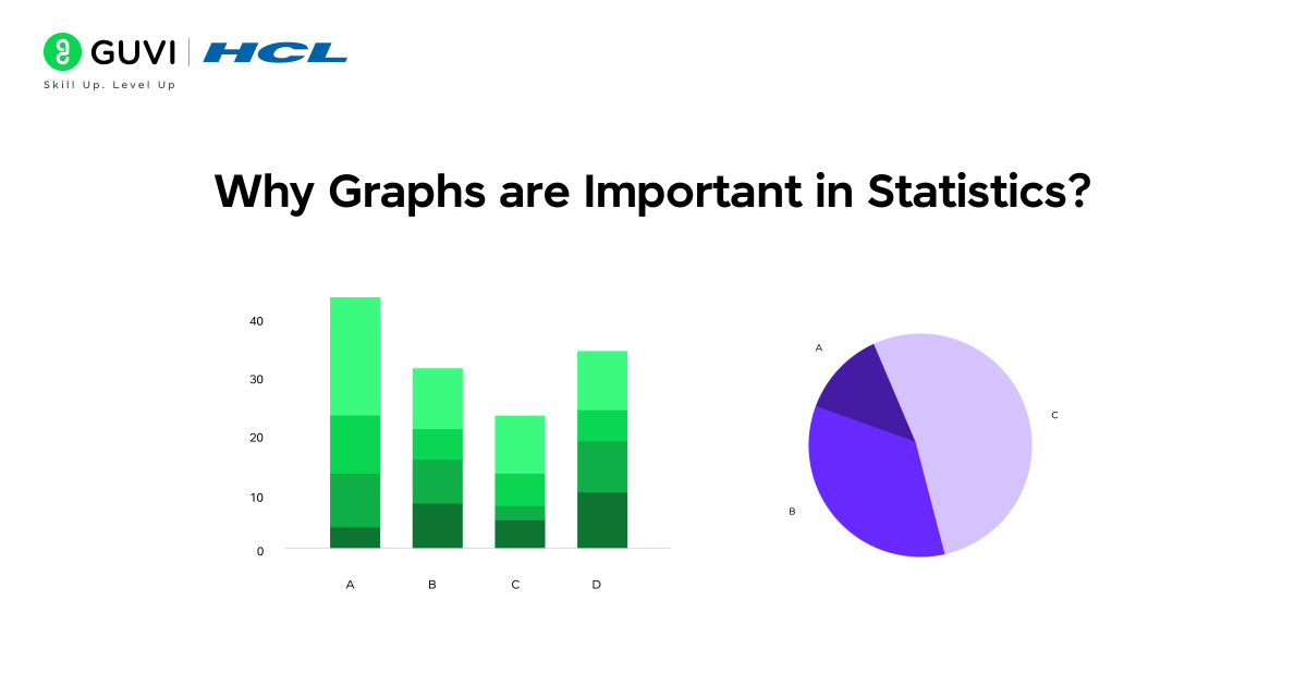
Graphs act as a bridge between raw data and meaningful insights. They allow you to quickly spot patterns, compare categories, and understand trends over time, making it easier to make informed decisions. In a world overflowing with data, simply looking at tables of numbers is rarely enough to make sense of patterns or trends. By transforming complex data into clear visuals, graphs help you highlight anomalies, track growth, and communicate insights effectively.
The important aspects and uses of graphs in statistics are:
- Simplify data for clarity: To transform large datasets into easily understandable visuals.
- Highlight trends and anomalies: To instantly detect growth, decline, or unexpected variations.
- Facilitate category or time-based comparisons: To compare products, regions, or periods efficiently.
- Support informed decision-making: To make presentations and reports more persuasive and actionable.
Kickstart your data science journey with this free 5-day data science email series. Learn Python basics, data analysis, visualization, and practical examples to build a strong foundation in data science.
Types Of Graphs In Statistics
Visualizing data through graphs is one of the most powerful techniques in statistics. Graphs help uncover patterns, relationships, and distributions that raw numbers often hide. To make it easier to understand, all graphs in statistics can be broadly classified into three major types: Comparative Graphs, Trend or Time-Series Graphs, and Distribution & Relationship Graphs. Each category serves a specific purpose, allowing analysts to extract meaningful insights from complex datasets.
1. Comparative Graphs
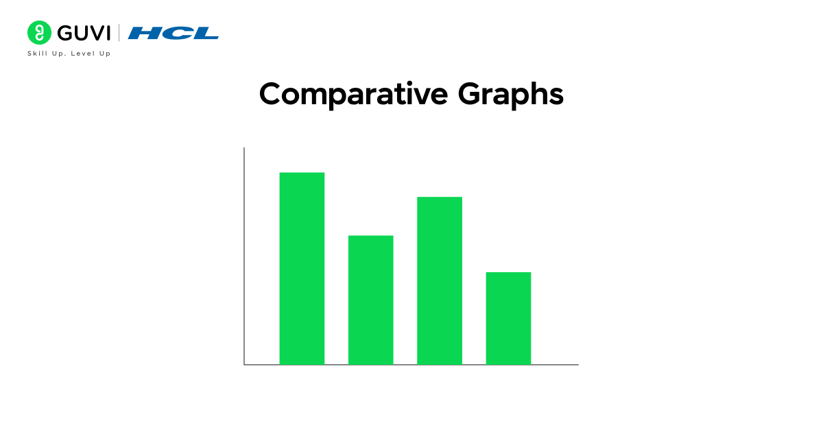
Graphs that help compare one set of values against another are known as comparative graphs. They are among the most commonly used visualizations in data analysis and business reporting, as they make it easy to see which category performs better or worse. Whether it’s analyzing sales performance across regions, tracking product popularity, or comparing market shares, comparative graphs provide a clear picture of differences and relationships in your data.
In this category, the most widely used types are Bar Charts, Stacked Bar Charts, and Column Charts. Let’s explore them one by one.
1.1 Bar Chart / Barplot
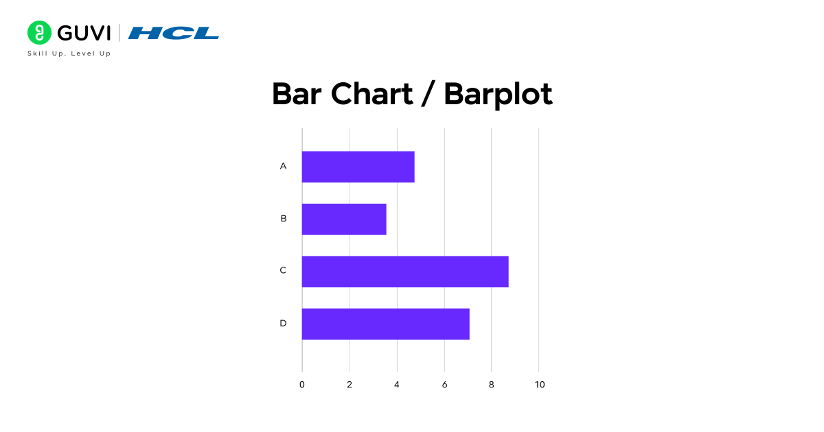
Want to instantly see which product sold the most last month? A bar chart makes that obvious at a glance. It represents data using rectangular bars, where each bar’s height or length indicates its value. This makes it one of the simplest yet most powerful ways to visualize categorical data, which is perfect for comparing product sales, survey results, or regional performance at a glance.
Key functions: Represent categorical data using bars; heights or lengths indicate values; can be displayed vertically or horizontally.
Example: Comparing the sales of phones, laptops, and tablets across different stores.
Features: Easy to interpret, ideal for side-by-side comparisons, and highly adaptable for various datasets.
1.2 Stacked Bar Chart
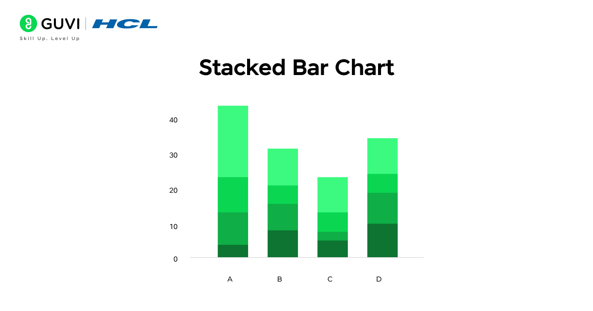
Curious about how different product lines contribute to overall monthly sales? A stacked bar chart makes that clear in a single view. Each bar is divided into segments that represent sub-categories, allowing you to see both the total value and the composition within it. This visualization is perfect for identifying how different elements, like product types or departments, contribute to an overall result.
Key functions: Divide categories into smaller components; display how sub-groups add up to a total.
Example: Monthly sales figures stacked by product line (phones, laptops, and accessories).
Features: Helps analyze overall and component-level performance, reveals proportional contributions, and is ideal for visualizing multi-dimensional categorical data.
1.3 Column Chart

Want to track how performance changes over time? A column chart makes it effortless to visualize upward and downward trends at a glance. Unlike bar charts, which are typically horizontal, column charts use vertical bars, making them ideal for representing data that changes over specific time intervals such as months, quarters, or years. This format emphasizes growth, decline, and variation, helping businesses quickly interpret performance metrics.
Key functions: Compare values across time intervals; highlight growth or decline patterns clearly.
Example: Comparing the monthly revenue of three store branches over six months.
Features: Excellent for visualizing time-based trends, commonly used in business analytics and reporting dashboards, and effective for showcasing performance progress over time.
2. Trend / Time-Series Graphs
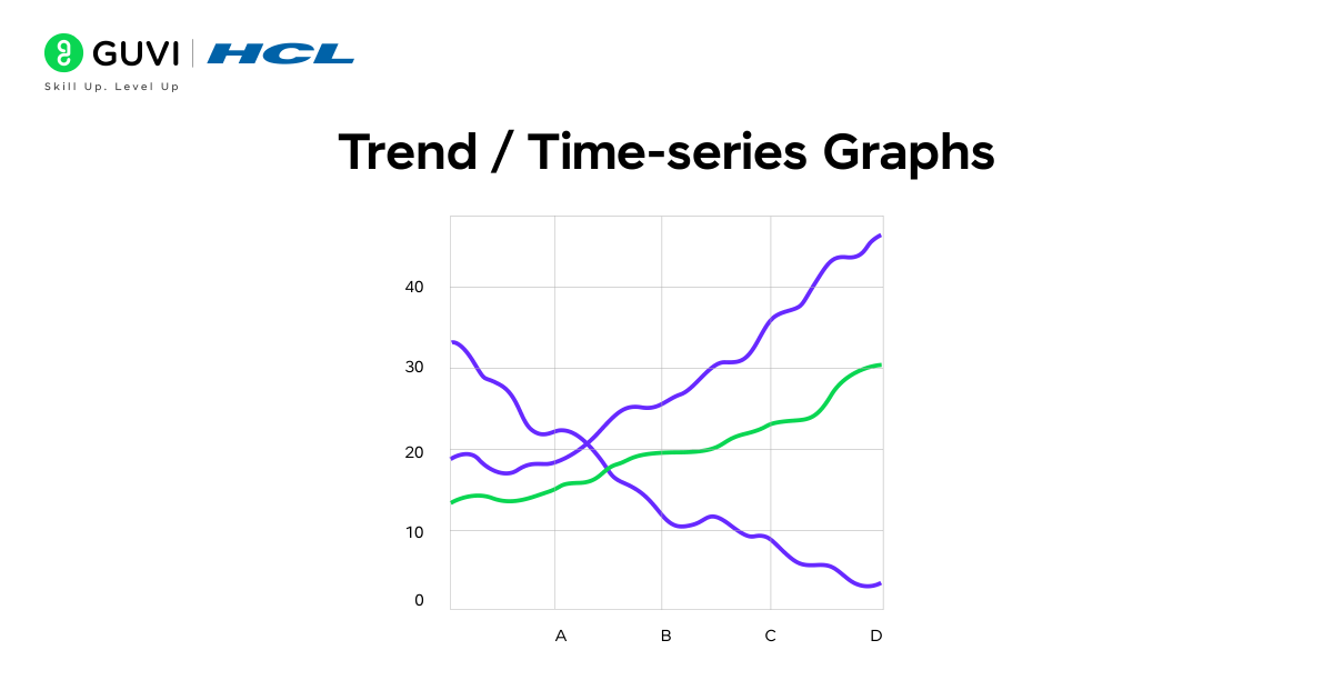
Trend or time-series graphs are used to track how data evolves, making them a cornerstone of statistical and business analysis. These graphs help identify patterns, fluctuations, and long-term movements in datasets, offering valuable insights into growth, decline, or cyclical behavior. They are widely used to analyze sales performance, stock prices, weather changes, and website traffic trends.
In this section, we will discuss two key types of trend or time-series graphs – Line Graphs and Area Charts, both of which help visualize how data progresses and changes over time. While line graphs clearly depict trends and variations, area charts highlight the magnitude and cumulative effect of those changes, making them essential tools for understanding and forecasting performance.
2.1 Line Graph / Line Plot
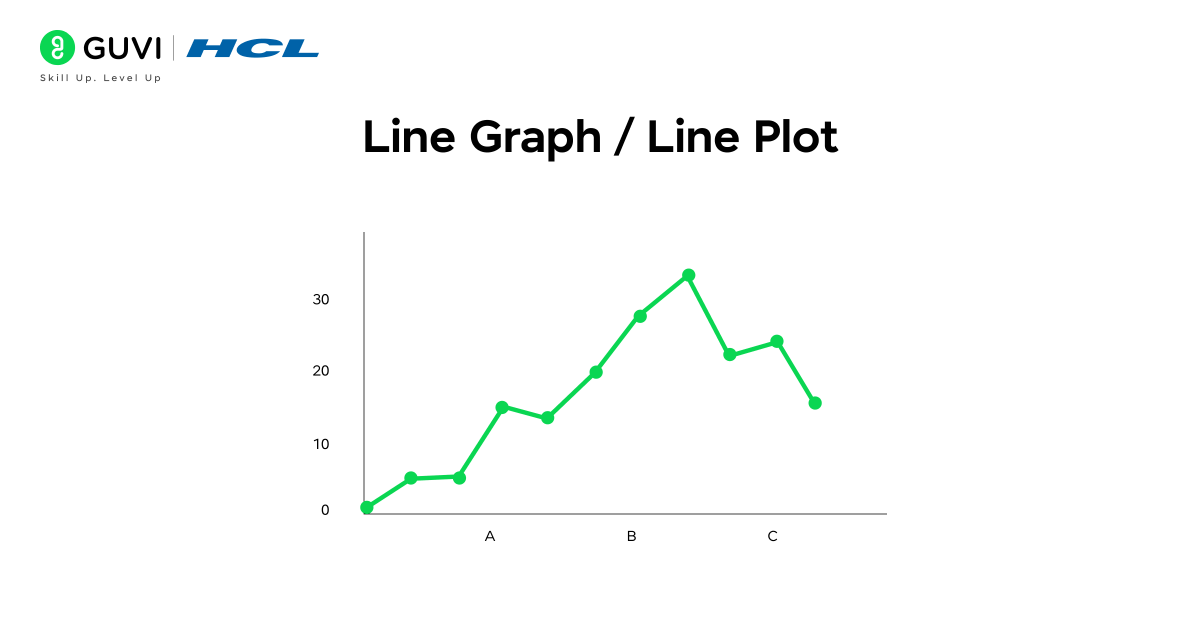
Want to see how your website traffic grows month by month? A line graph makes trends and fluctuations easy to identify by connecting individual data points with a continuous line. This type of graph is ideal for visualizing changes over time, highlighting patterns, and spotting peaks or drops in performance.
Key functions: Connects data points to show continuous trends over time, and visualizes growth, decline, and fluctuations clearly.
Example: Tracking monthly revenue trends across a financial year.
Features: Perfect for time-series data; allows easy comparison of performance over time; helps in forecasting future trends.
2.2 Area Chart
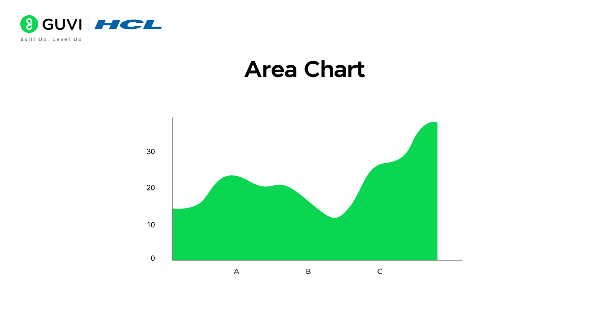
Area charts take trend visualization a step further by not only showing the direction of changes but also emphasizing the magnitude of those changes. By shading the area beneath the line, they provide a clear visual of cumulative values over time, making it easier to understand total contribution or growth.
Key functions: Shade the area under the line to represent cumulative or total data; highlight both trend and magnitude simultaneously.
Example: Monthly website traffic broken down by different marketing channels.
Features: Excellent for illustrating cumulative growth; highlights the contribution of multiple components over time; effective for comparing totals across periods.
3. Distribution & Relationship Graphs
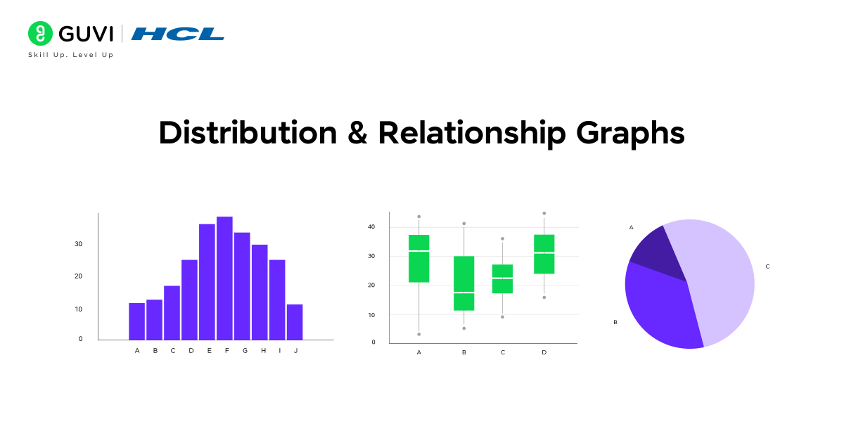
Distribution and relationship graphs are designed to show how data is spread, how values are distributed, and how variables relate to each other. They are essential for identifying patterns, spotting outliers, and analyzing correlations between different factors. These graphs are widely used in research, machine learning, quality control, and statistical modeling to gain deeper insights into datasets.
In this section, we will discuss the key types of distribution and relationship graphs, including Histograms, Box Plots, Scatter Plots, and Pie Charts, and how each can be used to extract meaningful insights from data.
3.1 Histogram
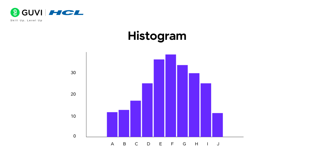
A histogram is an effective way to understand how values in a dataset are distributed. By dividing data into equal intervals, known as bins, and representing the frequency of each interval with bars, histograms make it easy to see patterns, clusters, and gaps in the data. This helps quickly identify the overall shape of the distribution and detect any skewness or anomalies.
Key functions: Divides the data into equal intervals and represents the frequency of values with bar heights..
Example: Analyzing the number of customers visiting a store each day.
Features: Highlights data distribution and spread; ideal for continuous variables; helps detect trends, clusters, and outliers.
3.2 Box Plot / Whisker Plot
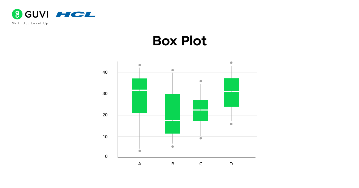
When you want a quick overview of your data’s spread and outliers, a box plot provides a complete snapshot in a single view. It visually summarizes data through its minimum, first quartile, median, third quartile, and maximum values, making it easy to understand how evenly data is distributed and where anomalies exist.
Key functions: Represent the range, quartiles, and median; identify outliers and variability within a dataset.
Example: Analyzing salary distribution across employees in an organization.
Features: Clearly displays data spread and central tendency; highlights variation and potential outliers; ideal for comparing multiple datasets side by side.
3.3 Scatter Plot
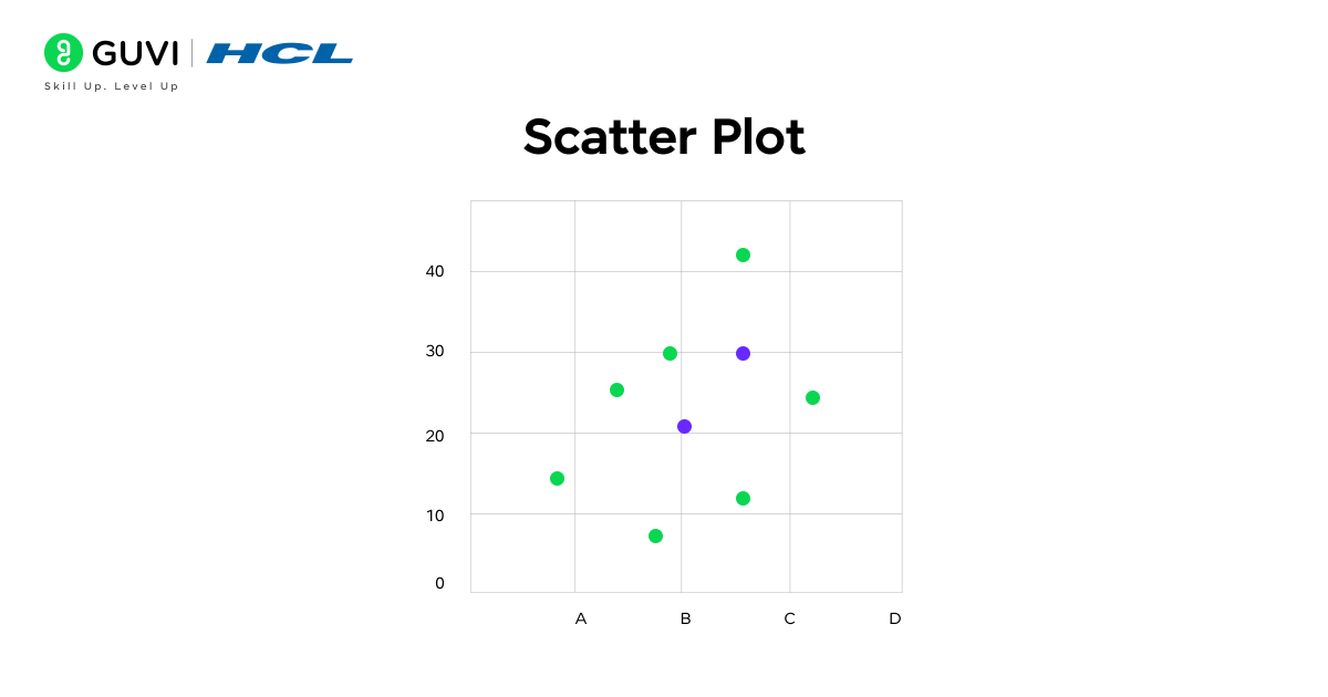
If you want to discover whether two variables are related, a scatter plot makes the connection instantly visible. Plotting data points along the X and Y axes reveals whether it is positively correlated, negatively correlated, or none, which helps identify clusters, trends, or outliers in the data. This makes it a powerful tool for predictive analysis and pattern recognition.

Key functions: Plot individual data points on two axes to show the relationship between variables; identify patterns, trends, or deviations.
Example: Analyzing the relationship between marketing budget and sales revenue.
Features: Reveals correlations and strength of relationships; highlights outliers; widely used in regression analysis and data exploration.
3.4 Pie Chart
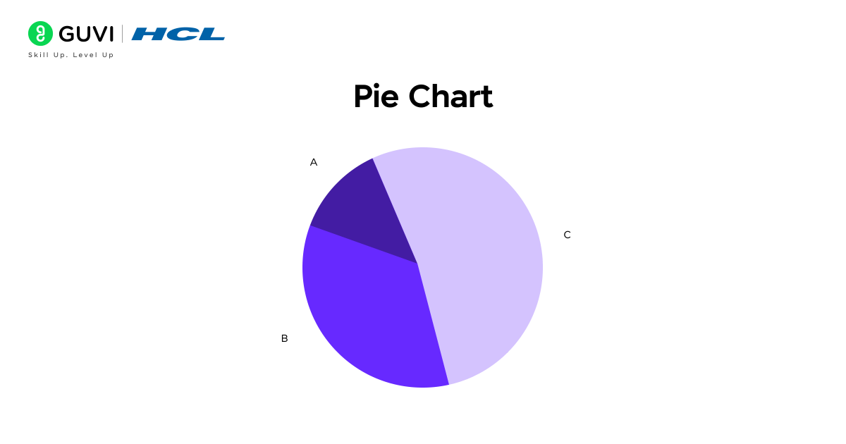
When you need to show how different categories contribute to a whole, a pie chart does it effortlessly through visually distinct slices of a circle. Each slice represents a category’s proportion of the total, making it one of the simplest and most intuitive ways to display percentage-based data. Pie charts are especially useful for comparing parts of a whole when dealing with limited categories.
Key functions: Divides a dataset into circular slices where each slice’s angle or area represents its share of the total.
Example: Visualizing the percentage of users across various social media platforms in a survey.
Features: Easy to understand at a glance, ideal for small datasets, and effectively communicates proportions and category contributions.
Types of Graphs in Statistics: Comparison Table
Each statistical graph answers a different question. Bar charts work well for categorical comparisons, while histograms display numerical distributions. Scatter plots are designed to show relationships between numerical variables.
| Graph Type | Data It Represents | Best Used For | Updated Example |
| Bar Chart | Categorical data with numerical values | Comparing separate categories | Comparing 2025 online sales across product categories |
| Stacked Bar Chart | Categories divided into subgroups | Showing totals and their composition | Comparing subscription revenue across different plans |
| Column Chart | Categories or fixed time periods | Comparing values through vertical bars | Comparing quarterly revenue across company branches |
| Line Graph | Ordered or time-series data | Tracking changes and long-term trends | Monitoring weekly active users throughout 2025 |
| Area Chart | Time-series data with cumulative values | Showing trend and magnitude | Tracking cloud usage across different services |
| Histogram | Continuous numerical data | Understanding frequency and distribution | Analysing delivery times across online orders |
| Box Plot | Continuous numerical data | Comparing spread, median, and outliers | Comparing salary distributions across departments |
| Scatter Plot | Two numerical variables | Identifying relationships or correlations | Comparing digital advertising spend with sales revenue |
| Pie Chart | Categorical proportions | Showing limited categories as parts of a whole | Displaying payment-method preferences from a customer survey |
Real-World Applications of Types of Graphs in Statistics
Statistical graphs help professionals understand information faster and communicate findings clearly.
1. E-Commerce and Retail
Retail teams use bar charts to compare product sales. Line graphs help track orders or website traffic over time. A stacked bar chart can show how product categories contribute to monthly revenue.
2. Healthcare Analytics
Healthcare teams use line graphs to monitor patient measurements over time. Histograms can display the distribution of waiting times or test results. Box plots help compare recovery times across treatment groups.
3. Finance and Investment
Line graphs are commonly used to track prices and financial performance over time. Scatter plots can examine the relationship between risk and return. Area charts can show how different revenue streams contribute to total income.
4. Education
Schools can use bar charts to compare subject performance. Histograms help show how marks are distributed across score ranges. Box plots allow educators to compare the spread of results between classes.
5. Marketing Analytics
Marketing teams use line graphs to monitor website visits and conversions. Scatter plots can help examine the relationship between advertising expenditure and revenue. Pie charts may show survey responses when only a few categories are involved.
6. Manufacturing and Quality Control
Histograms help teams examine variations in product measurements. Box plots can highlight unusual production results. These visuals support early identification of consistency problems.
Tools For Creating Graphs
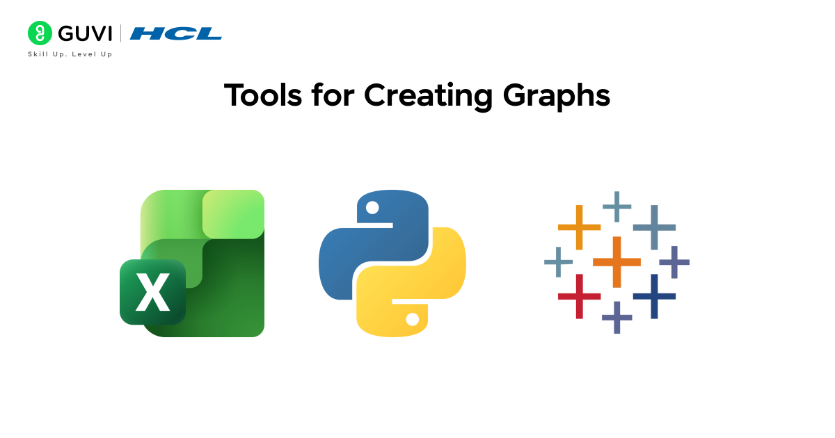
1. Microsoft Excel and Google Sheets
Excel and Google Sheets work well for beginners creating standard charts from smaller datasets.
Google Sheets supports line, area, column, bar, pie, scatter, histogram, and other chart formats.
2. Python Visualization Libraries
Python provides several libraries for statistical visualization:
- Matplotlib: Creates static and customizable plots.
- Seaborn: Builds statistical relationship, distribution, and categorical graphs.
- Plotly: Creates interactive and publication-quality charts.
Current documentation supports charts such as bar plots, scatter plots, histograms, box plots, and distribution plots.
3. R and ggplot2
R remains useful for statistical analysis and academic research. The ggplot2 package builds visualizations by adding data, geometric shapes, scales, and labels to a plot.
4. Tableau and Power BI
Tableau and Power BI are suitable for interactive business dashboards.
Power BI includes visuals for category comparison, trends, distributions, and relationships. Tableau also provides guidance for selecting chart types based on the analytical question.
5. Looker Studio
Looker Studio is a browser-based tool for creating interactive reports and dashboards. It connects with Google Sheets, Google Analytics, BigQuery, and SQL databases.
6. Datawrapper
Datawrapper helps users create clean charts, tables, and maps without coding. It works well for reports, articles, and data-driven storytelling.
7. Flourish
Flourish provides templates for interactive charts, maps, timelines, and visual stories. It is useful for presentations and digital publications.
8. Qlik Sense
Qlik Sense is a business intelligence tool for exploring data and building interactive dashboards. Its associative model helps users find connections across datasets.
9. Apache Superset
Apache Superset is an open-source platform for data exploration and dashboard creation. It connects with several SQL databases and supports multiple chart types.
10. Observable
Observable combines JavaScript-based analysis with interactive visualizations. It works well with libraries such as D3.js and Observable Plot.
11. D3.js
D3.js is a JavaScript library for building highly customized web visualizations. It is best suited for users with coding experience.
12. Grafana
Grafana is commonly used for real-time monitoring dashboards. It works well for time-series data, infrastructure metrics, and application performance tracking.
13. Jupyter Notebook
Jupyter Notebook combines Python code, written explanations, and visualizations in one document. Analysts often use it with Matplotlib, Seaborn, and Plotly.
HCL GUVI’s Data Science eBook is a beginner-friendly roadmap to mastering data science. This helps you learn Python programming, data analysis, visualization, and foundational machine learning concepts through simple explanations, practical examples, and exercises designed to help you apply skills in real-world scenarios.
Conclusion
Understanding the various types of graphs in statistics is essential for making sense of data and drawing accurate insights. By classifying graphs into Comparative, Trend (Time-Series), and Distribution & Relationship categories, beginners can easily select the most appropriate visualization for their dataset. From bar charts and column charts to line graphs, area charts, scatter plots, and pie charts, each graph serves a specific purpose in highlighting patterns, trends, or relationships.
To learn more about applying these concepts in real-world scenarios, join HCL GUVI’s Data Science Course, which covers Python, data analysis, visualization, machine learning, etc, to build hands-on experience and a strong portfolio.
FAQs
How many types of graphs are there in statistics?
Statistics uses many types of graphs depending on the data and purpose. Common examples include bar charts, line graphs, histograms, box plots, scatter plots, pie charts, area charts, and stacked bar charts.
What is the difference between a bar graph and a histogram?
A bar graph compares separate categories, while a histogram shows the distribution of continuous numerical data. Bar graphs usually have gaps between bars, whereas histogram bars typically touch because they represent continuous intervals.
Which graph is best for showing trends over time?
A line graph is usually the best choice for showing trends over time. It connects data points across ordered periods, making increases, decreases, and fluctuations easier to identify.
When should you use a scatter plot?
Use a scatter plot when you want to examine the relationship between two numerical variables. It can reveal positive or negative correlations, clusters, patterns, and possible outliers.
Which graph is best for comparing categories?
A bar graph is generally best for comparing values across different categories. Its separate bars make differences between groups easy to identify and interpret.
What is the difference between a graph and a chart?
A graph usually focuses on numerical relationships and often uses axes to display values. A chart is a broader term that includes visual formats such as pie charts, bar charts, and other graphical representations of data.
How do you choose the correct graph for data?
Start by identifying the type of data and the question you want to answer. Use bar charts for category comparisons, line graphs for trends, histograms for distributions, and scatter plots for relationships between numerical variables.
Success Stories

About the Author
Vaishali
I'm a seasoned writer with four years of experience across technical, non-technical, and just about every genre or niche you can imagine. Adaptable and curious, I enjoy exploring new topics and making information engaging and easy to understand. Fueled by a steady stream of tea, I approach each project with creativity, reliability, and genuine enthusiasm for storytelling.
View all posts by Vaishali
Connect with me @












Did you enjoy this article?