
What is Data Visualization? Definition, Types, and Examples
Feb 20, 2026 4 Min Read 23074 Views
(Last Updated)
Data plays a crucial role in today’s data-driven world. Millions and trillions of data points are generated on a daily basis. Thus, understanding and managing vast amounts of data becomes challenging. Hence, various modern methods are implemented to process this data and drive meaningful outcomes. This is where data visualization comes into play.
If you do not know what data visualization is, worry not! Businesses very often use this method and make data-driven choices. This article covers data visualization types and the tools required. Also, we’ll read about a few examples where data visualization techniques are used to get data-driven insights. Let’s explore them:
Table of contents
- What is Data Visualization?
- Why is Data Visualization Important?
- Types of Data Visualization
- What are the Steps in the Data Visualization process?
- Define the Goal
- Collect the data
- Clean the data
- Select the data visuals
- 5) Create the data visuals
- Examples of Data Visualization
- Sales Numbers for Different Products
- Stock Prices Over a Year
- Market Share of Different Companies
- Relationship Between Height and Weight
- Distribution of Exam Scores
- Correlation Matrix Between Variables
- Comparison of Test Scores Across Different Classes
- Tools for Data Visualization
- Final Words
- FAQs
- What is data visualization, and its types?
- What are the three types of visualization?
- What are some examples of data visualization?
- What are the three main goals of data visualization?
What is Data Visualization?
Data Visualization is the process of using visual elements such as maps, graphs, or charts to represent data. It translates complex, high-volume, or numerical data into a visual representation that is easy to process. It provides a clear, concise, and easily understandable way to transform complex data into an accessible manner.
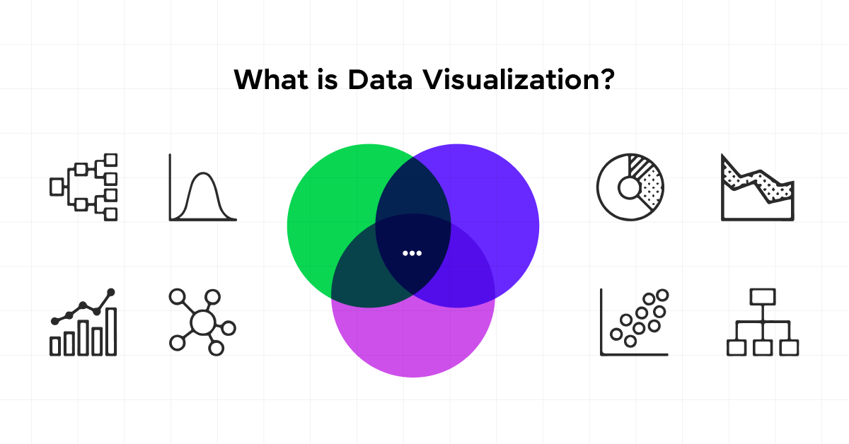
By employing various visualization techniques, patterns, trends, and correlations within the data become more apparent, aiding in better decision-making and analysis. Data visualization aims to help drive informed decision-making and add colorful meaning to an otherwise bland database.
Before we move into the next section, ensure you have a good grip on data science essentials like Python, MongoDB, Pandas, NumPy, Tableau & PowerBI Data Methods. If you are looking for a detailed course on Data Science, you can join HCL GUVI’s Data Science Course with Placement Assistance. You’ll also learn about the trending tools and technologies and work on some real-time projects.
Additionally, if you want to explore Python through a self-paced course, try HCL GUVI’s Python course.
Why is Data Visualization Important?
Data visualization is one of the important techniques used by various sectors. Modern businesses typically process large volumes of data from various data sources through data visualization. These data sources could be:
- social media
- smart devices
- websites
- Internal data collection systems
Data Visualization is important for multiple reasons, including the following:
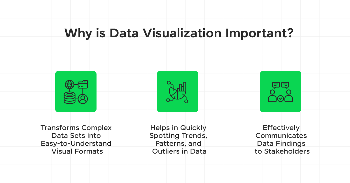
- It transforms complex data sets into easy-to-understand visual formats, making it easier to comprehend large volumes of information.
- Visualization helps in quickly spotting trends, patterns, and outliers in data, which might be missed in raw data formats.
- Interactive visualizations enable users to explore the data in depth, discovering insights through dynamic filtering and analysis.
- It effectively communicates data findings to stakeholders, allowing for better collaboration and understanding among team members and clients.
- When the data becomes accessible, it means you have more opportunities to explore, collaborate, and inform actionable decisions.
Types of Data Visualization
Let’s explore the types of data visualization used in data science:
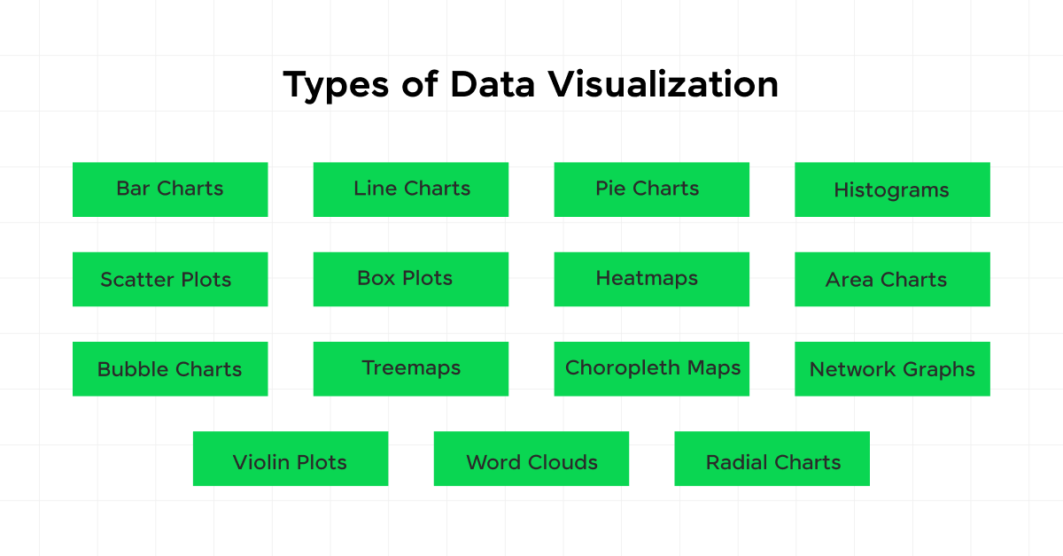
- Bar Charts: Used to compare quantities across different categories. They can be vertical or horizontal.
- Line Charts: Ideal for showing trends over time, they connect data points with a continuous line.
- Pie Charts: Represent parts of a whole, showing percentage or proportional data.
- Histograms: Display the distribution of a dataset and are used to show the frequency of data points within certain ranges.
- Scatter Plots: Show the relationship between two variables and help identify correlations or patterns.
- Box Plots: Provide a summary of a set of data values, including the median, quartiles, and potential outliers.
- Heatmaps: Use color to represent data values in a matrix format, useful for visualizing the magnitude of data points and identifying patterns.
- Area Charts: Similar to line charts but with the area below the line filled in, useful for showing cumulative totals over time.
- Bubble Charts: Extend scatter plots by adding a third variable, represented by the size of the bubbles.
- Treemaps: Display hierarchical data as nested rectangles, with the size and color representing different variables.
- Choropleth Maps: Use color shading to represent data values across geographical regions, useful for visualizing spatial distributions.
- Network Graphs: Visualize relationships between entities, with nodes representing entities and edges representing connections.
- Violin Plots: Combine box plots and kernel density plots to show data distributions, useful for comparing distributions between different groups.
- Word Clouds: Display the frequency of words in a text dataset, with the size of each word indicating its frequency.
- Radial Charts: Also known as spider or radar charts, they display multivariate data in a circular format, useful for comparing multiple variables.
What are the Steps in the Data Visualization process?
Data visualization is a technique to visualize data in various forms, and thus it includes multiple steps to be followed. Let’s discuss those steps:
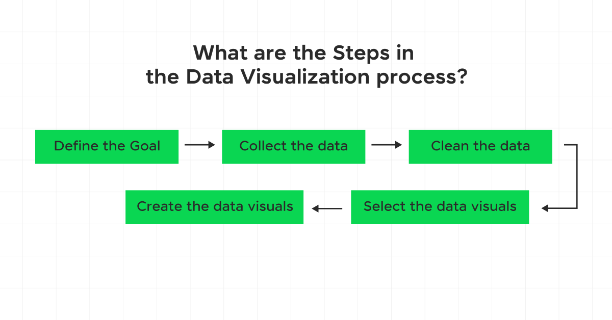
1. Define the Goal
You can define a data visualization goal by identifying questions that your existing dataset can potentially answer. A clear goal helps determine the type of:
- The data you use
- Analysis you do
- Visuals you use to communicate your findings effectively
For example, a retailer may seek to understand which type of product packaging gets the most sales.
2. Collect the data
Data collection involves identifying internal and external data sources. There are massive datasets available online for purchase and use. Your company may also have existing data archives available for analytics.
For example, you could collect historical sales volume, marketing campaigns, and product packaging data to find the best packaging.
3. Clean the data
Data cleaning involves removing redundant data, performing mathematical operations for further analysis, or filtering and converting data to meet the question criteria. For instance, you may remove sales volume data from the holiday months and after marketing campaigns to identify average sales by packaging type.
4. Select the data visuals
You can choose from several different chart types for efficient visual discovery. Relationships between the data points and the insights you want to communicate will determine the best graphical representations. For example, you may use a bar graph to represent packaging sales by color in the last month. However, a pie chart may be better suited to show the percentage of colored packaging in your inventory. There are two main types of data visualizations.
a) Static visualization
A static visualization provides only a single view of a specific data story. An infographic is an example of a static visualization.
b) Interactive visualization
Interactive visualization allows users to interact with graphs and charts. Viewers can change variables in visualization parameters to find new insights or access in-depth information. Data visualization software typically includes a dashboard for user interaction with the system.
5) Create the data visuals
You can create the data visuals you need by using data visualization tools. Most tools import your final dataset and automatically generate the required reports. Some design principles for effective data visualization include the following:
- Draw audience attention to important details using sizes, colors, fonts, and graphics
- Provide context to data using visual cues
- Choose the right color combinations
- Use explanatory titles to provide key insights to the audience and help them focus on the right questions
- Add clear labels and numbers
You should also have a look at Power BI Developer 2025: Career, Skills, Role, Salary, Scope if you’re interested in this.
Examples of Data Visualization
Now, let’s look at some of the examples of data visualization:
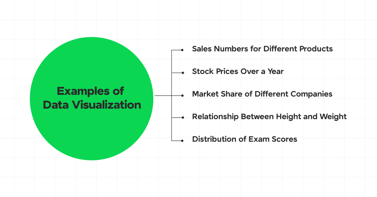
1. Sales Numbers for Different Products
- Visualization: Bar Chart
- Description: Compare the sales of multiple products by representing each product with a bar whose length corresponds to its sales figures.
2. Stock Prices Over a Year
- Visualization: Line Chart
- Description: Show the fluctuation of stock prices over a year by connecting data points representing the price at different times.
3. Market Share of Different Companies
- Visualization: Pie Chart
- Description: Illustrate the proportion of market share held by each company using slices of a pie, where each slice size is proportional to the company’s market share.
4. Relationship Between Height and Weight
- Visualization: Scatter Plot
- Description: Display the relationship between individuals’ heights and weights by plotting data points on a graph where one axis represents height and the other represents weight.
5. Distribution of Exam Scores
- Visualization: Histogram
- Description: Show how exam scores are distributed across different ranges by using vertical bars, where the height of each bar indicates the number of scores within that range.
6. Correlation Matrix Between Variables
- Visualization: Heatmap
- Description: Visualize the correlation between different variables by using a grid of colored cells, where the color intensity represents the strength of the correlation.
7. Comparison of Test Scores Across Different Classes
- Visualization: Box Plot
- Description: Summarize the distribution of test scores for different classes by showing the median, quartiles, and any outliers using a box and whiskers.
Tools for Data Visualization
To work on the data visualization process, data scientists use some specific tools that help in visualizing the data efficiently. Let’s look at some of the top data visualization tools you should know:
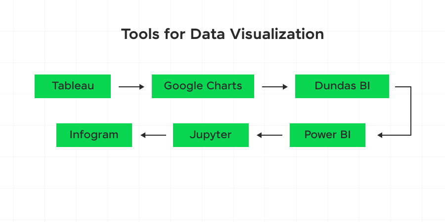
- Tableau
- Google Charts
- Dundas BI
- Power BI
- Jupyter
- Infogram
- ChartBlocks
- D3.js
- FusionCharts
- Grafana
Kickstart your career by enrolling in HCL GUVI’s Business Analytics and Digital Marketing Course, where you will master technologies including Power BI, Excel, SQL, Tableau, and Data Visualization, and build interesting real-life business analytics projects. Alternatively, if you would like to explore Python through a self-paced course, try HCL GUVI’s Python course.
Final Words
Now that you have a clear idea of the definition of data visualization, its types, and its importance, you have a basic idea of what it is. The steps in the data visualization process, with examples and tools, will give you an understanding of the tools required to visualize data and use it efficiently.
FAQs
What is data visualization, and its types?
Data visualization is the graphical representation of data using common graphics, such as plots, charts, infographics, and animations. These visual displays help in converting complex data into easy, data-driven insights.
What are the three types of visualization?
The three types of data visualization are graphs, charts, and maps. You can work on insights and storytelling. and take help in decision-making using the right type of data visualization.
What are some examples of data visualization?
Some of the sectors that include examples of data visualization are:
Finance,
Marketing,
Health Policy,
and many more.
What are the three main goals of data visualization?
The three main goals of data visualization are:
1) to help organizations and individuals explore,
2) monitor,
3) and explain insights within the data.







Did you enjoy this article?