

UI/UX Designing Articles
What is Design Thinking? A Complete 2026 Guide to the Process, Methodology, and Real Best Examples
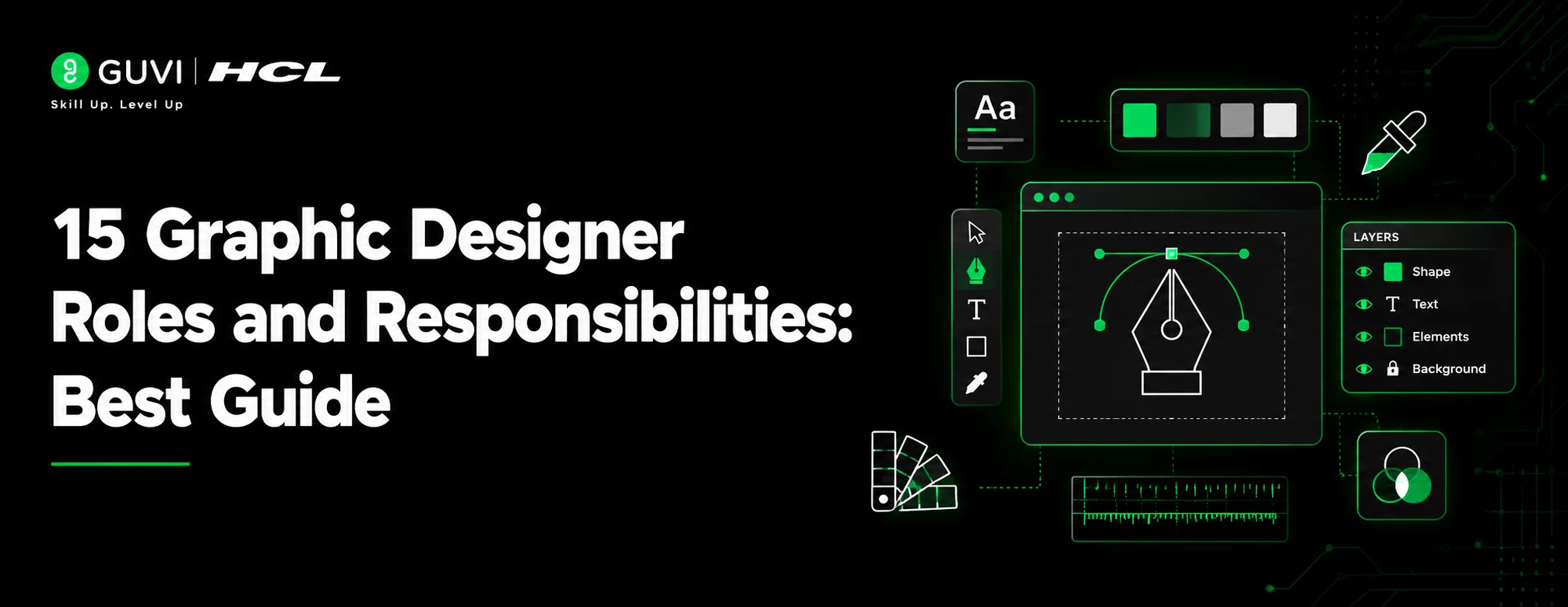
15 Graphic Designer Roles and Responsibilities: Best guide


Get In Touch For Details! Request More Information
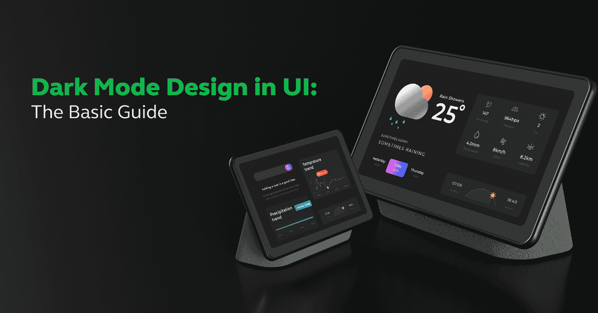
Dark Mode Design in UI: The Basic Guide
Oct 28, 2025 3 Min Read 8117 Views
(Last Updated)
According to several reports, 60-80% (approx.) of people prefer using dark mode design on their devices. Now with that huge amount of data, you need to build your application in such a way that users get the option to switch between dark mode and light mode.
Every one of us spends the majority of our time using smart devices and while using it, we prefer going for dark mode design. Switching to dark mode while using applications is very common and thus, people who are interested to know about how to implement them in applications must know the basics.
In this blog, we’ll be reading the basics of dark mode design. We’ll cover the basics yet important aspects required for you to know about dark mode design. General questions like – how dark mode design helps you improve your application’s visibility will also be answered. Let’s begin.
Table of contents
- What is Dark Mode Design?
- Tips for Creating Dark Mode Design
- Why to Use Dark Mode Design: Top Reasons
- Examples of Dark Mode Design
- Conclusion
- FAQs
- Q1. What is the aesthetic of dark mode?
- Q2. What is dark mode UI?
- Q3. What colors are used for the dark theme?
- Q4. What are the benefits of dark mode in design?
What is Dark Mode Design?
Dark Mode Design was introduced by Microsoft in the Anniversary Update of Windows 10 in 2016. In 2018, Apple followed in macOS Mojave. In September 2019, iOS 13 and Android 10 both introduced dark modes. It is the usage of a low-light (grey/black) user interface (UI) as the primary background color of an application.

It is not a new concept, it has existed since monochrome monitors used to display green text over a black background to reduce power consumption and heat generation of the devices. With the advancement in user experiences, dark mode design has made a comeback and rise.
The demand for dark themes increased among users of websites and applications. With the benefits like larger battery life, less eye strain, and accessibility issues, the dark mode theme gained more popularity.
Some of the examples that you can observe daily are Google, Instagram, WhatsApp, and many more, which have switched to dark mode design and provide users an option to switch between light and dark themes.
Also Read: What is UI/UX? Top Things to Know in 2025
As we proceed to the next phase, make sure you understand the fundamentals of UI/UX, which includes heuristic analysis, journey maps, testing, etc. If you want to explore more about it, join HCL GUVI’s UI/UX Course with Placement Assistance. You’ll also learn about the tools used in UI/UX which are AdobeXD, Illustrator, Photoshop, Figma, and many more. Build some amazing real-time projects to get hands-on experience.
Also, if you want to explore Figma through a Self-paced course, try HCL GUVI’s Figma certification course.
Tips for Creating Dark Mode Design
Now that you have understood dark mode design, let’s read about some of the tips which you can follow while implementing it:
1. To improve the readability of text and content and accessibility, you should use a better dark tone, instead of black.
2. Use only a limited number of colors and proportionally to avoid clutter.
3. You should also follow the standards of the WCAG (Web Content Accessibility Guidelines) to ensure adequate contrast between text and background colors.
4. The text size should be in readable format. Also, it is advised to get the text sizes from the device’s default settings to automatically accommodate the user’s preferences.
5. It is also advised to get feedback from users to assess the quality of your dark theme. Collect input from various sources and can improve based on them.
6. Test your dark theme UI on various screens and devices and make sure it responds favorably.
Not just the 10 Skills Required to Become a UI/UX Designer, you must also follow a complete roadmap or guide to get into the UI/UX journey.

Why to Use Dark Mode Design: Top Reasons
There are many benefits which state the reasons why you should use dark mode design for your application. Let’s discuss a few of them:
- Saves the battery life.
- Less strain on eyes/comfortable on eyes.
- Gives users the option to switch between dark mode and light mode.
- Increases brand’s value.
- Enhances aesthetics.
- Increases user satisfaction.
Find Out 14 Best AI Image Generator Tools
Examples of Dark Mode Design
It becomes very important to see some live examples of dark mode design to visualize how it looks when implemented:

1. Google Chrome: Google Chrome’s dark mode extends the dark theme to the browser interface, including the tabs and settings. It complements dark-themed websites and reduces eye strain during browsing.
2. Instagram: Instagram’s dark mode presents a black background with white text and icons. This design enhances the visibility of images and content while reducing the overall brightness of the interface.
3. YouTube: YouTube’s dark mode replaces the standard white background with a dark gray or black background. This reduces glare and is easier on the eyes, especially during extended viewing sessions.
4. Twitter: Twitter offers a dark mode option that transforms the interface into a dark blue background with lighter text and elements. This design reduces eye strain in low-light environments.
5. Netflix: Netflix’s dark mode helps users spend quality time watching their favorite shows without affecting their eyes. This dark mode design enhances the product’s appearance and visibility.
Kickstart your UI/UX journey by enrolling in HCL GUVI’s UI/UX Course where you will master technologies like AdobeXd, Illustrator, and Figma, and build interesting real-life UI/UX projects.
Alternatively, if you would like to explore Figma through a Self-paced course, try HCL GUVI’s Figma certification course.
Conclusion
Dark mode design comes with a lot of benefits, especially to visually impaired ones. It relaxes your eyes from glaring and thus, you do your work smoothly. According to data, 81.9% of people of smartphone users use dark mode.
Now that you’ve learned the basics about dark mode design, designers must start implementing them on their website so that users get an option to switch between the two- dark mode and light mode. It will not only impress your user but will also allow you to outstand your product from others in the market.
Also Know About Animation in UI/UX: Captivating Designs Through Motion
FAQs
Q1. What is the aesthetic of dark mode?
Dark mode has gained a lot of popularity because of its modern aesthetic. The darker color palette gives a sense of elegance and sophistication, which enhances the overall look of an application.
Q2. What is dark mode UI?
A dark mode UI displays the background of the application as a dark surface. It reduces the luminance emitted by device screens while meeting minimum color contrast ratios.
Q3. What colors are used for the dark theme?
The dark theme by Google’s Material Design recommends using dark gray (#121212) as a dark theme surface color “to express elevation and space in an environment with a wider range of depth.”
Q4. What are the benefits of dark mode in design?
There are lots of benefits to using dark mode in design, especially for visual impairments. It ensures content is accessible to a broader audience, which also aligns with the inclusive design principles.
Success Stories

About the Author
Isha Sharma
I’m a versatile technical content writer with over 3.5 years of experience in technical writing and 1 year of experience in web development. My specialized domains are web development, AWS, cloud computing, etc. I have written over 250+ SEO-optimized technical articles.
View all posts by Isha Sharma
Connect with me @


Did you enjoy this article?