Getting Started with Matplotlib: Fundamentals Explained
Sep 10, 2025 2 Min Read 2875 Views
(Last Updated)
Matplotlib is one of the Python libraries that is open source and is used to visualize data in the form of charts, graphs, plots, etc. The graphical output is easy to observe and understand by any user.
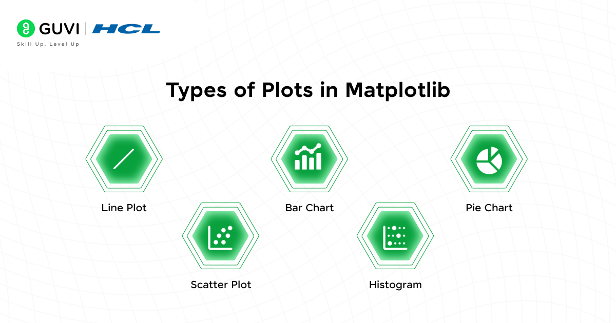
Here in this blog, we’re learning the basics of this data visualization library, which covers fundamental features such as line plots, scatter plots, histograms, pie charts, and bar graphs.
Table of contents
- Getting started with Matplotlib
- Installing Matplotlib
- Check Version
- Import pyplot
- Types of Plots in Matplotlib
- Line Plot
- Scatter Plot
- Bar Chart
- Histogram
- Pie Chart
- Conclusion
Getting started with Matplotlib
Before moving into the coding part, let us learn about pyplot. pyplot, an application interface (API), is a submodule of Matplotlib in the Python library that allows us to make changes to figures, such as creating labels, the style of our plots, representing in various colors, etc.
Installing Matplotlib
Using pip: Open the command prompt → type the below command.
| pip install matplotlib |
Using Anaconda: Open the Anaconda prompt → type the below command.
| conda install matplotlib |
Check Version
After successfully installing matplotlib, check the version by executing the command given below to verify the installation.
| import matplotlib print(matplotlib.__version__) |
Import pyplot
Import pyplot from Matplotlib by executing the command given below.
| from matplotlib import pyplot |
Let’s walk through the types of plots along with the example program.
Interested in learning more about Python programming? HCL Guvi provides an IIT-Madras-certified Full Stack Development Course. This is an online bootcamp that covers all the necessary skills required for a full-stack developer. This bootcamp follows a detailed roadmap and an updated curriculum with AI tools.
Types of Plots in Matplotlib

1. Line Plot
A line plot is a type of plot that represents the data as dots and is connected by line segments.
Example: In the below code, we are plotting (0,0) and (6,100) using a numpy array.
| from matplotlib import pyplot as plt import numpy as np x=np.array([0,6]) y=np.array([0,100]) plt.plot(x,y) plt.show() |
Output:
2. Scatter Plot
A scatter plot is a type of plot that displays the correlation between two variables.
Example: Let us take a simple example of a weather plot with day and temperature.
| day=[1,2,3,4,5,6,7] temp=[50,30,20,80,70,45,55] plt.title(“Weather plot”) plt.xlabel(‘day’) plt.ylabel(‘temperature’) plt.scatter(day,temp,color=’y’,s=100) #s-size of the plot plt.figure(figsize=(3,3),dpi=100) #canvas size can be modified,dpi-resolution can be fixed plt.show() |
Output:
3. Bar Chart
A Bar chart is a type of graph that represents categorical data using rectangular bars.
Example 1: Let us take a simple example of subjects and marks.
| x=np.array([“Language”, “English”, “Maths”, “Science”, “SocialScience”]) y=np.array([60,95,40,85,98]) plt.bar(x,y,width=0.5,color=”m”) #width-width of the bar plt.title(“Subject-Marks”) plt.xlabel(‘Subjects’) plt.ylabel(‘Marks’) plt.show() |
Output:
Example 2: The same graph can be represented horizontally, and we can add a grid (that can be used in any type of plot according to our preferences) to better understand these plots.
| x=np.array([“Language”,”English”,”Maths”,”Science”,”SocialScience”]) y=np.array([60,95,40,85,98]) plt.grid(color=”r”,ls=”–“,lw=0.5) #grid properties plt.title(“Subject-Marks”) plt.xlabel(‘Subjects’) plt.ylabel(‘Marks’) plt.barh(x,y,color=”y”) #barh-hoizontal view plt.show() |
Output:
4. Histogram
A histogram is a type of graphical representation that groups the data into ranges.
Example: For better understanding, let’s take the random variables using the numpy array, also here we use the hatch function to fill the plot space with patterns.
| x=np.random.normal(100,10,50) plt.title(“Histogram”) plt.xlabel(‘x axis’) plt.ylabel(‘y axis’) plt.hist(x,color=”w”,hatch=”*”) #hatch is used to fill the bar space plt.show() |
Output:
5. Pie Chart
A Pie chart is a circular graphical representation that divides the data into slices.
Example: For better understanding, let’s take the same example of the subject and marks which we’ve used in the example of the bar chart.
| sub=np.array([“Language”,”English”,”Maths”,”Science”,”SocialScience”]) marks=np.array([60,95,40,85,98]) plt.pie(marks,labels=sub) plt.show() |
Output:
Conclusion
Matplotlib is a foundational library in the Python data visualization ecosystem, offering flexibility and control for creating a wide range of static, animated, and interactive plots. We also covered the most commonly used plot types, such as line plots, bar charts, scatter plots, histograms, and pie charts. These are the basic plots we need to know before moving advanced into it. Happy learning!


Did you enjoy this article?