


Data Science Articles
Accountant vs Data Analyst Salary in India After Switching Careers - Best Guide
Finance Managers: Could Data Science Be Your Next Career Move?
Insurance Claims Executive to Data Analyst: Is It a Good Switch?
Banking Executive (Loans, KYC) to Data Analyst: Skills and Career Path


Get In Touch For Details! Request More Information
Descriptive Statistics: Definition, Overview, Types, and Examples
Oct 16, 2026 8 Min Read 12959 Views
(Last Updated)
Every chart you’ve ever seen in a news article, every “average salary” figure, every “most common answer” in a survey, all of it comes from one branch of statistics doing the quiet work behind the scenes.
Descriptive statistics is the branch of statistics that summarizes, organizes, and presents the key features of a dataset, without making predictions beyond it. It answers “what does my data look like?” using measures like mean, median, mode, and standard deviation.
This guide covers the core measures, how it differs from inferential statistics, how to calculate it in Python and Excel, and where it’s used in business, healthcare, and beyond, built for students, analysts, and anyone starting out in data science.
Table of contents
- Understanding Descriptive Statistics
- Key Components
- Importance in Data Analysis
- Descriptive Statistics vs Inferential Statistics: What's the Difference?
- Types of Descriptive Statistics
- A) Frequency Distribution
- B) Central Tendency
- C) Variability
- Skewness and Kurtosis: Understanding Distribution Shape
- Univariate vs. Bivariate
- Univariate Analysis
- Bivariate Analysis
- Visualizing Descriptive Statistics
- Histograms
- Box Plots
- Scatter Plots
- Bar Charts
- How to Calculate Descriptive Statistics in Python and Excel
- Applications of Descriptive Statistics
- Business and Finance
- Healthcare and Medicine
- Education
- Social Sciences
- Descriptive Statistics Cheat Sheet: Key Formulas at a Glance
- Common Mistakes to Avoid When Using Descriptive Statistics
- Concluding Thoughts...
- FAQs
- What is descriptive statistics and its types?
- What is the overview of statistics?
- What is the main purpose of descriptive statistics?
- Who is the father of statistics?
Understanding Descriptive Statistics
Descriptive statistics is a branch of statistics that helps you summarize, organize, and present data in a meaningful and concise way. Its primary goal is to provide a clear summary of a dataset’s main features and characteristics.
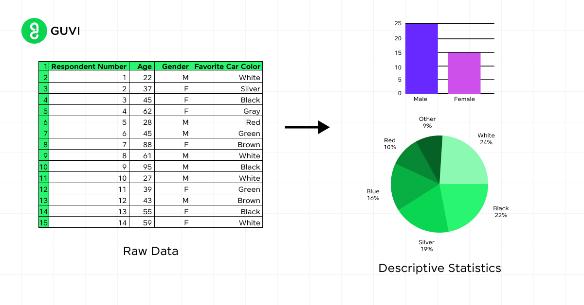
When you use descriptive statistics, you’re not making generalizations or inferences about a larger population. Instead, you’re focusing on describing and analyzing the data you have at hand.
Key Components
To get a comprehensive view of your data, descriptive statistics employs several key components:
- Measures of Central Tendency: These include the mean, median, and mode, which give you an idea of the average or typical value in your dataset.
- Measures of Variability: These show how spread out your data is and include the range, variance, and standard deviation.
- Distribution Shape: This looks at aspects like skewness and kurtosis to understand how your data is distributed.
- Graphical Representations: Charts, graphs, and tables help you visualize your data. Common types include histograms, bar charts, pie charts, scatter plots, and box plots.
Importance in Data Analysis
Descriptive statistics plays a crucial role in data analysis by:
- Providing basic information about variables in your dataset
- Highlighting potential relationships between variables
- Giving you a clear picture of what your current data shows
It’s important to note that descriptive statistics only make statements about the dataset you’re analyzing. They don’t go beyond your data or make projections. However, they do provide a solid foundation for further statistical analysis and decision-making processes.
Descriptive Statistics vs Inferential Statistics: What’s the Difference?
This is one of the most common points of confusion for beginners, so it’s worth clearing up directly before going further.
| Aspect | Descriptive Statistics | Inferential Statistics |
|---|---|---|
| Purpose | Summarizes and describes the data you already have | Makes predictions or generalizations about a larger population |
| Scope | Limited strictly to the dataset at hand | Extends conclusions beyond the sample to the population |
| Common methods | Mean, median, mode, standard deviation, frequency distribution | Hypothesis testing, confidence intervals, regression, ANOVA |
| Typical statement | “The average test score in this class was 78%” | “Based on this sample, the average score across all classes is likely between 75% and 81%” |
| When to use | Exploring and summarizing a dataset | Drawing conclusions or making predictions from a sample |
In short: descriptive statistics describes what you’re looking at; inferential statistics uses that description to make an educated guess about something bigger. Most data analysis projects use both, descriptive statistics first to understand the data, then inferential methods to test hypotheses about it.
Before we move into the next section, ensure you have a good grip on data science essentials like Python, MongoDB, Pandas, NumPy, Tableau & PowerBI Data Methods. If you are looking for a detailed course on Data Science, you can join HCL GUVI’s Data Science Course with Placement Assistance. You’ll also learn about the trending tools and technologies and work on some real-time projects.
Additionally, if you want to explore Python through a self-paced course, try HCL GUVI’s Python Certification course.
Types of Descriptive Statistics
Descriptive statistics allow you to characterize your data based on its properties. There are four major types of descriptive statistics that help you summarize and interpret numerical information effectively.
A) Frequency Distribution
A frequency distribution describes the number of observations for each possible value of a variable. It’s the most basic way to present a distribution, typically listing values from lowest to highest.
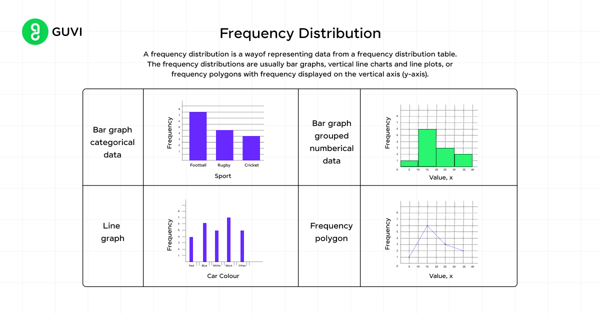
You can display frequency distributions using:
- Frequency tables: Two-column tables showing values and their frequencies
- Graphs: Pie charts, bar charts, and histograms
There are four types of frequency distributions:
- Ungrouped frequency distributions
- Grouped frequency distributions
- Relative frequency distributions
- Cumulative frequency distributions
B) Central Tendency
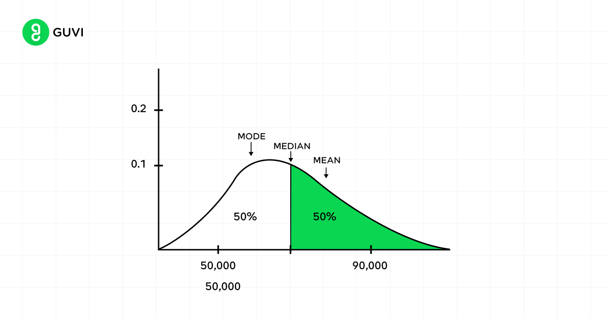
Measures of central tendency help you find the middle or average of a dataset. The three most common measures are:
- Mode: The most frequent value in a dataset
- Median: The middle number in an ordered dataset
- Mean: The sum of all values divided by the total number of values
These measures attempt to describe what a typical data point might look like. The mean is the most commonly used measure of central tendency.
Measures of Central Tendency
1. Mean
The mean, often referred to as the average, is the sum of all observations divided by the total number of observations. It’s represented by the formula:
x̄ = (1/n) × Σ(xi)
Where n is the number of observations and xi represents each individual value.
For example, if you have salaries of ₹50,000, ₹55,000, and ₹60,000, the mean would be:
(₹50,000 + ₹55,000 + ₹60,000) / 3 = ₹55,000
The mean is sensitive to extreme values, which can skew your results. In such cases, you might consider using a trimmed mean, which removes a certain percentage of the highest and lowest values before calculating.
2. Median
The median is the middle value when your data is arranged in order. To find it:
- Sort your data from lowest to highest.
- For an odd number of observations, select the middle number.
- For an even number, take the average of the two middle numbers.
The median is less affected by outliers than the mean, making it useful for skewed distributions. For instance, in income data, extremely high earners can significantly pull up the mean, while the median gives a better representation of a typical income.
3. Mode
The mode is the value that appears most frequently in your dataset. A distribution can have one mode (unimodal), two modes (bimodal), or multiple modes (multimodal). Some datasets may not have a mode at all.
For example, in the set {2, 3, 3, 4, 5, 5, 5, 6}, the mode is 5. The mode is particularly useful for categorical data where calculating a mean or median doesn’t make sense.
C) Variability
Variability refers to the spread of scores in a distribution. It helps you understand how spread out your data is from the central tendency. Common measures of variability include:
- Range: The difference between the largest and smallest values
- Interquartile Range (IQR): The range of the middle 50% of scores
- Variance: The average squared difference of scores from the mean
- Standard Deviation: The average amount by which scores differ from the mean
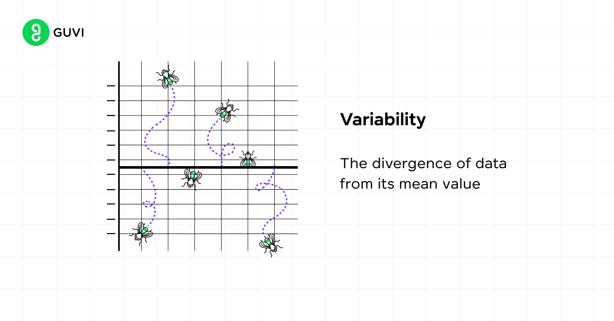
Measures of Variability
1. Range
The range is the simplest measure of variability, calculated by subtracting the lowest value from the highest value in your dataset. For example, if you have a dataset of exam scores ranging from 65 to 98, the range would be 33 points.
It’s sensitive to outliers and doesn’t tell you much about how the data is distributed between the extremes.
2. Variance
Variance measures how far each number in the set is from the mean. The formula for variance is:
σ² = Σ(x − μ)² / N
Where σ² is the variance, x represents each value in the dataset, μ is the mean, and N is the number of values. A larger variance indicates that your data points are further from the mean and from each other. Its squared units can make interpretation challenging.
3. Standard Deviation
To address the interpretation issue of variance, you can use standard deviation, the square root of the variance, which brings the measure back to your original units:
σ = √(Σ(x − μ)² / N)
For example, if the mean height in a group is 170 cm with a standard deviation of 5 cm, most heights fall within 5 cm above or below 170 cm.
4. Interquartile Range (IQR)
The interquartile range focuses on the middle 50% of your data, making it resistant to outliers. You first find the first quartile (Q1, 25th percentile) and the third quartile (Q3, 75th percentile). The IQR is then:
IQR = Q3 − Q1
This measure is particularly useful for skewed distributions where the mean and standard deviation might be misleading, and it’s often used in box plots to visualize data spread.
Skewness and Kurtosis: Understanding Distribution Shape
Central tendency and variability tell you where your data sits and how spread out it is, but they don’t tell you the shape of that spread. That’s what skewness and kurtosis are for.
Skewness measures how asymmetric your distribution is:
- Positive (right) skew: the tail stretches to the right, and the mean sits higher than the median. Income data is a classic example, since a few very high earners pull the mean up.
- Negative (left) skew: the tail stretches to the left, and the mean sits lower than the median. Age at retirement in a workforce often looks like this.
- Zero skew: the distribution is symmetric, like the classic bell-shaped normal distribution, where the mean and median are roughly equal.
Kurtosis measures how heavy the tails of your distribution are, which tells you how likely extreme values (outliers) are:
- Leptokurtic (kurtosis > 3, or excess kurtosis > 0): heavy tails, more outliers than a normal distribution. Stock market returns often show this.
- Platykurtic (kurtosis < 3, or excess kurtosis < 0): light tails, fewer extreme outliers than normal.
- Mesokurtic (kurtosis ≈ 3, or excess ≈ 0): tails behave like a standard normal distribution.
Why this matters practically: if you only look at the mean and standard deviation of a highly skewed or heavy-tailed dataset, you can seriously misjudge what “typical” actually looks like. Always plot your data (a histogram takes seconds) before trusting summary numbers alone.
Univariate vs. Bivariate
Univariate Analysis
When you’re dealing with descriptive statistics, univariate analysis is the simplest form you’ll encounter. It involves examining a single variable at a time, allowing you to summarize and describe the distribution of that variable without considering relationships with other factors.
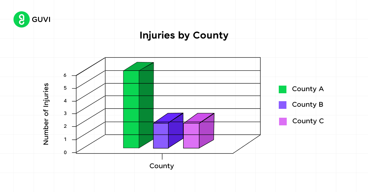
In univariate analysis, you focus on measures such as:
- Central tendency (mean, median, mode)
- Dispersion (range, standard deviation, variance)
- Distribution shape (skewness, kurtosis)
To visualize univariate data, you can use tools like histograms, box plots, or violin plots.
Bivariate Analysis
Bivariate analysis takes your statistical exploration a step further by examining the relationship between two variables, letting you understand how changes in one variable might correspond to changes in another.
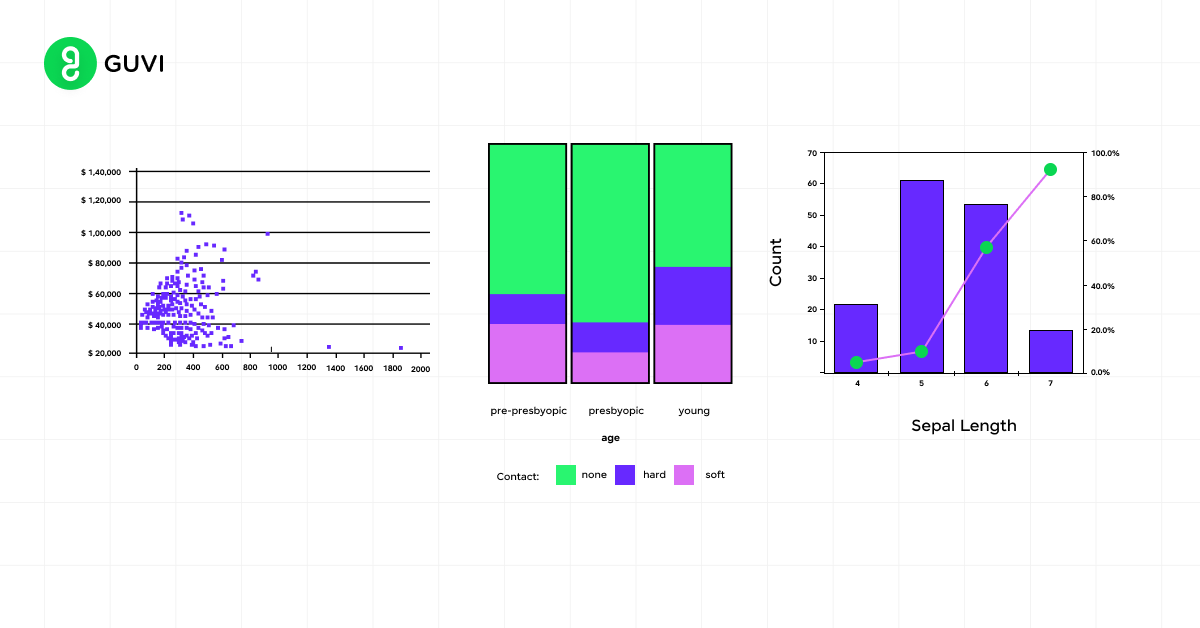
Key aspects of bivariate analysis include:
- Identifying relationships (positive, negative, or no clear pattern)
- Measuring correlation strength
- Visualizing data using scatter plots
The correlation coefficient, ranging from -1 to 1, quantifies the strength and direction of the linear relationship between your two variables.

Comparing the Two Approaches
To better understand the differences between univariate and bivariate analysis, consider this comparison:
| Aspect | Univariate | Bivariate |
| Variables | One | Two |
| Focus | Distribution and summary of a single variable | Relationship between two variables |
| Common visualizations | Histograms, box plots | Scatter plots, regression plots |
| Key statistics | Mean, median, mode, standard deviation | Correlation coefficient |
| Hypothesis testing | Simple hypotheses about a single variable | Hypotheses about associations between variables |
By using both univariate and bivariate analyses, you gain a comprehensive understanding of your data, from individual variable characteristics to potential relationships between variables. Learn more through data analytics projects.
Visualizing Descriptive Statistics
When you’re working with descriptive statistics, visualizing your data can provide valuable insights. Let’s explore four powerful tools to help you understand and present your data effectively.
1. Histograms
Histograms are excellent for displaying the distribution of continuous data. To create a histogram in Excel, select your data and use the histogram option in the chart menu. This graph allows you to observe the frequency of values within specific ranges.
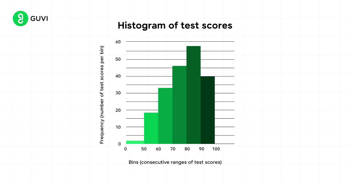
Key features of histograms include:
- Central location: Represented by mean, median, and mode
- Spread: Illustrated by the range and standard deviation
- Skewness: Measures the asymmetry of the distribution
- Kurtosis: Indicates the weight of the tails relative to the distribution’s center
2. Box Plots
Box plots, also known as box and whisker plots, provide a concise summary of your data’s distribution. They display the five-number summary: minimum, first quartile, median, third quartile, and maximum.
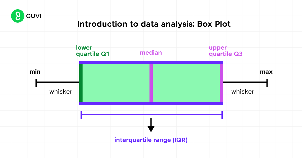
To interpret a box plot:
- The box represents the interquartile range (IQR)
- The line inside the box shows the median
- Whiskers extend to the minimum and maximum values
- Outliers are plotted as individual points beyond the whiskers
Box plots are particularly useful for comparing distributions across different groups or samples.
3. Scatter Plots
Scatter plots help you visualize relationships between two continuous variables. Each point on the graph represents an individual data point, with one variable on the x-axis and the other on the y-axis.
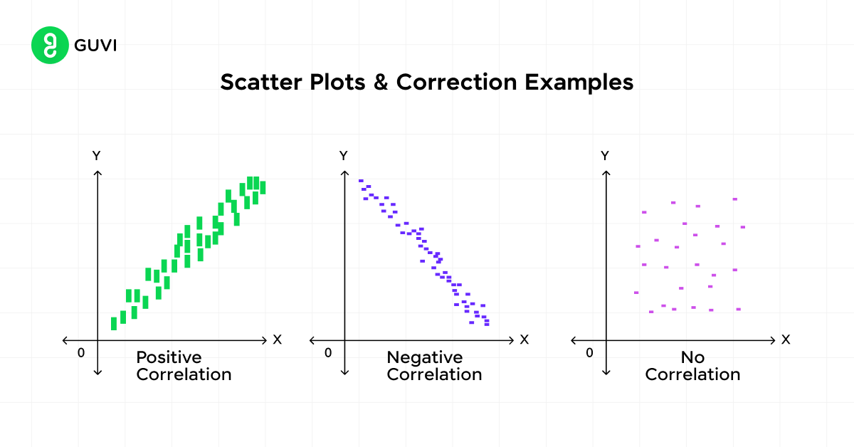
Key aspects to observe in scatter plots:
- Direction: Positive or negative relationship
- Form: Linear or curved relationship
- Strength: How closely the points cluster together
4. Bar Charts
Bar charts are ideal for displaying categorical data. They use rectangular bars to represent the frequency or proportion of each category.
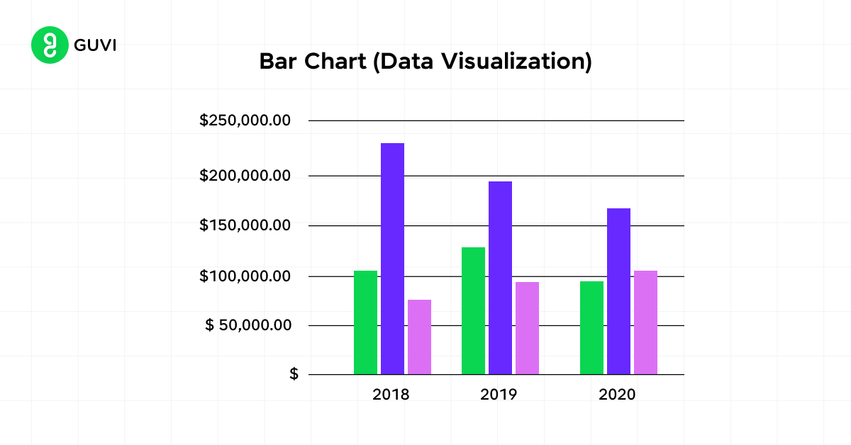
When creating bar charts:
- Ensure all bars start at a zero baseline
- Consider sorting bars from longest to shortest for easier comparison
- Use color purposefully to highlight specific categories or groups
By utilizing these visualization techniques, you can gain deeper insights into your data’s characteristics and effectively communicate your findings.
How to Calculate Descriptive Statistics in Python and Excel
Reading formulas is one thing; running them is another. Here’s how to get every measure covered above using two tools you’ll actually use day to day.
In Python, using pandas:
import pandas as pd

data = pd.Series([50000, 55000, 60000, 62000, 58000])

print("Mean:", data.mean())
print("Median:", data.median())
print("Mode:", data.mode()[0])
print("Standard Deviation:", data.std())
print("Variance:", data.var())
print("\nFull summary:\n", data.describe())
Running .describe() alone gives you count, mean, standard deviation, min, max, and all three quartiles in one call, which makes it the fastest way to get a first look at any numeric column.
In Excel, the core functions are:
| What You Want | Excel Formula |
|---|---|
| Mean | =AVERAGE(range) |
| Median | =MEDIAN(range) |
| Mode | =MODE.SNGL(range) |
| Sample standard deviation | =STDEV.S(range) |
| Sample variance | =VAR.S(range) |
| Range | =MAX(range)-MIN(range) |
| Quartiles (for IQR) | =QUARTILE.INC(range,1) and =QUARTILE.INC(range,3) |
If you want a single summary table without typing each formula, Excel’s Data Analysis ToolPak has a built-in “Descriptive Statistics” option under Data → Data Analysis, which outputs mean, median, mode, standard deviation, and more in one click.
If you’re serious about building this skill properly, HCL GUVI’s Data Science Course covers Python, Pandas, and Excel-based analysis with real projects and placement assistance.
Applications of Descriptive Statistics
Descriptive statistics play a crucial role in various fields, helping you make sense of complex data and draw meaningful insights. Let’s explore how these powerful tools are applied in different sectors.
1. Business and Finance
In the world of business and finance, descriptive statistics are invaluable for decision-making. You can use them to:
- Analyze financial information to make informed decisions
- Monitor relationships between variables using scatter plots
- Summarize and communicate key characteristics of financial datasets
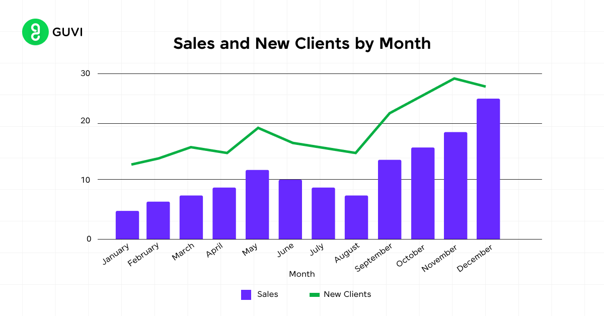
For instance, when examining stock returns, you might calculate the average annual return, standard deviation, and median. This allows you to compare different asset classes and understand their risk-return profiles. Here’s an example using data from 1928 to 2020:
| Asset Class | Average Annual Return | Standard Deviation | Median Return |
| U.S. Stocks | 11.64% | 19.49% | 14.22% |
| 10-Year Treasury Bonds | 5.21% | Lower than stocks | Lower than average |
| T-Bills | 3.36% | Lowest | Lower than average |
2. Healthcare and Medicine
In healthcare and medicine, descriptive statistics help you:
- Summarize patient data
- Analyze test scores and survey results
- Present findings visually using histograms, pie charts, and scatter plots
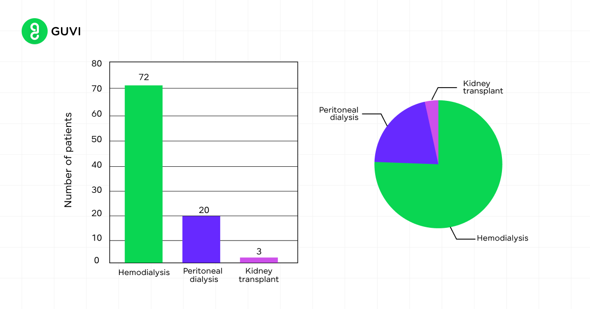
For example, you might use descriptive statistics to examine the distribution of patient ages in a study or to analyze the effectiveness of a new treatment by comparing mean outcomes between groups.
3. Education
Educators rely on descriptive statistics to:
- Make sense of test scores and performance data
- Identify areas where students excel or struggle
- Tailor educational strategies to meet learners’ needs
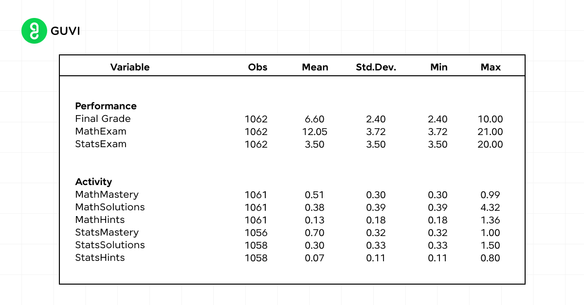
You can use measures of central tendency (mean, median, mode) to understand average student performance, and measures of variability (range, standard deviation) to assess the consistency of scores across a class.
4. Social Sciences
In social sciences, descriptive statistics help you:
- Summarize survey results
- Analyze demographic data
- Identify patterns and trends in social phenomena
For instance, you might use frequency distributions to examine the age distribution in a population study or calculate percentiles to understand income distribution in a socioeconomic analysis.
By applying descriptive statistics across these fields, you can transform raw data into meaningful information, enabling better decision-making and deeper insights into complex phenomena.
Descriptive Statistics Cheat Sheet: Key Formulas at a Glance
Bookmark this table for a fast recap of everything covered above.
| Measure | Formula | What It Tells You |
|---|---|---|
| Mean | x̄ = (1/n) × Σ(xi) | The average value |
| Median | Middle value of sorted data | The typical value, resistant to outliers |
| Mode | Most frequent value | The most common category or value |
| Range | Max − Min | Total spread of the data |
| Variance | σ² = Σ(x − μ)² / N | Average squared distance from the mean |
| Standard Deviation | σ = √(Σ(x − μ)² / N) | Average distance from the mean, in original units |
| IQR | Q3 − Q1 | Spread of the middle 50% of data |
| Correlation Coefficient | Ranges from -1 to 1 | Strength and direction of a relationship between two variables |
Common Mistakes to Avoid When Using Descriptive Statistics
Even experienced analysts fall into these traps. Watch out for:
- Reporting only the mean, ignoring the spread. Two datasets can share the same mean and look completely different once you check the standard deviation. Always report a measure of spread alongside a measure of central tendency.
- Using the mean on skewed data. For income, house prices, or anything with a long tail, the median almost always represents “typical” better than the mean does.
- Treating descriptive statistics as proof of a broader trend. Descriptive statistics describe your sample only. Claiming your findings apply to a larger population is an inferential statistics claim, and it needs the tools (and rigor) that come with that.
- Skipping a visual check before trusting the numbers. Two datasets can have identical mean, variance, and correlation while looking completely different when plotted, a real phenomenon known as Anscombe’s Quartet. A quick histogram or scatter plot catches what summary numbers alone can hide.
- Confusing correlation with causation. A strong correlation coefficient tells you two variables move together, not that one causes the other.
Kickstart your Data Science journey by enrolling in HCL GUVI’s Data Science Course where you will master technologies like MongoDB, Tableau, PowerBI, Pandas, etc., and build interesting real-life projects.
Alternatively, if you want to explore Python through a self-paced course, try HCL GUVI’s Python Certification course.
Concluding Thoughts…
Descriptive statistics serve as a powerful tool to analyze and interpret data across various fields. From business and finance to healthcare and education, these methods provide valuable insights into complex datasets.
By learning about its key characteristics, identifying patterns, and presenting information visually, descriptive statistics enable better decision-making and a deeper understanding of data.
As you start your data analysis journey, remember that descriptive statistics form the foundation for more advanced statistical techniques. They offer a clear picture of your data’s main features, helping you to spot trends and formulate hypotheses.
FAQs
What is descriptive statistics and its types?
Descriptive statistics summarize and organize data in a meaningful way. Types include measures of central tendency (mean, median, mode), measures of variability (range, variance, standard deviation), and measures of frequency (count, frequency distribution).
What is the overview of statistics?
Statistics is the science of collecting, analyzing, interpreting, and presenting data. It includes descriptive statistics for summarizing data and inferential statistics for making predictions or inferences about a population based on sample data.
What is the main purpose of descriptive statistics?
The main purpose of descriptive statistics is to provide a simple summary of the data, making it easier to understand and interpret large amounts of information by highlighting patterns and trends.
Who is the father of statistics?
Sir Ronald A. Fisher is often referred to as the father of modern statistics for his contributions to experimental design and statistical inference.
Success Stories

About the Author
Jebasta
I translate the language of data into stories that anyone can understand. As a writer with a data science background, I simplify analytics, AI, and decision-making so beginners and enthusiasts can confidently explore the world of data.
View all posts by Jebasta
Connect with me @














Did you enjoy this article?