

UI/UX Designing Articles
What is Design Thinking? A Complete 2026 Guide to the Process, Methodology, and Real Best Examples
15 Graphic Designer Roles and Responsibilities: Best guide


Get In Touch For Details! Request More Information
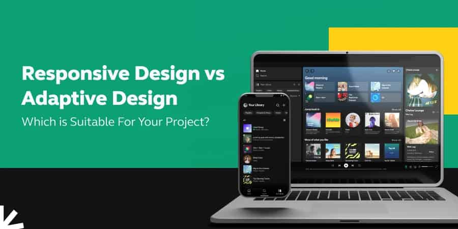
Responsive Design vs Adaptive Design: Which is Suitable For Your Project? [2025]
Oct 09, 2025 4 Min Read 9614 Views
(Last Updated)
With the increase in the number of smart devices that we use, there is a huge task of making sure a UI/UX design fits all of those devices uniformly without compromising anything. That is where responsive design and adaptive design come in.
The design aspects that a UI/UX designer employs to make sure their design fits in perfectly with every other device are known as responsive and adaptive design.
In this article, you are going to learn in-depth about those two concepts and how you can use them in your projects as both of them are quite similar in function. Without any delay let’s get started.
Table of contents
- What is Responsive Design and Adaptive Design?
- Comparison Between Responsive Design and Adaptive Design
- Responsive Design vs Adaptive Design: Which is Better for Your Project?
- Project Scope and Content
- Development Resources and Expertise
- Maintenance and Long-Term Management
- Performance and Load Times
- Search Engine Optimization (SEO)
- User Experience
- Future-Proofing
- Conclusion
- FAQs
- Is Responsive Design More Cost-Effective than Adaptive Design?
- Which is More Flexible: Responsive or Adaptive Design?
- Can Adaptive Design Provide a More Customized User Experience?
- Which Approach is Better for Complex Websites?
- Does Responsive Design Work with Older Browsers?
What is Responsive Design and Adaptive Design?

Before jumping into the comparison between the above-said two topics, let us first understand what those concepts mean as these play a huge role in the UX design process.
Responsive design is a web design approach that aims to create websites that offer an optimal viewing and interaction experience across a wide range of devices, from desktop computers to mobile phones.
The main idea is to ensure that a website’s layout, images, and other content automatically adjust and resize themselves to fit the screen size and resolution of the device being used to view them. In simple terms, it is like having a stretchy, flexible outfit that can fit you no matter if you lose or gain weight. Imagine you have a website that’s like this outfit.
When someone views your website on a big computer screen, the website stretches to use all the space nicely. And if they switch to a smaller phone screen, it shrinks down to fit that too, but everything still looks good and is easy to use.
Adaptive Design, on the other hand, is like having several outfits, each made to fit you perfectly at a specific weight. So, for your website, this means you have different versions of it for different screen sizes.
When someone views your website on a computer, they see a version made just for large screens. If they switch to a phone, the website changes to a version specifically designed for small screens. Each version of the website is tailored to provide the best look and experience for that particular screen size.
As we proceed to the next phase, make sure you understand the fundamentals of UI/UX, which includes heuristic analysis, journey maps, testing, etc. If you want to explore more about it, join HCL GUVI’s UI/UX Course with Placement Assistance. You’ll also learn about the tools used in UI/UX which are AdobeXD, Illustrator, Photoshop, Figma, and many more. Build some amazing real-time projects to get hands-on experience.
Also, if you want to explore Figma through a Self-paced course, try HCL GUVI’s Figma certification course.

Comparison Between Responsive Design and Adaptive Design

Now that you have a basic understanding of both design principles, let us now dive into their key differences and how one is different from the other.
| S.No | Aspect | Responsive Design | Adaptive Design |
|---|---|---|---|
| 1. | Definition | It employs a design approach where the layout adjusts fluidly across various screen sizes. | It follows the design approach that creates multiple fixed layout sizes to adapt to specific screen sizes. |
| 2. | Layout | It has fluid grids that resize and adjust to any screen size. | It has static layouts based on breakpoints for different screen sizes. |
| 3. | Content | It provides the same content across devices but is displayed differently based on screen size. | It may display different content or features on different devices. |
| 4. | Development Approach | Its approach is a one-size-fits-all solution. It requires more upfront design time but less maintenance later. | Its approach is multiple designs for multiple screen sizes, leading to potentially higher maintenance. |
| 5. | Load Time | Load time will be slower due to loading all content, regardless of device. | Load time will potentially be faster as only the necessary resources for a particular device are loaded. |
| 6. | User Experience (UX) | It offers a consistent experience across all devices but might compromise on elements not fitting perfectly on all screen sizes. | It offers a tailored experience for each device, potentially offering a more optimized UX per device but lacking consistency. |
| 7. | Cost and Resources | It involves lower long-term costs due to a single, fluid layout. But it requires fewer resources for maintenance. | It involves higher costs due to developing multiple layouts. It requires more resources for maintenance and updates. |
| 8. | SEO Impact | It is generally favored by search engines like Google for its one URL approach. | It can be more challenging for SEO due to multiple URLs for different device versions. |
| 9. | Flexibility | It offers high flexibility to accommodate new screen sizes and devices. | It offers less flexibility as new screen sizes may require new layouts. |
| 10. | Use Case | It is suitable for content-heavy sites that aim for a consistent brand experience across devices. | It is ideal for sites that require device-specific functionalities or when optimizing for a limited set of screen sizes. |
Read: 8 Stunning UI/UX Design Examples To Get You Inspired
Responsive Design vs Adaptive Design: Which is Better for Your Project?

To determine whether you should choose Responsive Design or Adaptive Design for your UI/UX project, it’s important to consider several key factors about your project, audience, and resources.
Here’s a breakdown of those things to help you make an informed decision:
1. Project Scope and Content
If your website has a lot of content that needs to be accessible across a wide range of devices, Responsive Design is often the better choice. It ensures that your content is fluid and adjusts seamlessly to different screen sizes. If your website requires highly tailored experiences on different devices (like specialized functionalities for mobile users), Adaptive Design might be more suitable.
Know More | 5 Mobile Apps with the Best UI/UX Design in 2025
2. Development Resources and Expertise
Responsive Design generally requires a deep understanding of CSS and flexible layouts. If your development team is skilled in these areas, this might be the more feasible option. Adaptive Design can require more initial development work since you are essentially creating multiple versions of your site. Consider this if you have the resources and time for more complex development.
Read: UI/UX Best Practices: Creating Exceptional Digital Experiences
3. Maintenance and Long-Term Management
Responsive Design is typically easier to maintain because you’re dealing with a single layout that works across all devices. Adaptive Design can be more challenging to maintain and update, as changes may need to be implemented across multiple layouts.
4. Performance and Load Times
Responsive websites can sometimes have slower load times on mobile devices as they load all content, even if it’s not necessary for smaller screens. Adaptive Design can offer optimized performance for specific devices, as only the relevant resources for that device are loaded.
5. Search Engine Optimization (SEO)
Responsive Design is often favored by search engines like Google because it’s easier for their algorithms to index one single site rather than multiple versions. Adaptive Design can present more challenges for SEO, as it may involve managing multiple URLs and ensuring each version of the site is properly indexed.
6. User Experience
For a consistent user experience across all devices, Responsive Design is ideal. If you want to provide a highly customized user experience for different devices, Adaptive Design could be more appropriate.
Explore: Top 10 UI Design Patterns: Creating Intuitive and Engaging User Experiences
7. Future-Proofing
Responsive Design is generally more future-proof as it can accommodate new devices and screen sizes more easily. Adaptive Design might require updates when new devices or screen sizes become popular.
In summary, choose Responsive Design if you prioritize universal accessibility, easier maintenance, SEO, and a consistent user experience across all devices. Opt for Adaptive Design if you need to provide a highly customized experience on different devices, and you have the resources for the development and maintenance of multiple site versions.
Kickstart your UI/UX journey by enrolling in HCL GUVI’s UI/UX Course where you will master technologies like AdobeXd, Illustrator, and Figma, and build interesting real-life UI/UX projects.
Alternatively, if you would like to explore Figma through a Self-paced course, try HCL GUVI’s Figma certification course.
Conclusion
In conclusion, while both the design principles aim to enhance user experience across various devices, they approach the multi-screen world differently.
One offers a fluid and flexible solution, dynamically adjusting to the screen size regardless of the device, ensuring a consistent user experience with less maintenance. On the other hand, adaptive design delivers tailor-made solutions for specific screen sizes, allowing for more control over the design and functionality of each device, which results in increased complexity in design and maintenance.
The choice between these two design principles ultimately depends on the specific needs and goals of the website, the target audience, and the resources available for development and maintenance.
Also Find Out Top 12 Key UI/UX Design Principles
FAQs
1. Is Responsive Design More Cost-Effective than Adaptive Design?
Typically, yes. Responsive design usually requires less development time and maintenance over multiple device-specific layouts.
2. Which is More Flexible: Responsive or Adaptive Design?
Responsive design is more flexible as it adjusts to any screen size, not just those sizes for which layouts were specifically designed.
3. Can Adaptive Design Provide a More Customized User Experience?
Yes, since adaptive design tailors layouts to specific devices, it can offer a more optimized user experience for each device type.
4. Which Approach is Better for Complex Websites?
It depends on the website’s needs. Adaptive design might be better for very complex sites requiring optimized performance on specific devices.
5. Does Responsive Design Work with Older Browsers?
Responsive design can have compatibility issues with older browsers, which may not fully support CSS3 and HTML5.
Success Stories

About the Author
Lukesh S
A professional content writer who has experience in freelancing and now working as a Technical Content Writer at HCL GUVI having sound knowledge in Blog Writing and Creative Writing!
View all posts by Lukesh S
Connect with me @


Did you enjoy this article?