Plotly for Data Visualization: Complete Guide
Dec 22, 2025 8 Min Read 3111 Views
(Last Updated)
What happens when data speaks through visuals instead of spreadsheets? The answer shapes decisions in research labs, product teams, trading floors, and every field that depends on evidence. Charts turn numbers into patterns that the human eye can understand faster than any table. Interactive visuals go further and allow users to explore data instead of only viewing it. That is where Plotly becomes relevant in modern analytics.
Keep reading to learn how Plotly brings interactivity, precision, and cross-language support to data visualization.
Table of contents
- Introduction to Plotly for Interactive Data Visualization
- Core Features of Plotly
- Plotly Architecture Overview
- Rendering Engine Selection: SVG vs WebGL
- Types of Visualizations Supported in Plotly
- Basic Charts
- Statistical Charts
- Scientific and Analytical Charts
- Geo-Spatial Charts
- Financial Charts
- Real-Time and Streaming Charts
- Specialized Visual Forms
- Installing Plotly and First Plot
- Plotly Installation in Python
- Creating a Basic Scatter Plot
- How the Figure Object Works?
- Running Plotly in Jupyter
- Customization and Styling in Plotly
- Control Over Color and Themes
- Axis Formatting and Titles
- Text, Labels, and Annotations
- Hover Interactions
- Legends and Trace Grouping
- Layout Styling for Reports and Dashboards
- Plotly Express vs Plotly Graph Objects
- Interactive Dashboards with Dash
- Example: Basic Dash App with a Plotly Chart
- Working with Large Datasets in Plotly
- Exporting and Sharing Visualizations
- Comparison with Other Visualization Libraries
- Best Practices for Plotly in Production
- Version Control for Figures
- Efficient Handling of Large Data
- Mobile and Responsive Layout
- Cache Heavy Computation
- Export Checks Before Deployment
- Secure Data Delivery
- Conclusion
- FAQs
- 1: Is Plotly free for personal and commercial use?
- 2: Does Plotly work without internet access?
- 3: Can Plotly be used with machine learning workflows?
Introduction to Plotly for Interactive Data Visualization
Data visualization has become a core part of modern analytics because raw numbers alone rarely provide clear insight. Graphs and interactive charts help teams understand trends, evaluate patterns, and communicate findings with clarity. Organizations rely on visualization tools to support decisions across product development, finance, healthcare, scientific research, and artificial intelligence.
Plotly is an open-source graphing library that allows users to create interactive and publication-quality visualizations. It supports multiple programming languages such as Python, R, Julia, MATLAB, and JavaScript. The library renders visual output directly in web browsers through HTML, SVG, and WebGL, which makes it suitable for notebooks, dashboards, and standalone web pages.
Developers choose Plotly for data visualization because it offers a single workflow for statistical charts and real-time data streams. Analysts value its high-level API that reduces the amount of code required to build a chart. Researchers use it because Plotly produces vector graphics that maintain precision in scientific papers and technical reports. The library gives full control over layout and interaction logic, which supports both quick exploration and production-ready visualization.
Core Features of Plotly
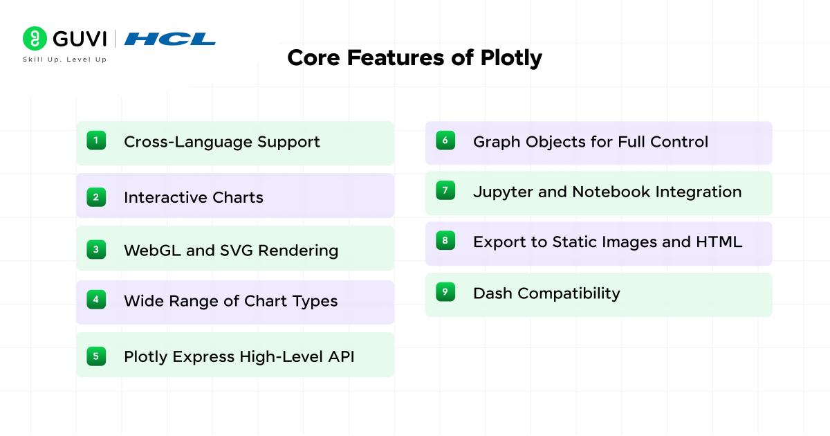
- Cross-Language Support: Plotly works with Python, R, Julia, MATLAB, and JavaScript, which allows teams to use the same visualization library across different tech stacks.
- Interactive Charts: Every plot supports zoom, hover labels, legend toggling, and data selection. Interaction happens in the browser with no extra plugins.
- WebGL and SVG Rendering: The library switches between WebGL for large datasets and SVG for crisp vector output. This balance helps with both performance and visual quality.
- Wide Range of Chart Types: Plotly covers line charts, bar charts, scatter plots, heatmaps, 3D surface plots, choropleth maps, and financial charts. Users work with one library instead of multiple tools.
- Plotly Express High-Level API: A concise syntax helps create charts with fewer lines of code. It speeds up exploratory analysis while keeping configuration readable.
- Graph Objects for Full Control: The lower-level API exposes every layout and styling parameter. It supports complex dashboards, multi-axis charts, and deeply customized visuals.
- Jupyter and Notebook Integration: Plots render inline in Jupyter, Google Colab, and other notebook environments. This makes Plotly a natural fit for data science workflows.
- Export to Static Images and HTML: Visuals export as PNG, PDF, SVG, or standalone HTML files, which helps with sharing results in reports and web pages.
- Dash Compatibility: Plotly works with the Dash framework to build analytical web apps using pure Python, without writing separate frontend code.
Plotly Architecture Overview
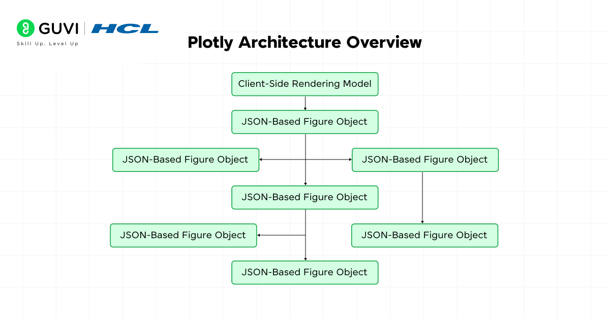
- Client-Side Rendering Model
Plotly builds every chart through a JavaScript rendering engine that runs entirely in the browser. The core library draws shapes, text, and traces using either SVG or WebGL. Interaction events such as hover, zoom, pan, drag, and selection are handled on the client side, which keeps latency low even in offline environments.
- JSON-Based Figure Object
Every Plotly figure is defined as a structured JSON object. The object contains three main sections:
- data for traces
- layout for visual configuration
- config for interaction rules and export controls
This structure allows the same chart definition to be transferred across languages, stored in databases, or sent over a network API without conversion.
- Trace and Layout Separation
A trace defines the geometry of a plot, such as points, lines, bars, or surfaces. Layout controls global elements such as axes domains, margins, legend placement, grid overlays, and color themes. This modular structure allows a single layout to be reused while swapping traces, which helps in automated reporting pipelines.
Rendering Engine Selection: SVG vs WebGL
Plotly chooses the render backend based on trace type and data size.
- SVG runs with high typographic precision and is ideal for scientific papers and vector export.
- WebGL supports GPU acceleration, which scales to millions of points in scatter, heatmap, and surface plots.
This dual system lets users control memory footprint and visual accuracy.
- Language Wrappers and Data Flow
Python, R, Julia, and MATLAB packages serve as thin wrappers. They convert user code into the same JSON payload that the JavaScript core interprets. This design avoids duplicated logic across languages. The browser becomes the final execution layer, which guarantees uniform rendering whether the chart was written in a notebook, a Dash app, or a standalone HTML file.
- Reactive Update Pipeline
Plotly uses a diff-based update mechanism. Only the changed sections of the JSON structure trigger redraws. Axes, legends, and traces are updated independently. This selective redraw process reduces GPU load in dashboards that refresh on a schedule or through user input.
- Support for Server-Linked Interactivity
Although charts render in the browser, Plotly can link to backend data sources through frameworks like Dash. A callback system passes filtered or updated data into the figure object, which allows time-series streaming, database queries, and live sensor feeds.
- Export and Serialization Layer
Charts export through a static image server or a local rendering engine that converts the figure into PNG, JPEG, SVG, or PDF. Serialized figures can also be embedded in HTML with no external dependencies, which supports long-term archival and offline viewing.
Also, Explore: Free Python Tutorial for Beginners from Basics to Advanced
Types of Visualizations Supported in Plotly
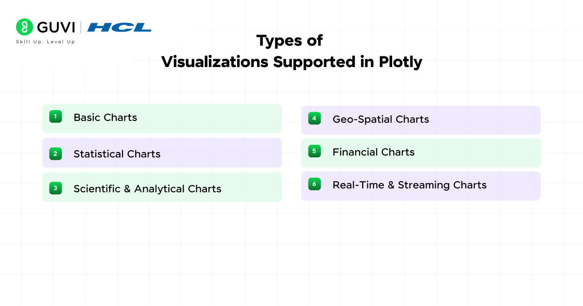
1. Basic Charts
Plotly covers core chart types used in exploratory analysis and reporting. Line charts track changes across a continuous scale such as time. Bar charts compare values across categories with clear height ratios. Scatter plots reveal relationships between two numeric variables through marker placement. Each of these charts supports hover data, zoom control, legends, annotations, and custom color mapping, which helps analysts review data patterns with accuracy.
2. Statistical Charts
Statistical charts provide distribution-level insight without manual computation. Box plots summarize quartiles and outliers through a single visual form. Violin plots extend this idea with a density curve that reflects value concentration. Histograms group numeric values into bins to show frequency patterns. These charts help spot skewness, gaps, and clustering in datasets.
3. Scientific and Analytical Charts
Plotly supports visual workflows in physics, chemistry, engineering, and geoscience. Heatmaps display intensity values across two axes with a color range. Contour charts draw lines of equal value, which helps interpret gradients. 3D surface charts add a z-axis for terrain, simulation output, and mathematical functions. These charts work with both static datasets and live computation models.
4. Geo-Spatial Charts
Geographic visualizations in Plotly operate on both vector and tile map layers. Choropleth maps shade regions based on numeric values such as population density or infection rate. Scatter map plots show point data over city, street, or satellite layers sourced through Mapbox. Plotly supports projections, zoom bounds, and geographic coordinate systems, which makes it suitable for demographics, mobility analysis, and logistics planning.
5. Financial Charts
Plotly includes chart structures used in quantitative finance. Candlestick charts display open, high, low, and close values for markets. OHLC charts offer the same information with a minimal stroke design. These charts work with time-series indexing and can include overlays such as moving averages or volatility bands.
6. Real-Time and Streaming Charts
Plotly refreshes graphics without reloading the page through partial JSON updates. This capability supports dashboards that read data from APIs, sensors, or databases. Plots can refresh on intervals or react to user input through callbacks. This is useful in manufacturing telemetry, medical monitoring, trade analytics, and control systems.
7. Specialized Visual Forms
Plotly provides Sankey diagrams for flow analysis such as energy transfer or user funnels. Treemaps display hierarchical data through nested rectangles. Parallel coordinates charts help compare multi-feature records. These charts support interaction through brushing, highlighting, and filtering.
Also, Read: 10 Impressive Data Visualization Project Ideas [With Source Code]
Installing Plotly and First Plot
Plotly Installation in Python
Plotly can be installed through pip or conda, which makes it accessible in both virtual environments and system-wide setups. The command below installs the latest stable build through pip:
pip install plotly
Users who work with Anaconda can install it through the main channel:
conda install -c plotly plotly
Once installed, Plotly works in Jupyter Notebook, JupyterLab, IPython, Google Colab, and plain Python scripts.
Creating a Basic Scatter Plot
The example below builds a scatter chart with Plotly Express. It uses two numeric lists to define points on the x and y axes.
import plotly.express as px
x_values = [1, 2, 3, 4, 5]
y_values = [10, 15, 13, 17, 19]
fig = px.scatter(x=x_values, y=y_values, title=”Sample Scatter Plot”)
fig.show()
The fig object holds the complete chart structure. Calling fig.show() renders the plot in the browser or notebook output cell.
How the Figure Object Works?
The figure contains two main components: traces and layout. Traces store the data points, and the layout controls labels, margins, axis titles, and background. This separation keeps the visual configuration independent from the stored data.
Running Plotly in Jupyter
Plotly auto-detects the notebook environment and displays charts inline. Users working in JupyterLab may install the Plotly JupyterLab extension for older versions, although current releases render without extra plugins.
Customization and Styling in Plotly
Control Over Color and Themes
Plotly supports color scales for both categorical and continuous data. Users can switch themes through predefined templates such as plotly, ggplot2, or seaborn. Custom palettes can be applied to match brand guides or publication rules. Colors can target traces, markers, lines, text, and backgrounds with full hex and RGBA support.
Axis Formatting and Titles
Axis labels, tick spacing, and value formatting are controlled through the layout section. Numeric axes can switch between linear and logarithmic scale. Date axes auto-parse time strings, which helps with time-series data. Axis ranges can lock or adjust based on zoom level, and grid lines can be toggled or styled with separate opacity and width values.
Text, Labels, and Annotations
Plotly supports inline labels for points, bars, and slices. Annotation layers add callouts, arrows, or notes at exact coordinates. These elements sit on top of the chart canvas and do not shift during zoom events. This feature is useful for marking thresholds, peaks, or events in time-series charts.
Hover Interactions
Hover labels display exact values without cluttering the chart. They support custom text, number formatting, and multi-line content. Users can switch hover mode between unified, closest point, or x-axis comparison, which changes how values are revealed in multi-trace charts.
Legends and Trace Grouping
Legends can dock to any side of the chart or float inside the plot area. They support click-to-hide and click-to-isolate behavior, which helps viewers focus on one trace at a time. Traces can share a legend group to toggle multiple series with a single click.
Layout Styling for Reports and Dashboards
Margins, background colors, fonts, and title alignment are controlled through layout keys. Exported images keep all style settings, which ensures consistency between on-screen charts and static assets in PDFs or presentations. Font families support system fonts and web-safe fonts without extra configuration.
Master real-world data visualization with HCL GUVI’s Data Science Course: learn Python, Plotly, Power BI, and machine learning from industry experts. Build dashboards, analyze trends, and earn a globally recognized certificate with 100% placement support. Turn your data skills into a professional career today!
Plotly Express vs Plotly Graph Objects
The table below presents a clear technical comparison between Plotly Express (PX) and Plotly Graph Objects (GO), fully aligned with your writing rules.
| Feature | Plotly Express | Plotly Graph Objects |
| API Level | High-level wrapper | Low-level, full control |
| Code Length | Fewer lines for common charts | More lines because every element is defined |
| Best Use Case | Quick exploration and prototyping | Complex dashboards and deeply customized visuals |
| Data Handling | Accepts data frames directly | Requires explicit x and y values or trace definitions |
| Customization Depth | Limited to layout edits | Full access to every trace and layout attribute |
| Multiple Traces | Created automatically when grouping data | Added manually through go.Figure().add_trace() |
| Figure Structure | One function builds the full chart | User builds figure, traces, and layout separately |
| Learning Curve | Faster to get started | More verbose but offers full flexibility |
| Exporting and Embedding | Same export options as GO | Same export options as PX |
| Interaction Logic | Basic hover and legend control | Extended control with update menus, sliders, and buttons |
Interactive Dashboards with Dash
- What Dash Brings to Plotly
Dash is a Python framework that builds web dashboards with Plotly charts. It removes the need to write separate frontend code in HTML, CSS, or JavaScript. A dashboard built in Dash runs as a web app, which means users can view it in any browser on any device inside a local network or over the internet.
- Core Building Blocks
A Dash app has three main parts:
| Component | Purpose |
| Layout | Defines the structure of the page such as charts, text, buttons, and input fields |
| Callbacks | Connect user actions to chart updates through Python functions |
| Server | Runs the app and responds to browser requests |
Each part works in the same Python file, which keeps deployment simple.
Example: Basic Dash App with a Plotly Chart
from dash import Dash, dcc, html
import plotly.express as px
app = Dash(__name__)
fig = px.line(x=[1, 2, 3, 4], y=[10, 12, 15, 18], title=”Line Chart”)
app.layout = html.Div([
dcc.Graph(figure=fig)
])
if __name__ == “__main__”:
app.run_server(debug=True)
The example above loads a Plotly chart inside a web app. The app runs on a local server and opens in the browser.
- Callback Logic for Interaction
Dash updates charts through callback functions. A callback listens to components such as dropdowns, sliders, or text inputs. The output of the callback updates the figure object, which refreshes the chart without reloading the page. This flow makes Dash suitable for parameter controls, scenario analysis, and streaming displays.
- Deployment Options
Dash apps can run on Flask, Gunicorn, or cloud platforms such as Heroku and Azure. A single Python script can scale to a production service without rewriting the chart logic.
Working with Large Datasets in Plotly
- WebGL Support for High-Volume Data
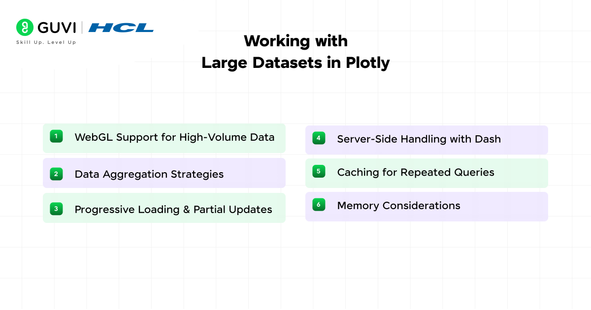
Plotly switches to WebGL rendering for charts with large point counts. WebGL uses GPU acceleration, which helps display datasets that reach hundreds of thousands or millions of points without freezing the browser. Scattergl, heatmapgl, and surfacegl are WebGL variants that handle heavy workloads with stable frame rates.
- Data Aggregation Strategies
Large datasets often slow down chart rendering. Plotly supports downsampling and binning to reduce load. Downsampling keeps representative points, and binning groups values into ranges. These approaches maintain data shape while reducing memory use.
- Progressive Loading and Partial Updates
Plotly supports patching, which updates only part of a figure instead of rebuilding the full chart. This method is useful for real-time dashboards that stream values from sensors or APIs. The browser redraws only the updated trace, which helps maintain smooth interaction.
- Server-Side Handling with Dash
Dash can preprocess large datasets on the backend before pushing data to the browser. Heavy computation such as grouping, resampling, or summarizing can run in Python with NumPy or Pandas. The frontend receives only the reduced result, which keeps the chart responsive.
- Caching for Repeated Queries
Dash supports caching layers that store processed data. Frequent user actions such as filter selection or date range change can reuse cached output. This reduces CPU load and shortens response time.
- Memory Considerations
Browser limits apply when loading extremely large arrays. WebGL helps, but it still allocates memory per trace. Breaking data into multiple traces or paging through subsets reduces memory pressure. Vector export requires SVG mode, which is not ideal for huge datasets, so static image output should be done after filtering.
Exporting and Sharing Visualizations
- Static Image Export
Plotly figures can export to PNG, JPEG, SVG, and PDF through the write_image() function or the built-in download button in the chart toolbar. SVG and PDF preserve vector quality, which keeps lines and labels sharp in printed reports. PNG and JPEG are useful for slide decks and web uploads that require raster output.
- HTML Export for Offline Sharing
A Plotly figure can be saved as a standalone HTML file. The file contains the full chart definition and the Plotly JavaScript engine, which means the recipient does not need Plotly installed. This format supports hover labels, zoom, and interaction even without an internet connection.
fig.write_html(“chart.html”)
- Embedding in Web Pages and CMS Platforms
Plotly charts can embed into any site through a simple <script> tag or iframe. Content platforms such as WordPress, Ghost, and Medium accept HTML embeds. This helps share analytics dashboards without converting them into static images.
- Export Through Dash Apps
Dash supports export triggers that let users download the current state of a chart from a dashboard. Exports can include filtered or updated data, which gives each viewer a personalized output.
- Version Control of Figures
Since every Plotly figure is a JSON object, it can be stored in Git, databases, or API responses. This allows teams to track changes in layout and data structure the same way they track source code. Figure JSON can recreate the exact same chart in any Plotly-supported language.
- Sharing in Jupyter and Colab
Jupyter Notebook and Google Colab display Plotly plots inline. Notebooks can be shared through GitHub, nbviewer, or Colab links. Anyone who opens the file sees the chart with full interaction, which makes Plotly a reliable choice for collaborative research.
Comparison with Other Visualization Libraries
| Library | Output Type | Interactivity | 3D Support | WebGL Support | Primary Language | Best Fit |
| Plotly | Static and interactive | Yes | Yes | Yes | Python, R, Julia, JS | Dashboards, analytics apps, research visuals |
| Matplotlib | Static | No | Limited | No | Python | Academic papers and static reports |
| Seaborn | Static | No | No | No | Python | Statistical summaries and quick plots |
| Bokeh | Interactive | Yes | Limited | Partial | Python | Browser-based visuals and streaming panels |
| D3.js | Interactive | Yes | Custom only | Manual | JavaScript | Fully custom visual design at SVG level |
| Chart.js | Interactive | Yes | No | No | JavaScript | Lightweight web charts for front-end use |
Best Practices for Plotly in Production
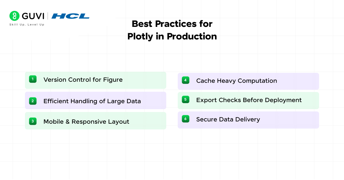
1. Version Control for Figures
Store figure JSON in Git or a database so every chart configuration can be reproduced. This prevents layout or style drift across environments.
2. Efficient Handling of Large Data
Preprocess data on the server before sending it to the browser. Reduce resolution through downsampling or binning when full precision is not required.
3. Mobile and Responsive Layout
Set autosize and responsive flags to adjust plots for smaller screens. Test dashboards on tablets and phones to confirm that labels stay readable.
4. Cache Heavy Computation
Use caching layers in Dash to store grouped or aggregated data. This avoids repeated computation when different users trigger the same filters.
5. Export Checks Before Deployment
Test both static image export and HTML export. Some font or margin settings may appear different between browser render and saved output.
6. Secure Data Delivery
Do not load sensitive data directly into the browser. Use authenticated API endpoints or server callbacks that filter data before exposure.
Conclusion
Plotly for data visualization in data science offers a flexible path from quick exploratory charts to fully deployed analytical dashboards. It supports multiple languages, works in browsers and notebooks, and handles both small datasets and high-volume streaming data. The library balances simplicity through Plotly Express and full control through graph objects. Teams across research, business intelligence, and engineering rely on Plotly because it delivers interactive visuals that align with modern data workflows.
FAQs
1: Is Plotly free for personal and commercial use?
Plotly’s core graphing library is open source under the MIT license. It can be used in personal projects, enterprise systems, and academic work without a paid plan.
2: Does Plotly work without internet access?
Plotly charts render in the browser through local JavaScript files, so they can run offline in notebooks, HTML exports, and Dash apps that do not depend on external CDNs.
3: Can Plotly be used with machine learning workflows?
Plotly integrates smoothly with NumPy, Pandas, scikit-learn, TensorFlow, and PyTorch. This allows models to output predictions directly into visual plots for error analysis, performance tracking, and model comparison.




Did you enjoy this article?