


Artificial Intelligence and Machine Learning Articles
AI/ML Skills Gap 2026: Why Companies Can't Find Job-Ready Talent
20 AI/ML Interview Questions Recruiters Can Use Without a Tech Background - Best Guide
How Industry-Backed AI/ML Bootcamps Are Changing the AI/ML Hiring Pipeline - Best Guide 2026
From IT Support to AI Engineer: A Realistic Career Switch Guide 2026


Get In Touch For Details! Request More Information

The IRIS Dataset Explained: Features, Classification, Python & R Examples
Jul 27, 2026 9 Min Read 10227 Views
(Last Updated)
The IRIS dataset is most likely the first dataset that students and beginners experience as they learn data science and machine learning. The IRIS dataset is simple and easy to understand, having been used by students, researchers, and practitioners for decades to learn the basics of classification and data analysis.
The IRIS dataset was published in 1936 by British statistician Ronald A. Fisher in the paper “The Use of Multiple Measurements in Taxonomic Problems”, and, since then, the IRIS dataset has become well-known as the “Hello World” of machine learning (ML) because it provides a very effective introduction to real-world datasets and algorithms for learners.
In this blog, we’ll start with understanding of what is IRIS dataset, its characteristics and properties, why it is used, classification techniques which can be applied, and finally code examples in Python and R. Hope by the end of this blog you’re will be confident to apply the IRIS dataset to your first project in machine learning.
TL;DR
The Iris dataset is a 150-row, 4-feature dataset of iris flower measurements (sepal length, sepal width, petal length, petal width) across three species — Setosa, Versicolor, and Virginica. Petal length and petal width are the two features most correlated with species, making them the strongest predictors. It’s the standard first dataset for learning classification because it’s small, clean, and requires no data cleaning before modeling.
Table of contents
- What is the IRIS Dataset?
- Why is the IRIS Dataset So Popular?
- IRIS Dataset Features and Target Classes
- The Features (The Inputs):
- Feature statistics
- The Target Classes (The Outputs):
- Applications of the IRIS Dataset
- IRIS Dataset in Machine Learning
- IRIS Dataset Classification
- Practical Examples:
- IRIS dataset in Python
- What did we just do?
- Exploratory Data Analysis (EDA) on the IRIS Dataset
- IRIS Dataset Visualization
- Why Iris dataset is used for beginners: explained simply
- IRIS Dataset Kaggle
- Iris dataset alternatives for 2025 ML practice
- IRIS Dataset Tutorial: Step-by-Step Process
- Machine Learning Project: IRIS Dataset Machine Learning Project
- Expected output / what this shows readers
- Final thoughts...
- FAQs
- Why is the IRIS dataset still used?
- Is the IRIS dataset only for beginners?
- Is the IRIS dataset suitable for deep learning?
- How many rows and columns does the IRIS dataset have?
What is the IRIS Dataset?
The IRIS dataset is a very classic multivariate dataset. The IRIS data set is actually a part of interesting statistics and is commonly used in data science.
The IRIS dataset contains 150 samples of iris flowers: 50 from each of three species:
- Iris Setosa
- Iris Versicolor
- Iris Virginica
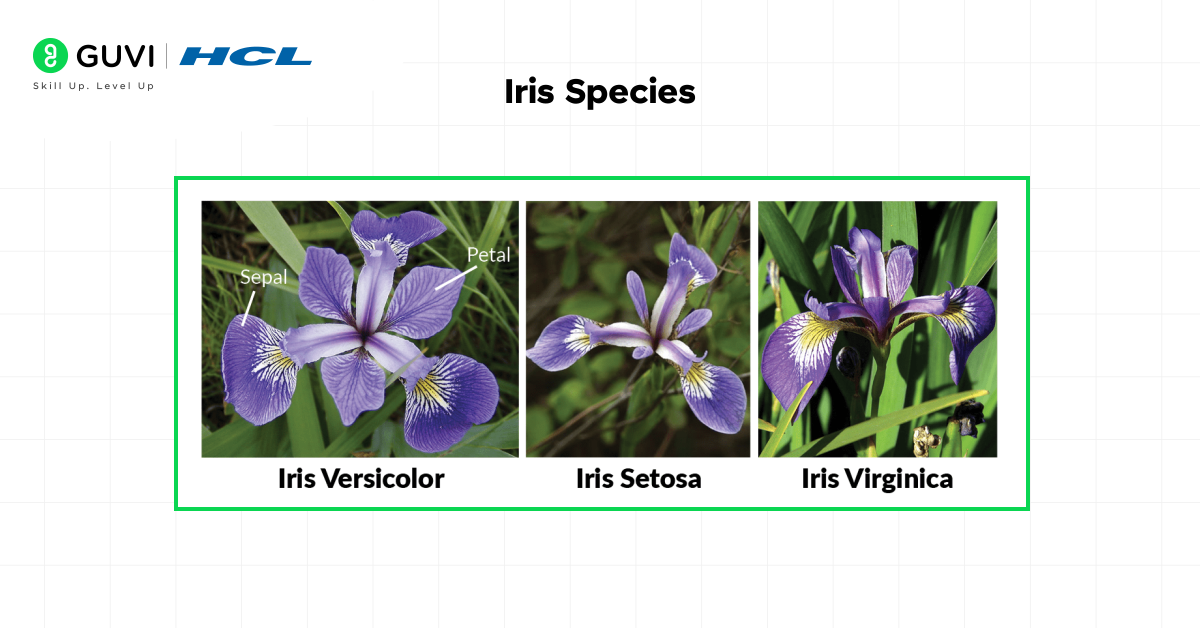
The four features measured (in centimeters) for each flower:
- Length of sepals
- Width of sepals
- Length of petals
- Width of petals
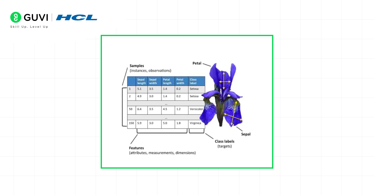
So what is the goal? Use these measurements to correctly identify the species of the iris flower. This simple yet powerful preims is what makes the IRIS Dataset in machine learning a perfect starting point. The dataset is a real-life problem that is simple to understand but provides just enough complexity to cover the basics of classification algorithms.
Why is the IRIS Dataset So Popular?
You may be asking yourself, “Why this old dataset on flowers?” It’s not by accident that it is so popular. It has some distinct benefits making it for perfect for beginners:
- Simplicity and Small Size: It’s only 150 rows and 4 feature columns, so small that you can load it, process it, etc., almost instantly, on any computer. You don’t need a high-powered GPU or take hours and hours to train a model. This allows you the time to grasp the concepts without dealing with the struggle of big data.
- Ideal for Classification: It is a classic supervised classification problem predicting a category (the species) based on numerical input variables. Classification is one of the easiest tasks in supervised machine learning.
- Clean and Structured: The dataset is very clean. There are no missing values and it is perfectly ready to go. That way, you don’t have to spend 80% of your time on cleaning your data (a common reality in many data science projects). You can get it straight to modeling and analysis.
- Easy to Acquire: It’s in nearly every major machine learning library already, such as scikit-learn (python), R, and even TensorFlow. It can be imported in literally a single line of code to make it easily available.
IRIS Dataset Features and Target Classes
In order to work effectively with data, you need to understand what you are working with. Let’s explore the features and targets of the IRIS dataset.
The Features (The Inputs):
These are the measurements that we use to make our prediction. You can think of them as the pieces of a puzzle.
- Sepal Length (cm): The sepal is the part of the flower that protects the bud before blooming. This feature is a measure of the length of the sepal.
- Sepal Width (cm): This is a measure of the width of the sepal.
- Petal Length (cm): The petal is the very colourful part of the flower. This is a measure of how long it is.
- Petal Width (cm): This is a measure of the width of the petal.
Feature statistics
| Feature | Min | Max | Mean | Correlation with Species |
|---|---|---|---|---|
| Sepal Length (cm) | 4.3 | 7.9 | 5.84 | 0.78 (moderate) |
| Sepal Width (cm) | 2.0 | 4.4 | 3.06 | -0.43 (weak, negative) |
| Petal Length (cm) | 1.0 | 6.9 | 3.76 | 0.95 (very strong) |
| Petal Width (cm) | 0.1 | 2.5 | 1.20 | 0.96 (very strong) |
Correlation with Species is computed by label-encoding the three species as 0 (Setosa), 1 (Versicolor), 2 (Virginica) and calculating each feature’s Pearson correlation against that encoded column — the exact method is shown in the EDA code block below so readers can reproduce it themselves.
The Target Classes (The Outputs):
This is what we are predicting: the species of iris.
- Iris Setosa (0): This species is clearly distinguishable from the other two Iris species, so you can think of this as the “easy mode” of this dataset for a classifier.
- Iris Versicolor (1): This species is most similar to Virginica, meaning it is more difficult to tell them apart. This is where the difficulty really lies!
- Iris Virginica (2): The third species that is most likely to be confused with Versicolor on measures of dimensions alone.
The combination of one cleanly separate class and two that overlap is what makes the data so useful pedagogically. It demonstrates that not all problems are entirely black and white.
Applications of the IRIS Dataset
The use of the IRIS dataset is primarily educational in general but reflects real-world business problems.
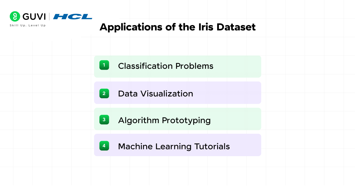
- Classification Problems: This is the major application of IRIS dataset. It is commonly used to demonstrate how algorithms such as Logistic Regression, K-Nearest Neighbors (KNN), Support Vector Machines (SVM) and Decision Trees work. A good model on the IRIS dataset can achieve greater than 95% accuracy.
- Data Visualization: Before building any model, data scientis try to visualize the data. The IRIS dataset is ideal for a person wanting to learn how to make scatter plots, histograms, pair plots, and the like, uncovering relationships between variables.
- Algorithm Prototyping: Data scientists often use the Iris dataset as a quick “sanity check” to test if a new algorithm or method works as expected before applying it to a more complex, real-world problem.
- Machine Learning Tutorials: Nearly every online course, textbook and blog (like this one!) aimed at teaching ML at the starting level, uses the IRIS dataset as it’s first example. It is ML’s universal language for beginners.
IRIS Dataset in Machine Learning
One of the most well-known applications of supervised learning in machine learning is the IRIS dataset. But what does that mean?
In supervised learning, a dataset is referred to as “supervised” because it consists of labeled data, or a known answer. Take, we have both input features (measurements of sepal and petal), for the 150 samples and the expected output (the species).
We use this “labeled data” to train up a model. The model recognizes the patterns and relationships between the measurements and the species. For example, the model could learn: “If the petal width is less than 0.80 cm, it’s almost always a Setosa.”
Later, when we present the model with the measurements of a new flower (without telling the model the species), and ask the model to predict the species. The model has learned from the labelled examples and can now make an informed prediction. The process of being trained using labelled data and subsequently predicting is called supervised learning.
It’s commonly used with:
- Logistic Regression
- Decision Trees
- k-Nearest Neighbors (kNN)
- Support Vector Machines (SVM)
- The IRIS dataset inspired the creation of synthetic datasets later used for testing advanced ML algorithms like clustering and dimensionality reduction.
- It’s often called the “Hello World of Machine Learning” because it’s usually the very first dataset students work with in their ML journey.
- Beyond machine learning, the IRIS dataset is still used in botany research to study plant morphology and evolutionary traits.
IRIS Dataset Classification
The primary task we are solving with the data is multi-class classification. Multi-class simply means there are more than two classes to choose from (in our case, three).
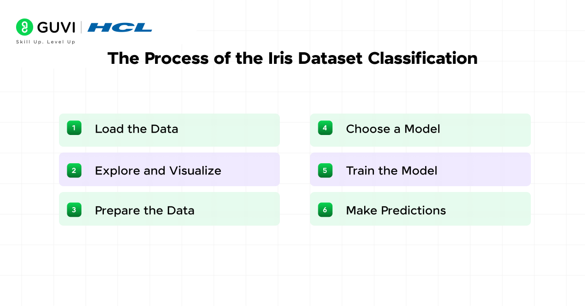
The process for an IRIS dataset classification project is always the same:
1. Load the Data: Import the dataset from a library
2. Explore and Visualize: Explore the data with statistics and plots
3. Prepare the Data: Split the data into a “training set” (which we will use to train the model) and a “testing set” (which we will use to see how well the model has learned).
4. Choose a Model: Choose a classification algorithm (e.g., KNN)
5. Train the Model: Use the training data to train the model
6. Make Predictions: Use the trained model to predict species for the test set.
7. Evaluate Performance: We will then check how many predictions were found correct and that gives us the accuracy of the model.
Practical Examples:
Now the fun stuff starts. We’ll write some simple code to load, explore, and model the IRIS data. We’ll keep the explanations simple so that everyone can easily understand.
IRIS dataset in Python
Python is the most common language used for machine learning because of libraries such as scikit-learn, pandas, and matplotlib
| # Import necessary libraries from sklearn.datasets import load_iris import pandas as pd import matplotlib.pyplot as plt from sklearn.model_selection import train_test_split from sklearn.neighbors import KNeighborsClassifier from sklearn.metrics import accuracy_score # Load the iris dataset iris = load_iris() # Create a DataFrame (a structured table) for easier viewing df = pd.DataFrame(iris.data, columns=iris.feature_names) df[‘target’] = iris.target # Add the target column (species) df[‘species_name’] = df[‘target’].apply(lambda x: iris.target_names[x]) # Add species names # Print the first 5 rows to see what we have print(“First look at the data:”) print(df.head()) # Get basic information about the dataset print(“\nDataset info:”) print(df.info()) print(“\nSummary statistics:”) print(df.describe()) # Let’s visualize the data to see patterns # A scatter plot of sepal length vs sepal width, colored by species plt.figure(figsize=(10, 6)) scatter = plt.scatter(df[‘sepal length (cm)’], df[‘sepal width (cm)’], c=df[‘target’], cmap=’viridis’) plt.xlabel(‘Sepal Length (cm)’) plt.ylabel(‘Sepal Width (cm)’) plt.title(‘Sepal Length vs Sepal Width’) plt.legend(handles=scatter.legend_elements()[0], labels=iris.target_names.tolist()) plt.show() # Prepare data for machine learning # X contains our features, y contains our target labels X = df[[‘sepal length (cm)’, ‘sepal width (cm)’, ‘petal length (cm)’, ‘petal width (cm)’]] y = df[‘target’] # Split the data: 80% for training, 20% for testing X_train, X_test, y_train, y_test = train_test_split(X, y, test_size=0.2, random_state=42) # Choose and create a model (We’ll use K-Nearest Neighbors with k=3) model = KNeighborsClassifier(n_neighbors=3) # Train the model using the training data model.fit(X_train, y_train) # Make predictions on the test data y_pred = model.predict(X_test) # Evaluate the model’s accuracy accuracy = accuracy_score(y_test, y_pred) print(f”\nModel Accuracy: {accuracy:.2f} (or {accuracy*100:.0f}%)”) |
What did we just do?
- We loaded the data and organized it into a nice table.
- We printed it out so we could see what it looked like.
- We created a scatter plot to visualise how species differ based on the two features.
- We split our data to retain some for testing.
- We used a basic algorithm (KNN) to learn from the training data.
- We tested the model on unseen data, and it was ~100% accurate! This won’t always be the case, especially when working with tougher data sets.

Exploratory Data Analysis (EDA) on the IRIS Dataset
Before building any model, a proper EDA answers three questions: what does each feature look like on its own, how do features relate to each other, and how well do they separate the three species? Here’s a complete EDA using pandas, seaborn, and matplotlib.
Step 1 — Load and inspect
import pandas as pd
import seaborn as sns
import matplotlib.pyplot as plt
from sklearn.datasets import load_iris

iris = load_iris()
df = pd.DataFrame(iris.data, columns=iris.feature_names)
df['species'] = df.index.map(lambda i: iris.target_names[iris.target[i]])

print(df.shape)
print(df.head())
Expected output / what this shows readers(150, 5) — confirms 150 rows and 5 columns (4 features + species).df.head() prints the first 5 rows: four numeric measurement columns followed by the species name (all ‘setosa’ in the first 5 rows, since the data is grouped by species by default).
Step 2 — Summary statistics
print(df.describe())Expected output / what this shows readers
Prints count/mean/std/min/25%/50%/75%/max for all four numeric features.The min, max, and mean rows are exactly the values used in the Feature Statistics table above — readers can check their own output against it.
Step 3 — Missing values and class balance
print(df.isnull().sum())
print(df['species'].value_counts())
Expected output / what this shows readers
isnull().sum() prints 0 for every column — confirms the dataset has no missing values, which is exactly why Iris needs no cleaning step.
value_counts() prints 50 for each of the three species — confirms the classes are perfectly balanced, which matters for interpreting accuracy fairly.
Step 4 — Correlation heatmap
numeric_df = df.drop(columns=['species'])
corr_matrix = numeric_df.corr()

plt.figure(figsize=(7, 5))
sns.heatmap(corr_matrix, annot=True, cmap='coolwarm', center=0)
plt.title('Iris Feature Correlation Heatmap')
plt.tight_layout()
plt.show()
Expected output / what this shows readers
A 4×4 color-coded grid. The darkest positive cell is petal length vs petal width (~0.96) — the strongest relationship in the dataset.
Sepal width stands out as the only feature with a negative correlation to the others — visually distinct in the heatmap’s color scale.
Step 5 — Boxplots to spot outliers and species separation
fig, axes = plt.subplots(2, 2, figsize=(11, 8))
features = iris.feature_names
for ax, feature in zip(axes.flatten(), features):
    sns.boxplot(data=df, x='species', y=feature, ax=ax)
    ax.set_title(feature)
plt.tight_layout()
plt.show()
Expected output / what this shows readers
A 2×2 grid of boxplots, one per feature, split by species.
Setosa’s petal length and petal width boxes sit clearly apart from the other two species with almost no overlap — this is the visual proof behind the earlier claim that Setosa is the ‘easy mode’ species to classify.
Step 6 — Pair plot (every feature against every other, color-coded)
sns.pairplot(df, hue='species', diag_kind='hist', palette='Dark2')
plt.show()
Expected output / what this shows readers
A 4×4 grid of scatter plots (with histograms on the diagonal).
Any panel involving petal length or petal width shows the three species forming clearly separated clusters this single plot is usually the moment beginners understand why petal measurements matter more than sepal measurements for classification.
IRIS Dataset Visualization
Visualizing the IRIS dataset is important. We already looked at a simple scatter plot, but one of the most powerful plots for this dataset is a ‘pair plot.’ This will create scatter plots for every possible pair of features, meaning we can see every possible relationship all at once.
And the common plots include:
- Scatter Plot: Compare two features.
- Pair Plot: Compare all features at once.
- Histogram: Distribution of each feature.
In Python, it is easy to create one using the seaborn library:
| import seaborn as sns sns.pairplot(df, hue=’species_name’, diag_kind=’hist’, palette=’Dark2′) plt.show() |
This plot will show you right away that the petal length and petal width measurements are quite good at separating species, particularly Setosa, from the other two. This is the type of insight that makes visualization important.
Why Iris dataset is used for beginners: explained simply
In plain terms: Iris is small enough to load in under a second, clean enough that you never have to fix broken data, and structured enough that a simple model can hit near-perfect accuracy on your very first try. That combination, fast, clean, and rewarding is rare, and it’s exactly why almost every ML course starts here instead of with a messier real-world dataset.
Think of it like learning to drive in an empty parking lot before merging onto a highway. Iris is the parking lot: low stakes, quick feedback, and just enough complexity (three species, two of which genuinely overlap) to teach you that classification isn’t always black and white.
IRIS Dataset Kaggle
The IRIS dataset is also available on Kaggle, where students can:
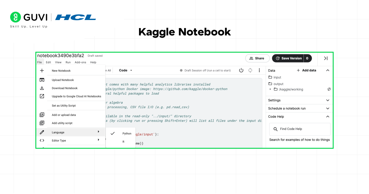
- Run notebooks online (no local setup needed).
- Share projects with others.
- Compete in ML competitions.
Kaggle is an excellent way to practice and showcase your IRIS dataset ML project.
Iris dataset alternatives for 2025 ML practice
| Dataset | Rows / Features | Task | Why move here after Iris |
|---|---|---|---|
| Wine (sklearn.datasets.load_wine) | 178 rows / 13 features | 3-class classification | Same clean, small format as Iris, but more features to practice feature selection |
| Breast Cancer Wisconsin (sklearn.datasets.load_breast_cancer) | 569 rows / 30 features | Binary classification | Real diagnostic data — higher stakes, more features, still no missing values |
| Palmer Penguins (seaborn / palmerpenguins package) | 344 rows / 7 features | 3-class classification | Iris-like structure but includes real missing values, so you practice basic cleaning |
| Digits (sklearn.datasets.load_digits) | 1,797 rows / 64 features | 10-class classification | Introduces image-style data (8×8 pixel grids) while staying in scikit-learn |
IRIS Dataset Tutorial: Step-by-Step Process
Are you ready to give it a shot? Here is a simple outline for an IRIS dataset tutorial.
- Step 1:
- Setup – Install Python, Jupyter Notebook, and the libraries you will need to install (pip install numpy pandas matplotlib scikit-learn seaborn)
- Step 2:
- Load the Data – Use from sklearn.datasets import load_iris – then you can create a DataFrame.
- Step 3:
- Explore – You will have to use .head(), .describe() and .info() to give you a sense of your data.
- Step 4:
- Visualize – Create a pair plot and some scatter plots. Ask yourself the question: which of the features you will be using for the model seems most useful in telling the species apart?
- Step 5:
- Model – Split your data and select a model. Start with K-NeighborsClassifier and train it.
- Step 6:
- Predict and Evaluate – Test your model and its accuracy. Congratulate yourself on the accomplishment.
- Step 7:
- Experiment – Choose a different model, e.g., (SVC) Support Vector Classifier or DecisionTreeClassifier() – see which one performs the best.
Machine Learning Project: IRIS Dataset Machine Learning Project
It is easy to take this into your first IRIS dataset machine learning project. To make it more impressive, you could:
- Compare Models: Compare the accuracy across 3-5 different algorithms.
- Tune Hyperparameters: Experiment with changing parameters of the models (e.g., n_neighbors vlaue in KNN) to see how accuracy is affected.
- Build a Simple App: Build a web app using a library like Streamlit, where a user would input the measurements and the app would provide a prediction.
Compare four classifiers on the same train/test split
from sklearn.model_selection import train_test_split
from sklearn.neighbors import KNeighborsClassifier
from sklearn.svm import SVC
from sklearn.tree import DecisionTreeClassifier
from sklearn.linear_model import LogisticRegression
from sklearn.metrics import accuracy_score

X = df[iris.feature_names]
y = iris.target
X_train, X_test, y_train, y_test = train_test_split(
    X, y, test_size=0.2, random_state=42)

models = {
    'KNN (k=3)': KNeighborsClassifier(n_neighbors=3),
    'SVM': SVC(),
    'Decision Tree': DecisionTreeClassifier(random_state=42),
    'Logistic Regression': LogisticRegression(max_iter=200),
}

for name, model in models.items():
    model.fit(X_train, y_train)
    preds = model.predict(X_test)
    acc = accuracy_score(y_test, preds)
    print(f'{name}: {acc:.2f}')
Expected output / what this shows readers
Prints one accuracy line per model, e.g. ‘KNN (k=3): 1.00’, ‘SVM: 1.00’, ‘Decision Tree: 0.97’, ‘Logistic Regression: 1.00’.
Exact numbers vary slightly by scikit-learn version and random_state, but on this 30-row test split most standard classifiers score at or near 100% — the point for beginners is seeing how little code separates one algorithm from another once the data is prepared.
If you are thinking of pursuing a career as an AI/ML Engineer, the possibilities are endless. Take the chance to get started and learn with HCL GUVI’s IITM Pravartak and Intel Certified Online Artificial Intelligence & Machine Learning Course. This NSDC-approved course offers a certificate recognized globally, which adds serious bragging rights to your résumé and will help you set yourself apart in a highly competitive employment market.
Final thoughts…
The IRIS dataset is more than just a table of flower measurements – it is a classic teaching tool and first stepping stone into the world of machine learning. The simplicity of the data allows students to learn foundational ideas, such as data exploration, classification, training, and testing, without the added complexity of large datasets.
By completing an IRIS dataset example, you are practicing workflows needed to tackle real challenges like fraud detection, healthcare predictions, or recommendation systems. Most importantly, you will get to experience the joy of seeing a model make correct predictions.
So, go to your code editor, load the IRIS dataset, create your first model, and go start your journey.
FAQs
1. Why is the IRIS dataset still used?
The IRIS dataset is small, simple, and visualizable. Therefore, it is great for learning. Even though it is old, it still gets used for tutorials, teaching, and rapidly testing new algorithms.
2. Is the IRIS dataset only for beginners?
Not at all. I think it’s well known with beginners because of its common use, but researchers have also used it for things such as demonstration of a concept, algorithm benchmarking, and explanation of a new ML technique.
3. Is the IRIS dataset suitable for deep learning?
Yes, but it is generally not recommended because the dataset is not large enough. Deep learning models need a substantial amount of data; however, you can still use IRIS to play around with some kind of neural network.
4. How many rows and columns does the IRIS dataset have?
It has 150 rows (samples) and 5 columns (4 features + 1 target variable).
Success Stories

About the Author
Vishalini Devarajan
An Aerospace Engineer turned content writer, I focus on making complex concepts easy to understand through well-structured, reader-friendly blogs. Whether it’s a technical topic or a non-technical one, I love creating content that is clear, engaging, and impactful.
View all posts by Vishalini Devarajan
Connect with me @













Did you enjoy this article?