
Data Visualization in Data Science: Interpret Data Easily
Oct 09, 2025 6 Min Read 2227 Views
(Last Updated)
Have you ever stared at a spreadsheet full of numbers and felt completely lost? You’re not alone. Data, in its raw form, is often dense, dull, and difficult to interpret.
However, when the same data is transformed into a clear, compelling visual, such as a line chart, a heatmap, or a scatter plot, it suddenly becomes more understandable. In the world of data science, data visualization is more than just “pretty charts.” It’s a powerful way to explore patterns, communicate insights, and drive better decisions.
So, how do you master the art of turning numbers into narratives? That’s where we introduce data visualization in data science, which helps in achieving our goal of visualizing data clearly. So, without further ado, let us get started!
Table of contents
- Why Do We Need Data Visualization in Data Science?
- Common Types of Data Visualization in Data Science
- Line Chart
- Bar Chart (Vertical/Horizontal)
- Pie and Donut Charts
- Histogram
- Heatmap
- How to Choose the Right Visualization?
- Tools You Should Learn for Data Visualization)
- Python Libraries (For Programmers/Data Scientists)
- Business Intelligence (BI) Tools (For Analysts and Non-Programmers)
- JavaScript Libraries (For Web Developers)
- Challenge Time: Put What You Learnt Into Practice!
- Best Practices for Effective Data Visualizations
- Prioritize Clarity Over Complexity
- Label Everything Clearly
- Tell a Story, Not Just Display Data
- Use Colors Purposefully
- Maintain Visual Hierarchy
- Test Your Chart with Fresh Eyes
- Mistakes to Avoid in Data Visualization in Data Science
- Using the Wrong Chart Type for the Data
- Overcrowding the Visualization with Too Much Information
- Manipulating Axes to Mislead
- Poor Color Choices and Overuse of Colors
- Overuse of 3D Effects, Shadows, and Animation
- Conclusion
- FAQs
- What is data visualization, and why is it important in data science?
- Which tools are commonly used for data visualization in data science?
- How do I choose the right type of chart for my data?
- What are the common mistakes to avoid in data visualization?
- Can data visualization be used for data analysis?
Why Do We Need Data Visualization in Data Science?
Data visualization acts as a bridge between complex datasets and human understanding. It simplifies the communication of insights, particularly to non-technical stakeholders such as product managers, business leaders, or marketing teams.
Whatever you’re building, be it dashboards or showcasing the results of a machine learning model, your audience needs to see the “what” and “why” without needing to decode your code or SQL queries.
Enhances Pattern Recognition
Humans are visual creatures. Our brains are hardwired to detect patterns, contrasts, and anomalies when presented visually. Charts and graphs help us:
- Spot trends over time
- Detect outliers or missing values
- Understand correlations or distributions
- Compare categories effectively
Common Types of Data Visualization in Data Science
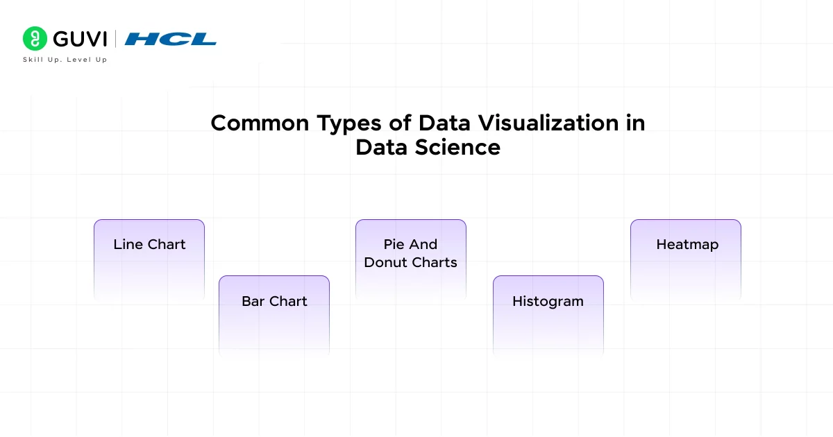
Each type of data visualization serves a specific purpose in data science. Understanding when and how to use them is essential for turning raw numbers into intuitive insights. Here’s a breakdown of the common types of data visualization:
1. Line Chart
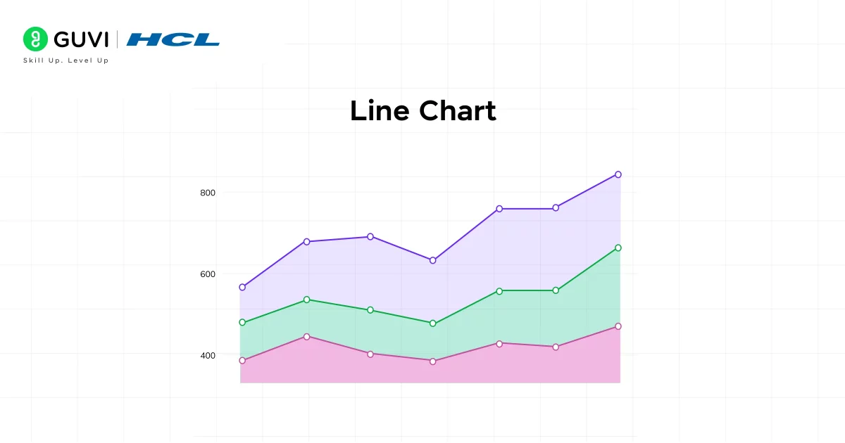
A line chart comes in handy when you need to show trends over time or continuous data. Moreover, line charts are intuitive for tracking changes. Slope indicates the rate of change: upward = increase, downward = decrease.
Example Use Cases:
- Website traffic across weeks/months.
- Temperature readings by hour.
- Company revenue growth over the years.
2. Bar Chart (Vertical/Horizontal)
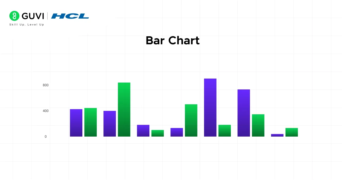
A bar chart compares quantities among discrete categories. It plays a major role in visualizing data because the height or length of a bar chart makes comparisons simple.
Example Use Cases:
- Number of users from different countries.
- Sales comparison of different products.
- App usage across devices.
3. Pie and Donut Charts
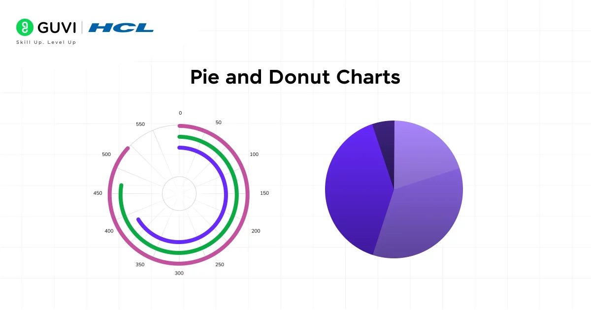
A pie chart, or what some people call a donut chart, shows proportions of the data as a whole. This helps in giving us a quick sense of which parts dominate.
Example Use Cases:
- Budget allocation.
- Market share distribution.
- Customer demographic split.
4. Histogram
A histogram shows the distribution of a variable across the data. It helps you understand central tendency and spread of the data.
Example Use Cases:
- Distribution of student scores.
- Frequency of product prices.
- Age distribution in a dataset.
5. Heatmap
A heatmap visualizes values in a matrix format, with varying colors indicating separate data in a separate color. The major advantage of a heatmap is its coloring method, where the color gradients quickly communicate intensity or concentration.
Example Use Cases:
- User activity across days and hours.
- Correlation matrix between variables.
- Exam scores of students by subject and week.
How to Choose the Right Visualization?
Choosing the right chart is not just a design decision; it’s a storytelling decision. The question is: “What are you trying to show?”
Here’s a decision-making guide based on data intent and structure that helps you in choosing the right visualization for your data:
| Goal / Task | Recommended Chart Types | Purpose |
| Show trends over time | Line chart, Area chart | Visualize changes over a continuous time axis |
| Compare values across categories | Vertical Bar chart, Horizontal Bar chart | Highlight differences in magnitude between discrete groups |
| Show proportions or part-to-whole | Pie chart, Donut chart, Stacked bar chart | Display the relative size of parts within a whole |
| Show relationships or correlations | Scatter plot, Bubble chart, Heatmap | Reveal how two or more numeric variables relate to each other |
| Visualize distributions | Histogram | Understand the spread, skewness, and concentration of data |
| Rank items | Bar chart (sorted) | Visually emphasize rankings and comparisons |
| Compare actual vs. target | Bullet chart, Bar chart with goal lines | Evaluate progress towards benchmarks or goals |
| Show magnitude over categories and dimensions | Heatmap | Represent values with color intensity in two dimensions |
If you want to read more about how beneficial it is to have data visualization in data science, consider reading HCL GUVI’s Free Ebook: Master the Art of Data Science – A Complete Guide, which covers the key concepts of Data Science, including foundational concepts like statistics, probability, and linear algebra, along with essential tools.
Tools You Should Learn for Data Visualization)
Data visualization tools vary from code-based libraries to drag-and-drop BI platforms and frontend-focused libraries for interactive web apps. Here’s a look at the most important tools across categories:
1. Python Libraries (For Programmers/Data Scientists)
Python is one of the most popular languages for data science, and it has a powerful stack of visualization libraries:
- Matplotlib
- Seaborn
- Plotly
- Altair
2. Business Intelligence (BI) Tools (For Analysts and Non-Programmers)
These tools require no coding and are suitable for business users who want to build and share dashboards easily.
- Tableau
- Microsoft Power BI
- Google Looker Studio (formerly Data Studio)
3. JavaScript Libraries (For Web Developers)
For interactive web applications, JavaScript libraries offer pixel-perfect control over visualizations.
a. D3.js (Data-Driven Documents): A powerful, low-level JS library that manipulates the DOM to create custom interactive visuals.
- When to use: When you need full customization or novel chart types.
- Strengths:
- Unlimited flexibility
- Can create unique visuals
- Great for infographics and data journalism
- Ideal for: Interactive storytelling, custom chart types, web visualizations.
b. Chart.js: A lightweight, beginner-friendly JS charting library with easy setup.
- When to use: When you want basic charts on a website or admin panel.
- Strengths:
- Minimal configuration
- Supports major chart types
- Works well in HTML/JS apps
- Minimal configuration
- Ideal for: Dashboards, product analytics, and admin panels.
Example Use Case: Real-time bar chart showing product inventory levels.
Challenge Time: Put What You Learnt Into Practice!
Take a simple dataset (like the Iris dataset or a CSV with sales data).
Challenge: Using Python (with Pandas + Matplotlib or Seaborn), visualize:
- Sales trend over time (Line chart)
- Sales by category (Bar chart)
- Relationship between price and quantity sold (Scatter plot)
Try this on your local Jupyter Notebook or Google Colab and observe how much faster you grasp insights visually.
Best Practices for Effective Data Visualizations
Here’s how you can go from “decent chart” to “wow, I get it!” with best practices rooted in psychology, design principles, and storytelling.
1. Prioritize Clarity Over Complexity
Your visualization should answer a question, not raise one. Keep it clean and focused.
- Remove unnecessary gridlines and clutter.
- Stick to clean layouts and consistent spacing.
- Use plain backgrounds (white or light gray) for readability.
2. Label Everything Clearly
What you think is obvious may not be obvious to others.
- Use descriptive titles: “Sales Growth in 2025” is better than “Chart 1.”
- Label axes, units, and scales.
- Use legends only if colors or shapes are not self-explanatory.
3. Tell a Story, Not Just Display Data
Ask yourself: What’s the insight here?
Use:
- Annotations for key turning points.
- Callouts or highlight colors for unusual patterns.
- Subtitles that describe the insight, not the metric.
Example: “Sales dropped by 32% after policy change in Q3”
4. Use Colors Purposefully
Colors should guide attention, not confuse.
- Use contrasting colors for categories or highlights.
- Use colorblind-friendly palettes (like Viridis or Tableau’s default).
- Avoid using red-green combinations in critical comparisons.
5. Maintain Visual Hierarchy
Help users understand what to focus on first.
- Use bold, larger fonts for key metrics.
- Use white space to separate different sections.
- Draw attention using color, size, and layout, not animation alone.
6. Test Your Chart with Fresh Eyes
Before presenting, ask:
- Can a new user understand this in 10 seconds?
- Is my key takeaway obvious?
- Are there distractions or ambiguities?
By following these practices, you have a powerful way to represent the data, and you can make users understand the vast set of raw numbers easily!
Mistakes to Avoid in Data Visualization in Data Science
Even a beautifully styled chart can fail miserably if it’s misleading, confusing, or cluttered. Let’s explore the most common mistakes and how to avoid them:
1. Using the Wrong Chart Type for the Data
This is one of the most frequent errors. The wrong chart misrepresents the data or makes it harder to interpret.
Example: Using a pie chart to compare 8 different customer segments with nearly equal shares. Viewers will struggle to detect meaningful differences in angles and sizes.
2. Overcrowding the Visualization with Too Much Information
More data ≠ more insight. Visual overload is real. When a single chart tries to do too much, it overwhelms the viewer and leads to cognitive fatigue.
Example: A bar chart comparing 20 products, each color-coded by region, with additional tooltips and grid lines.
Why It’s a Problem: When every element competes for attention, nothing stands out. People get lost trying to decode it instead of grasping the message.
3. Manipulating Axes to Mislead
This mistake may be unintentional, but it can distort reality and mislead stakeholders.
Example: A bar chart showing profit increase with a y-axis that starts at 90 instead of 0. A modest 2% growth visually looks like a 40% leap.
Solution:
- Start the y-axis at 0 for most bar charts and line graphs unless there’s a clear, ethical reason not to.
- Always label axes and units.
- Use gridlines or data labels to aid interpretation.
4. Poor Color Choices and Overuse of Colors
Color is powerful, but only when used wisely. Poor color schemes can create visual chaos or accessibility issues.
Example: Using a rainbow palette for 6 similar categories, or red-green contrast without considering colorblind users.
Why It’s a Problem: Colors that are too bright, too similar, or inaccessible can make your visuals harder to understand. Red-green color blindness affects ~8% of men globally.
Solution:
- Use color intentionally: one for highlight, others neutral.
- Stick to 2–3 base colors and use saturation to indicate depth.
- Choose colorblind-safe palettes (e.g., ColorBrewer, Viridis).
5. Overuse of 3D Effects, Shadows, and Animation
Visual embellishments like 3D bars or rotating charts may seem “fancy,” but they often do more harm than good.
Example: A 3D pie chart makes one slice appear larger due to perspective distortion, even if it’s numerically smaller.
Solution:
- Stick to flat, clean 2D charts unless you’re doing true spatial or 3D modeling.
- Use animation sparingly — to reveal or highlight, not to entertain.
These are some of the common mistakes that one tends to make while starting, but if you are aware of them and avoid them at the early stage itself, then you can build effective illustrations of data visualization in data science.
If you want to learn more about how Data Visualization is important in data science through a structured program that starts from scratch, consider enrolling in HCL GUVI’s IIT-M Pravartak Certified Data Science Course, which empowers you with the skills and guidance for a successful and rewarding data science career!
Conclusion
In conclusion, raw numbers alone rarely tell the full story. It’s through effective data visualization that patterns emerge, insights become clear, and decisions gain direction. If you’re showcasing business performance, uncovering correlations, or presenting the results of a machine learning model, your ability to visualize data with clarity and purpose is what makes your work impactful.
By choosing the right chart type, using the right tools, and following visualization best practices, you transform complex datasets into meaningful stories. So as you continue your data journey, remember: great data science doesn’t just inform, it communicates. And visualization is the bridge that connects insight to action.
FAQs
1. What is data visualization, and why is it important in data science?
Data visualization is the graphical representation of information and data. It enables data scientists and analysts to present complex data in a visual context, such as charts or graphs, making it easier to identify patterns, trends, and outliers.
2. Which tools are commonly used for data visualization in data science?
Several tools are widely used for data visualization:
Matplotlib
Seaborn
Plotly
Tableau
Power BI
3. How do I choose the right type of chart for my data?
Selecting the appropriate chart depends on the nature of your data and the message you want to convey:
Line Charts: Ideal for showing trends over time.
Bar Charts: Useful for comparing quantities across categories.
Pie Charts: Best for illustrating proportions within a whole.
Heatmaps: Great for showing data density or correlation matrices.
4. What are the common mistakes to avoid in data visualization?
Common pitfalls include:
Overcomplicating Visuals: Adding unnecessary elements that clutter the visualization.
Inappropriate Chart Types: Using charts that don’t suit the data, leading to misinterpretation.
Lack of Context: Omitting titles, labels, or legends that help interpret the data.
Overuse of Colors: Using too many colors can confuse the audience.
5. Can data visualization be used for data analysis?
Absolutely. Data visualization is a critical component of exploratory data analysis (EDA). It allows analysts to uncover underlying structures, detect outliers, test hypotheses, and check assumptions through visual means. By presenting data visually, it becomes easier to identify patterns and insights that might not be apparent from raw data alone.











Did you enjoy this article?