The Ultimate Guide to Mastering Bootstrap Framework
Aug 29, 2025 7 Min Read 2263 Views
(Last Updated)
Bootstrap remains the most widely adopted front-end toolkit in professional development. It lets teams deliver responsive layouts without reinventing foundational CSS patterns. Engineers use it to stabilize build times and reduce cross-browser discrepancies.
This guide covers everything from foundational setup to advanced troubleshooting and comparisons. Read on now to start mastering Bootstrap.
Table of contents
- What is a Bootstrap Framework?
- Top 10 Features of the Bootstrap Framework for Web Developers
- Learn Faster with the GUVI Full-Stack Development Course
- Best Benefits of Bootstrap Framework
- Step-by-Step Tutorial: Designing with Bootstrap Framework
- Step 1: Setting Up the Environment
- Step 2: Structuring the Grid
- Step 3: Building Navigation
- Step 4: Styling Content with Utility Classes
- Step 5: Adding Interactivity
- Step 6: Customising with Sass Variables
- Step 7: Testing and Debugging across Browsers
- Step 8: Preparing for Production Deployment
- Bootstrap Framework Templates: Free and Premium Resources
- Common Mistakes to Avoid When Using Bootstrap Framework
- Bootstrap Framework vs. Other CSS Frameworks: Which Is Best?
- Conclusion
- FAQs
What is a Bootstrap Framework?

Bootstrap is an open-source front-end toolkit created by Twitter engineers and refined by contributors worldwide. Developers apply Bootstrap to accelerate layout creation and enforce consistent styling without low-level CSS rewrites. Designers appreciate its base aesthetic that works across browsers consistently. Teams benefit from faster delivery, fewer code regressions, and reduced design drift. Overall, Bootstrap serves organizations by solidifying design systems and streamlining workflow dependencies.
Top 10 Features of the Bootstrap Framework for Web Developers
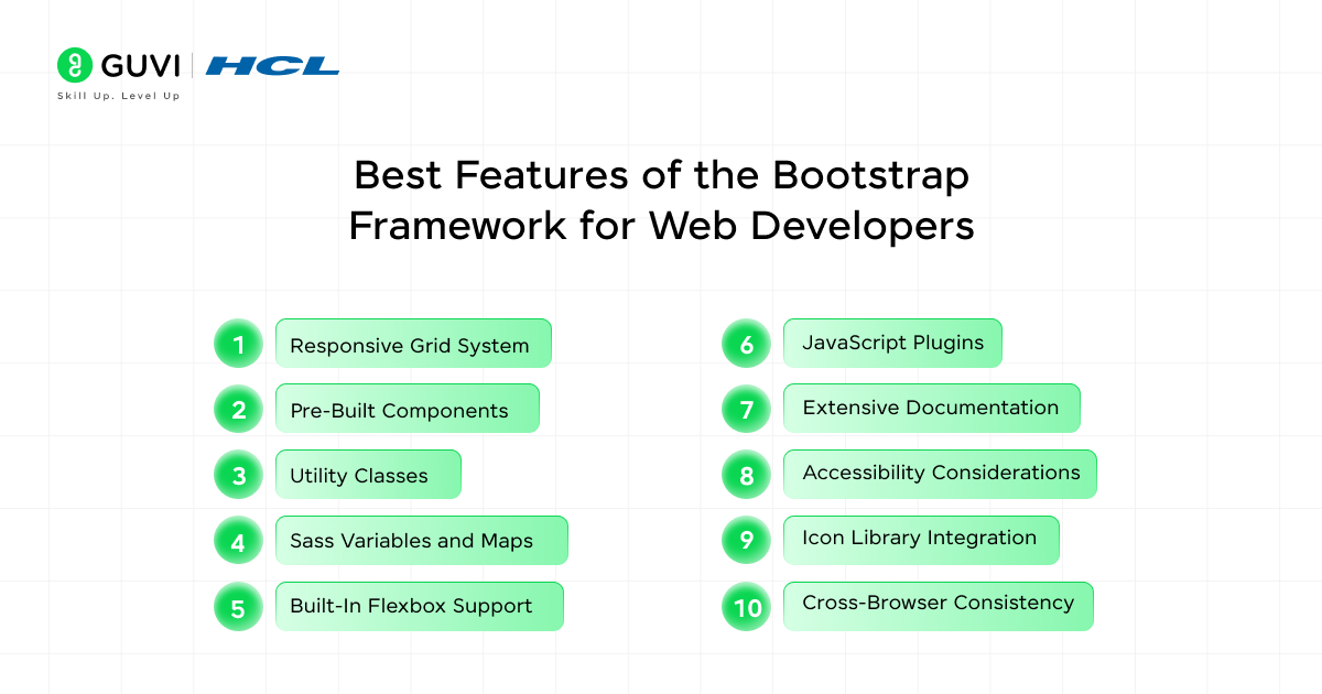
Following are ten core features that professionals value in enterprise-grade Bootstrap usage. Each section covers its technical strengths and practical use cases.
- Responsive Grid System
Bootstrap’s grid system is built on a twelve-column flex layout. It adapts automatically at defined breakpoints without custom media queries. Developers define column spans like .col-md-6 and .col-xl-4 for device-specific design. It helps with complex layout structures without writing boilerplate code.
The system includes .container, .row, and gutter spacing. Engineers can also rearrange column order across screen sizes using utilities such as .order-lg-2. This creates powerful adaptive layouts while maintaining semantic and clean HTML.
- Pre-Built Components
Bootstrap includes UI components like navbars, cards, modals, alerts, and more. Each component features accessible markup and consistent style defaults. Developers wire them together using classes and roles without reinventing HTML structures. The plugins provide keyboard support, focus management, and ARIA attributes.
Designers maintain visual consistency across screens and interactions. Teams ship dynamic pages faster because building blocks require no third-party plug‑ins. Maintenance becomes simpler due to official updates and community feedback tracking component performance and accessibility issues.
- Utility Classes
Bootstrap offers single-purpose utility classes for spacing, typography, flex control, and display toggles. Engineers apply visual adjustments directly in HTML without modifying CSS. This keeps base styles clean and predictable. For instance, .mt-3 adds controlled margin, while .text-center adjusts alignment.
Utility chains make rapid style changes possible during design sprints. Teams avoid style duplication and cascading overrides. Code readability increases when styling intent is embedded alongside markup. In long-term projects, utility classes support consistent UX.
- Sass Variables and Maps
Bootstrap configuration uses Sass variables and maps for colors, grid sizes, spacings, and breakpoints. Organizations customize brand identity by editing variable values without altering core CSS. This supports design tokens and theme archival.
Developers create modular styles based on centralized settings. Audits are easier because color scales and layout breakpoints reference the same source. Renaming variables or adjusting scale requires single-line edits. It supports large-scale systems and white label deployments. It eliminates duplication and supports style guide fidelity.
- Built-In Flexbox Support
Bootstrap default grid and utilities rely on flexbox to deliver flexible alignment and distribution. Engineers can center content along both axes using .align-items-center and .justify-content-center. Creating equal-height columns would have required CSS hacks before.
The grid supports dynamic resizing across viewports. Building responsive navigation or card layouts becomes simpler. Flex utilities unlock options for vertical alignment and responsive design patterns. Teams can adapt layouts fluidly without extra CSS rules. It results in cleaner HTML and more predictable behaviors.
- JavaScript Plugins
Bootstrap bundles native JavaScript plugins for dropdowns, tooltips, popovers, carousels, and collapse behaviors. These plugins activate through data attributes like data-bs-toggle=”tooltip”. Developers avoid dependency on jQuery or heavy UI libraries. The bundle uses ES modules and supports lifecycle events for integration.
Components offer keyboard and focus support. Teams deploy interactive actions without writing boilerplate code. Lazy initialization and modular imports keep performance overhead minimal. Overall, Bootstrap plugin architecture balances interactivity and simplicity.
- Extensive Documentation
Bootstrap documentation includes API references and accessibility guidelines. Engineers confirm usage patterns and markup validity without guesswork. Copy-and-paste code snippets reduce onboarding time. Documentation also includes browser support, best practices, and common gotchas.
Teams can reference the source with confidence. This guide also points out pitfalls and advanced layout considerations. Over time, the documentation supports smooth onboarding of external contributors. It becomes the single source of truth for design systems and usage conventions.
- Accessibility Considerations
Bootstrap components use ARIA roles, keyboard bindings, and focus control to improve screen reader compatibility. For example, modals manage focus trapping automatically. Dropdowns are keyboard accessible and respect fallback scenarios. Alerts include role=”alert” for assistive notifications. This design-first approach helps avoid post-development audits and retrofits.
Engineers maintain compliance with WCAG standards. The default UI ensures users with disabilities receive helpful interaction cues. Designers can prototype accessible patterns confidently. Overall, Bootstrap accessibility support is baked in, not bolted on.
- Icon Library Integration
Bootstrap Icons is a companion SVG icon library that aligns fluidly with the framework style. Developers embed icons using consistent markup and sizing classes such as bi bi-alarm. It guarantees visual harmony across components. Icons are vector-based, which makes scaling efficient. No need to load heavy PNG or web font packs.
Projects benefit from fast asset delivery and smaller file sizes. Branding becomes smoother when designers can treat icons and components from one ecosystem. There is also custom theming support through Sass variables.
- Cross-Browser Consistency
Bootstrap resets and normalizes core HTML elements across browsers. Input styling, button padding, font sizes, and default margins are standardized. Teams spend less effort chasing visual discrepancies during testing. After building a layout once it looks similar on Chrome, Firefox, Safari, and Edge.
The framework handles unpredictable base CSS differences across browsers. This leads to fewer test cycles and quicker QA passes. Production stability increases when UI remains consistent across platforms. Projects satisfy client expectations sooner.
Learn Faster with the GUVI Full-Stack Development Course
Developers seeking structured guidance and mentor feedback can enrol in our full-stack program. The curriculum includes an in-depth Bootstrap track, hands-on labs, and code reviews tailored to real business scenarios, accelerating proficiency and career momentum.
Best Benefits of Bootstrap Framework
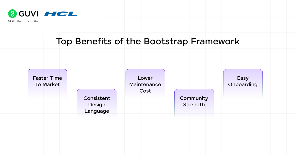
Here are practical benefits that clients and developers experience once Bootstrap becomes part of a project stack:
- Faster Time to Market
Reusable components and utility classes reduce development cycles. Teams deliver MVP products without rewriting core UI structures. This frees up time for business logic, usability testing, and iteration. Clients see visible prototype progress within days instead of weeks.
Features launch earlier so market feedback can begin sooner. Teams can pivot without scrambling for low-level CSS fixes. Bootstrap supports agility without sacrificing consistency or quality.
- Consistent Design Language
Shared CSS variables and standardized classes preserve brand cohesion across pages. Whether internal or external developers contribute, the result still aligns with design standards. Marketing or editorial teams cannot unknowingly break layouts.
Component reuse avoids visual drift and consistency builds trust with returning users. Pages across campaigns appear familiar yet flexible. This cohesion improves usability and positions teams for scalable design systems.
- Lower Maintenance Cost
With most styling handled through CSS vars and utility classes, there is less custom CSS to manage. Updates, refactors, and site rebuilds become simpler. Teams avoid CSS cascade issues because styling logic is centralized.
Long-term projects remain maintainable as individuals rotate out. Support costs drop since fewer style conflicts arise. Styles degrade gracefully with fewer bugs. Overall, code longevity improves and technical debt remains manageable.
- Community Strength
Bootstrap enjoys an enormous contributor base, which means patches, security reports, and feature ideas appear quickly. When project teams encounter unusual edge cases, community members often share working solutions through repositories, forums, or conference talks.
Businesses benefit directly, because engineering efforts focus on innovative tasks rather than isolated troubleshooting. Community involvement also drives timely compatibility updates when browsers deprecate behaviors or introduce new capabilities.
- Easy Onboarding
New developers can understand Bootstrap naming conventions and layout patterns within hours, not days. Teams share links to official examples, and junior engineers learn by inspecting class names rather than reading dense documentation.
Familiar utility classes appear across many projects, so skills travel easily between codebases. Project ramp-up costs drop, velocity increases, and knowledge silos fade. Senior leaders notice improved delivery consistency when onboarding overhead disappears.
Step-by-Step Tutorial: Designing with Bootstrap Framework
Below is a complete workflow that carries a project from empty HTML to production deployment. Each stage contains one concise paragraph and a focused checklist.
Step 1: Setting Up the Environment
Begin by linking the official Bootstrap CSS and JavaScript bundles from a trusted CDN. Position the JavaScript file before the closing body tag, which prevents render blocking. Include integrity attributes and cross-origin settings, which protect against corrupted assets. Verify that the CSS and JavaScript versions match to avoid feature mismatch warnings throughout development.
Checklist
- Confirm matching version numbers for CSS and JavaScript.
- Place JavaScript after the main content to preserve performance.
- Add Subresource Integrity hashes for security verification.
Step 2: Structuring the Grid
Wrap page sections inside .container for fixed-width or .container-fluid for full-width designs. Insert .row elements, then assign responsive column classes like .col-md-6 or .col-xl-4. Use .g-3 gutter classes to maintain even spacing. Reorder columns on larger screens with utilities such as .order-lg-2, which rearranges flow without extra markup.
Checklist
- Select container type based on layout width goals.
- Apply uniform gutters using .g-* classes.
- Utilise ordering utilities to change layout at breakpoints.
Step 3: Building Navigation
Create a .navbar with .navbar-expand-lg so menus collapse on tablets yet remain horizontal on larger screens. Add .navbar-brand for the logo. Attach a toggle button linked to a .collapse div that stores navigation links. Provide ARIA attributes for screen-reader context. Push menu items right using .ms-auto for balanced alignment.
Checklist
- Connect toggler and menu with matching identifiers.
- Insert required ARIA attributes for accessibility.
- Use margin utilities to align links within the bar.
Step 4: Styling Content with Utility Classes
Leverage spacing utilities like .pt-5 and .mb-4 to control paddings and margins without extra CSS. Center text using .text-center and add depth with .shadow-sm. Combine utilities thoughtfully so markup remains readable and maintainable. Override global variables in Sass when brand requirements change instead of stacking excessive inline classes.
Checklist
- Group related utilities to keep class lists manageable.
- Monitor responsive utilities for breakpoints beyond default.
- Refactor variable overrides Sass for global reach.
Step 5: Adding Interactivity
Enable dynamic behaviors such as tooltips or collapse elements using data attributes. Initialise components that load later through JavaScript calls, ensuring functionality for lazily injected content. Test keyboard navigation and focus trapping, which preserve accessibility across plugins. Trim unused plugins from the bundle to maintain lean load times.
Checklist
- Activate plugins with data-bs-toggle attributes.
- Initialise dynamic content through explicit JavaScript calls.
- Validate focus and keyboard flow for every interactive element.
Step 6: Customising with Sass Variables
Create a _custom.scss file and import it before Bootstrap core. Modify colour, spacing, and breakpoint variables to match brand guidelines. Compile the Sass source using the documented build toolchain, which outputs themed CSS. Keep all custom tokens centralised to simplify future redesigns and maintain coherent visual language across teams.
Checklist
- Place custom variable overrides above Bootstrap imports.
- Run a watch task for continuous Sass compilation.
- Document variable changes inside a shared design system.
Step 7: Testing and Debugging across Browsers
Audit layouts on Chrome, Firefox, Safari, Edge, and a modern mobile browser. Use Lighthouse and WebPageTest to measure performance. Inspect accessibility with Axe. Confirm component alignment, keyboard reachability, and text contrast. Address slow resources, blocking scripts, or layout shifts before stakeholder review.
Checklist
- Capture performance baselines for each major browser.
- Fix contrast violations and misaligned elements promptly.
- Retest after every optimization to confirm stability.
Step 8: Preparing for Production Deployment
Purge unused selectors with a tool like PurgeCSS to minimise bundle size. Enable content hashing for CSS and JavaScript filenames, which ensures cache refresh after releases. Serve assets using Brotli compression and enforce HTTPS. Configure server headers for caching, content security, and transport protection before moving traffic.
Checklist
- Remove unused CSS selectors during build.
- Apply hashed filenames for reliable cache invalidation.
- Serve all assets over secure, compressed channels.
These eight steps, when executed in sequence, guide any team from blank markup toward a stable and performant Bootstrap deployment ready for real users.
Bootstrap Framework Templates: Free and Premium Resources
Following are trusted template sources that accelerate builds while maintaining professional standards.
- Start Bootstrap supplies MIT-licensed landing pages, dashboards, and blog layouts suitable for SaaS or portfolio work.
- Bootswatch delivers alternate theme palettes that drop into default builds, instantly adjusting visual tone without editing components.
- Creative Tim offers admin dashboards that blend Bootstrap styling with React or Vue, ideal for data-heavy applications.
- ThemeForest hosts premium templates featuring extended customer support and niche vertical designs for enterprise buyers.
- GitHub community repositories often provide minimal starter kits and boilerplates, useful for rapid prototypes or teaching demos.
Evaluate each template for code quality, accessibility compliance, and update cadence before adoption. Premium licenses sometimes bundle design files, which helps maintain brand alignment across teams.
Common Mistakes to Avoid When Using Bootstrap Framework
Below are errors frequently observed during code reviews and rescue projects:
- Overwriting core classes directly, which breaks updates. Extend or override through custom selectors or Sass variables instead.
- Duplicating container wrappers inside nested sections, inadvertently adding extra padding and producing misalignment.
- Mixing multiple Bootstrap versions within one application, creating unpredictable cascade conflicts and inflated bundle sizes.
- Ignoring accessibility when customizing JavaScript plugins, leading to unreadable components for assistive technology users.
- Neglecting image optimization and lazy loading, which damages performance metrics despite an otherwise streamlined CSS stack.
Avoiding these pitfalls preserves performance budgets and guarantees design consistency throughout the project lifecycle.
Bootstrap Framework vs. Other CSS Frameworks: Which Is Best?
Here is a concise comparison that highlights how Bootstrap stacks up against three other popular frameworks:
| Key Factor | Bootstrap 5 | Tailwind CSS | Foundation 6 | Bulma 0.9 |
| Grid methodology | Twelve-column flex grid with preset gutters | Utility grid plugins optional | XY grid with cells and gutters | Flex grid using simple column classes |
| Component availability | Extensive bundle covering navbars, modals, and forms | Minimal core, external UI kits needed | Comprehensive yet slower updates | Moderate set, lightweight scope |
| Customization strategy | Sass variables plus maps | Configuration file plus PostCSS pipeline | Sass mixins and variables | Sass variables |
| Learning curve | Moderate due to structural conventions | Steeper because utility mindset dominates | High for grid mastery | Gentle for basic layouts |
| Community size | Very large with corporate adoption | Rapidly expanding and well-documented | Stable yet smaller | Active though limited |
Bootstrap remains the most balanced choice for teams needing both predefined components and straightforward theming. Tailwind suits developers who prefer utility-first workflows. Foundation and Bulma compete in specific niches but lack Bootstrap’s ecosystem depth.
Conclusion
Bootstrap stands as a reliable, feature-rich framework that speeds development without sacrificing quality. Its responsive grid, customizable variables, and accessible components make it a sensible foundation for projects ranging from landing pages to enterprise dashboards. Mastery requires an understanding of Sass architecture and thoughtful use of utilities. By implementing the steps outlined above, avoiding common mistakes, and leveraging community resources responsibly, teams deliver high-performance experiences that meet stakeholder goals and user expectations.
FAQs
1. Does Bootstrap integrate smoothly with React, Vue, and other modern stacks?
Yes. Framework-specific wrappers expose Bootstrap components as native elements, preserving reactivity and state management.
2. How can designers apply custom brand palettes across a Bootstrap project?
Adjust primary, secondary, and accent variables in the Sass file, then compile fresh CSS to propagate changes.
3. What strategies protect Core Web Vitals when using Bootstrap?
Purge unused CSS, compress assets, defer non-critical scripts, and implement lazy loading for imagery.
4. Is it possible to create a unique design while still using Bootstrap?
Definitely. Custom themes, variable adjustments, and bespoke components can differentiate the final product.
5. When should a team move beyond Bootstrap to a fully bespoke design system?
Shift when project requirements demand component patterns or visual language that extend far outside Bootstrap’s model.





Did you enjoy this article?