Have you ever wondered how analysts transform rows of raw numbers into stunning charts that instantly make sense? That’s the power of data visualization. By representing data visually, it becomes much easier to identify trends, uncover patterns, and make informed decisions based on data.
One of the most popular Python libraries for this purpose is Seaborn. Built on top of Matplotlib, Seaborn makes it simple to create clean, attractive, and informative visualizations with minimal code. It’s especially loved for its ability to handle complex datasets and automatically style visuals beautifully.
In this blog, we’ll explore everything you need to know about Seaborn data visualization — from understanding its importance to learning how to install and import it, exploring different types of charts, and creating hands-on visualizations using a sample dataset. By the end, you’ll be ready to use Seaborn confidently for your own data projects.
Table of contents
- Importance Of Data Visualization
- What Is Seaborn?
- Key Features Of Seaborn
- Types Of Visualizations In Seaborn
- Relational Plots — Show Relationships Between Variables
- Categorical Plots — Compare Categories or Groups
- Distribution Plots — Understand Data Spread and Shape
- Matrix Plots — Visualize Relationships Between Multiple Variables
- Regression Plots — Explore Relationships With Trend Lines
- Hands-On: Working With A Dataset Using Seaborn
- Step 1: Installing And Importing Seaborn
- Step 2: Using A Pre-Made Dataset
- Step 3: Plotting With Seaborn
- Advantages Of Using Seaborn
- Challenges Or Limitations
- Conclusion
- FAQs
- How Is Seaborn Different From Matplotlib?
- Can Seaborn Handle Large Datasets Efficiently?
- What Type Of Plots Are Best For Correlation Analysis?
- Do I Need Pandas To Use Seaborn Effectively?
- Is Seaborn Suitable For Beginners In Data Visualization?
Importance Of Data Visualization
Data visualization is not just about making charts; it’s about revealing the story hidden within your data. It helps simplify complex information, making it easier to understand and analyze.
It allows you to:
- Identify Trends and Relationships: Spot how variables interact and uncover hidden correlations in your data.
- Detect Outliers: Quickly find unusual or unexpected data points that might affect your analysis.
- Summarize Complex Data: Convert large datasets into clear visuals that are easier to interpret and present.
- Support Data Storytelling: Turn raw numbers into visual insights that make your message more impactful and convincing.
In short, visualization bridges the gap between raw data and decision-making. Seaborn makes this process smooth and efficient, helping you focus on insights instead of struggling with complex code.
What Is Seaborn?
Seaborn is a powerful Python library designed for statistical data visualization, built on top of Matplotlib. It helps create clean, professional, and visually appealing charts with minimal code.
Unlike traditional plotting tools, Seaborn integrates smoothly with pandas DataFrames, making it ideal for analyzing real-world datasets. It automatically manages colors, themes, and layouts, allowing you to focus on understanding the data rather than adjusting visuals.
Seaborn is especially useful for exploratory data analysis (EDA), helping you quickly identify trends, relationships, and patterns that might not be obvious in raw data.
Key Features Of Seaborn
Seaborn comes with a range of features that make it one of the best tools for creating clear and visually appealing charts in Python:
- Built-in Themes: Comes with attractive default themes that improve the look and readability of your charts.
- Seamless Integration with Pandas: Works directly with DataFrames, making it easy to plot real-world datasets.
- Statistical Support: Automatically adds statistical insights like confidence intervals, trends, and distributions.
- Wide Variety of Plots: Supports multiple chart types such as scatter plots, bar plots, box plots, and heatmaps.
- Customizable Colors and Styles: Offers rich color palettes and style options to personalize your visuals.
These features make Seaborn a go-to choice for anyone who wants to create meaningful, professional-quality visualizations with minimal effort.
If you want to build a solid foundation in data visualization and analytics,do check out the Data Science eBook is a perfect start. It covers key topics like Python basics, Seaborn data visualization, data cleaning, machine learning concepts, and real-world case studies. With clear explanations and examples, this eBook helps you move from beginner to confident data explorer.
Types Of Visualizations In Seaborn
Seaborn data visualization offers many chart types to explore distributions, relationships, categories, and patterns. Below are the most popular kinds, explained in simple terms with when to use each and example functions.
1. Relational Plots — Show Relationships Between Variables
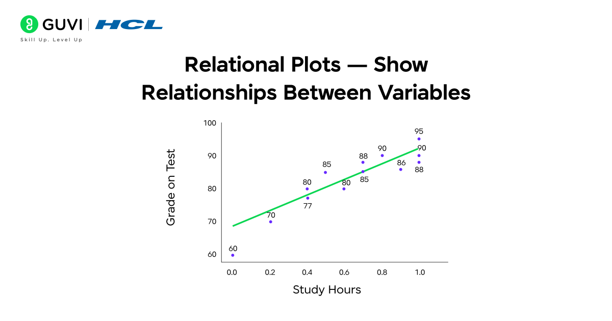
Relational plots let you see how two (or more) numeric variables change together. They are great for spotting trends, clusters, or correlations.
- Common functions: scatterplot(), lineplot()
- When to use: Use a scatterplot to check if two variables move together (for example, hours studied vs test score). Use a line plot when one variable is ordered (usually time) to show trends.
- What you learn: strength and direction of relationships, possible outliers, basic trend shape.
- Quick tip: Add hue to color points by category (e.g., gender) to compare groups in one chart.
2. Categorical Plots — Compare Categories or Groups
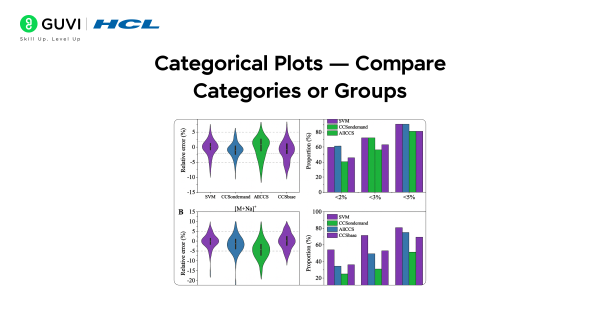
Categorical plots compare values across different groups or categories so you can see differences and spreads.
- Common functions: barplot(), countplot(), boxplot(), violinplot()
- When to use: Use a barplot to compare average values by group (e.g., average tip by day). Use countplot to show the frequency of categories. Use a boxplot or violin plot to see the distribution and spread inside each category.
- What you learn: group averages, distribution shape per group, and whether groups differ significantly.
- Quick tip: violinplot combines distribution and density information — useful when you want to see the full distribution shape for each category.
3. Distribution Plots — Understand Data Spread and Shape
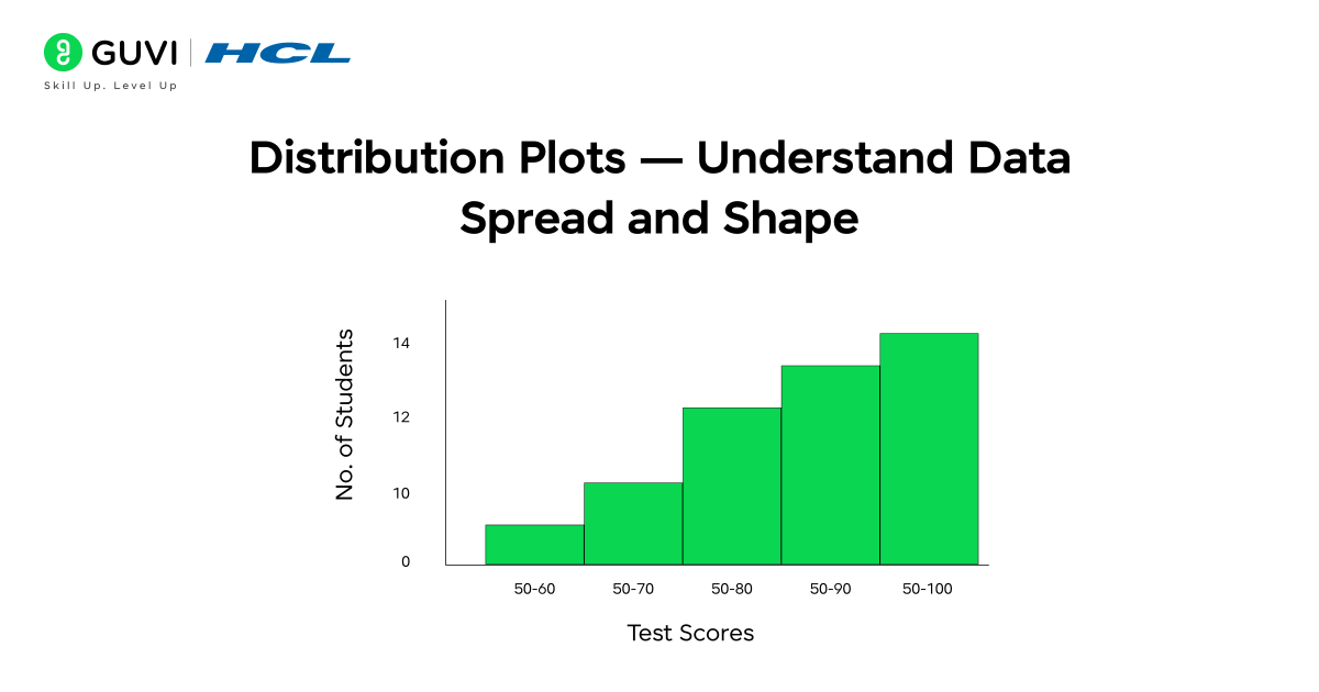
Distribution plots show how values are spread across a single variable — useful for understanding skew, peaks, and fullness.
- Common functions: histplot(), kdeplot()
- When to use: Use histplot to view frequency counts across bins. Use kdeplot for a smooth estimate of the distribution. Combine both to get counts and smooth shape.
- What you learn: where most values lie, whether the data is skewed, and if there are multiple modes (peaks).
- Quick tip: Overlay distributions for multiple groups using hue or plot separate KDE lines to compare shapes.
4. Matrix Plots — Visualize Relationships Between Multiple Variables
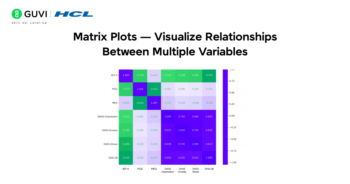
Matrix plots summarize pairwise relationships or correlations among many variables in one view.
- Common function: heatmap() (also clustermap() for clustered matrices)
- When to use: Use a heatmap to show correlation matrices or intensity tables (for example, correlation between features in a dataset). Use clustermap to group similar rows/columns visually.
- What you learn: which variable pairs are strongly related, clusters of similar features, and where to focus feature engineering.
- Quick tip: Annotate values (annot=True) in the heatmap when precise numbers are important.
5. Regression Plots — Explore Relationships With Trend Lines
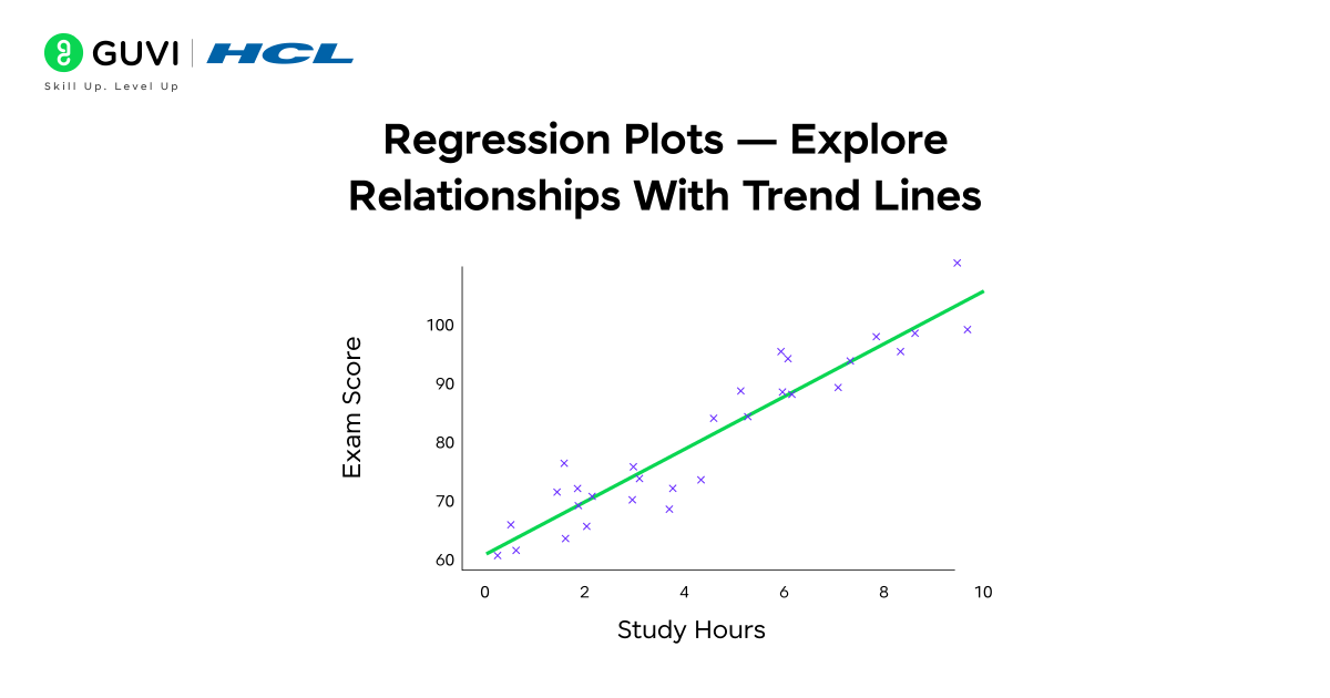
Regression plots combine scatter/points with fitted trend lines and confidence intervals to show predictive relationships.
- Common functions: regplot(), lmplot()
- When to use: Use regression plots when you want to quantify the linear (or low-degree) trend between two variables and see the confidence band around the fit.
- What you learn: slope and direction of the relationship, strength of fit, and estimated uncertainty.
- Quick tip: Use order in regplot to fit polynomial trends when relationships are non-linear.
Hands-On: Working With A Dataset Using Seaborn
Now, let’s put everything into practice and see how Seaborn data visualization works step by step.
Step 1: Installing And Importing Seaborn
Before you can use Seaborn, you need to install it. Open your terminal or Jupyter Notebook and type:
pip install seabornOnce installed, import it along with pandas and matplotlib:
import seaborn as sns
import pandas as pd
import matplotlib.pyplot as plt
Step 2: Using A Pre-Made Dataset
For a simple example, let’s use a small dataset that represents students’ performance in a test.
| Student | Hours_Studied | Sleep_Hours | Test_Score | Gender |
| A | 2 | 6 | 45 | F |
| B | 4 | 7 | 65 | M |
| C | 5 | 5 | 70 | F |
| D | 6 | 8 | 75 | M |
| E | 8 | 6 | 85 | F |
| F | 3 | 5 | 55 | M |
| G | 7 | 7 | 80 | F |
| H | 9 | 6 | 90 | M |
| I | 4 | 8 | 68 | F |
| J | 5 | 7 | 72 | M |
Step 3: Plotting With Seaborn
Now that we have our data, let’s visualize it using Seaborn.
Example 1: Scatter Plot
A scatter plot helps visualize the relationship between two variables.
sns.scatterplot(x='Hours_Studied', y='Test_Score', data=df)
plt.title('Study Hours vs Test Score')
plt.show()
You’ll see that as study hours increase, test scores generally improve — showing a positive relationship.
Example 2: Heatmap
A heatmap is great for showing correlations between variables.
sns.heatmap(df.corr(), annot=True, cmap='coolwarm')
plt.title('Correlation Between Study Factors')
plt.show()
This visualization helps you see which factors (like sleep or study hours) have the strongest impact on test scores.
Example 3: Box Plot
Box plots show the distribution of data and help detect outliers.
sns.boxplot(x='Gender', y='Test_Score', data=df)
plt.title('Test Scores by Gender')
plt.show()
You can quickly compare average scores and score spread between genders.
Advantages Of Using Seaborn
Seaborn offers several advantages that make it a preferred visualization library for data analysts and scientists. Here’s a detailed look at why it stands out:
- Simplifies complex visualizations:
Seaborn allows you to create advanced statistical plots with just a few lines of code. Tasks like visualizing distributions, correlations, or relationships that might take several steps in Matplotlib can be achieved easily with Seaborn’s built-in functions. - Automatic handling of aesthetics:
It automatically manages color palettes, grid styles, and layouts to make your graphs look professional without manual styling. This saves time and ensures your visualizations maintain consistency and clarity. - Seamless integration with pandas and NumPy:
Seaborn works directly with pandas DataFrames, so you can use column names in plots without needing to extract arrays manually. This makes it extremely convenient for exploratory data analysis (EDA). - Built-in support for statistical plots:
Many Seaborn plots, like regression, distribution, and categorical plots, come with statistical summaries by default (e.g., confidence intervals or trend lines). This makes it easier to interpret patterns and relationships in your data. - Enhances storytelling through visuals:
Seaborn’s attractive styles, intuitive syntax, and powerful functions make it ideal for presenting findings to non-technical audiences. Whether you’re exploring data trends or preparing stakeholder reports, it helps communicate insights clearly and visually.
In short, Seaborn turns complex data relationships into elegant, easy-to-understand visual stories, making it a must-have tool for anyone working with data.
Start your learning with HCL GUVI’s 5-Day Free Data Science Email Series. Each day, you’ll receive interactive lessons covering Python essentials, data visualization using Seaborn, data preprocessing, and an introduction to machine learning. This series helps you understand the workflow of data science step-by-step — right in your inbox.
Challenges Or Limitations
While Seaborn is an amazing tool for creating beautiful charts, it does have a few limitations to keep in mind:
- Limited interactivity: Seaborn creates static charts, meaning you can’t click, zoom, or hover like you can with tools such as Plotly. This makes it less suitable for interactive dashboards.
- Requires Matplotlib for extra changes: If you want to make very specific design changes, you may need to use Matplotlib commands, which can be tricky for beginners.
- Slow with very large datasets: When working with huge datasets, Seaborn may take longer to load or display visuals, especially for detailed plots like heatmaps.
- Less control over styling: Seaborn automatically applies themes and colors, but sometimes you might find it harder to fully customize every small detail.
Still, for most data visualization tasks, Seaborn offers the perfect mix of simplicity, beauty, and functionality, making it one of the best tools for Seaborn data visualization in Python.
Conclusion
Learning Seaborn data visualization is a powerful step toward becoming confident in data science and analytics. It helps you turn numbers into clear, meaningful visuals that reveal patterns and insights hidden within your data.
By mastering Seaborn, you not only improve your ability to analyze data but also learn how to communicate findings effectively through visuals — an essential skill for any data professional.
If you’re ready to take your data visualization skills further, explore the Data Science Course by HCL GUVI. This program offers mentor-led sessions, hands-on projects, and practical training in key areas like Python, data visualization, machine learning, and statistics — helping you build a solid, job-ready foundation in data science.
FAQs
1. How Is Seaborn Different From Matplotlib?
Seaborn is built on top of Matplotlib but offers simpler syntax, better design, and integrated support for pandas DataFrames.
2. Can Seaborn Handle Large Datasets Efficiently?
Yes, but for extremely large datasets, performance might slow down. In such cases, consider sampling or using libraries like Plotly.
3. What Type Of Plots Are Best For Correlation Analysis?
Heatmaps and pair plots are excellent for showing relationships and correlations between multiple variables.
4. Do I Need Pandas To Use Seaborn Effectively?
While not mandatory, using pandas DataFrames makes Seaborn more efficient and easier to use.
5. Is Seaborn Suitable For Beginners In Data Visualization?
Absolutely! Seaborn’s easy syntax and built-in styling make it ideal for beginners learning data visualization in Python.










Did you enjoy this article?