

'%3e%3cpath%20d='M20.134%2023.75H14.266L13.42%2026H10.18L15.4%2013.4H19L24.22%2026H20.98L20.134%2023.75ZM17.2%2015.866L15.238%2021.14H19.162L17.2%2015.866ZM24.9185%2013.724C24.9185%2012.752%2025.7105%2011.96%2026.6825%2011.96C27.6545%2011.96%2028.4465%2012.752%2028.4465%2013.724C28.4465%2014.696%2027.6545%2015.488%2026.6825%2015.488C25.7105%2015.488%2024.9185%2014.696%2024.9185%2013.724ZM25.2065%2016.64H28.1765V26H25.2065V16.64Z'%20fill='url(%23paint0_linear_1812_470)'/%3e%3c/g%3e%3cdefs%3e%3cfilter%20id='filter0_dd_1812_470'%20x='7.18018'%20y='9.95996'%20width='24.2661'%20height='20.04'%20filterUnits='userSpaceOnUse'%20color-interpolation-filters='sRGB'%3e%3cfeFlood%20flood-opacity='0'%20result='BackgroundImageFix'/%3e%3cfeColorMatrix%20in='SourceAlpha'%20type='matrix'%20values='0%200%200%200%200%200%200%200%200%200%200%200%200%200%200%200%200%200%20127%200'%20result='hardAlpha'/%3e%3cfeOffset%20dy='1'/%3e%3cfeGaussianBlur%20stdDeviation='1.5'/%3e%3cfeColorMatrix%20type='matrix'%20values='0%200%200%200%200.0627451%200%200%200%200%200.109804%200%200%200%200%200.156863%200%200%200%200.1%200'/%3e%3cfeBlend%20mode='normal'%20in2='BackgroundImageFix'%20result='effect1_dropShadow_1812_470'/%3e%3cfeColorMatrix%20in='SourceAlpha'%20type='matrix'%20values='0%200%200%200%200%200%200%200%200%200%200%200%200%200%200%200%200%200%20127%200'%20result='hardAlpha'/%3e%3cfeOffset%20dy='1'/%3e%3cfeGaussianBlur%20stdDeviation='1'/%3e%3cfeColorMatrix%20type='matrix'%20values='0%200%200%200%200.0627451%200%200%200%200%200.109804%200%200%200%200%200.156863%200%200%200%200.06%200'/%3e%3cfeBlend%20mode='normal'%20in2='effect1_dropShadow_1812_470'%20result='effect2_dropShadow_1812_470'/%3e%3cfeBlend%20mode='normal'%20in='SourceGraphic'%20in2='effect2_dropShadow_1812_470'%20result='shape'/%3e%3c/filter%3e%3clinearGradient%20id='paint0_linear_1812_470'%20x1='10'%20y1='21.5'%20x2='29'%20y2='21.5'%20gradientUnits='userSpaceOnUse'%3e%3cstop%20stop-color='%236729FF'/%3e%3cstop%20offset='1'%20stop-color='%238A5CFF'/%3e%3c/linearGradient%3e%3c/defs%3e%3c/svg%3e)
'%3e%3cpath%20d='M10.9424%2022.8545C11.3105%2022.8545%2011.6092%2023.1525%2011.6094%2023.5205V30.1875C11.6094%2030.5557%2011.3105%2030.8545%2010.9424%2030.8545H8.27637C7.9082%2030.8545%207.60938%2030.5557%207.60938%2030.1875V23.5205C7.60951%2023.1525%207.90828%2022.8545%208.27637%2022.8545H10.9424ZM17.6104%2017.5205C17.9785%2017.5205%2018.2773%2017.8193%2018.2773%2018.1875V30.1875C18.2773%2030.5557%2017.9785%2030.8545%2017.6104%2030.8545H14.9434C14.5754%2030.8542%2014.2773%2030.5555%2014.2773%2030.1875V18.1875C14.2773%2017.8195%2014.5754%2017.5208%2014.9434%2017.5205H17.6104ZM24.2754%2020.1875C24.6433%2020.1878%2024.9414%2020.4865%2024.9414%2020.8545V30.1875C24.9414%2030.5555%2024.6433%2030.8542%2024.2754%2030.8545H21.6084C21.2402%2030.8545%2020.9414%2030.5557%2020.9414%2030.1875V20.8545C20.9414%2020.4863%2021.2402%2020.1875%2021.6084%2020.1875H24.2754ZM30.9424%2016.1875C31.3105%2016.1875%2031.6094%2016.4863%2031.6094%2016.8545V30.1875C31.6094%2030.5557%2031.3105%2030.8545%2030.9424%2030.8545H28.2764C27.9082%2030.8545%2027.6094%2030.5557%2027.6094%2030.1875V16.8545C27.6094%2016.4863%2027.9082%2016.1875%2028.2764%2016.1875H30.9424ZM29.6094%208.1875C30.7139%208.1875%2031.6094%209.08301%2031.6094%2010.1875C31.6094%2011.292%2030.7139%2012.1875%2029.6094%2012.1875C29.2368%2012.1863%2028.8723%2012.0798%2028.5576%2011.8809L24.9277%2014.0391C24.9314%2014.0889%2024.9424%2014.1367%2024.9424%2014.1875C24.9436%2015.2062%2024.1783%2016.0619%2023.166%2016.1748C22.1536%2016.2876%2021.2183%2015.6208%2020.9951%2014.627L17.6475%2012.9688C17.0271%2013.5698%2016.0864%2013.6931%2015.332%2013.2725L11.4756%2016.1514C11.5624%2016.3756%2011.6077%2016.6139%2011.6094%2016.8545C11.6092%2017.9589%2010.7138%2018.8545%209.60938%2018.8545C8.50496%2018.8545%207.60951%2017.9589%207.60938%2016.8545C7.60938%2015.7498%208.50488%2014.8545%209.60938%2014.8545C9.96191%2014.8564%2010.3076%2014.9524%2010.6104%2015.1328L14.4287%2012.2832C14.1184%2011.5355%2014.2896%2010.6748%2014.8623%2010.1025C15.4347%209.53038%2016.2955%209.35961%2017.043%209.66992C17.7905%209.98068%2018.2777%2010.711%2018.2764%2011.5205C18.2732%2011.6071%2018.2644%2011.6937%2018.25%2011.7793L21.1934%2013.2373C21.4939%2012.6739%2022.0476%2012.2898%2022.6807%2012.2051C23.3132%2012.1205%2023.9478%2012.3454%2024.3857%2012.8096L27.7236%2010.8262C27.6506%2010.6211%2027.6121%2010.4053%2027.6094%2010.1875C27.6106%209.0835%2028.5054%208.18872%2029.6094%208.1875Z'%20fill='url(%23paint0_linear_1812_508)'/%3e%3c/g%3e%3cdefs%3e%3cfilter%20id='filter0_dd_1812_508'%20x='4.60938'%20y='6.1875'%20width='30'%20height='28.667'%20filterUnits='userSpaceOnUse'%20color-interpolation-filters='sRGB'%3e%3cfeFlood%20flood-opacity='0'%20result='BackgroundImageFix'/%3e%3cfeColorMatrix%20in='SourceAlpha'%20type='matrix'%20values='0%200%200%200%200%200%200%200%200%200%200%200%200%200%200%200%200%200%20127%200'%20result='hardAlpha'/%3e%3cfeOffset%20dy='1'/%3e%3cfeGaussianBlur%20stdDeviation='1.5'/%3e%3cfeColorMatrix%20type='matrix'%20values='0%200%200%200%200.0627451%200%200%200%200%200.109804%200%200%200%200%200.156863%200%200%200%200.1%200'/%3e%3cfeBlend%20mode='normal'%20in2='BackgroundImageFix'%20result='effect1_dropShadow_1812_508'/%3e%3cfeColorMatrix%20in='SourceAlpha'%20type='matrix'%20values='0%200%200%200%200%200%200%200%200%200%200%200%200%200%200%200%200%200%20127%200'%20result='hardAlpha'/%3e%3cfeOffset%20dy='1'/%3e%3cfeGaussianBlur%20stdDeviation='1'/%3e%3cfeColorMatrix%20type='matrix'%20values='0%200%200%200%200.0627451%200%200%200%200%200.109804%200%200%200%200%200.156863%200%200%200%200.06%200'/%3e%3cfeBlend%20mode='normal'%20in2='effect1_dropShadow_1812_508'%20result='effect2_dropShadow_1812_508'/%3e%3cfeBlend%20mode='normal'%20in='SourceGraphic'%20in2='effect2_dropShadow_1812_508'%20result='shape'/%3e%3c/filter%3e%3clinearGradient%20id='paint0_linear_1812_508'%20x1='7.60938'%20y1='19.521'%20x2='31.6094'%20y2='19.521'%20gradientUnits='userSpaceOnUse'%3e%3cstop%20stop-color='%236729FF'/%3e%3cstop%20offset='1'%20stop-color='%238A5CFF'/%3e%3c/linearGradient%3e%3c/defs%3e%3c/svg%3e)
'%3e%3cpath%20d='M29.2646%2023.1094C29.4038%2023.0408%2029.5668%2023.0408%2029.7061%2023.1094L29.7568%2023.1338C30.8936%2023.6938%2030.8937%2025.3073%2029.7568%2025.8672L21.0049%2030.1758C20.1262%2030.6084%2019.0926%2030.6084%2018.2139%2030.1758L9.46191%2025.8672C8.3249%2025.3073%208.32502%2023.6938%209.46191%2023.1338L9.5127%2023.1094C9.65194%2023.0408%209.81488%2023.0408%209.9541%2023.1094L18.2139%2027.1758C19.0926%2027.6084%2020.1262%2027.6084%2021.0049%2027.1758L29.2646%2023.1094ZM29.2646%2018.1094C29.4038%2018.0408%2029.5668%2018.0408%2029.7061%2018.1094L29.7568%2018.1338C30.8936%2018.6938%2030.8937%2020.3073%2029.7568%2020.8672L21.0049%2025.1758C20.1262%2025.6084%2019.0926%2025.6084%2018.2139%2025.1758L9.46191%2020.8672C8.32488%2020.3073%208.32505%2018.6938%209.46191%2018.1338L9.5127%2018.1094C9.65194%2018.0408%209.81487%2018.0408%209.9541%2018.1094L18.2139%2022.1758C19.0926%2022.6084%2020.1262%2022.6084%2021.0049%2022.1758L29.2646%2018.1094ZM18.2139%208.82422C19.0926%208.39162%2020.1262%208.39162%2021.0049%208.82422L29.7568%2013.1338C30.8936%2013.6938%2030.8937%2015.3073%2029.7568%2015.8672L21.0049%2020.1758C20.1262%2020.6084%2019.0926%2020.6085%2018.2139%2020.1758L9.46191%2015.8672C8.32488%2015.3073%208.32502%2013.6938%209.46191%2013.1338L18.2139%208.82422Z'%20fill='url(%23paint0_linear_1812_474)'/%3e%3c/g%3e%3cdefs%3e%3cfilter%20id='filter0_dd_1812_474'%20x='5.60938'%20y='6.5'%20width='28'%20height='28'%20filterUnits='userSpaceOnUse'%20color-interpolation-filters='sRGB'%3e%3cfeFlood%20flood-opacity='0'%20result='BackgroundImageFix'/%3e%3cfeColorMatrix%20in='SourceAlpha'%20type='matrix'%20values='0%200%200%200%200%200%200%200%200%200%200%200%200%200%200%200%200%200%20127%200'%20result='hardAlpha'/%3e%3cfeOffset%20dy='1'/%3e%3cfeGaussianBlur%20stdDeviation='1.5'/%3e%3cfeColorMatrix%20type='matrix'%20values='0%200%200%200%200.0627451%200%200%200%200%200.109804%200%200%200%200%200.156863%200%200%200%200.1%200'/%3e%3cfeBlend%20mode='normal'%20in2='BackgroundImageFix'%20result='effect1_dropShadow_1812_474'/%3e%3cfeColorMatrix%20in='SourceAlpha'%20type='matrix'%20values='0%200%200%200%200%200%200%200%200%200%200%200%200%200%200%200%200%200%20127%200'%20result='hardAlpha'/%3e%3cfeOffset%20dy='1'/%3e%3cfeGaussianBlur%20stdDeviation='1'/%3e%3cfeColorMatrix%20type='matrix'%20values='0%200%200%200%200.0627451%200%200%200%200%200.109804%200%200%200%200%200.156863%200%200%200%200.06%200'/%3e%3cfeBlend%20mode='normal'%20in2='effect1_dropShadow_1812_474'%20result='effect2_dropShadow_1812_474'/%3e%3cfeBlend%20mode='normal'%20in='SourceGraphic'%20in2='effect2_dropShadow_1812_474'%20result='shape'/%3e%3c/filter%3e%3clinearGradient%20id='paint0_linear_1812_474'%20x1='8.60938'%20y1='19.5002'%20x2='30.6096'%20y2='19.5002'%20gradientUnits='userSpaceOnUse'%3e%3cstop%20stop-color='%236729FF'/%3e%3cstop%20offset='1'%20stop-color='%238A5CFF'/%3e%3c/linearGradient%3e%3c/defs%3e%3c/svg%3e)
'%3e%3cpath%20d='M21.7207%2028.6406C22.9675%2028.6407%2024.0267%2029.5026%2024.3945%2030.6279C24.5363%2031.0618%2024.1674%2031.5%2023.7109%2031.5H15.5117C15.0552%2031.5%2014.6855%2031.0618%2014.8271%2030.6279C15.1949%2029.5025%2016.2551%2028.6406%2017.502%2028.6406H21.7207ZM25.8193%2021.9229C26.0053%2022.2016%2025.9683%2022.5727%2025.7314%2022.8096C24.4407%2024.1004%2023.6153%2025.7631%2023.2969%2027.5469C22.8085%2027.3489%2022.2774%2027.2344%2021.7188%2027.2344H17.5C16.9414%2027.2344%2016.4102%2027.3488%2015.9219%2027.5469C15.6034%2025.7632%2014.7781%2024.1003%2013.4873%2022.8096C13.2505%2022.5727%2013.2135%2022.2016%2013.3994%2021.9229L18.9062%2013.6621V20.333C18.0897%2020.6243%2017.5%2021.3971%2017.5%2022.3125C17.5%2023.4757%2018.4462%2024.4219%2019.6094%2024.4219C20.7725%2024.4219%2021.7188%2023.4757%2021.7188%2022.3125C21.7188%2021.3971%2021.1291%2020.6243%2020.3125%2020.333V13.6621L25.8193%2021.9229ZM19.6094%2021.6094C19.9973%2021.6094%2020.3125%2021.9246%2020.3125%2022.3125C20.3125%2022.7004%2019.9973%2023.0156%2019.6094%2023.0156C19.2214%2023.0156%2018.9062%2022.7004%2018.9062%2022.3125C18.9062%2021.9246%2019.2214%2021.6094%2019.6094%2021.6094ZM11.1719%207.5C11.5605%207.5%2011.875%207.81448%2011.875%208.20312V8.90625H17.6299C17.9211%208.08965%2018.6939%207.5%2019.6094%207.5C20.5248%207.5%2021.2976%208.08965%2021.5889%208.90625L27.3438%208.90625V8.20312C27.3438%207.81448%2027.6582%207.5%2028.0469%207.5H30.9062C31.2949%207.5%2031.6094%207.81448%2031.6094%208.20312V11.0156C31.6094%2011.4043%2031.2949%2011.7188%2030.9062%2011.7188H28.0469C27.6582%2011.7188%2027.3438%2011.4043%2027.3438%2011.0156V10.3125H24.4561C26.8962%2011.8369%2028.5049%2014.5051%2028.6973%2017.5039C29.5409%2017.78%2030.1562%2018.5653%2030.1562%2019.5C30.1562%2020.6632%2029.21%2021.6094%2028.0469%2021.6094C26.8837%2021.6094%2025.9375%2020.6632%2025.9375%2019.5C25.9375%2018.6028%2026.5027%2017.8396%2027.2939%2017.5352C27.0539%2014.1921%2024.7213%2011.3743%2021.4766%2010.5703C21.1256%2011.2489%2020.4247%2011.7188%2019.6094%2011.7188C18.7941%2011.7188%2018.0931%2011.2489%2017.7422%2010.5703C14.4975%2011.3744%2012.1649%2014.1921%2011.9248%2017.5352C12.716%2017.8396%2013.2812%2018.6028%2013.2812%2019.5C13.2812%2020.6632%2012.335%2021.6094%2011.1719%2021.6094C10.0087%2021.6094%209.0625%2020.6632%209.0625%2019.5C9.0625%2018.5653%209.67783%2017.78%2010.5215%2017.5039C10.7138%2014.5051%2012.3225%2011.8272%2014.7627%2010.3027H11.875V11.0156C11.875%2011.4043%2011.5605%2011.7188%2011.1719%2011.7188H8.3125C7.92386%2011.7188%207.60938%2011.4043%207.60938%2011.0156V8.20312C7.60938%207.81448%207.92386%207.5%208.3125%207.5H11.1719Z'%20fill='url(%23paint0_linear_1812_524)'/%3e%3c/g%3e%3cdefs%3e%3cfilter%20id='filter0_dd_1812_524'%20x='4.60938'%20y='5.5'%20width='30'%20height='30'%20filterUnits='userSpaceOnUse'%20color-interpolation-filters='sRGB'%3e%3cfeFlood%20flood-opacity='0'%20result='BackgroundImageFix'/%3e%3cfeColorMatrix%20in='SourceAlpha'%20type='matrix'%20values='0%200%200%200%200%200%200%200%200%200%200%200%200%200%200%200%200%200%20127%200'%20result='hardAlpha'/%3e%3cfeOffset%20dy='1'/%3e%3cfeGaussianBlur%20stdDeviation='1.5'/%3e%3cfeColorMatrix%20type='matrix'%20values='0%200%200%200%200.0627451%200%200%200%200%200.109804%200%200%200%200%200.156863%200%200%200%200.1%200'/%3e%3cfeBlend%20mode='normal'%20in2='BackgroundImageFix'%20result='effect1_dropShadow_1812_524'/%3e%3cfeColorMatrix%20in='SourceAlpha'%20type='matrix'%20values='0%200%200%200%200%200%200%200%200%200%200%200%200%200%200%200%200%200%20127%200'%20result='hardAlpha'/%3e%3cfeOffset%20dy='1'/%3e%3cfeGaussianBlur%20stdDeviation='1'/%3e%3cfeColorMatrix%20type='matrix'%20values='0%200%200%200%200.0627451%200%200%200%200%200.109804%200%200%200%200%200.156863%200%200%200%200.06%200'/%3e%3cfeBlend%20mode='normal'%20in2='effect1_dropShadow_1812_524'%20result='effect2_dropShadow_1812_524'/%3e%3cfeBlend%20mode='normal'%20in='SourceGraphic'%20in2='effect2_dropShadow_1812_524'%20result='shape'/%3e%3c/filter%3e%3clinearGradient%20id='paint0_linear_1812_524'%20x1='7.60938'%20y1='19.5'%20x2='31.6094'%20y2='19.5'%20gradientUnits='userSpaceOnUse'%3e%3cstop%20stop-color='%236729FF'/%3e%3cstop%20offset='1'%20stop-color='%238A5CFF'/%3e%3c/linearGradient%3e%3c/defs%3e%3c/svg%3e)
'%3e%3cpath%20d='M33.9999%200.400391H5.9999C2.90711%200.400391%200.399902%202.9076%200.399902%206.00039V34.0004C0.399902%2037.0932%202.90711%2039.6004%205.9999%2039.6004H33.9999C37.0927%2039.6004%2039.5999%2037.0932%2039.5999%2034.0004V6.00039C39.5999%202.9076%2037.0927%200.400391%2033.9999%200.400391Z'%20fill='white'%20stroke='%23E4E8EC'%20stroke-width='0.8'/%3e%3cg%20filter='url(%23filter0_dd_4322_3743)'%3e%3cpath%20d='M27.874%2013.3767C26.7727%2013.323%2025.7215%2013.55%2024.7897%2013.9943C24.5776%2014.0953%2024.3758%2014.2161%2024.1725%2014.3334C23.9762%2014.4466%2023.8022%2014.5904%2023.6152%2014.7175C23.6135%2014.7187%2023.6117%2014.7199%2023.61%2014.721L22.9464%2015.181L21.929%2013.9332L21.5398%2016.1558L21.388%2017.023L21.1564%2018.346L23.1154%2018.461L23.301%2018.4718L25.7471%2018.6154L24.7615%2017.4069L25.2915%2017.0205L25.7217%2016.7215C26.3093%2016.3732%2027.0018%2016.1869%2027.7351%2016.2227C29.7261%2016.3199%2031.2613%2018.0127%2031.1641%2020.0037C31.0507%2022.3259%2028.6157%2023.9488%2026.4149%2023.2429C25.5114%2022.953%2024.8454%2022.2337%2024.1381%2021.6335C23.4004%2021.0075%2022.6626%2020.3813%2021.9248%2019.7553C21.8396%2019.683%2021.7543%2019.6106%2021.6691%2019.5383L19.4169%2017.6273L19.3504%2017.5708L19.3503%2017.5725L16.7577%2015.3667C16.6695%2015.2872%2016.5788%2015.2104%2016.4862%2015.1358C16.4862%2015.1358%2016.4808%2015.1311%2016.4806%2015.1312C15.4545%2014.306%2014.1691%2013.7854%2012.7564%2013.7164C9.19933%2013.5427%206.16411%2016.2953%205.99042%2019.8524C5.81674%2023.4095%208.56936%2026.4447%2012.1264%2026.6184C13.2277%2026.6721%2014.2789%2026.4451%2015.2107%2026.0009C15.4228%2025.8998%2015.6246%2025.779%2015.8279%2025.6618C16.0242%2025.5485%2016.1982%2025.4047%2016.3852%2025.2776C16.387%2025.2764%2016.3887%2025.2752%2016.3905%2025.2741L17.054%2024.8142L18.0715%2026.0618L18.4606%2023.8392L18.6124%2022.972L18.844%2021.6491L16.885%2021.5341L16.6994%2021.5232L14.2534%2021.3796L15.2388%2022.5881L14.7088%2022.9746L14.2786%2023.2736C13.691%2023.622%2012.9985%2023.8082%2012.2652%2023.7724C10.2742%2023.6752%208.73905%2021.9824%208.83626%2019.9914C8.94965%2017.6692%2011.3846%2016.0463%2013.5854%2016.7523C14.4889%2017.0421%2015.1549%2017.7614%2015.8622%2018.3616C16.5999%2018.9877%2017.3378%2019.6138%2018.0755%2020.2398C18.1608%2020.3121%2018.246%2020.3846%2018.3312%2020.4569L20.5831%2022.3678L20.6497%2022.4243L20.6498%2022.4226L23.2423%2024.6284C23.3305%2024.7079%2023.4213%2024.7848%2023.5138%2024.8593L23.5195%2024.8639C24.5455%2025.6891%2025.8309%2026.2098%2027.2436%2026.2787C30.8007%2026.4524%2033.8359%2023.6998%2034.0096%2020.1427C34.1837%2016.5856%2031.4311%2013.5504%2027.874%2013.3767Z'%20fill='url(%23paint0_linear_4322_3743)'/%3e%3c/g%3e%3c/g%3e%3cdefs%3e%3cfilter%20id='filter0_dd_4322_3743'%20x='1.18237'%20y='10.1689'%20width='37.6354'%20height='22.8584'%20filterUnits='userSpaceOnUse'%20color-interpolation-filters='sRGB'%3e%3cfeFlood%20flood-opacity='0'%20result='BackgroundImageFix'/%3e%3cfeColorMatrix%20in='SourceAlpha'%20type='matrix'%20values='0%200%200%200%200%200%200%200%200%200%200%200%200%200%200%200%200%200%20127%200'%20result='hardAlpha'/%3e%3cfeOffset%20dy='1.6001'/%3e%3cfeGaussianBlur%20stdDeviation='2.40015'/%3e%3cfeColorMatrix%20type='matrix'%20values='0%200%200%200%200.0627451%200%200%200%200%200.109804%200%200%200%200%200.156863%200%200%200%200.1%200'/%3e%3cfeBlend%20mode='normal'%20in2='BackgroundImageFix'%20result='effect1_dropShadow_4322_3743'/%3e%3cfeColorMatrix%20in='SourceAlpha'%20type='matrix'%20values='0%200%200%200%200%200%200%200%200%200%200%200%200%200%200%200%200%200%20127%200'%20result='hardAlpha'/%3e%3cfeOffset%20dy='1.6001'/%3e%3cfeGaussianBlur%20stdDeviation='1.6001'/%3e%3cfeColorMatrix%20type='matrix'%20values='0%200%200%200%200.0627451%200%200%200%200%200.109804%200%200%200%200%200.156863%200%200%200%200.06%200'/%3e%3cfeBlend%20mode='normal'%20in2='effect1_dropShadow_4322_3743'%20result='effect2_dropShadow_4322_3743'/%3e%3cfeBlend%20mode='normal'%20in='SourceGraphic'%20in2='effect2_dropShadow_4322_3743'%20result='shape'/%3e%3c/filter%3e%3clinearGradient%20id='paint0_linear_4322_3743'%20x1='6.0167'%20y1='19.3147'%20x2='33.9835'%20y2='20.6802'%20gradientUnits='userSpaceOnUse'%3e%3cstop%20stop-color='%236729FF'/%3e%3cstop%20offset='1'%20stop-color='%238A5CFF'/%3e%3c/linearGradient%3e%3cclipPath%20id='clip0_4322_3743'%3e%3crect%20width='40'%20height='40'%20fill='white'/%3e%3c/clipPath%3e%3c/defs%3e%3c/svg%3e)

'%3e%3cpath%20d='M14.6667%2024.6663C14.399%2024.6663%2014.1477%2024.562%2013.9593%2024.373L10.293%2020.7067C10.1043%2020.5187%2010%2020.2673%2010%2019.9997C10%2019.732%2010.1043%2019.4807%2010.2933%2019.2923L13.9597%2015.626C14.1477%2015.4373%2014.399%2015.333%2014.6667%2015.333C15.218%2015.333%2015.6667%2015.7817%2015.6667%2016.333C15.6667%2016.6007%2015.5623%2016.852%2015.3733%2017.0403L12.414%2019.9997L15.3737%2022.9593C15.5627%2023.1473%2015.6667%2023.3987%2015.6667%2023.6663C15.6667%2024.2177%2015.218%2024.6663%2014.6667%2024.6663Z'%20fill='%230A0F14'/%3e%3cpath%20d='M14.6667%2024.6663C14.399%2024.6663%2014.1477%2024.562%2013.9593%2024.373L10.293%2020.7067C10.1043%2020.5187%2010%2020.2673%2010%2019.9997C10%2019.732%2010.1043%2019.4807%2010.2933%2019.2923L13.9597%2015.626C14.1477%2015.4373%2014.399%2015.333%2014.6667%2015.333C15.218%2015.333%2015.6667%2015.7817%2015.6667%2016.333C15.6667%2016.6007%2015.5623%2016.852%2015.3733%2017.0403L12.414%2019.9997L15.3737%2022.9593C15.5627%2023.1473%2015.6667%2023.3987%2015.6667%2023.6663C15.6667%2024.2177%2015.218%2024.6663%2014.6667%2024.6663Z'%20fill='url(%23paint0_linear_1812_1508)'/%3e%3cpath%20d='M25.334%2024.9993C24.7827%2024.9993%2024.334%2024.5507%2024.334%2023.9993C24.334%2023.7317%2024.4383%2023.4803%2024.6273%2023.292L27.5867%2020.3327L24.627%2017.373C24.4383%2017.1843%2024.334%2016.933%2024.334%2016.666C24.334%2016.1147%2024.7827%2015.666%2025.334%2015.666C25.6017%2015.666%2025.853%2015.7703%2026.0413%2015.9593L29.7077%2019.6257C29.8967%2019.8143%2030.0007%2020.0657%2030.0007%2020.3327C30.0007%2020.6003%2029.8963%2020.8517%2029.7073%2021.04L26.041%2024.7063C25.853%2024.8953%2025.6017%2024.9993%2025.334%2024.9993Z'%20fill='%230A0F14'/%3e%3cpath%20d='M25.334%2024.9993C24.7827%2024.9993%2024.334%2024.5507%2024.334%2023.9993C24.334%2023.7317%2024.4383%2023.4803%2024.6273%2023.292L27.5867%2020.3327L24.627%2017.373C24.4383%2017.1843%2024.334%2016.933%2024.334%2016.666C24.334%2016.1147%2024.7827%2015.666%2025.334%2015.666C25.6017%2015.666%2025.853%2015.7703%2026.0413%2015.9593L29.7077%2019.6257C29.8967%2019.8143%2030.0007%2020.0657%2030.0007%2020.3327C30.0007%2020.6003%2029.8963%2020.8517%2029.7073%2021.04L26.041%2024.7063C25.853%2024.8953%2025.6017%2024.9993%2025.334%2024.9993Z'%20fill='url(%23paint1_linear_1812_1508)'/%3e%3cpath%20d='M17%2027.6663C16.4487%2027.6663%2016%2027.2177%2016%2026.6663C16%2026.5337%2016.026%2026.404%2016.0767%2026.2813L22.077%2012.9473C22.2337%2012.574%2022.596%2012.333%2023%2012.333C23.5513%2012.333%2024%2012.7817%2024%2013.333C24%2013.4657%2023.974%2013.5953%2023.9233%2013.718L17.923%2027.052C17.7663%2027.4253%2017.404%2027.6663%2017%2027.6663Z'%20fill='%230A0F14'/%3e%3cpath%20d='M17%2027.6663C16.4487%2027.6663%2016%2027.2177%2016%2026.6663C16%2026.5337%2016.026%2026.404%2016.0767%2026.2813L22.077%2012.9473C22.2337%2012.574%2022.596%2012.333%2023%2012.333C23.5513%2012.333%2024%2012.7817%2024%2013.333C24%2013.4657%2023.974%2013.5953%2023.9233%2013.718L17.923%2027.052C17.7663%2027.4253%2017.404%2027.6663%2017%2027.6663Z'%20fill='url(%23paint2_linear_1812_1508)'/%3e%3c/g%3e%3cdefs%3e%3clinearGradient%20id='paint0_linear_1812_1508'%20x1='10'%20y1='19.9997'%20x2='15.6667'%20y2='19.9997'%20gradientUnits='userSpaceOnUse'%3e%3cstop%20stop-color='%236729FF'/%3e%3cstop%20offset='1'%20stop-color='%238A5CFF'/%3e%3c/linearGradient%3e%3clinearGradient%20id='paint1_linear_1812_1508'%20x1='24.334'%20y1='20.3327'%20x2='30.0007'%20y2='20.3327'%20gradientUnits='userSpaceOnUse'%3e%3cstop%20stop-color='%236729FF'/%3e%3cstop%20offset='1'%20stop-color='%238A5CFF'/%3e%3c/linearGradient%3e%3clinearGradient%20id='paint2_linear_1812_1508'%20x1='16'%20y1='19.9997'%20x2='24'%20y2='19.9997'%20gradientUnits='userSpaceOnUse'%3e%3cstop%20stop-color='%236729FF'/%3e%3cstop%20offset='1'%20stop-color='%238A5CFF'/%3e%3c/linearGradient%3e%3cclipPath%20id='clip0_1812_1508'%3e%3crect%20width='20'%20height='20'%20fill='white'%20transform='translate(10%2010)'/%3e%3c/clipPath%3e%3c/defs%3e%3c/svg%3e)
'/%3e%3cpath%20d='M28%2025.5C28.5523%2025.5%2029%2025.0523%2029%2024.5C29%2023.9477%2028.5523%2023.5%2028%2023.5H20C19.4477%2023.5%2019%2023.9477%2019%2024.5C19%2025.0523%2019.4477%2025.5%2020%2025.5H28Z'%20fill='url(%23paint1_linear_1812_1498)'/%3e%3cdefs%3e%3clinearGradient%20id='paint0_linear_1812_1498'%20x1='11'%20y1='20'%20x2='18'%20y2='20'%20gradientUnits='userSpaceOnUse'%3e%3cstop%20stop-color='%236729FF'/%3e%3cstop%20offset='1'%20stop-color='%238A5CFF'/%3e%3c/linearGradient%3e%3clinearGradient%20id='paint1_linear_1812_1498'%20x1='19'%20y1='24.5'%20x2='29'%20y2='24.5'%20gradientUnits='userSpaceOnUse'%3e%3cstop%20stop-color='%236729FF'/%3e%3cstop%20offset='1'%20stop-color='%238A5CFF'/%3e%3c/linearGradient%3e%3c/defs%3e%3c/svg%3e)
'%3e%3cpath%20d='M31.009%2019.258V16.9295C31.009%2016.687%2030.7179%2016.5414%2030.5239%2016.687C28.1469%2018.5789%2023.8779%2019.5491%2019.609%2019.5491C15.3886%2019.5491%2011.1196%2018.5789%208.69409%2016.687C8.50005%2016.5414%208.20898%2016.687%208.20898%2016.9295V19.258V19.4521C8.20898%2022.1687%2013.3026%2024.4002%2019.609%2024.4002C25.9154%2024.4002%2031.009%2022.1687%2031.009%2019.4036C31.009%2019.3551%2031.009%2019.3065%2031.009%2019.258Z'%20fill='%230A0F14'/%3e%3cpath%20d='M31.009%2019.258V16.9295C31.009%2016.687%2030.7179%2016.5414%2030.5239%2016.687C28.1469%2018.5789%2023.8779%2019.5491%2019.609%2019.5491C15.3886%2019.5491%2011.1196%2018.5789%208.69409%2016.687C8.50005%2016.5414%208.20898%2016.687%208.20898%2016.9295V19.258V19.4521C8.20898%2022.1687%2013.3026%2024.4002%2019.609%2024.4002C25.9154%2024.4002%2031.009%2022.1687%2031.009%2019.4036C31.009%2019.3551%2031.009%2019.3065%2031.009%2019.258Z'%20fill='url(%23paint0_linear_1812_1488)'/%3e%3cpath%20d='M31.009%2025.758V23.4295C31.009%2023.187%2030.7179%2023.0414%2030.5239%2023.187C28.1469%2025.0789%2023.8779%2026.0491%2019.609%2026.0491C15.3886%2026.0491%2011.1196%2025.0789%208.69409%2023.187C8.50005%2023.0414%208.20898%2023.187%208.20898%2023.4295V25.758V25.9521C8.20898%2028.6687%2013.3026%2030.9002%2019.609%2030.9002C25.9154%2030.9002%2031.009%2028.6687%2031.009%2025.9036C31.009%2025.8551%2031.009%2025.8065%2031.009%2025.758Z'%20fill='%230A0F14'/%3e%3cpath%20d='M31.009%2025.758V23.4295C31.009%2023.187%2030.7179%2023.0414%2030.5239%2023.187C28.1469%2025.0789%2023.8779%2026.0491%2019.609%2026.0491C15.3886%2026.0491%2011.1196%2025.0789%208.69409%2023.187C8.50005%2023.0414%208.20898%2023.187%208.20898%2023.4295V25.758V25.9521C8.20898%2028.6687%2013.3026%2030.9002%2019.609%2030.9002C25.9154%2030.9002%2031.009%2028.6687%2031.009%2025.9036C31.009%2025.8551%2031.009%2025.8065%2031.009%2025.758Z'%20fill='url(%23paint1_linear_1812_1488)'/%3e%3cpath%20d='M19.609%2018.0927C25.905%2018.0927%2031.009%2015.8557%2031.009%2013.0962C31.009%2010.3366%2025.905%208.09961%2019.609%208.09961C13.3129%208.09961%208.20898%2010.3366%208.20898%2013.0962C8.20898%2015.8557%2013.3129%2018.0927%2019.609%2018.0927Z'%20fill='%230A0F14'/%3e%3cpath%20d='M19.609%2018.0927C25.905%2018.0927%2031.009%2015.8557%2031.009%2013.0962C31.009%2010.3366%2025.905%208.09961%2019.609%208.09961C13.3129%208.09961%208.20898%2010.3366%208.20898%2013.0962C8.20898%2015.8557%2013.3129%2018.0927%2019.609%2018.0927Z'%20fill='url(%23paint2_linear_1812_1488)'/%3e%3c/g%3e%3cdefs%3e%3clinearGradient%20id='paint0_linear_1812_1488'%20x1='8.20898'%20y1='20.5145'%20x2='31.009'%20y2='20.5145'%20gradientUnits='userSpaceOnUse'%3e%3cstop%20stop-color='%236729FF'/%3e%3cstop%20offset='1'%20stop-color='%238A5CFF'/%3e%3c/linearGradient%3e%3clinearGradient%20id='paint1_linear_1812_1488'%20x1='8.20898'%20y1='27.0145'%20x2='31.009'%20y2='27.0145'%20gradientUnits='userSpaceOnUse'%3e%3cstop%20stop-color='%236729FF'/%3e%3cstop%20offset='1'%20stop-color='%238A5CFF'/%3e%3c/linearGradient%3e%3clinearGradient%20id='paint2_linear_1812_1488'%20x1='8.20898'%20y1='13.0962'%20x2='31.009'%20y2='13.0962'%20gradientUnits='userSpaceOnUse'%3e%3cstop%20stop-color='%236729FF'/%3e%3cstop%20offset='1'%20stop-color='%238A5CFF'/%3e%3c/linearGradient%3e%3cclipPath%20id='clip0_1812_1488'%3e%3crect%20width='24'%20height='24'%20fill='white'%20transform='translate(7.60938%207.5)'/%3e%3c/clipPath%3e%3c/defs%3e%3c/svg%3e)


'/%3e%3cpath%20d='M21.8957%207.53398L22.8013%208.98336L24.4594%209.39648C24.7344%209.46523%2024.8426%209.79773%2024.6607%2010.0152L23.5619%2011.324L23.6813%2013.0284C23.7013%2013.3109%2023.4182%2013.5171%2023.1551%2013.4109L21.5707%2012.7702L19.9863%2013.4109C19.7238%2013.5171%2019.4401%2013.3115%2019.4601%2013.0284L19.5794%2011.324L18.4807%2010.0152C18.2982%209.79836%2018.4069%209.46523%2018.6819%209.39648L20.3401%208.98336L21.2457%207.53398C21.3951%207.29336%2021.7457%207.29336%2021.8957%207.53398Z'%20fill='%230A0F14'/%3e%3cpath%20d='M21.8957%207.53398L22.8013%208.98336L24.4594%209.39648C24.7344%209.46523%2024.8426%209.79773%2024.6607%2010.0152L23.5619%2011.324L23.6813%2013.0284C23.7013%2013.3109%2023.4182%2013.5171%2023.1551%2013.4109L21.5707%2012.7702L19.9863%2013.4109C19.7238%2013.5171%2019.4401%2013.3115%2019.4601%2013.0284L19.5794%2011.324L18.4807%2010.0152C18.2982%209.79836%2018.4069%209.46523%2018.6819%209.39648L20.3401%208.98336L21.2457%207.53398C21.3951%207.29336%2021.7457%207.29336%2021.8957%207.53398Z'%20fill='url(%23paint1_linear_1812_1874)'/%3e%3cdefs%3e%3clinearGradient%20id='paint0_linear_1812_1874'%20x1='6.6875'%20y1='17.5217'%20x2='22.7875'%20y2='17.5217'%20gradientUnits='userSpaceOnUse'%3e%3cstop%20stop-color='%236729FF'/%3e%3cstop%20offset='1'%20stop-color='%238A5CFF'/%3e%3c/linearGradient%3e%3clinearGradient%20id='paint1_linear_1812_1874'%20x1='18.3906'%20y1='10.3964'%20x2='24.7505'%20y2='10.3964'%20gradientUnits='userSpaceOnUse'%3e%3cstop%20stop-color='%236729FF'/%3e%3cstop%20offset='1'%20stop-color='%238A5CFF'/%3e%3c/linearGradient%3e%3c/defs%3e%3c/svg%3e)

'/%3e%3cdefs%3e%3clinearGradient%20id='paint0_linear_1812_1827'%20x1='6.1333'%20y1='15.9947'%20x2='25.8635'%20y2='15.9947'%20gradientUnits='userSpaceOnUse'%3e%3cstop%20stop-color='%236729FF'/%3e%3cstop%20offset='1'%20stop-color='%238A5CFF'/%3e%3c/linearGradient%3e%3c/defs%3e%3c/svg%3e)
'%3e%3cmask%20id='mask0_1812_1767'%20style='mask-type:luminance'%20maskUnits='userSpaceOnUse'%20x='6'%20y='6'%20width='20'%20height='20'%3e%3cpath%20d='M6%206H26V26H6V6Z'%20fill='white'/%3e%3c/mask%3e%3cg%20mask='url(%23mask0_1812_1767)'%3e%3cpath%20d='M19.8244%2013.5H18.4994V9.33333C18.4994%208.875%2018.1244%208.5%2017.666%208.5H14.3327C13.8743%208.5%2013.4993%208.875%2013.4993%209.33333V13.5H12.1743C11.4327%2013.5%2011.0577%2014.4%2011.5827%2014.925L15.4077%2018.75C15.7327%2019.075%2016.2577%2019.075%2016.5827%2018.75L20.4077%2014.925C20.9327%2014.4%2020.566%2013.5%2019.8244%2013.5ZM10.166%2021.8333C10.166%2022.2917%2010.541%2022.6667%2010.9993%2022.6667H20.9994C21.4577%2022.6667%2021.8327%2022.2917%2021.8327%2021.8333C21.8327%2021.375%2021.4577%2021%2020.9994%2021H10.9993C10.541%2021%2010.166%2021.375%2010.166%2021.8333Z'%20fill='%230A0F14'/%3e%3cpath%20d='M19.8244%2013.5H18.4994V9.33333C18.4994%208.875%2018.1244%208.5%2017.666%208.5H14.3327C13.8743%208.5%2013.4993%208.875%2013.4993%209.33333V13.5H12.1743C11.4327%2013.5%2011.0577%2014.4%2011.5827%2014.925L15.4077%2018.75C15.7327%2019.075%2016.2577%2019.075%2016.5827%2018.75L20.4077%2014.925C20.9327%2014.4%2020.566%2013.5%2019.8244%2013.5ZM10.166%2021.8333C10.166%2022.2917%2010.541%2022.6667%2010.9993%2022.6667H20.9994C21.4577%2022.6667%2021.8327%2022.2917%2021.8327%2021.8333C21.8327%2021.375%2021.4577%2021%2020.9994%2021H10.9993C10.541%2021%2010.166%2021.375%2010.166%2021.8333Z'%20fill='url(%23paint0_linear_1812_1767)'/%3e%3c/g%3e%3c/g%3e%3cdefs%3e%3clinearGradient%20id='paint0_linear_1812_1767'%20x1='10.166'%20y1='15.5833'%20x2='21.8327'%20y2='15.5833'%20gradientUnits='userSpaceOnUse'%3e%3cstop%20stop-color='%236729FF'/%3e%3cstop%20offset='1'%20stop-color='%238A5CFF'/%3e%3c/linearGradient%3e%3cclipPath%20id='clip0_1812_1767'%3e%3crect%20width='20'%20height='20'%20fill='white'%20transform='translate(6%206)'/%3e%3c/clipPath%3e%3c/defs%3e%3c/svg%3e)
'/%3e%3cdefs%3e%3clinearGradient%20id='paint0_linear_1812_1798'%20x1='6'%20y1='15.9814'%20x2='26'%20y2='15.9814'%20gradientUnits='userSpaceOnUse'%3e%3cstop%20stop-color='%236729FF'/%3e%3cstop%20offset='1'%20stop-color='%238A5CFF'/%3e%3c/linearGradient%3e%3c/defs%3e%3c/svg%3e)

'/%3e%3cdefs%3e%3clinearGradient%20id='paint0_linear_1812_3580'%20x1='8.33301'%20y1='19.5873'%20x2='31.667'%20y2='19.5873'%20gradientUnits='userSpaceOnUse'%3e%3cstop%20stop-color='%236729FF'/%3e%3cstop%20offset='1'%20stop-color='%238A5CFF'/%3e%3c/linearGradient%3e%3c/defs%3e%3c/svg%3e)


Developing the Components
Developing the Components
This project's components are split across three folders, each grouped by who uses them:
A. Common Components
• Navbar.jsx manages the top bar — logo on the left, and on desktop, the user's name and a Logout button on the right; on mobile, it collapses to just the logo, a user icon, and a hamburger button that toggles the MobileMenu open.
• MobileMenu.jsx is the slide-in panel that appears on smaller screens, sliding in smoothly from the right when the hamburger icon is tapped, showing the user's info and a Logout option.
B. Jobseeker Page Components
• TabSwitcher.jsx is the capsule-style switcher on the Job Seeker page — it holds a small sliding highlight behind whichever tab (Browse Jobs / My Applications) is currently active, animated with a smooth transition.
• JobCard.jsx displays a single job's title, company, location, salary, and type, with a "Job Description" toggle that expands to reveal the full description, and an "Apply Now" button that opens ApplyModal for that specific job.
• ApplyModal.jsx is the popup form for applying — it uses useState to hold the candidate's details, runs simple validation before allowing submission, and calls the onSubmit prop to hand the new application back up to the page.
• StatusBadge.jsx is a small read-only pill that colours itself based on the status text passed in — amber for Pending, teal for Shortlisted, rose for Rejected.
• Toast.jsx is the floating confirmation message shown after a successful application, which disappears automatically after a short delay.
C. Employer-Admin Page Components
• AdminTabSwitcher.jsx is the same capsule-switcher idea as TabSwitcher, extended to work with three tabs instead of two.
• StatCard.jsx is a small reusable box used on the dashboard to display a single number and label, like Total Jobs or Total Applicants.
• JobTable.jsx lists every posted job with Edit and Delete actions on each row.
• JobForm.jsx is the modal used for both adding a new job and editing an existing one, using useEffect to pre-fill its fields whenever an existing job is passed in for editing.
• ApplicantsTable.jsx lists every applicant with their name (next to a colour-coded status dot), the job they applied for, email, resume, and a StatusDropdown to change their status.
• StatusDropdown.jsx is the interactive dropdown the employer uses to move an applicant between Pending, Shortlisted, and Rejected.
Note: Colored dots show applicant status at a glance — amber (Pending), teal (Shortlisted), rose (Rejected).
Job Portal with Applicant Tracking System Using Full Stack Development
Abhishek Pati
Recommended Handbooks

C++ Handbook

Python Basics Handbook

Javascript Handbook

Building a Random Joke Generator Using ReactJS

Build a Character Counter in React JS

Build Your QR Code Generator using React JS

Build a Birthday Reminder App using React JS

Building BMI Calculator Using ReactJS
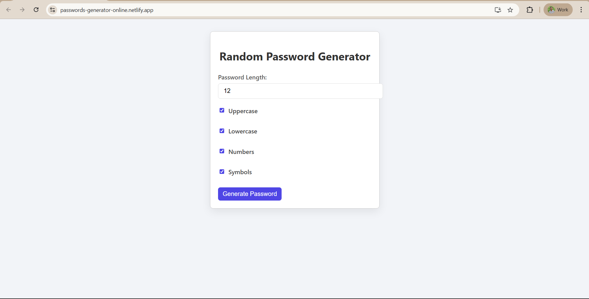
Building Random Password Generator using ReactJS
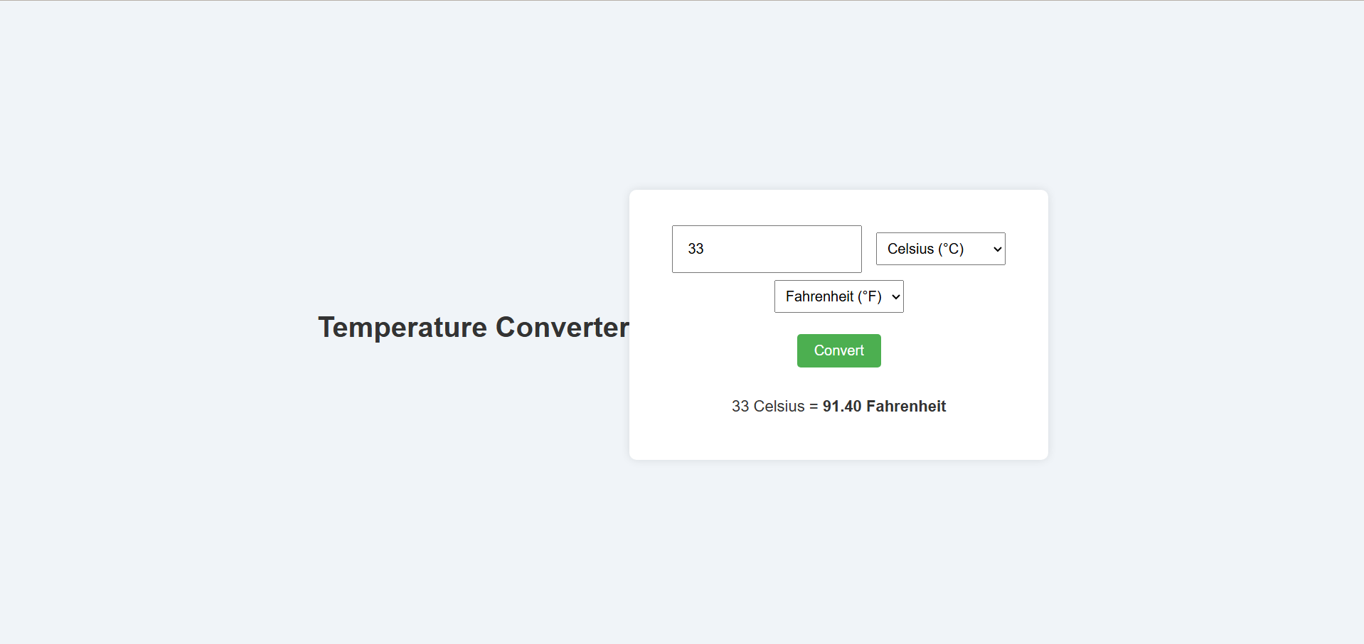
Temperature Converter Project in React
Building a To-Do List App Using ReactJS
Building a Weather App Project Using ReactJS
Building a Quiz App in ReactJS

Building a GenZ Carousel App in React

ReactJS Projects Handbook

Computer Networks Tutorial

Operating System Tutorial

DBMS and SQL Tutorial

Java Tutorial

C Language Tutorial

PHP Tutorial

Android Tutorial

Linux Guide Tutorial

Data Structures and Algorithms Tutorial

Computer Architecture

HTML 5 References Tutorial

Docker Tutorial

GIT (Using Github) Tutorial

Go Language Tutorial

GIT Guide

CSS Tutorial

Advanced Data Structures

Spring Framework Tutorial

Spring Boot Tutorial

Kotlin Tutorial

Apache Cordova Tutorial

Python Tutorial

SASS-SCSS Tutorial

MongoDB Tutorial

Numpy Tutorial

PL-SQL Tutorial

Python Built-in Functions Tutorial

Pandas Tutorial

Elasticsearch Tutorial

Matplotlib Tutorial

Web Scraping Tutorial

Networking with Python

Tkinter Tutorial

Java Programs Tutorial

Java Examples Tutorial

Servlet Tutorial

JSP Tutorial

Java Type Conversion Tutorial

Java 8 Tutorial

Java 9 Tutorial

Java 10 Tutorial

Java 11 Tutorial

Java Util Library Tutorial

Building a Contact Us Form in ReactJS

Building a Age Calculator App Using ReactJS

Movie Recommendation System Project Using Content-Based Filtering

Recipe Finder App using ReactJS

Sales Data Analysis Project for Beginners Using Data Science

Student Performance Analysis Project for Beginners Using Data Science

Word Counter Tool Using ReactJS

Customer Churn Prediction Project Using Classification Techniques

Basic Expense Tracker App using ReactJS

Simple Binary to Decimal Converter in React

Real-Time Unit Converter in React

House Price Prediction Using Machine Learning (XGBoost)

Weather Data Analysis and Visualization Using Python

Expandable Accordion Component using React

OTP Verification Component using React

Cricket Data Analysis Using Python

Credit Card Fraud Detection for Beginners using Data Science

Deep learning Tutorial

Software Development Life Cycle Tutorial

Stock Price Prediction for Beginners using Data Science

Apache Kafka Tutorial

Angular Tutorial

Django Tutorial

Computer Programming Tutorial

Tensorflow Tutorial

Java OOPs Concepts Tutorial

Building an Image Classification System Using CNN

News Recommendation System Using Machine Learning

Fake Review Detection System using Machine Learning

Product Feedback App Using Full Stack Development - Customer Review and Rating System

(FalCon Store) A Modern React-Based E-Commerce App UI with Admin Dashboard

Student Management System using Python (Beginner-Friendly Project Guide)

HTML Tutorial - From Basics to Implementation

Machine Learning Tutorial

ReactJS Tutorial

Hibernate Tutorial

Data Analysis with Python Handbook

Probability and Statistics for Data Science

Artificial Intelligence Tutorial

Power BI Tutorial

R for Data Science

SQL for Data Science

Data Analytics Tutorial