

'%3e%3cpath%20d='M20.134%2023.75H14.266L13.42%2026H10.18L15.4%2013.4H19L24.22%2026H20.98L20.134%2023.75ZM17.2%2015.866L15.238%2021.14H19.162L17.2%2015.866ZM24.9185%2013.724C24.9185%2012.752%2025.7105%2011.96%2026.6825%2011.96C27.6545%2011.96%2028.4465%2012.752%2028.4465%2013.724C28.4465%2014.696%2027.6545%2015.488%2026.6825%2015.488C25.7105%2015.488%2024.9185%2014.696%2024.9185%2013.724ZM25.2065%2016.64H28.1765V26H25.2065V16.64Z'%20fill='url(%23paint0_linear_1812_470)'/%3e%3c/g%3e%3cdefs%3e%3cfilter%20id='filter0_dd_1812_470'%20x='7.18018'%20y='9.95996'%20width='24.2661'%20height='20.04'%20filterUnits='userSpaceOnUse'%20color-interpolation-filters='sRGB'%3e%3cfeFlood%20flood-opacity='0'%20result='BackgroundImageFix'/%3e%3cfeColorMatrix%20in='SourceAlpha'%20type='matrix'%20values='0%200%200%200%200%200%200%200%200%200%200%200%200%200%200%200%200%200%20127%200'%20result='hardAlpha'/%3e%3cfeOffset%20dy='1'/%3e%3cfeGaussianBlur%20stdDeviation='1.5'/%3e%3cfeColorMatrix%20type='matrix'%20values='0%200%200%200%200.0627451%200%200%200%200%200.109804%200%200%200%200%200.156863%200%200%200%200.1%200'/%3e%3cfeBlend%20mode='normal'%20in2='BackgroundImageFix'%20result='effect1_dropShadow_1812_470'/%3e%3cfeColorMatrix%20in='SourceAlpha'%20type='matrix'%20values='0%200%200%200%200%200%200%200%200%200%200%200%200%200%200%200%200%200%20127%200'%20result='hardAlpha'/%3e%3cfeOffset%20dy='1'/%3e%3cfeGaussianBlur%20stdDeviation='1'/%3e%3cfeColorMatrix%20type='matrix'%20values='0%200%200%200%200.0627451%200%200%200%200%200.109804%200%200%200%200%200.156863%200%200%200%200.06%200'/%3e%3cfeBlend%20mode='normal'%20in2='effect1_dropShadow_1812_470'%20result='effect2_dropShadow_1812_470'/%3e%3cfeBlend%20mode='normal'%20in='SourceGraphic'%20in2='effect2_dropShadow_1812_470'%20result='shape'/%3e%3c/filter%3e%3clinearGradient%20id='paint0_linear_1812_470'%20x1='10'%20y1='21.5'%20x2='29'%20y2='21.5'%20gradientUnits='userSpaceOnUse'%3e%3cstop%20stop-color='%236729FF'/%3e%3cstop%20offset='1'%20stop-color='%238A5CFF'/%3e%3c/linearGradient%3e%3c/defs%3e%3c/svg%3e)
'%3e%3cpath%20d='M10.9424%2022.8545C11.3105%2022.8545%2011.6092%2023.1525%2011.6094%2023.5205V30.1875C11.6094%2030.5557%2011.3105%2030.8545%2010.9424%2030.8545H8.27637C7.9082%2030.8545%207.60938%2030.5557%207.60938%2030.1875V23.5205C7.60951%2023.1525%207.90828%2022.8545%208.27637%2022.8545H10.9424ZM17.6104%2017.5205C17.9785%2017.5205%2018.2773%2017.8193%2018.2773%2018.1875V30.1875C18.2773%2030.5557%2017.9785%2030.8545%2017.6104%2030.8545H14.9434C14.5754%2030.8542%2014.2773%2030.5555%2014.2773%2030.1875V18.1875C14.2773%2017.8195%2014.5754%2017.5208%2014.9434%2017.5205H17.6104ZM24.2754%2020.1875C24.6433%2020.1878%2024.9414%2020.4865%2024.9414%2020.8545V30.1875C24.9414%2030.5555%2024.6433%2030.8542%2024.2754%2030.8545H21.6084C21.2402%2030.8545%2020.9414%2030.5557%2020.9414%2030.1875V20.8545C20.9414%2020.4863%2021.2402%2020.1875%2021.6084%2020.1875H24.2754ZM30.9424%2016.1875C31.3105%2016.1875%2031.6094%2016.4863%2031.6094%2016.8545V30.1875C31.6094%2030.5557%2031.3105%2030.8545%2030.9424%2030.8545H28.2764C27.9082%2030.8545%2027.6094%2030.5557%2027.6094%2030.1875V16.8545C27.6094%2016.4863%2027.9082%2016.1875%2028.2764%2016.1875H30.9424ZM29.6094%208.1875C30.7139%208.1875%2031.6094%209.08301%2031.6094%2010.1875C31.6094%2011.292%2030.7139%2012.1875%2029.6094%2012.1875C29.2368%2012.1863%2028.8723%2012.0798%2028.5576%2011.8809L24.9277%2014.0391C24.9314%2014.0889%2024.9424%2014.1367%2024.9424%2014.1875C24.9436%2015.2062%2024.1783%2016.0619%2023.166%2016.1748C22.1536%2016.2876%2021.2183%2015.6208%2020.9951%2014.627L17.6475%2012.9688C17.0271%2013.5698%2016.0864%2013.6931%2015.332%2013.2725L11.4756%2016.1514C11.5624%2016.3756%2011.6077%2016.6139%2011.6094%2016.8545C11.6092%2017.9589%2010.7138%2018.8545%209.60938%2018.8545C8.50496%2018.8545%207.60951%2017.9589%207.60938%2016.8545C7.60938%2015.7498%208.50488%2014.8545%209.60938%2014.8545C9.96191%2014.8564%2010.3076%2014.9524%2010.6104%2015.1328L14.4287%2012.2832C14.1184%2011.5355%2014.2896%2010.6748%2014.8623%2010.1025C15.4347%209.53038%2016.2955%209.35961%2017.043%209.66992C17.7905%209.98068%2018.2777%2010.711%2018.2764%2011.5205C18.2732%2011.6071%2018.2644%2011.6937%2018.25%2011.7793L21.1934%2013.2373C21.4939%2012.6739%2022.0476%2012.2898%2022.6807%2012.2051C23.3132%2012.1205%2023.9478%2012.3454%2024.3857%2012.8096L27.7236%2010.8262C27.6506%2010.6211%2027.6121%2010.4053%2027.6094%2010.1875C27.6106%209.0835%2028.5054%208.18872%2029.6094%208.1875Z'%20fill='url(%23paint0_linear_1812_508)'/%3e%3c/g%3e%3cdefs%3e%3cfilter%20id='filter0_dd_1812_508'%20x='4.60938'%20y='6.1875'%20width='30'%20height='28.667'%20filterUnits='userSpaceOnUse'%20color-interpolation-filters='sRGB'%3e%3cfeFlood%20flood-opacity='0'%20result='BackgroundImageFix'/%3e%3cfeColorMatrix%20in='SourceAlpha'%20type='matrix'%20values='0%200%200%200%200%200%200%200%200%200%200%200%200%200%200%200%200%200%20127%200'%20result='hardAlpha'/%3e%3cfeOffset%20dy='1'/%3e%3cfeGaussianBlur%20stdDeviation='1.5'/%3e%3cfeColorMatrix%20type='matrix'%20values='0%200%200%200%200.0627451%200%200%200%200%200.109804%200%200%200%200%200.156863%200%200%200%200.1%200'/%3e%3cfeBlend%20mode='normal'%20in2='BackgroundImageFix'%20result='effect1_dropShadow_1812_508'/%3e%3cfeColorMatrix%20in='SourceAlpha'%20type='matrix'%20values='0%200%200%200%200%200%200%200%200%200%200%200%200%200%200%200%200%200%20127%200'%20result='hardAlpha'/%3e%3cfeOffset%20dy='1'/%3e%3cfeGaussianBlur%20stdDeviation='1'/%3e%3cfeColorMatrix%20type='matrix'%20values='0%200%200%200%200.0627451%200%200%200%200%200.109804%200%200%200%200%200.156863%200%200%200%200.06%200'/%3e%3cfeBlend%20mode='normal'%20in2='effect1_dropShadow_1812_508'%20result='effect2_dropShadow_1812_508'/%3e%3cfeBlend%20mode='normal'%20in='SourceGraphic'%20in2='effect2_dropShadow_1812_508'%20result='shape'/%3e%3c/filter%3e%3clinearGradient%20id='paint0_linear_1812_508'%20x1='7.60938'%20y1='19.521'%20x2='31.6094'%20y2='19.521'%20gradientUnits='userSpaceOnUse'%3e%3cstop%20stop-color='%236729FF'/%3e%3cstop%20offset='1'%20stop-color='%238A5CFF'/%3e%3c/linearGradient%3e%3c/defs%3e%3c/svg%3e)
'%3e%3cpath%20d='M29.2646%2023.1094C29.4038%2023.0408%2029.5668%2023.0408%2029.7061%2023.1094L29.7568%2023.1338C30.8936%2023.6938%2030.8937%2025.3073%2029.7568%2025.8672L21.0049%2030.1758C20.1262%2030.6084%2019.0926%2030.6084%2018.2139%2030.1758L9.46191%2025.8672C8.3249%2025.3073%208.32502%2023.6938%209.46191%2023.1338L9.5127%2023.1094C9.65194%2023.0408%209.81488%2023.0408%209.9541%2023.1094L18.2139%2027.1758C19.0926%2027.6084%2020.1262%2027.6084%2021.0049%2027.1758L29.2646%2023.1094ZM29.2646%2018.1094C29.4038%2018.0408%2029.5668%2018.0408%2029.7061%2018.1094L29.7568%2018.1338C30.8936%2018.6938%2030.8937%2020.3073%2029.7568%2020.8672L21.0049%2025.1758C20.1262%2025.6084%2019.0926%2025.6084%2018.2139%2025.1758L9.46191%2020.8672C8.32488%2020.3073%208.32505%2018.6938%209.46191%2018.1338L9.5127%2018.1094C9.65194%2018.0408%209.81487%2018.0408%209.9541%2018.1094L18.2139%2022.1758C19.0926%2022.6084%2020.1262%2022.6084%2021.0049%2022.1758L29.2646%2018.1094ZM18.2139%208.82422C19.0926%208.39162%2020.1262%208.39162%2021.0049%208.82422L29.7568%2013.1338C30.8936%2013.6938%2030.8937%2015.3073%2029.7568%2015.8672L21.0049%2020.1758C20.1262%2020.6084%2019.0926%2020.6085%2018.2139%2020.1758L9.46191%2015.8672C8.32488%2015.3073%208.32502%2013.6938%209.46191%2013.1338L18.2139%208.82422Z'%20fill='url(%23paint0_linear_1812_474)'/%3e%3c/g%3e%3cdefs%3e%3cfilter%20id='filter0_dd_1812_474'%20x='5.60938'%20y='6.5'%20width='28'%20height='28'%20filterUnits='userSpaceOnUse'%20color-interpolation-filters='sRGB'%3e%3cfeFlood%20flood-opacity='0'%20result='BackgroundImageFix'/%3e%3cfeColorMatrix%20in='SourceAlpha'%20type='matrix'%20values='0%200%200%200%200%200%200%200%200%200%200%200%200%200%200%200%200%200%20127%200'%20result='hardAlpha'/%3e%3cfeOffset%20dy='1'/%3e%3cfeGaussianBlur%20stdDeviation='1.5'/%3e%3cfeColorMatrix%20type='matrix'%20values='0%200%200%200%200.0627451%200%200%200%200%200.109804%200%200%200%200%200.156863%200%200%200%200.1%200'/%3e%3cfeBlend%20mode='normal'%20in2='BackgroundImageFix'%20result='effect1_dropShadow_1812_474'/%3e%3cfeColorMatrix%20in='SourceAlpha'%20type='matrix'%20values='0%200%200%200%200%200%200%200%200%200%200%200%200%200%200%200%200%200%20127%200'%20result='hardAlpha'/%3e%3cfeOffset%20dy='1'/%3e%3cfeGaussianBlur%20stdDeviation='1'/%3e%3cfeColorMatrix%20type='matrix'%20values='0%200%200%200%200.0627451%200%200%200%200%200.109804%200%200%200%200%200.156863%200%200%200%200.06%200'/%3e%3cfeBlend%20mode='normal'%20in2='effect1_dropShadow_1812_474'%20result='effect2_dropShadow_1812_474'/%3e%3cfeBlend%20mode='normal'%20in='SourceGraphic'%20in2='effect2_dropShadow_1812_474'%20result='shape'/%3e%3c/filter%3e%3clinearGradient%20id='paint0_linear_1812_474'%20x1='8.60938'%20y1='19.5002'%20x2='30.6096'%20y2='19.5002'%20gradientUnits='userSpaceOnUse'%3e%3cstop%20stop-color='%236729FF'/%3e%3cstop%20offset='1'%20stop-color='%238A5CFF'/%3e%3c/linearGradient%3e%3c/defs%3e%3c/svg%3e)
'%3e%3cpath%20d='M21.7207%2028.6406C22.9675%2028.6407%2024.0267%2029.5026%2024.3945%2030.6279C24.5363%2031.0618%2024.1674%2031.5%2023.7109%2031.5H15.5117C15.0552%2031.5%2014.6855%2031.0618%2014.8271%2030.6279C15.1949%2029.5025%2016.2551%2028.6406%2017.502%2028.6406H21.7207ZM25.8193%2021.9229C26.0053%2022.2016%2025.9683%2022.5727%2025.7314%2022.8096C24.4407%2024.1004%2023.6153%2025.7631%2023.2969%2027.5469C22.8085%2027.3489%2022.2774%2027.2344%2021.7188%2027.2344H17.5C16.9414%2027.2344%2016.4102%2027.3488%2015.9219%2027.5469C15.6034%2025.7632%2014.7781%2024.1003%2013.4873%2022.8096C13.2505%2022.5727%2013.2135%2022.2016%2013.3994%2021.9229L18.9062%2013.6621V20.333C18.0897%2020.6243%2017.5%2021.3971%2017.5%2022.3125C17.5%2023.4757%2018.4462%2024.4219%2019.6094%2024.4219C20.7725%2024.4219%2021.7188%2023.4757%2021.7188%2022.3125C21.7188%2021.3971%2021.1291%2020.6243%2020.3125%2020.333V13.6621L25.8193%2021.9229ZM19.6094%2021.6094C19.9973%2021.6094%2020.3125%2021.9246%2020.3125%2022.3125C20.3125%2022.7004%2019.9973%2023.0156%2019.6094%2023.0156C19.2214%2023.0156%2018.9062%2022.7004%2018.9062%2022.3125C18.9062%2021.9246%2019.2214%2021.6094%2019.6094%2021.6094ZM11.1719%207.5C11.5605%207.5%2011.875%207.81448%2011.875%208.20312V8.90625H17.6299C17.9211%208.08965%2018.6939%207.5%2019.6094%207.5C20.5248%207.5%2021.2976%208.08965%2021.5889%208.90625L27.3438%208.90625V8.20312C27.3438%207.81448%2027.6582%207.5%2028.0469%207.5H30.9062C31.2949%207.5%2031.6094%207.81448%2031.6094%208.20312V11.0156C31.6094%2011.4043%2031.2949%2011.7188%2030.9062%2011.7188H28.0469C27.6582%2011.7188%2027.3438%2011.4043%2027.3438%2011.0156V10.3125H24.4561C26.8962%2011.8369%2028.5049%2014.5051%2028.6973%2017.5039C29.5409%2017.78%2030.1562%2018.5653%2030.1562%2019.5C30.1562%2020.6632%2029.21%2021.6094%2028.0469%2021.6094C26.8837%2021.6094%2025.9375%2020.6632%2025.9375%2019.5C25.9375%2018.6028%2026.5027%2017.8396%2027.2939%2017.5352C27.0539%2014.1921%2024.7213%2011.3743%2021.4766%2010.5703C21.1256%2011.2489%2020.4247%2011.7188%2019.6094%2011.7188C18.7941%2011.7188%2018.0931%2011.2489%2017.7422%2010.5703C14.4975%2011.3744%2012.1649%2014.1921%2011.9248%2017.5352C12.716%2017.8396%2013.2812%2018.6028%2013.2812%2019.5C13.2812%2020.6632%2012.335%2021.6094%2011.1719%2021.6094C10.0087%2021.6094%209.0625%2020.6632%209.0625%2019.5C9.0625%2018.5653%209.67783%2017.78%2010.5215%2017.5039C10.7138%2014.5051%2012.3225%2011.8272%2014.7627%2010.3027H11.875V11.0156C11.875%2011.4043%2011.5605%2011.7188%2011.1719%2011.7188H8.3125C7.92386%2011.7188%207.60938%2011.4043%207.60938%2011.0156V8.20312C7.60938%207.81448%207.92386%207.5%208.3125%207.5H11.1719Z'%20fill='url(%23paint0_linear_1812_524)'/%3e%3c/g%3e%3cdefs%3e%3cfilter%20id='filter0_dd_1812_524'%20x='4.60938'%20y='5.5'%20width='30'%20height='30'%20filterUnits='userSpaceOnUse'%20color-interpolation-filters='sRGB'%3e%3cfeFlood%20flood-opacity='0'%20result='BackgroundImageFix'/%3e%3cfeColorMatrix%20in='SourceAlpha'%20type='matrix'%20values='0%200%200%200%200%200%200%200%200%200%200%200%200%200%200%200%200%200%20127%200'%20result='hardAlpha'/%3e%3cfeOffset%20dy='1'/%3e%3cfeGaussianBlur%20stdDeviation='1.5'/%3e%3cfeColorMatrix%20type='matrix'%20values='0%200%200%200%200.0627451%200%200%200%200%200.109804%200%200%200%200%200.156863%200%200%200%200.1%200'/%3e%3cfeBlend%20mode='normal'%20in2='BackgroundImageFix'%20result='effect1_dropShadow_1812_524'/%3e%3cfeColorMatrix%20in='SourceAlpha'%20type='matrix'%20values='0%200%200%200%200%200%200%200%200%200%200%200%200%200%200%200%200%200%20127%200'%20result='hardAlpha'/%3e%3cfeOffset%20dy='1'/%3e%3cfeGaussianBlur%20stdDeviation='1'/%3e%3cfeColorMatrix%20type='matrix'%20values='0%200%200%200%200.0627451%200%200%200%200%200.109804%200%200%200%200%200.156863%200%200%200%200.06%200'/%3e%3cfeBlend%20mode='normal'%20in2='effect1_dropShadow_1812_524'%20result='effect2_dropShadow_1812_524'/%3e%3cfeBlend%20mode='normal'%20in='SourceGraphic'%20in2='effect2_dropShadow_1812_524'%20result='shape'/%3e%3c/filter%3e%3clinearGradient%20id='paint0_linear_1812_524'%20x1='7.60938'%20y1='19.5'%20x2='31.6094'%20y2='19.5'%20gradientUnits='userSpaceOnUse'%3e%3cstop%20stop-color='%236729FF'/%3e%3cstop%20offset='1'%20stop-color='%238A5CFF'/%3e%3c/linearGradient%3e%3c/defs%3e%3c/svg%3e)
'%3e%3cpath%20d='M33.9999%200.400391H5.9999C2.90711%200.400391%200.399902%202.9076%200.399902%206.00039V34.0004C0.399902%2037.0932%202.90711%2039.6004%205.9999%2039.6004H33.9999C37.0927%2039.6004%2039.5999%2037.0932%2039.5999%2034.0004V6.00039C39.5999%202.9076%2037.0927%200.400391%2033.9999%200.400391Z'%20fill='white'%20stroke='%23E4E8EC'%20stroke-width='0.8'/%3e%3cg%20filter='url(%23filter0_dd_4322_3743)'%3e%3cpath%20d='M27.874%2013.3767C26.7727%2013.323%2025.7215%2013.55%2024.7897%2013.9943C24.5776%2014.0953%2024.3758%2014.2161%2024.1725%2014.3334C23.9762%2014.4466%2023.8022%2014.5904%2023.6152%2014.7175C23.6135%2014.7187%2023.6117%2014.7199%2023.61%2014.721L22.9464%2015.181L21.929%2013.9332L21.5398%2016.1558L21.388%2017.023L21.1564%2018.346L23.1154%2018.461L23.301%2018.4718L25.7471%2018.6154L24.7615%2017.4069L25.2915%2017.0205L25.7217%2016.7215C26.3093%2016.3732%2027.0018%2016.1869%2027.7351%2016.2227C29.7261%2016.3199%2031.2613%2018.0127%2031.1641%2020.0037C31.0507%2022.3259%2028.6157%2023.9488%2026.4149%2023.2429C25.5114%2022.953%2024.8454%2022.2337%2024.1381%2021.6335C23.4004%2021.0075%2022.6626%2020.3813%2021.9248%2019.7553C21.8396%2019.683%2021.7543%2019.6106%2021.6691%2019.5383L19.4169%2017.6273L19.3504%2017.5708L19.3503%2017.5725L16.7577%2015.3667C16.6695%2015.2872%2016.5788%2015.2104%2016.4862%2015.1358C16.4862%2015.1358%2016.4808%2015.1311%2016.4806%2015.1312C15.4545%2014.306%2014.1691%2013.7854%2012.7564%2013.7164C9.19933%2013.5427%206.16411%2016.2953%205.99042%2019.8524C5.81674%2023.4095%208.56936%2026.4447%2012.1264%2026.6184C13.2277%2026.6721%2014.2789%2026.4451%2015.2107%2026.0009C15.4228%2025.8998%2015.6246%2025.779%2015.8279%2025.6618C16.0242%2025.5485%2016.1982%2025.4047%2016.3852%2025.2776C16.387%2025.2764%2016.3887%2025.2752%2016.3905%2025.2741L17.054%2024.8142L18.0715%2026.0618L18.4606%2023.8392L18.6124%2022.972L18.844%2021.6491L16.885%2021.5341L16.6994%2021.5232L14.2534%2021.3796L15.2388%2022.5881L14.7088%2022.9746L14.2786%2023.2736C13.691%2023.622%2012.9985%2023.8082%2012.2652%2023.7724C10.2742%2023.6752%208.73905%2021.9824%208.83626%2019.9914C8.94965%2017.6692%2011.3846%2016.0463%2013.5854%2016.7523C14.4889%2017.0421%2015.1549%2017.7614%2015.8622%2018.3616C16.5999%2018.9877%2017.3378%2019.6138%2018.0755%2020.2398C18.1608%2020.3121%2018.246%2020.3846%2018.3312%2020.4569L20.5831%2022.3678L20.6497%2022.4243L20.6498%2022.4226L23.2423%2024.6284C23.3305%2024.7079%2023.4213%2024.7848%2023.5138%2024.8593L23.5195%2024.8639C24.5455%2025.6891%2025.8309%2026.2098%2027.2436%2026.2787C30.8007%2026.4524%2033.8359%2023.6998%2034.0096%2020.1427C34.1837%2016.5856%2031.4311%2013.5504%2027.874%2013.3767Z'%20fill='url(%23paint0_linear_4322_3743)'/%3e%3c/g%3e%3c/g%3e%3cdefs%3e%3cfilter%20id='filter0_dd_4322_3743'%20x='1.18237'%20y='10.1689'%20width='37.6354'%20height='22.8584'%20filterUnits='userSpaceOnUse'%20color-interpolation-filters='sRGB'%3e%3cfeFlood%20flood-opacity='0'%20result='BackgroundImageFix'/%3e%3cfeColorMatrix%20in='SourceAlpha'%20type='matrix'%20values='0%200%200%200%200%200%200%200%200%200%200%200%200%200%200%200%200%200%20127%200'%20result='hardAlpha'/%3e%3cfeOffset%20dy='1.6001'/%3e%3cfeGaussianBlur%20stdDeviation='2.40015'/%3e%3cfeColorMatrix%20type='matrix'%20values='0%200%200%200%200.0627451%200%200%200%200%200.109804%200%200%200%200%200.156863%200%200%200%200.1%200'/%3e%3cfeBlend%20mode='normal'%20in2='BackgroundImageFix'%20result='effect1_dropShadow_4322_3743'/%3e%3cfeColorMatrix%20in='SourceAlpha'%20type='matrix'%20values='0%200%200%200%200%200%200%200%200%200%200%200%200%200%200%200%200%200%20127%200'%20result='hardAlpha'/%3e%3cfeOffset%20dy='1.6001'/%3e%3cfeGaussianBlur%20stdDeviation='1.6001'/%3e%3cfeColorMatrix%20type='matrix'%20values='0%200%200%200%200.0627451%200%200%200%200%200.109804%200%200%200%200%200.156863%200%200%200%200.06%200'/%3e%3cfeBlend%20mode='normal'%20in2='effect1_dropShadow_4322_3743'%20result='effect2_dropShadow_4322_3743'/%3e%3cfeBlend%20mode='normal'%20in='SourceGraphic'%20in2='effect2_dropShadow_4322_3743'%20result='shape'/%3e%3c/filter%3e%3clinearGradient%20id='paint0_linear_4322_3743'%20x1='6.0167'%20y1='19.3147'%20x2='33.9835'%20y2='20.6802'%20gradientUnits='userSpaceOnUse'%3e%3cstop%20stop-color='%236729FF'/%3e%3cstop%20offset='1'%20stop-color='%238A5CFF'/%3e%3c/linearGradient%3e%3cclipPath%20id='clip0_4322_3743'%3e%3crect%20width='40'%20height='40'%20fill='white'/%3e%3c/clipPath%3e%3c/defs%3e%3c/svg%3e)

'%3e%3cpath%20d='M14.6667%2024.6663C14.399%2024.6663%2014.1477%2024.562%2013.9593%2024.373L10.293%2020.7067C10.1043%2020.5187%2010%2020.2673%2010%2019.9997C10%2019.732%2010.1043%2019.4807%2010.2933%2019.2923L13.9597%2015.626C14.1477%2015.4373%2014.399%2015.333%2014.6667%2015.333C15.218%2015.333%2015.6667%2015.7817%2015.6667%2016.333C15.6667%2016.6007%2015.5623%2016.852%2015.3733%2017.0403L12.414%2019.9997L15.3737%2022.9593C15.5627%2023.1473%2015.6667%2023.3987%2015.6667%2023.6663C15.6667%2024.2177%2015.218%2024.6663%2014.6667%2024.6663Z'%20fill='%230A0F14'/%3e%3cpath%20d='M14.6667%2024.6663C14.399%2024.6663%2014.1477%2024.562%2013.9593%2024.373L10.293%2020.7067C10.1043%2020.5187%2010%2020.2673%2010%2019.9997C10%2019.732%2010.1043%2019.4807%2010.2933%2019.2923L13.9597%2015.626C14.1477%2015.4373%2014.399%2015.333%2014.6667%2015.333C15.218%2015.333%2015.6667%2015.7817%2015.6667%2016.333C15.6667%2016.6007%2015.5623%2016.852%2015.3733%2017.0403L12.414%2019.9997L15.3737%2022.9593C15.5627%2023.1473%2015.6667%2023.3987%2015.6667%2023.6663C15.6667%2024.2177%2015.218%2024.6663%2014.6667%2024.6663Z'%20fill='url(%23paint0_linear_1812_1508)'/%3e%3cpath%20d='M25.334%2024.9993C24.7827%2024.9993%2024.334%2024.5507%2024.334%2023.9993C24.334%2023.7317%2024.4383%2023.4803%2024.6273%2023.292L27.5867%2020.3327L24.627%2017.373C24.4383%2017.1843%2024.334%2016.933%2024.334%2016.666C24.334%2016.1147%2024.7827%2015.666%2025.334%2015.666C25.6017%2015.666%2025.853%2015.7703%2026.0413%2015.9593L29.7077%2019.6257C29.8967%2019.8143%2030.0007%2020.0657%2030.0007%2020.3327C30.0007%2020.6003%2029.8963%2020.8517%2029.7073%2021.04L26.041%2024.7063C25.853%2024.8953%2025.6017%2024.9993%2025.334%2024.9993Z'%20fill='%230A0F14'/%3e%3cpath%20d='M25.334%2024.9993C24.7827%2024.9993%2024.334%2024.5507%2024.334%2023.9993C24.334%2023.7317%2024.4383%2023.4803%2024.6273%2023.292L27.5867%2020.3327L24.627%2017.373C24.4383%2017.1843%2024.334%2016.933%2024.334%2016.666C24.334%2016.1147%2024.7827%2015.666%2025.334%2015.666C25.6017%2015.666%2025.853%2015.7703%2026.0413%2015.9593L29.7077%2019.6257C29.8967%2019.8143%2030.0007%2020.0657%2030.0007%2020.3327C30.0007%2020.6003%2029.8963%2020.8517%2029.7073%2021.04L26.041%2024.7063C25.853%2024.8953%2025.6017%2024.9993%2025.334%2024.9993Z'%20fill='url(%23paint1_linear_1812_1508)'/%3e%3cpath%20d='M17%2027.6663C16.4487%2027.6663%2016%2027.2177%2016%2026.6663C16%2026.5337%2016.026%2026.404%2016.0767%2026.2813L22.077%2012.9473C22.2337%2012.574%2022.596%2012.333%2023%2012.333C23.5513%2012.333%2024%2012.7817%2024%2013.333C24%2013.4657%2023.974%2013.5953%2023.9233%2013.718L17.923%2027.052C17.7663%2027.4253%2017.404%2027.6663%2017%2027.6663Z'%20fill='%230A0F14'/%3e%3cpath%20d='M17%2027.6663C16.4487%2027.6663%2016%2027.2177%2016%2026.6663C16%2026.5337%2016.026%2026.404%2016.0767%2026.2813L22.077%2012.9473C22.2337%2012.574%2022.596%2012.333%2023%2012.333C23.5513%2012.333%2024%2012.7817%2024%2013.333C24%2013.4657%2023.974%2013.5953%2023.9233%2013.718L17.923%2027.052C17.7663%2027.4253%2017.404%2027.6663%2017%2027.6663Z'%20fill='url(%23paint2_linear_1812_1508)'/%3e%3c/g%3e%3cdefs%3e%3clinearGradient%20id='paint0_linear_1812_1508'%20x1='10'%20y1='19.9997'%20x2='15.6667'%20y2='19.9997'%20gradientUnits='userSpaceOnUse'%3e%3cstop%20stop-color='%236729FF'/%3e%3cstop%20offset='1'%20stop-color='%238A5CFF'/%3e%3c/linearGradient%3e%3clinearGradient%20id='paint1_linear_1812_1508'%20x1='24.334'%20y1='20.3327'%20x2='30.0007'%20y2='20.3327'%20gradientUnits='userSpaceOnUse'%3e%3cstop%20stop-color='%236729FF'/%3e%3cstop%20offset='1'%20stop-color='%238A5CFF'/%3e%3c/linearGradient%3e%3clinearGradient%20id='paint2_linear_1812_1508'%20x1='16'%20y1='19.9997'%20x2='24'%20y2='19.9997'%20gradientUnits='userSpaceOnUse'%3e%3cstop%20stop-color='%236729FF'/%3e%3cstop%20offset='1'%20stop-color='%238A5CFF'/%3e%3c/linearGradient%3e%3cclipPath%20id='clip0_1812_1508'%3e%3crect%20width='20'%20height='20'%20fill='white'%20transform='translate(10%2010)'/%3e%3c/clipPath%3e%3c/defs%3e%3c/svg%3e)
'/%3e%3cpath%20d='M28%2025.5C28.5523%2025.5%2029%2025.0523%2029%2024.5C29%2023.9477%2028.5523%2023.5%2028%2023.5H20C19.4477%2023.5%2019%2023.9477%2019%2024.5C19%2025.0523%2019.4477%2025.5%2020%2025.5H28Z'%20fill='url(%23paint1_linear_1812_1498)'/%3e%3cdefs%3e%3clinearGradient%20id='paint0_linear_1812_1498'%20x1='11'%20y1='20'%20x2='18'%20y2='20'%20gradientUnits='userSpaceOnUse'%3e%3cstop%20stop-color='%236729FF'/%3e%3cstop%20offset='1'%20stop-color='%238A5CFF'/%3e%3c/linearGradient%3e%3clinearGradient%20id='paint1_linear_1812_1498'%20x1='19'%20y1='24.5'%20x2='29'%20y2='24.5'%20gradientUnits='userSpaceOnUse'%3e%3cstop%20stop-color='%236729FF'/%3e%3cstop%20offset='1'%20stop-color='%238A5CFF'/%3e%3c/linearGradient%3e%3c/defs%3e%3c/svg%3e)
'%3e%3cpath%20d='M31.009%2019.258V16.9295C31.009%2016.687%2030.7179%2016.5414%2030.5239%2016.687C28.1469%2018.5789%2023.8779%2019.5491%2019.609%2019.5491C15.3886%2019.5491%2011.1196%2018.5789%208.69409%2016.687C8.50005%2016.5414%208.20898%2016.687%208.20898%2016.9295V19.258V19.4521C8.20898%2022.1687%2013.3026%2024.4002%2019.609%2024.4002C25.9154%2024.4002%2031.009%2022.1687%2031.009%2019.4036C31.009%2019.3551%2031.009%2019.3065%2031.009%2019.258Z'%20fill='%230A0F14'/%3e%3cpath%20d='M31.009%2019.258V16.9295C31.009%2016.687%2030.7179%2016.5414%2030.5239%2016.687C28.1469%2018.5789%2023.8779%2019.5491%2019.609%2019.5491C15.3886%2019.5491%2011.1196%2018.5789%208.69409%2016.687C8.50005%2016.5414%208.20898%2016.687%208.20898%2016.9295V19.258V19.4521C8.20898%2022.1687%2013.3026%2024.4002%2019.609%2024.4002C25.9154%2024.4002%2031.009%2022.1687%2031.009%2019.4036C31.009%2019.3551%2031.009%2019.3065%2031.009%2019.258Z'%20fill='url(%23paint0_linear_1812_1488)'/%3e%3cpath%20d='M31.009%2025.758V23.4295C31.009%2023.187%2030.7179%2023.0414%2030.5239%2023.187C28.1469%2025.0789%2023.8779%2026.0491%2019.609%2026.0491C15.3886%2026.0491%2011.1196%2025.0789%208.69409%2023.187C8.50005%2023.0414%208.20898%2023.187%208.20898%2023.4295V25.758V25.9521C8.20898%2028.6687%2013.3026%2030.9002%2019.609%2030.9002C25.9154%2030.9002%2031.009%2028.6687%2031.009%2025.9036C31.009%2025.8551%2031.009%2025.8065%2031.009%2025.758Z'%20fill='%230A0F14'/%3e%3cpath%20d='M31.009%2025.758V23.4295C31.009%2023.187%2030.7179%2023.0414%2030.5239%2023.187C28.1469%2025.0789%2023.8779%2026.0491%2019.609%2026.0491C15.3886%2026.0491%2011.1196%2025.0789%208.69409%2023.187C8.50005%2023.0414%208.20898%2023.187%208.20898%2023.4295V25.758V25.9521C8.20898%2028.6687%2013.3026%2030.9002%2019.609%2030.9002C25.9154%2030.9002%2031.009%2028.6687%2031.009%2025.9036C31.009%2025.8551%2031.009%2025.8065%2031.009%2025.758Z'%20fill='url(%23paint1_linear_1812_1488)'/%3e%3cpath%20d='M19.609%2018.0927C25.905%2018.0927%2031.009%2015.8557%2031.009%2013.0962C31.009%2010.3366%2025.905%208.09961%2019.609%208.09961C13.3129%208.09961%208.20898%2010.3366%208.20898%2013.0962C8.20898%2015.8557%2013.3129%2018.0927%2019.609%2018.0927Z'%20fill='%230A0F14'/%3e%3cpath%20d='M19.609%2018.0927C25.905%2018.0927%2031.009%2015.8557%2031.009%2013.0962C31.009%2010.3366%2025.905%208.09961%2019.609%208.09961C13.3129%208.09961%208.20898%2010.3366%208.20898%2013.0962C8.20898%2015.8557%2013.3129%2018.0927%2019.609%2018.0927Z'%20fill='url(%23paint2_linear_1812_1488)'/%3e%3c/g%3e%3cdefs%3e%3clinearGradient%20id='paint0_linear_1812_1488'%20x1='8.20898'%20y1='20.5145'%20x2='31.009'%20y2='20.5145'%20gradientUnits='userSpaceOnUse'%3e%3cstop%20stop-color='%236729FF'/%3e%3cstop%20offset='1'%20stop-color='%238A5CFF'/%3e%3c/linearGradient%3e%3clinearGradient%20id='paint1_linear_1812_1488'%20x1='8.20898'%20y1='27.0145'%20x2='31.009'%20y2='27.0145'%20gradientUnits='userSpaceOnUse'%3e%3cstop%20stop-color='%236729FF'/%3e%3cstop%20offset='1'%20stop-color='%238A5CFF'/%3e%3c/linearGradient%3e%3clinearGradient%20id='paint2_linear_1812_1488'%20x1='8.20898'%20y1='13.0962'%20x2='31.009'%20y2='13.0962'%20gradientUnits='userSpaceOnUse'%3e%3cstop%20stop-color='%236729FF'/%3e%3cstop%20offset='1'%20stop-color='%238A5CFF'/%3e%3c/linearGradient%3e%3cclipPath%20id='clip0_1812_1488'%3e%3crect%20width='24'%20height='24'%20fill='white'%20transform='translate(7.60938%207.5)'/%3e%3c/clipPath%3e%3c/defs%3e%3c/svg%3e)


'/%3e%3cpath%20d='M21.8957%207.53398L22.8013%208.98336L24.4594%209.39648C24.7344%209.46523%2024.8426%209.79773%2024.6607%2010.0152L23.5619%2011.324L23.6813%2013.0284C23.7013%2013.3109%2023.4182%2013.5171%2023.1551%2013.4109L21.5707%2012.7702L19.9863%2013.4109C19.7238%2013.5171%2019.4401%2013.3115%2019.4601%2013.0284L19.5794%2011.324L18.4807%2010.0152C18.2982%209.79836%2018.4069%209.46523%2018.6819%209.39648L20.3401%208.98336L21.2457%207.53398C21.3951%207.29336%2021.7457%207.29336%2021.8957%207.53398Z'%20fill='%230A0F14'/%3e%3cpath%20d='M21.8957%207.53398L22.8013%208.98336L24.4594%209.39648C24.7344%209.46523%2024.8426%209.79773%2024.6607%2010.0152L23.5619%2011.324L23.6813%2013.0284C23.7013%2013.3109%2023.4182%2013.5171%2023.1551%2013.4109L21.5707%2012.7702L19.9863%2013.4109C19.7238%2013.5171%2019.4401%2013.3115%2019.4601%2013.0284L19.5794%2011.324L18.4807%2010.0152C18.2982%209.79836%2018.4069%209.46523%2018.6819%209.39648L20.3401%208.98336L21.2457%207.53398C21.3951%207.29336%2021.7457%207.29336%2021.8957%207.53398Z'%20fill='url(%23paint1_linear_1812_1874)'/%3e%3cdefs%3e%3clinearGradient%20id='paint0_linear_1812_1874'%20x1='6.6875'%20y1='17.5217'%20x2='22.7875'%20y2='17.5217'%20gradientUnits='userSpaceOnUse'%3e%3cstop%20stop-color='%236729FF'/%3e%3cstop%20offset='1'%20stop-color='%238A5CFF'/%3e%3c/linearGradient%3e%3clinearGradient%20id='paint1_linear_1812_1874'%20x1='18.3906'%20y1='10.3964'%20x2='24.7505'%20y2='10.3964'%20gradientUnits='userSpaceOnUse'%3e%3cstop%20stop-color='%236729FF'/%3e%3cstop%20offset='1'%20stop-color='%238A5CFF'/%3e%3c/linearGradient%3e%3c/defs%3e%3c/svg%3e)

'/%3e%3cdefs%3e%3clinearGradient%20id='paint0_linear_1812_1827'%20x1='6.1333'%20y1='15.9947'%20x2='25.8635'%20y2='15.9947'%20gradientUnits='userSpaceOnUse'%3e%3cstop%20stop-color='%236729FF'/%3e%3cstop%20offset='1'%20stop-color='%238A5CFF'/%3e%3c/linearGradient%3e%3c/defs%3e%3c/svg%3e)
'%3e%3cmask%20id='mask0_1812_1767'%20style='mask-type:luminance'%20maskUnits='userSpaceOnUse'%20x='6'%20y='6'%20width='20'%20height='20'%3e%3cpath%20d='M6%206H26V26H6V6Z'%20fill='white'/%3e%3c/mask%3e%3cg%20mask='url(%23mask0_1812_1767)'%3e%3cpath%20d='M19.8244%2013.5H18.4994V9.33333C18.4994%208.875%2018.1244%208.5%2017.666%208.5H14.3327C13.8743%208.5%2013.4993%208.875%2013.4993%209.33333V13.5H12.1743C11.4327%2013.5%2011.0577%2014.4%2011.5827%2014.925L15.4077%2018.75C15.7327%2019.075%2016.2577%2019.075%2016.5827%2018.75L20.4077%2014.925C20.9327%2014.4%2020.566%2013.5%2019.8244%2013.5ZM10.166%2021.8333C10.166%2022.2917%2010.541%2022.6667%2010.9993%2022.6667H20.9994C21.4577%2022.6667%2021.8327%2022.2917%2021.8327%2021.8333C21.8327%2021.375%2021.4577%2021%2020.9994%2021H10.9993C10.541%2021%2010.166%2021.375%2010.166%2021.8333Z'%20fill='%230A0F14'/%3e%3cpath%20d='M19.8244%2013.5H18.4994V9.33333C18.4994%208.875%2018.1244%208.5%2017.666%208.5H14.3327C13.8743%208.5%2013.4993%208.875%2013.4993%209.33333V13.5H12.1743C11.4327%2013.5%2011.0577%2014.4%2011.5827%2014.925L15.4077%2018.75C15.7327%2019.075%2016.2577%2019.075%2016.5827%2018.75L20.4077%2014.925C20.9327%2014.4%2020.566%2013.5%2019.8244%2013.5ZM10.166%2021.8333C10.166%2022.2917%2010.541%2022.6667%2010.9993%2022.6667H20.9994C21.4577%2022.6667%2021.8327%2022.2917%2021.8327%2021.8333C21.8327%2021.375%2021.4577%2021%2020.9994%2021H10.9993C10.541%2021%2010.166%2021.375%2010.166%2021.8333Z'%20fill='url(%23paint0_linear_1812_1767)'/%3e%3c/g%3e%3c/g%3e%3cdefs%3e%3clinearGradient%20id='paint0_linear_1812_1767'%20x1='10.166'%20y1='15.5833'%20x2='21.8327'%20y2='15.5833'%20gradientUnits='userSpaceOnUse'%3e%3cstop%20stop-color='%236729FF'/%3e%3cstop%20offset='1'%20stop-color='%238A5CFF'/%3e%3c/linearGradient%3e%3cclipPath%20id='clip0_1812_1767'%3e%3crect%20width='20'%20height='20'%20fill='white'%20transform='translate(6%206)'/%3e%3c/clipPath%3e%3c/defs%3e%3c/svg%3e)
'/%3e%3cdefs%3e%3clinearGradient%20id='paint0_linear_1812_1798'%20x1='6'%20y1='15.9814'%20x2='26'%20y2='15.9814'%20gradientUnits='userSpaceOnUse'%3e%3cstop%20stop-color='%236729FF'/%3e%3cstop%20offset='1'%20stop-color='%238A5CFF'/%3e%3c/linearGradient%3e%3c/defs%3e%3c/svg%3e)

'/%3e%3cdefs%3e%3clinearGradient%20id='paint0_linear_1812_3580'%20x1='8.33301'%20y1='19.5873'%20x2='31.667'%20y2='19.5873'%20gradientUnits='userSpaceOnUse'%3e%3cstop%20stop-color='%236729FF'/%3e%3cstop%20offset='1'%20stop-color='%238A5CFF'/%3e%3c/linearGradient%3e%3c/defs%3e%3c/svg%3e)


Developing the Components
Developing the Components
This project has 5 reusable components, each handling one specific job:
Navbar.jsx manages the top navigation bar using the drawerOpen state. On desktop, it shows the logo, user name, and logout button inline; on mobile, it hides those and shows just the logo, user icon, and a hamburger button, which toggles drawerOpen to slide in a side menu from the right containing the user info and logout option.
StarRating.jsx is a simple read-only component that takes a value prop and displays filled or unfilled stars using .map() — used wherever a rating needs to be shown, like on product cards and the admin table.
StarInput.jsx is the interactive version — it uses useState to track hover and lets the user click a star to set the rating, giving that smooth fill-on-hover effect used inside the review modal.
ProductCard.jsx displays a single product's image, description, stock status, and rating (using StarRating), and includes a Select button that calls the onSelect prop passed down from the parent, which opens the review modal for that specific product.
ReviewModal.jsx is the popup that appears after selecting a product. It uses useState to manage the rating, text, and submitted status, uses StarInput for the rating selection, and on submit, uses setTimeout to briefly show a success message before automatically closing the modal via the onClose prop.
Product Feedback App Using Full Stack Development - Customer Review and Rating System
Abhishek Pati
Recommended Handbooks

C++ Handbook

Python Basics Handbook

Javascript Handbook

Building a Random Joke Generator Using ReactJS

Build a Character Counter in React JS

Build Your QR Code Generator using React JS

Build a Birthday Reminder App using React JS

Building BMI Calculator Using ReactJS
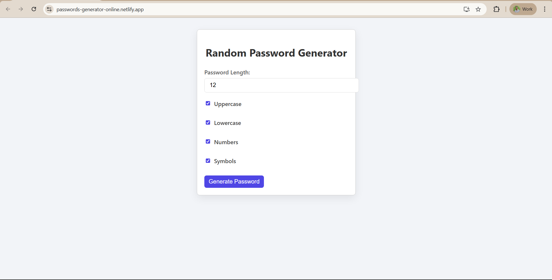
Building Random Password Generator using ReactJS
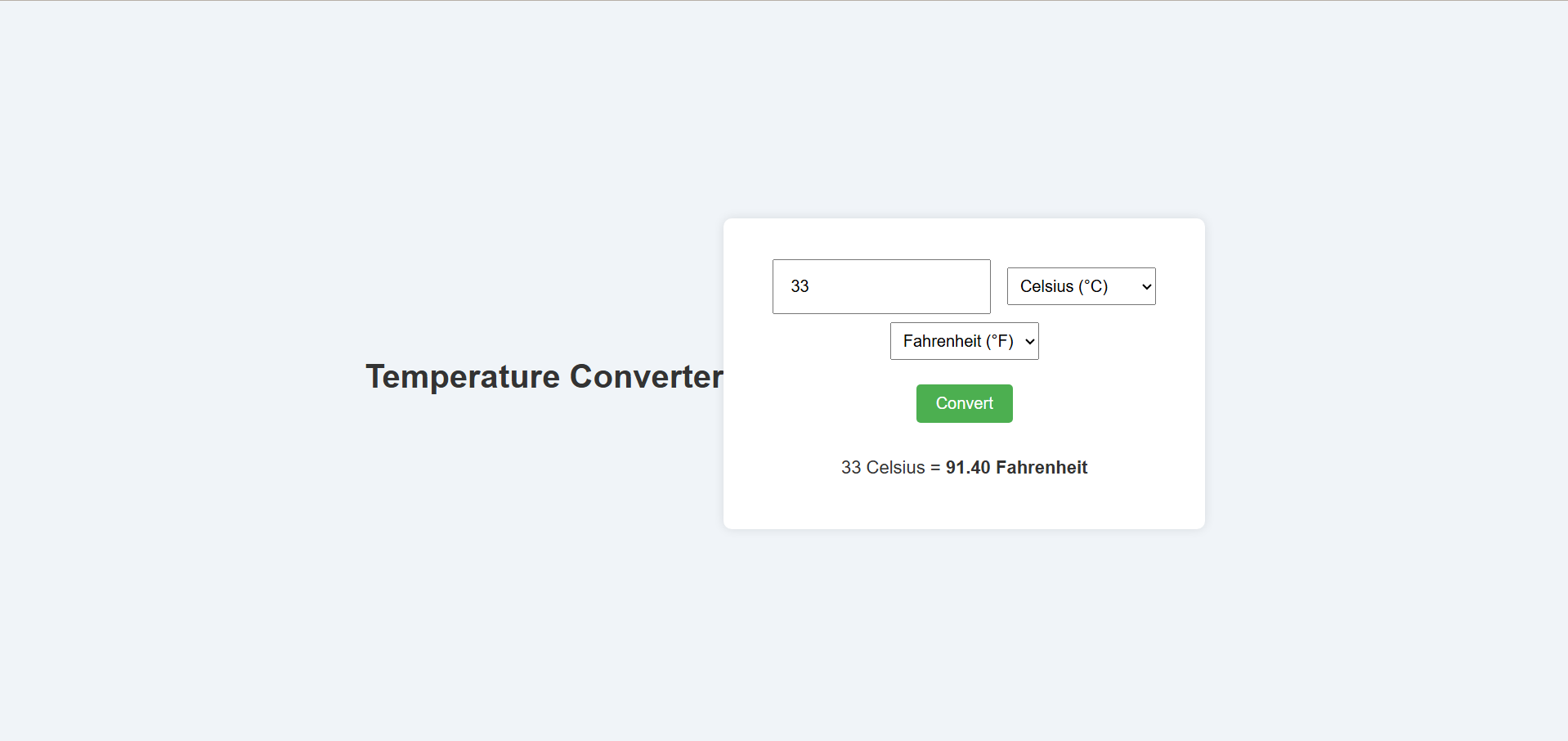
Temperature Converter Project in React
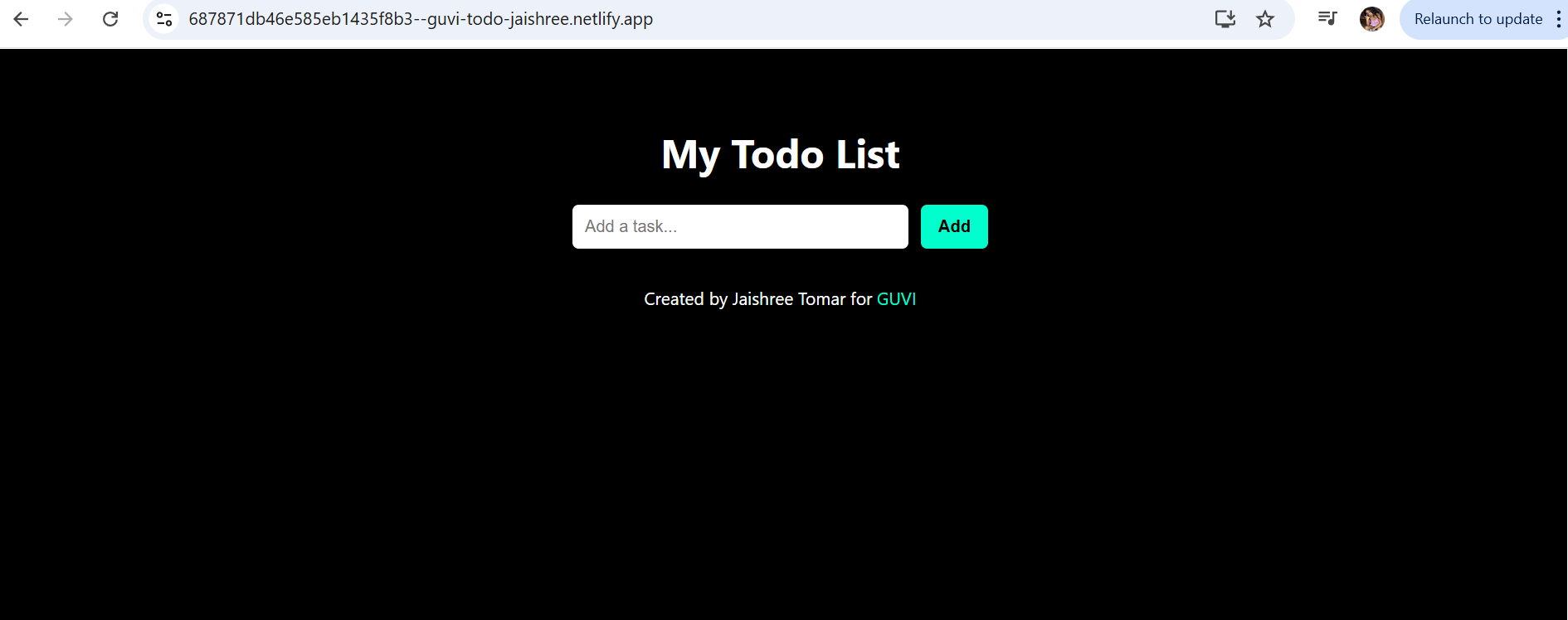
Building a To-Do List App Using ReactJS
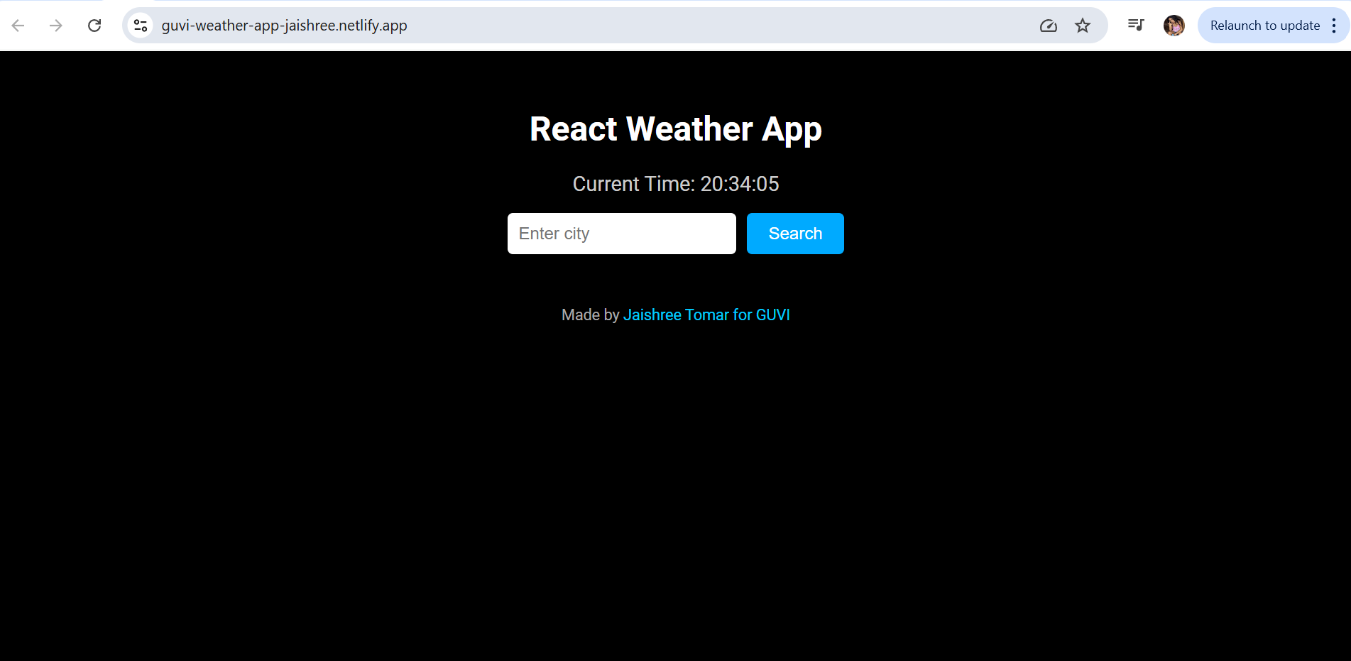
Building a Weather App Project Using ReactJS
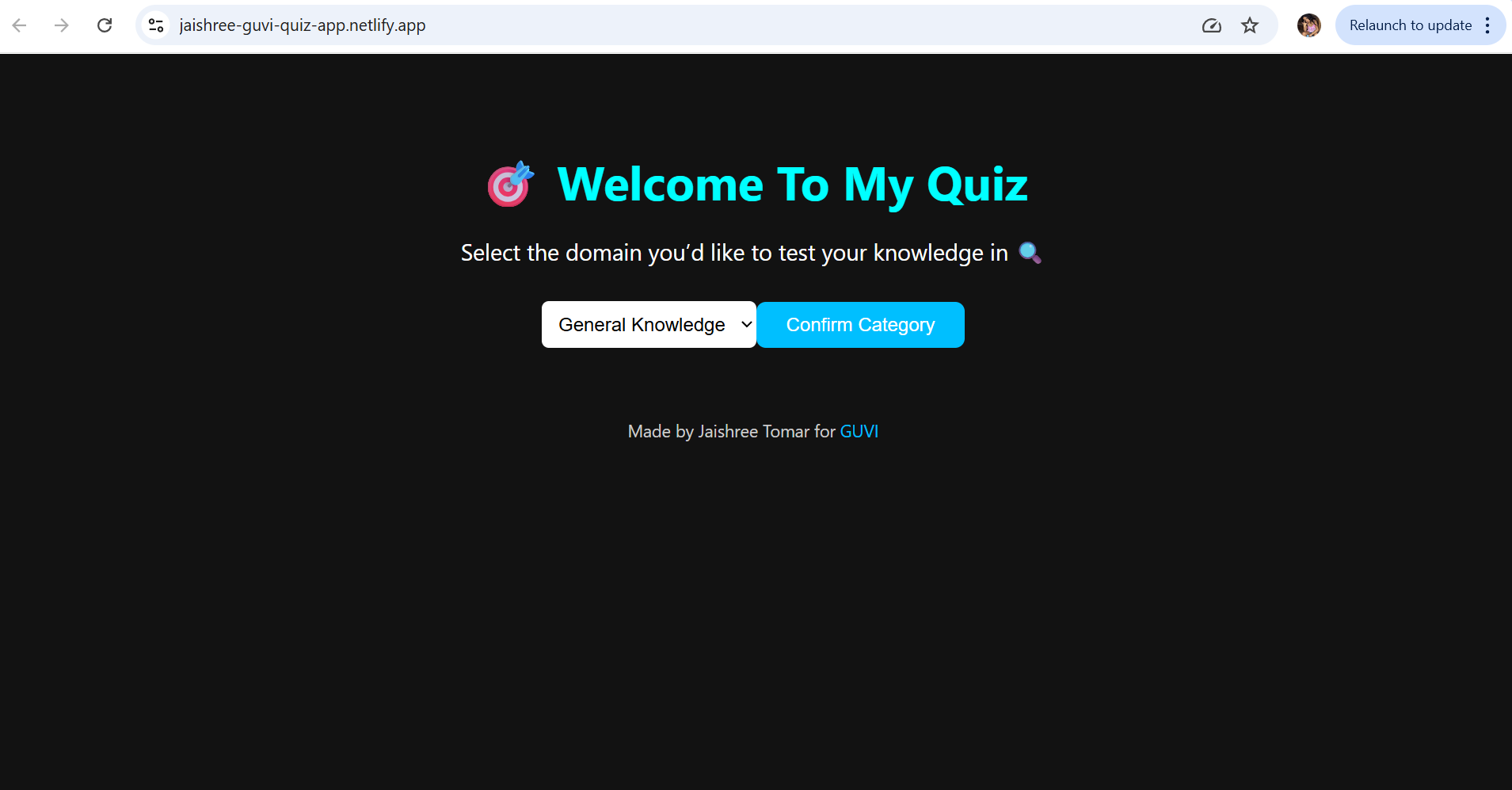
Building a Quiz App in ReactJS

Building a GenZ Carousel App in React

ReactJS Projects Handbook

Computer Networks Tutorial

Operating System Tutorial

DBMS and SQL Tutorial

Java Tutorial

C Language Tutorial

PHP Tutorial

Android Tutorial

Linux Guide Tutorial

Data Structures and Algorithms Tutorial

Computer Architecture

HTML 5 References Tutorial

Docker Tutorial

GIT (Using Github) Tutorial

Go Language Tutorial

GIT Guide

CSS Tutorial

Advanced Data Structures

Spring Framework Tutorial

Spring Boot Tutorial

Kotlin Tutorial

Apache Cordova Tutorial

Python Tutorial

SASS-SCSS Tutorial

MongoDB Tutorial

Numpy Tutorial

PL-SQL Tutorial

Python Built-in Functions Tutorial

Pandas Tutorial

Elasticsearch Tutorial

Matplotlib Tutorial

Web Scraping Tutorial

Networking with Python

Tkinter Tutorial

Java Programs Tutorial

Java Examples Tutorial

Servlet Tutorial

JSP Tutorial

Java Type Conversion Tutorial

Java 8 Tutorial

Java 9 Tutorial

Java 10 Tutorial

Java 11 Tutorial

Java Util Library Tutorial

Building a Contact Us Form in ReactJS

Building a Age Calculator App Using ReactJS

Movie Recommendation System Project Using Content-Based Filtering

Recipe Finder App using ReactJS

Sales Data Analysis Project for Beginners Using Data Science

Student Performance Analysis Project for Beginners Using Data Science

Word Counter Tool Using ReactJS

Customer Churn Prediction Project Using Classification Techniques

Basic Expense Tracker App using ReactJS

Simple Binary to Decimal Converter in React

Real-Time Unit Converter in React

House Price Prediction Using Machine Learning (XGBoost)

Weather Data Analysis and Visualization Using Python

Expandable Accordion Component using React

OTP Verification Component using React

Cricket Data Analysis Using Python

Credit Card Fraud Detection for Beginners using Data Science

Deep learning Tutorial

Software Development Life Cycle Tutorial

Stock Price Prediction for Beginners using Data Science

Apache Kafka Tutorial

Angular Tutorial

Django Tutorial

Computer Programming Tutorial

Tensorflow Tutorial

Java OOPs Concepts Tutorial

Building an Image Classification System Using CNN

News Recommendation System Using Machine Learning

Fake Review Detection System using Machine Learning

Job Portal with Applicant Tracking System Using Full Stack Development

(FalCon Store) A Modern React-Based E-Commerce App UI with Admin Dashboard

Student Management System using Python (Beginner-Friendly Project Guide)

HTML Tutorial - From Basics to Implementation

Machine Learning Tutorial

ReactJS Tutorial

Hibernate Tutorial

Data Analysis with Python Handbook

Probability and Statistics for Data Science

Artificial Intelligence Tutorial

Power BI Tutorial

R for Data Science

SQL for Data Science

Data Analytics Tutorial