Live Output and Visualization Overview
Live Output and Visualization Overview
Live Output: Stock Price Prediction
After executing the notebook, the project generates multiple visualizations and evaluation reports that help interpret stock market trends and assess prediction accuracy.
Each visualization provides unique insights into the dataset and the regression model.
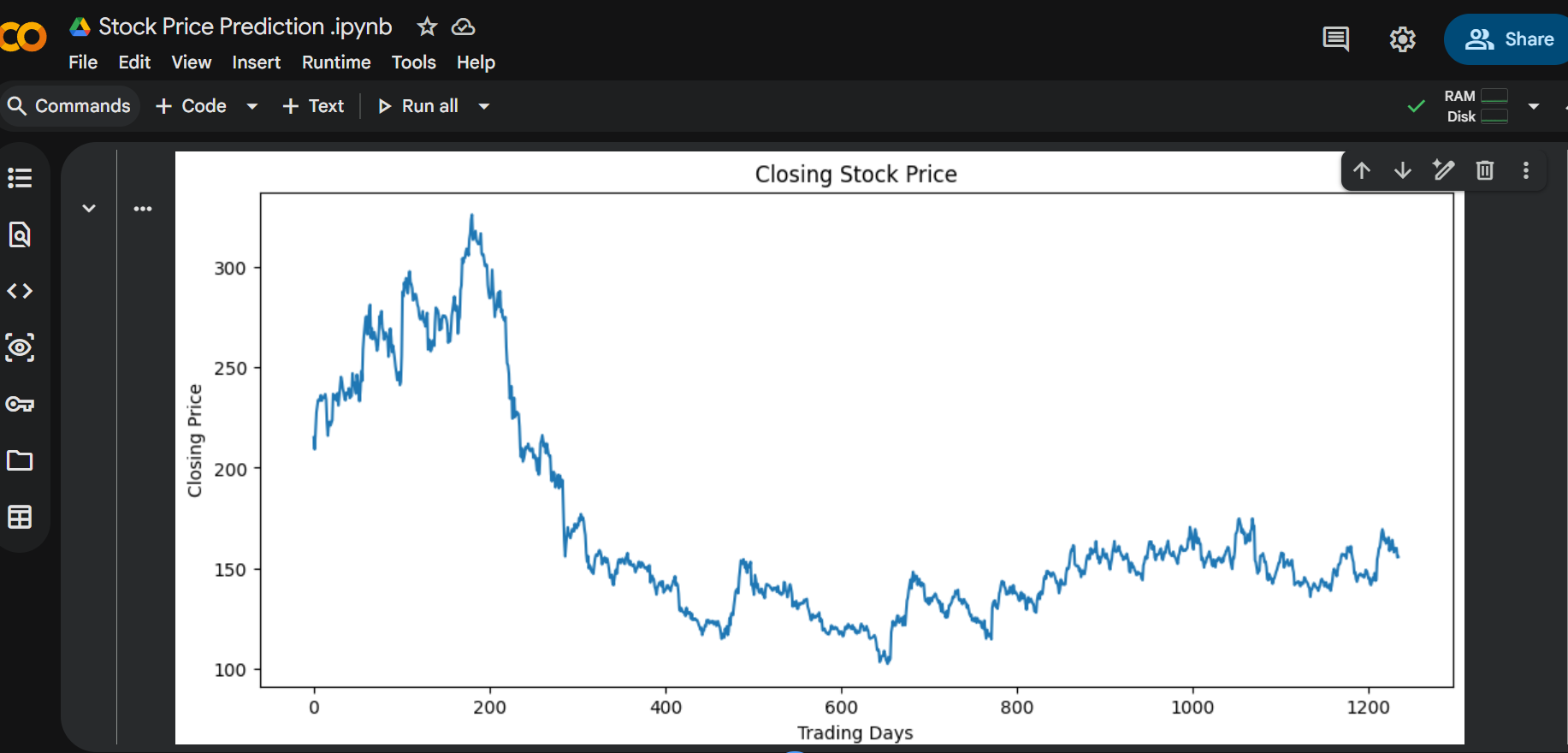
Closing Price Trend
Displays how the stock’s closing price changes over time.
This chart helps identify upward trends, downward trends, and periods of market volatility.
Open vs Close Price Comparison
Compares the opening and closing prices for each trading day.
This visualization helps understand daily market movement and trading behavior.
Actual vs Predicted Stock Prices
Compares the stock prices predicted by the KNN model with the actual closing prices.
A closer match between the two indicates better predictive performance.
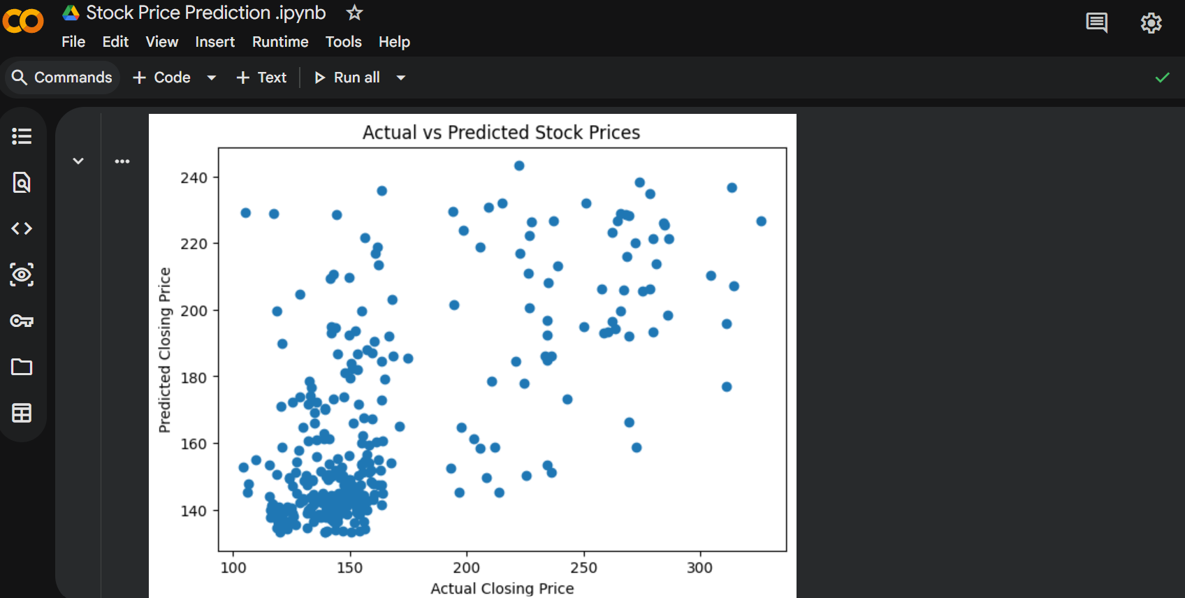
Scatter Plot of Predictions
Displays the relationship between actual and predicted stock prices.
When prediction points lie close to the diagonal trend, the model demonstrates higher accuracy.
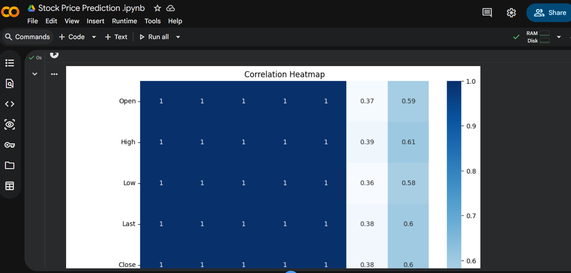
Correlation Heatmap
Shows the relationships among numerical stock market variables.
The heatmap helps identify which features are strongly related to the closing price.
Regression Metrics
The project calculates the following evaluation metrics:
- Mean Absolute Error (MAE)
- Mean Squared Error (MSE)
- Root Mean Squared Error (RMSE)
- R² Score
Together, these metrics provide a reliable measure of the model’s prediction accuracy.