Top Products by Revenue
Lesson 2: Top Products by Revenue
After understanding overall revenue movement, the next step is to identify which products contribute the most to total sales. This analysis helps businesses focus on high-performing product lines.
Code:
# Group sales by product line and calculate total revenue
top_products = df.groupby('PRODUCTLINE')['SALES'].sum().reset_index().sort_values(by='SALES', ascending=False)
top_products
plt.figure(figsize=(5,3))
sns.barplot(
data=top_products,
x='PRODUCTLINE',
y='SALES'
)
plt.title("Top Product Lines by Revenue")
plt.xticks(rotation=45)
plt.ylabel("Total Sales")
plt.show()
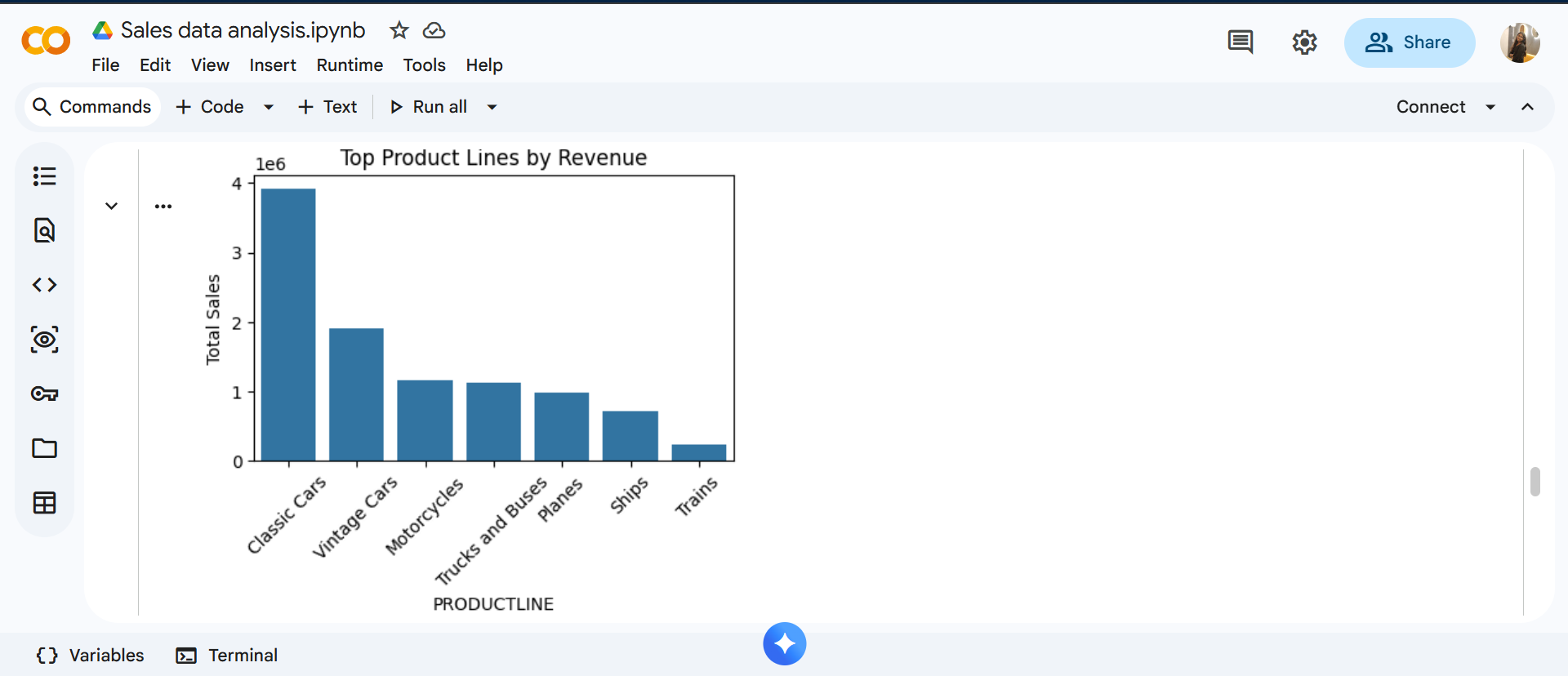
Insights:
The bar chart compares total revenue across different product lines. Bar charts are used because they make comparison simple and clear. Product lines with taller bars generate higher revenue, helping identify which products drive business growth.